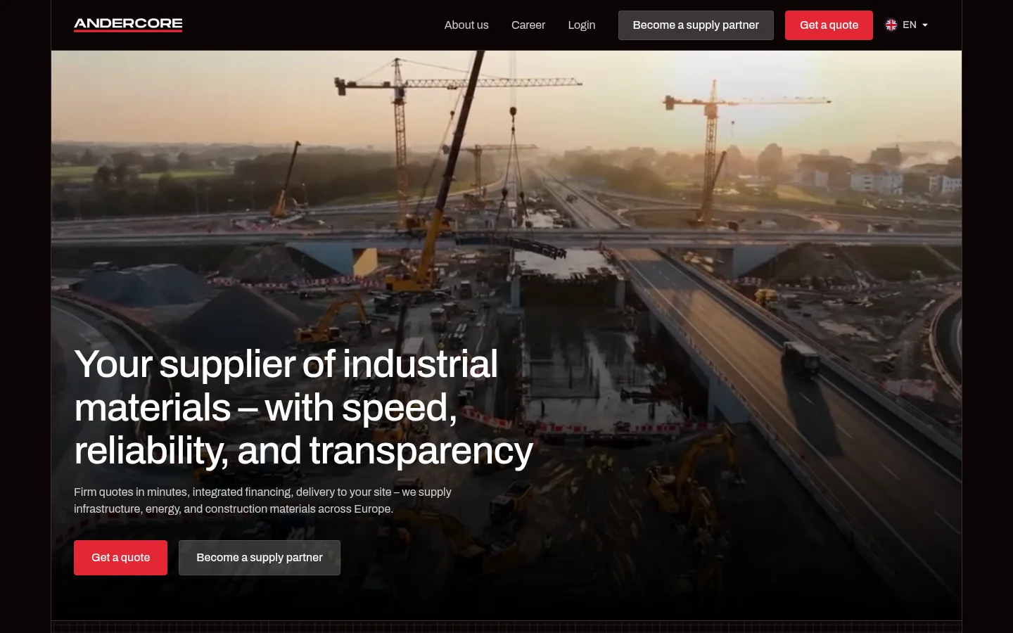
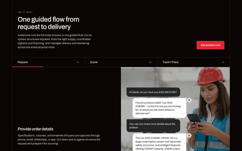
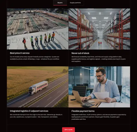
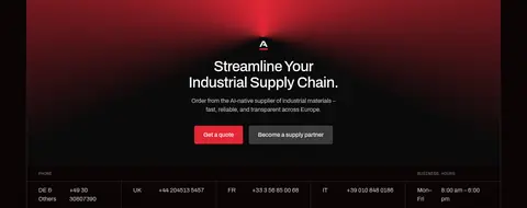
North star · Use the near-black canvas and fine rules to frame real industrial imagery, reserving bright red for the most important action.
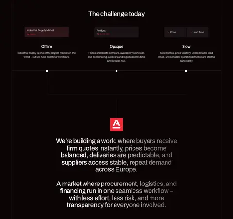
The visual identity is built on a near-black canvas (#0b0405) that lets the industrial imagery feel immersive without turning the interface into a conventional catalog. White headings and muted-gray supporting text establish a clear reading hierarchy, while vivid red (#e32735) is reserved for the primary quote actions, selected emphasis, and map details. Archivo carries nearly all interface typography: medium-weight, tightly tracked headings contrast with regular, comfortably spaced body copy. Space Mono appears in small uppercase labels, adding a technical data-note quality. The page alternates cinematic, full-bleed media with centered introductions, image-led feature cards, and split content blocks. Fine dark borders organize cards and section edges instead of shadows. Consistent section breaks and generous vertical breathing room keep the long homepage navigable; images provide most of its tonal variation, rather than extra interface colors.
配色
点色块复制色值。用途说明来自对页面的实测位置(背景、文字、描边、按钮)与截图判读。
品牌色
强调色
表层色
中性色
功能色
页面底色 · Foundry Black表层 · Hard White主文字 · Hard White次要文字 · Pale Alloy弱文字 · Ash Gray描边 · Iron Seam强调 · Signal Red
Display and heading text, body copy, navigation, links, and buttons.
Aa 设计
Space Mono
网络字体 · 字重 400 · 占比 5%
免费替代:IBM Plex Mono
Small uppercase captions and technical-style labels.
角色
示例
字号
字重
行高
字距
特大标题
Large hero or campaign headline.
Andercore
56px
500
1.1
-0.02em
一级标题
Primary page and major section headings.
Andercore
40px
500
1.1
-0.02em
二级标题
Feature titles and secondary section headings.
The quick brown fox 敏捷的狐狸
24px
500
1.2
-0.02em
正文
Explanatory paragraphs and feature descriptions.
The quick brown fox 敏捷的狐狸
16px
400
1.5
0
辅助文字
Small uppercase section labels and category markers.
The quick brown fox 敏捷的狐狸
12px
400
1.5
0
按钮
Quote and supply-partner calls to action.
The quick brown fox 敏捷的狐狸
16px
500
1.5
0
导航
Header navigation labels.
The quick brown fox 敏捷的狐狸
16px
400
1.5
0
链接
Inline and location links.
The quick brown fox 敏捷的狐狸
16px
400
1.5
0
代码
Compact uppercase technical annotations.
const style = 1;
12px
400
1.5
0
间距与布局
基准单位 8px · 密度:宽松
64px版块间距
32px元素间距
—卡片内边距
1294px内容最大宽度
4px
6px
8px
12px
16px
24px
28px
32px
40px
48px
64px
72px
The content sits within a centered frame measured at a 1294px maximum width, with dark outer margins visible in the desktop screenshot. A spacious 8px-based rhythm supports long sections, and the measured section gap is 64px. The page alternates two-column hero and editorial splits with centered introductions, multi-column feature grids, and image-led cards. Most text aligns to the left within its block; section introductions often center. Hairlines trace card and section boundaries, while repeated grid layouts make the long page feel ordered rather than dense.
圆角与层次
按钮 · 4px
图片 · 50%
没有测到阴影:页面是扁平的,层次靠底色和描边区分。
The interface is predominantly flat, with no measured shadows. Thin #382e30 borders define cards, section edges, and navigation divisions against the dark canvas. Use dark overlays within photography for legibility, and keep the red-gradient treatment confined to the closing campaign area rather than adding general raised surfaces.
组件
下面的预览按实测的按钮、输入框、徽标、卡片样式重建(字体用替代字体)。
Primary quote button
Red #e32735 fill with white Archivo text, a matching 1px border, and a measured 4px radius; the common measured padding is 12px 24px.
Supply partner button
Muted charcoal-gray fill with white text and a darker border; use the measured 4px radius and 12px 24px padding.
Header navigation
A compact dark header with the wordmark, white Archivo navigation, partner action, red quote action, and language control.
Bordered feature card
Flat dark content area with white heading and copy, separated from neighboring cards by a fine #382e30 border; card radius measures 0px.
Image feature tile
Rectangular industrial or workplace photograph paired with a dark copy area, short title, and muted supporting text.
Technical section marker
Small uppercase Space Mono label preceding a larger Archivo heading, used to identify sections such as solution or careers.
Closing campaign panel
Centered logo, headline, short supporting copy, and paired actions over a dark field with a red-to-white gradient treatment.
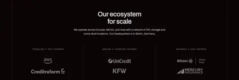
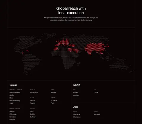
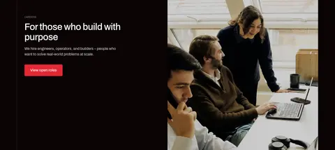
Imagery · Use documentary-style photography and a full-bleed construction-site video for the hero. Images show infrastructure, warehouses, logistics, workers, and business operations, usually cropped to fill rectangular panels. The hero uses a dark fade over its footage so white copy remains legible. Partner marks and a dotted world map provide supporting graphic content; warm color in the photos belongs to the media, not the interface palette.
Keep the canvas near-black and consistent across sections.
Reserve Signal Red for primary actions and selected highlights.
Use Archivo for nearly all interface text.
Set small technical labels in uppercase Space Mono.
Separate cards and sections with fine dark hairlines.
Let genuine industrial photography carry the warm color.
Alternate image-led blocks with spacious text sections.
✕ 不该做
Do not introduce bright colors beyond the measured palette.
Do not add shadows or raised-card effects.
Do not turn every section into a centered card grid.
Do not use decorative gradients across ordinary content.
Do not make secondary copy as bright as the headings.
Do not style the interface like a conventional product catalog.
给 AI 的提示词
想快速出一个同风格的新页面,把这段话连同 DESIGN.md 一起发给 AI。
Build a new Andercore-style industrial materials page with a Foundry Black canvas (#0b0405), white headings (#ffffff), and Pale Alloy copy (#cecdcd). Use Signal Red (#e32735) sparingly for the primary CTA and selected details. Keep Iron Seam (#382e30) hairlines subtle; avoid shadows and raised surfaces. Set most content in Archivo, with Space Mono reserved for small uppercase technical labels. Compose a cinematic industrial-photo hero with a dark legibility overlay, then alternate centered introductions, image-led feature grids, and left-aligned editorial splits. Keep the layout spacious and structured within the measured 1294px maximum width, using the measured section rhythm. Let photography provide natural tonal variation rather than adding interface colors. Finish with a focused campaign block and clear paired actions.