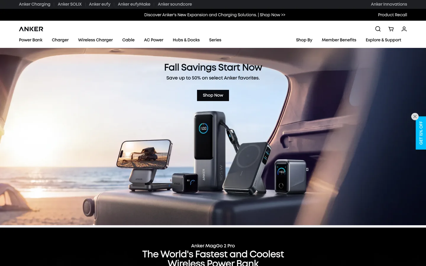
North star · Keep the interface quiet and high-contrast, using large campaign imagery to make products—not decoration—the focal point.
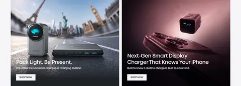
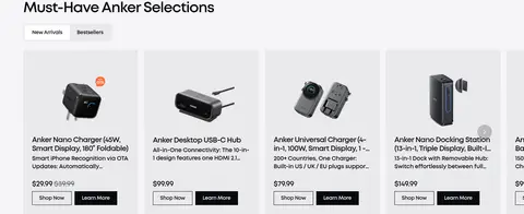
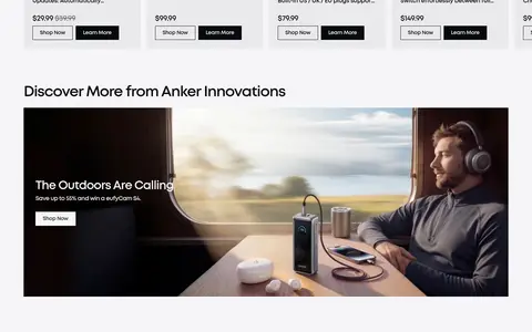
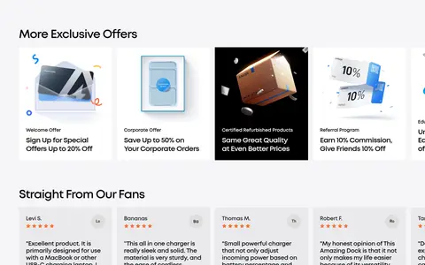
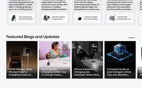
Anker’s visual system keeps the storefront chrome quiet so campaign imagery can carry the page. The pale #f5f5f7 canvas alternates with white and light-gray product surfaces, while black and near-black navigation, CTA buttons, and the footer establish contrast. Signal blue #00befa is used sparingly as a brand accent rather than a dominant fill. MontForAnker is used throughout in bold weights, with tight tracking on large headings and compact, readable labels. Full-bleed campaign images anchor the top of the page; lower sections shift to aligned grids of category tiles, product cards, and editorial panels. Generous section separation gives each merchandising story room, while repeated card patterns make browsing predictable. Borders are understated, corners are nearly square, and elevation is restrained, keeping attention on product photography and clear shopping actions.
配色
点色块复制色值。用途说明来自对页面的实测位置(背景、文字、描边、按钮)与截图判读。
品牌色
表层色
中性色
功能色
页面底色 · Gallery Mist表层 · Clean White表层 2 · Soft Silver表层 3 · Pure Black表层 4 · Graphite主文字 · Anker Ink描边 · Fine Gray强调 · Signal Cyan
Site-wide type for headings, body copy, navigation, links, buttons, and product labels.
角色
示例
字号
字重
行高
字距
一级标题
Primary campaign headline, centered over full-bleed hero imagery.
Anker
40px
700
1
-0.04em
二级标题
Major campaign and merchandising section headings.
Anker
32px
700
1
-0.04em
三级标题
Feature-card and product-story titles.
The quick brown fox 敏捷的狐狸
24px
700
1.2
-0.013em
四级标题
Compact subsection and product-card headings.
The quick brown fox 敏捷的狐狸
20px
700
1.2
-0.04em
正文
Product descriptions and supporting promotional copy.
The quick brown fox 敏捷的狐狸
16px
700
1.4
-0.02em
辅助文字
Short product details and small supporting labels.
The quick brown fox 敏捷的狐狸
14px
700
1.2
-0.023em
按钮
Shopping and discovery actions, set as bold concise labels.
The quick brown fox 敏捷的狐狸
14px
700
1.2
-0.023em
导航
Primary category navigation and secondary utility links.
The quick brown fox 敏捷的狐狸
14px
700
1.4
-0.02em
链接
Inline calls to action and product or editorial links.
The quick brown fox 敏捷的狐狸
14px
700
1.2
-0.023em
间距与布局
基准单位 4px · 密度:适中
64px版块间距
8px元素间距
113px卡片内边距
1312px内容最大宽度
4px
8px
10px
11px
12px
16px
20px
24px
32px
64px
The measured content max width is 1312px, with a comfortable density and a 12-column merchandise area. The page alternates full-bleed, single-column campaign panels with contained feature grids, category tiles, product cards, and supporting content. Hero headings are centered, while merchandising titles and card content generally align left. Sections have a measured 64px rhythm; smaller element gaps are 8px. Keep the navigation compact and allow image-led panels to span the available width.
圆角与层次
按钮 · 2px
lg · card
The interface is mostly flat: light surfaces, square-edged cards, and discreet hairlines do the structural work. Measured card shadows are soft and restrained rather than a pervasive effect. Dark and light campaign images create depth through their own lighting and composition; avoid adding heavy shadows or ornamental borders to reproduce that richness.
组件
下面的预览按实测的按钮、输入框、徽标、卡片样式重建(字体用替代字体)。
Two-tier navigation
A slim dark brand/announcement strip sits above a white primary navigation with logo, product categories, and utility icons.
Campaign hero
Full-bleed product or lifestyle imagery paired with a centered bold headline, short support copy, and a compact Shop Now action.
Feature tiles
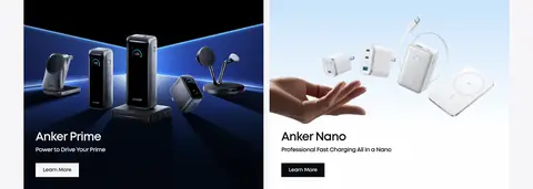
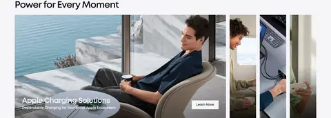
Image-led feature panels arranged in two-column rows, with short titles and small calls to action over or alongside the imagery.
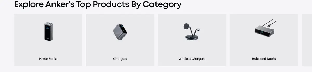
Category tiles
A horizontal multi-column browsing row with light-gray surfaces, centered product images, and concise category labels.
Product cards
Merchandise sits on #eaeaec surfaces with product imagery, compact descriptions, prices, and dark or light shopping actions.
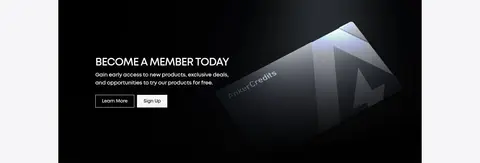
Member offer panel
A wide dark image-led promotional block places brief membership copy and light actions over a contrasting visual.
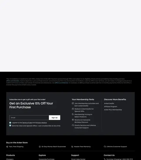
Newsletter footer
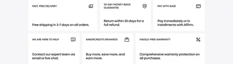
A black footer combines a subdued sign-up area, compact link columns, service information, and payment or social marks.
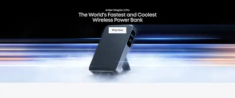
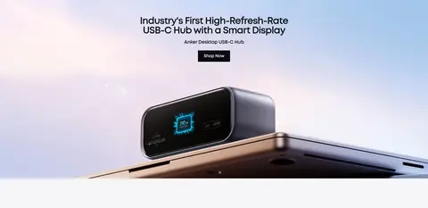
Imagery · Use polished product photography and campaign scenes as the primary visual feature: chargers and power banks appear in lifestyle settings, close-up product compositions, and clean category tiles. Hero imagery spans the full content width, with concise centered copy and CTAs layered over it. Lower-page editorial panels and product cards mix lifestyle images with isolated product shots. Some imagery is dark or cinematic, but it belongs to the photography rather than defining the site-wide palette.
Let polished product imagery lead each campaign section.
Use #080a0f for primary text and dark shopping actions.
Reserve #00befa for focused brand accents and prominent actions.
Keep headings bold, concise, and tightly tracked.
Use light-gray surfaces to distinguish product cards from the canvas.
✕ 不该做
Do not turn every section into a dark panel.
Do not use accent cyan as a large decorative background.
Do not add rounded, pill-shaped card treatments.
Do not clutter image-led sections with long copy.
Do not introduce decorative gradients that compete with product photography.
Do not give every card a strong shadow or thick border.
给 AI 的提示词
想快速出一个同风格的新页面,把这段话连同 DESIGN.md 一起发给 AI。
Build a new Anker-style ecommerce page with a quiet, product-first visual hierarchy. Use Gallery Mist (#f5f5f7) as the main canvas, Clean White (#ffffff) and Soft Silver (#eaeaec) for cards, and Anker Ink (#080a0f) for text and primary dark actions. Apply Signal Cyan (#00befa) sparingly to brand emphasis and standout CTAs. Use bold MontForAnker-style sans typography, or Montserrat as a free substitute, with compact labels and tight headline tracking. Combine full-width lifestyle/product photography with contained category and product grids; keep copy short, actions clear, and section spacing generous. Use near-square corners, fine gray separators, and restrained elevation. Keep navigation compact, make product browsing easy, and use dark panels selectively for membership or footer content.