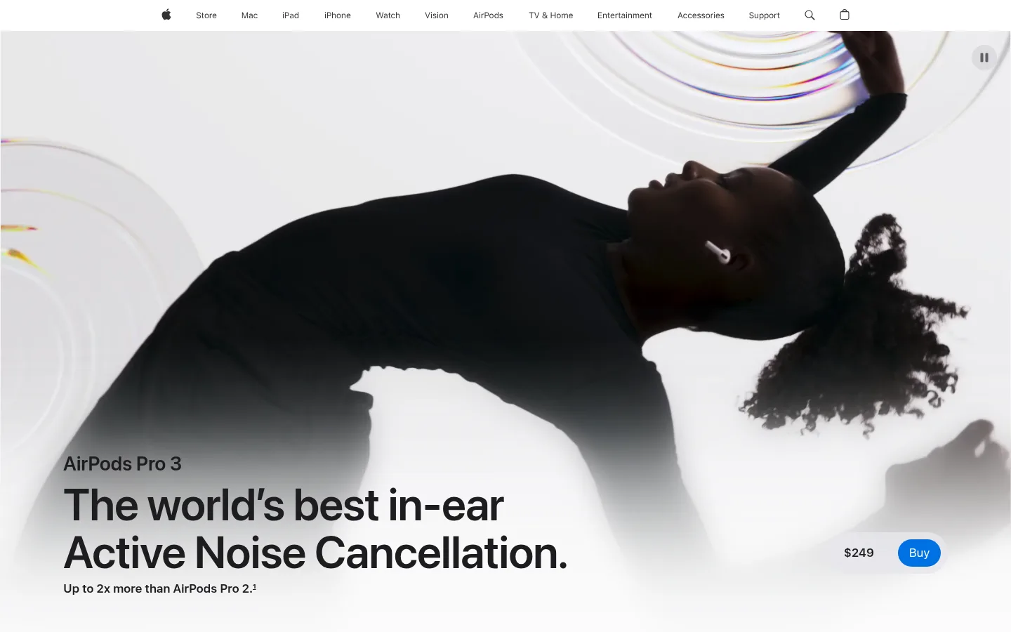
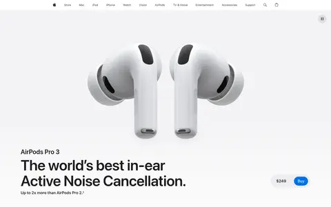
页面以克制的中性色、醒目的大字和沉浸式视频,讲述 AirPods Pro 3 的产品故事。浅灰与白色区块交替铺陈,让节奏保持简洁,产品及人物影像则带来视觉张力。
North star · Keep the interface quiet and neutral so oversized type and cinematic product imagery carry the story.
The page builds its identity from a near-white foundation: #f5f5f7 creates the opening canvas and selected feature bands, while #ffffff gives long-form product sections a clean reset. Headings and primary copy use deep #1d1d1f; muted grays carry secondary descriptions and utility text. Blue is reserved for actionable links and purchase buttons rather than broad decoration. SF Pro Display gives headlines a bold, tightly tracked editorial presence, while SF Pro Text handles navigation, body copy, and controls. The layout alternates expansive full-bleed media with centered copy, feature cards, and product-focused panels. Generous vertical pauses make each feature feel like a new chapter. High-contrast, carefully art-directed video and photography provide most of the color and emotional movement; the interface itself remains quiet, flat, and precise.
配色
点色块复制色值。用途说明来自对页面的实测位置(背景、文字、描边、按钮)与截图判读。
品牌色
强调色
表层色
中性色
功能色
页面底色 · Gallery Mist表层 · Studio White主文字 · Apple Ink次要文字 · Quiet Graphite弱文字 · Soft Alloy描边 · Apple Ink强调 · Action Blue强调 2 · Link Blue
Oversized campaign headline in the hero and major story moments.
Apple
96px
600
1.04
-0.015em
一级标题
Primary product-story headline.
Apple
80px
600
1
-0.015em
二级标题
Large chapter headlines and centered feature statements.
Apple
64px
600
1.06
-0.009em
三级标题
Secondary feature and section headlines.
Apple
56px
600
1.07
-0.005em
四级标题
Compact feature headings and prominent links.
Apple
28px
600
1.14
0.007em
正文
Product descriptions and key supporting copy.
The quick brown fox 敏捷的狐狸
17px
600
1.47
-0.022em
辅助文字
Small labels, footnotes, and supporting details.
The quick brown fox 敏捷的狐狸
12px
400
1.33
-0.01em
按钮
Purchase and compact action labels.
The quick brown fox 敏捷的狐狸
12px
400
1.33
-0.01em
导航
Global navigation labels and utility items.
The quick brown fox 敏捷的狐狸
12px
400
1
-0.01em
链接
Prominent text links within product content.
Apple
28px
600
1.14
0.007em
间距与布局
基准单位 4px · 密度:宽松
160px版块间距
20px元素间距
10px卡片内边距
1260px内容最大宽度
2px
3px
4px
6px
8px
10px
12px
14px
15px
16px
18px
20px
22px
24px
28px
30px
Use a broad centered content frame with the measured 1260px page maximum, while allowing campaign media to run full bleed. The measured grid ranges from single-column editorial sections to four-column feature areas and two-column copy blocks. Alternate white and #f5f5f7 bands to establish chapter boundaries. Center major story introductions; align feature headings and detail copy to the start of their grids. Preserve the measured spacious rhythm, including the large section gap, and avoid crowding the media with interface elements.
圆角与层次
按钮 · 50%
inset · other
The page is predominantly flat: rely on alternating surface colors and full-bleed media rather than raised cards. Measured card outlines are dark and restrained; avoid adding pervasive borders or shadows. The button is a bright blue pill with a clean white label and no measured shadow.
组件
下面的预览按实测的按钮、输入框、徽标、卡片样式重建(字体用替代字体)。
Global navigation
A slim white header with compact SF Pro Text navigation, dark labels, and utility icons; keep it visually quiet above the hero.
Hero purchase action
Set the product message over immersive media and pair the price with a blue, white-text pill purchase button.
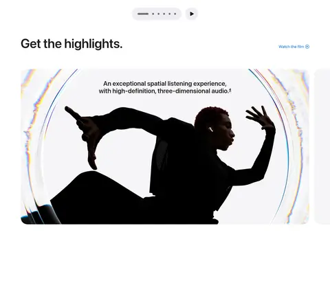
Feature highlights
Present a white section with a heading, compact links, and large feature media that reads as a sequence of editorial highlights.
Product detail showcase
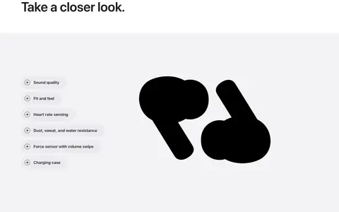
Use a pale-gray field, isolated earbud imagery, and a compact list of selectable feature topics.
Feature cards
Arrange product and lifestyle imagery with concise supporting copy in a multi-column feature area.
Story introduction
Center a small category label and an oversized SF Pro Display headline, followed by restrained explanatory text.
Pill CTA
Use #0071e3 with a white label, rounded pill silhouette, and compact SF Pro Text treatment for primary purchase actions.
Imagery · Lead with full-bleed campaign video and high-resolution product imagery, then mix in lifestyle scenes, close-up acoustic details, and large isolated product views. Use strong silhouette contrast against bright, pale environments. Keep imagery carefully art-directed and spacious, with occasional prismatic color appearing as part of the campaign visuals rather than as interface decoration.
Use the pale neutral and white bands as the main section structure.
Reserve blue for purchase actions and meaningful links.
Let large product imagery and video dominate feature storytelling.
Use tight, bold display typography for major headings.
Keep secondary copy muted and concise.
Leave generous vertical breathing room between story chapters.
✕ 不该做
Do not add decorative colors across the interface.
Do not turn every feature into a raised card.
Do not crowd full-bleed imagery with overlays and controls.
Do not use heavy shadows as a substitute for section structure.
Do not make body copy compete with display headlines.
Do not introduce gradients or prismatic effects outside the imagery.
给 AI 的提示词
想快速出一个同风格的新页面,把这段话连同 DESIGN.md 一起发给 AI。
Build a new product storytelling page in Apple’s restrained AirPods Pro 3 style. Use Gallery Mist (#f5f5f7) and Studio White (#ffffff) for alternating sections, Apple Ink (#1d1d1f) for headlines, and Quiet Graphite (#6e6e73) or Soft Alloy (#86868b) for secondary copy. Reserve Action Blue (#0071e3) and Link Blue (#0066cc) for interactions. Set large, tightly tracked headlines in an SF Pro Display-like face and supporting text in an SF Pro Text-like face. Compose a spacious centered content frame with occasional full-bleed campaign media, varied column layouts, and clear chapter breaks. Let polished product and lifestyle imagery bring contrast and color. Keep surfaces flat, buttons pill-shaped, and controls minimal; do not add ornamental shadows or unmeasured decoration.