Things 以宁静、留白充足的页面呈现个人任务管理工具,产品界面与简洁文案相互衬托。浅灰分区、深色文字、蓝色链接,以及大量用户和媒体评价,共同营造出精致而亲和的观感。
North star · Let spacious, quiet layouts and clear product imagery lead; use blue only as a deliberate point of interaction.
The page uses a restrained palette anchored by white and pale blue-gray, with dark charcoal text providing clear contrast and saturated blue reserved for links and the newsletter button. Broad background bands distinguish major sections without making the page feel boxed in. System sans-serif typography keeps the experience familiar: bold, compact headings introduce sections, while centered explanatory copy remains readable and understated. The layout alternates centered product introductions with large device imagery, a compact platform grid, and two-column testimonial and editorial collections. Generous whitespace gives each block room to breathe, while a consistent content width keeps long sections controlled. Product imagery carries most of the visual personality: crisp app screens and devices are presented with soft shadows against quiet backgrounds. Flat cards, subtle borders, and restrained elevation support the content rather than competing with it.
配色
点色块复制色值。用途说明来自对页面的实测位置(背景、文字、描边、按钮)与截图判读。
品牌色
强调色
表层色
中性色
功能色
页面底色 · Paper White表层 · Mist Gray主文字 · Things Charcoal次要文字 · Slate Copy弱文字 · Muted Steel描边 · Cloud Line强调 · Action Blue强调 2 · Link Blue
All page typography, including headings, body copy, navigation, and links.
角色
示例
字号
字重
行高
字距
一级标题
Hero product name; bold, compact display heading.
Cultured Code
36px
700
1
0
二级标题
Section headings, generally centered and regular-weight.
The quick brown fox 敏捷的狐狸
24px
400
1.25
0
正文
Main explanatory copy and testimonial text.
The quick brown fox 敏捷的狐狸
18px
400
1.35
0
辅助文字
Small supporting labels, attributions, and metadata.
The quick brown fox 敏捷的狐狸
15px
400
1.3
0
导航
Top navigation and compact menu labels.
The quick brown fox 敏捷的狐狸
15px
600
1.6
0
链接
Inline calls to action and secondary navigation links.
The quick brown fox 敏捷的狐狸
15px
400
1.3
0
间距与布局
基准单位 1px · 密度:适中
81px版块间距
18px元素间距
27px卡片内边距
900px内容最大宽度
2px
3px
4px
5px
6px
7px
8px
9px
10px
13px
18px
23px
27px
29px
36px
40px
A centered content system uses a measured maximum width of 900px, with a comfortable rather than dense rhythm. The hero aligns its logo, title, copy, and video link centrally, then transitions into full-bleed product media. Later sections alternate white and pale gray bands, using centered introductions above product displays or two-column collections. The platform area uses a four-column grid; reviews and editorial cards use two columns. Section gaps are generous, while card padding and element spacing stay consistent.
圆角与层次
按钮 · 8px
输入框 · 6px
卡片 · 18px
图片 · 3px
导航 · 6px
链接 · 3px
md · card
hairline · nav
md · media
Most section and testimonial surfaces stay flat, with pale background bands doing the structural work. Product media and selected social-style cards use soft, low-contrast shadows to suggest depth. Inputs and footer structure use fine gray borders or rules; keep outlines and elevation understated rather than adding heavy card frames.
组件
下面的预览按实测的按钮、输入框、徽标、卡片样式重建(字体用替代字体)。
Top navigation
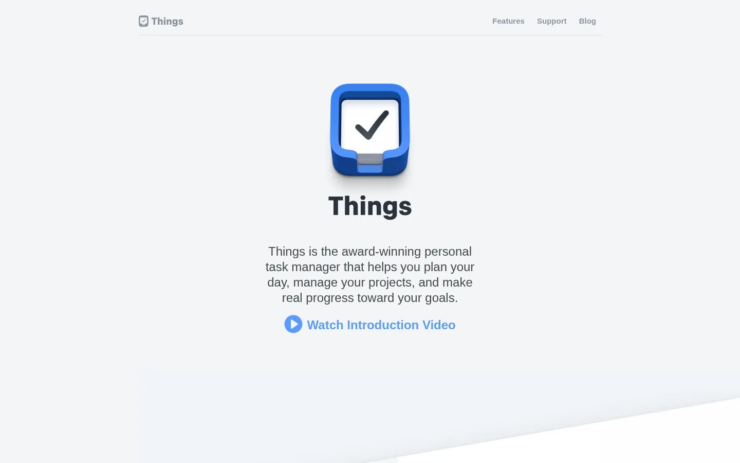
A restrained horizontal header with a compact Things mark at left and Features, Support, and Blog links at right. Dark text sits on the light canvas above a subtle hairline.
Hero introduction
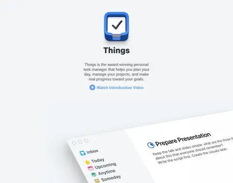
Centered product mark, bold title, concise supporting paragraph, and blue video link on a pale gray band; large product media continues below.
Feature showcase
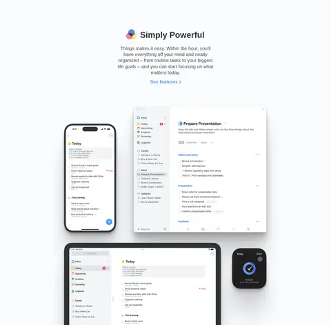
Centered heading and short copy lead into a large composition of app screens across Apple devices, supported by a modest blue feature link.
Platform cards
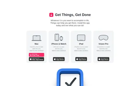
Four compact platform columns on white, each combining a device icon, platform details, and download or purchase links.
Testimonials
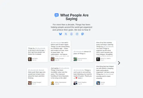
Two-column collection of user-review cards on a pale gray band, with brief introductory copy and small social links above.
Press and awards
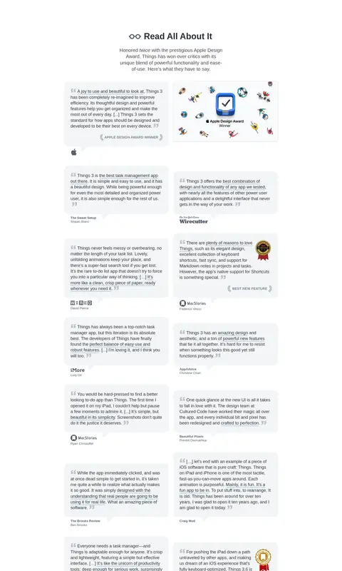
Editorial section on white, pairing review excerpts and publication marks in a two-column card layout.
Newsletter form
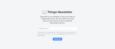
Centered sign-up area on pale gray with explanatory copy, email inputs, privacy note, and a blue Subscribe button.
Footer
Pale gray footer with four link groups, subtle divider, and compact company mark.
Imagery · Product imagery is the main visual anchor: app screens appear on Mac, iPhone, tablet, and Watch devices, often grouped into polished showcase compositions. The hero includes a video link and large product media. Review and press sections rely on small cards, logos, and award graphics. Device imagery may include vivid blue and other colors; treat those as product artwork, not as additional page-brand colors.
Use pale gray bands to distinguish major content sections.
Keep primary headings and body copy in dark charcoal.
Center product introductions and keep their copy concise.
Let device screenshots carry the detail in product showcases.
Reserve blue for links and the primary subscription action.
Use subtle card shadows and hairlines only where needed.
✕ 不该做
Do not introduce gradients or loud background colors.
Do not make every section a bordered card.
Do not crowd product imagery with decorative copy.
Do not use blue as a large section background.
Do not overstate muted labels or footer links.
Do not treat colors inside product artwork as brand palette colors.
给 AI 的提示词
想快速出一个同风格的新页面,把这段话连同 DESIGN.md 一起发给 AI。
Build a new page in the Things visual style: calm, spacious, product-focused, and editorial. Use a centered content area capped at the measured 900px, generous section rhythm, and alternating Paper White (#ffffff) and Mist Gray (#f2f5f7) bands. Set headings and body text in Things Charcoal (#303336) with a system sans-serif stack; keep headings bold and copy restrained. Use Link Blue (#5c9cf5) for inline actions and Action Blue (#4f91fb) for a primary button with white text. Present product UI in crisp device mockups with soft, quiet shadows. Prefer flat surfaces, fine Cloud Line (#dfe3e8) input borders, and understated card treatments. Keep navigation compact, introductions centered, and content grids clear. Avoid gradients, dense layouts, and decorative color that competes with the product.