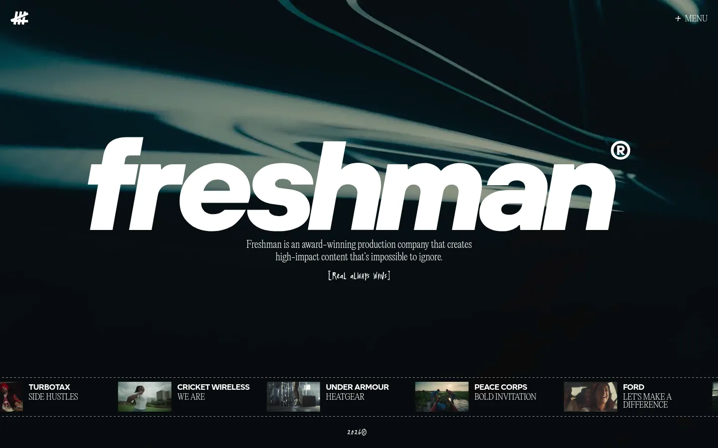
North star · Let full-bleed moving imagery and oversized white typography command a dark, uncluttered stage.
The homepage is built around a near-black stage, with white typography providing crisp contrast and the moving footage supplying most of the screen’s changing colour. The measured red accent is part of the palette, but it is not a defining feature of the captured first viewport; avoid forcing it into prominent UI. An oversized, bold Freshman wordmark dominates the hero, while a smaller, delicate serif-like statement sits centered below it. A hand-drawn caption adds a rough, human counterpoint. Navigation stays discreet at the top edge. At the bottom, a narrow horizontal project strip combines small video stills with concise client and project labels, separated by fine dashed rules. The composition favors full-bleed media and generous open dark space over boxed content. Keep additional elements restrained so the footage, wordmark, and project reel carry the identity.
配色
点色块复制色值。用途说明来自对页面的实测位置(背景、文字、描边、按钮)与截图判读。
品牌色
强调色
表层色
中性色
功能色
页面底色 · Night Canvas表层 · Black Stage主文字 · Studio White强调 · Signal Red
Light editorial display and uppercase navigation or body labels.
Aa 设计
Altform
网络字体 · 字重 700 · 占比 35%
免费替代:Archivo Black
Heavy display wordmark and emphatic brand lettering.
Aa 设计
Wasted Year
网络字体 · 字重 400 · 占比 4%
免费替代:Caveat
Handwritten-style caption and rough-edged supporting notes.
角色
示例
字号
字重
行高
字距
一级标题
Primary hero statement and oversized brand presence.
The quick brown fox 敏捷的狐狸
20px
200
1.25
-0.01em
正文
Uppercase supporting copy and compact editorial text.
The quick brown fox 敏捷的狐狸
16px
200
1
-0.01em
辅助文字
Short handwritten-style slogan or annotation.
The quick brown fox 敏捷的狐狸
14px
400
0.86
0
导航
Small uppercase menu label at the top edge.
The quick brown fox 敏捷的狐狸
16px
200
1
-0.01em
间距与布局
基准单位 4px · 密度:适中
—版块间距
12px元素间距
—卡片内边距
1400px内容最大宽度
1px
4px
8px
12px
20px
The measured page uses a 12-column structure and a maximum width of 1400px, while the hero media runs full bleed. The central wordmark and supporting statement anchor the viewport; the menu sits near the upper-right edge and a small mark near the upper-left. A compact project reel spans the lower edge, with thumbnail-and-label pairs arranged horizontally. Keep alignment deliberate and the overall density comfortable, leaving substantial open dark space around the central content.
圆角与层次
没有测到阴影:页面是扁平的,层次靠底色和描边区分。
The page reads as a flat, dark film stage rather than a stack of cards. No measured shadows or radius scale define the interface. Use fine dashed horizontal separators around the project reel, and rely on contrast and media layering—not raised panels—to distinguish content.
组件
下面的预览按实测的按钮、输入框、徽标、卡片样式重建(字体用替代字体)。
Corner navigation
A compact white “+ MENU” label sits at the top-right over the media, with no filled button treatment.
Hero wordmark
A very large, bold white Freshman wordmark is centered over full-bleed footage and dominates the opening view.
Editorial statement
A small, centered two-line company introduction sits directly below the wordmark in a light editorial face.
Handwritten slogan
A brief informal caption follows the statement, adding a hand-drawn texture without competing with the main headline.
Project reel
A narrow horizontal strip pairs small film stills with concise client and project names; dashed hairlines bound the strip.
Brand mark
A small white graphic mark occupies the upper-left corner, balanced against the menu on the opposite side.
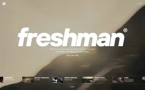
Imagery · Use full-bleed cinematic video rather than decorative illustration as the main visual. The captured first viewport shows dark, teal-tinged footage behind the white wordmark; the scaled full-page view shows a brighter, warm-toned shot, indicating the background can change. Keep footage immersive and allow its natural colors to vary. Project stills appear as small, horizontal thumbnails in the bottom reel.
Keep primary display lettering white and visually forceful.
Place concise editorial copy close to the hero wordmark.
Let cinematic video occupy the full hero canvas.
Keep navigation small and positioned at the edge.
Use a restrained horizontal reel for featured projects.
✕ 不该做
Do not turn the hero into a conventional card layout.
Do not add prominent UI colors absent from the captured viewport.
Do not let body copy compete with the brand wordmark.
Do not add heavy shadows or rounded-card styling.
Do not crowd the open space around the central hero.
Do not treat video colors as fixed brand palette colors.
给 AI 的提示词
想快速出一个同风格的新页面,把这段话连同 DESIGN.md 一起发给 AI。
Build a new Freshman-style agency page as a cinematic stage, not a conventional dashboard. Use Night Canvas (#101010) and Black Stage (#000000) for the dark foundation, with Studio White (#ffffff) for key typography and navigation. Signal Red (#ff2936) is a measured accent but should remain restrained; Warm Parchment (#f3f1e7) is not a defining hero color. Make full-bleed video the primary visual layer, then place a bold oversized wordmark and concise light editorial copy over it. Keep the menu discreet near the top edge. Use a short handwritten caption as a secondary texture, and present selected work in a compact horizontal strip with small stills and fine dashed separators. Favor open space, sharp contrast, and flat surfaces; avoid cards, heavy shadows, and decorative clutter.