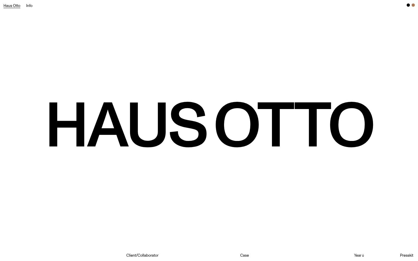
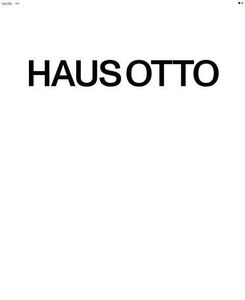
Haus Otto 首页以纯白背景衬托醒目的黑色巨型字标,并以克制的项目索引收尾。页面依靠字体尺度、留白与精准对齐营造编辑式气质,不依赖装饰元素。
North star · Keep the canvas white and let oversized black typography, precise alignment, and generous empty space do the visual work.
The page is built around a strict black-and-white palette: #ffffff fills the canvas, while #000000 carries the wordmark, navigation, and project-list labels. The screenshot’s tiny black and warm-colored dots are limited interface details, not a broader colour system, and the measured palette provides no additional brand colours. Monument is the defining visual instrument: a huge, tightly tracked uppercase display wordmark anchors the otherwise quiet opening, while small, regular-weight text handles navigation and index labels. The composition is deliberately sparse, with the logo occupying a broad central band and ample uninterrupted space around it. A compact top navigation sits at the upper left, balanced by two small circular marks at the upper right. At the bottom, project-list column headings establish an editorial grid. Treat the page as a typographic portfolio canvas, not as a conventional image-led landing page; preserve the white field and let scale, alignment, and negative space create hierarchy.
配色
点色块复制色值。用途说明来自对页面的实测位置(背景、文字、描边、按钮)与截图判读。
品牌色
表层色
页面底色 · Gallery White主文字 · Studio Ink
文字
背景
对比度
WCAG
#000000 Studio Ink
#ffffff Gallery White
21:1
AAA
字体
字号阶梯:Custom(比例约 4.076,正文 13px)。示例用免费替代字体渲染,数值为实测。
Aa 设计
Monument-Regular
网络字体 · 字重 400 · 占比 100%
免费替代:Space Grotesk
Navigation, headings, body copy, and large link labels throughout the homepage.
角色
示例
字号
字重
行高
字距
特大标题
The oversized uppercase Haus Otto wordmark anchoring the opening canvas.
Haus Otto
216px
400
normal
-0.033em
一级标题
Primary page heading or compact introductory text where present.
The quick brown fox 敏捷的狐狸
22.5px
400
1.16
0
正文
Small supporting copy and project-index labels.
The quick brown fox 敏捷的狐狸
13px
400
1.23
0
链接
Prominent project and download links in the portfolio index.
The quick brown fox 敏捷的狐狸
22.5px
400
1.16
0
间距与布局
基准单位 4px · 密度:适中
80px版块间距
—元素间距
—卡片内边距
1424px内容最大宽度
3px
4px
5px
8px
20px
30px
Use a single, open canvas with a measured maximum width of 1424px and comfortable density. Keep the navigation near the top edge, with the wordmark broadly centered in the opening field and substantial whitespace above and below. The project index follows as a clean, multi-column editorial row, with labels aligned to consistent vertical tracks. The measured section gap is 80px; preserve the spacious rhythm rather than adding stacked cards or dense content. Maintain simple horizontal alignment and avoid visible container framing.
圆角与层次
没有测到阴影:页面是扁平的,层次靠底色和描边区分。
The interface reads as flat: no measured shadows, gradients, or layered cards. Keep the white canvas uninterrupted and use text placement rather than elevation to define hierarchy. Avoid prominent borders; any dividing lines should remain understated and should not introduce a new colour.
组件
下面的预览按实测的按钮、输入框、徽标、卡片样式重建(字体用替代字体)。
Top navigation
Small black Haus Otto and Info text links sit at the upper left with minimal separation and no enclosing bar.
Corner marks
Two tiny circular marks sit at the upper right; treat them as restrained interface details, not core palette colours.
Wordmark
A huge black uppercase HAUS OTTO wordmark dominates the opening field, with tight tracking and no surrounding box.
Project index header
Small labels such as Client/Collaborator, Case, Year, and Presskit define aligned editorial columns near the lower edge.
Text links
Links are unboxed, black, and typographic; measured link styles include 22.5px Monument-Regular labels.
Imagery · The supplied viewport and full-page capture show no photography, illustration, 3D, or video; the visual identity is carried by typography and whitespace. Do not invent image treatments or decorative artwork for this page. If project imagery is introduced on a new page, keep it subordinate to the editorial layout and avoid adding unmeasured colour to the core palette.
Align navigation and project labels with a clear editorial grid.
Keep links unboxed and visually restrained.
✕ 不该做
Do not add gradients or shadows.
Do not introduce decorative cards or heavy borders.
Do not add extra palette colours as brand accents.
Do not crowd the opening with body copy.
Do not replace the wordmark with imagery.
Do not use multiple typefaces without evidence.
给 AI 的提示词
想快速出一个同风格的新页面,把这段话连同 DESIGN.md 一起发给 AI。
Build a new page in the Haus Otto visual style: use a clean #ffffff Gallery White canvas and #000000 Studio Ink for typography. Keep the composition flat, sparse, and editorial, with a compact text navigation, a bold oversized uppercase typographic anchor, and project or content links arranged on a carefully aligned grid. Use Monument-Regular where available; Space Grotesk is a practical free substitute. Keep text links unboxed and avoid card styling, gradients, shadows, and decorative borders. Preserve generous negative space and let changes in type scale establish hierarchy. Do not promote the tiny corner marks from the reference into a new colour system. Add only the content needed for the new page, maintaining the same disciplined alignment and quiet visual tone.