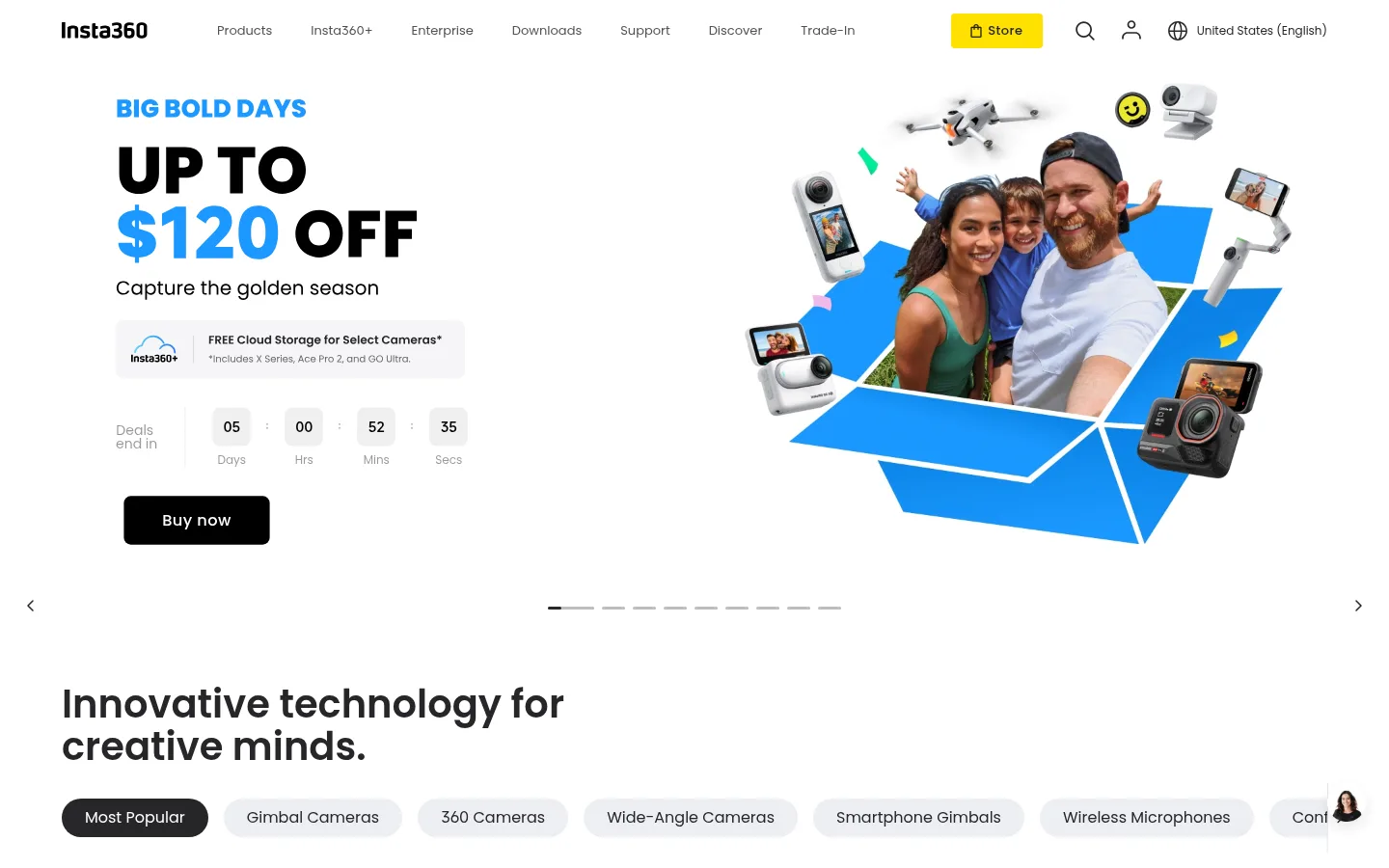
North star · Keep the interface bright and restrained, using bold product imagery for impact and yellow only as a precise shopping signal.
The page uses white as its dominant canvas, letting large promotional media and product imagery carry the visual energy. Pale blue-gray surfaces distinguish product cards, utility panels, and the enterprise band without making the page feel segmented. Near-black text provides a firm, readable contrast; the saturated yellow Store button is a focused brand signal, while blue accents appear sparingly in promotional artwork and links. Poppins Num supplies rounded, friendly letterforms across headings, body copy, and controls. Large semibold headlines establish each section, with compact supporting text and labels. The layout alternates full-width campaign imagery with centered product grids, interest cards, and paired utility panels. Generous white space separates these blocks, while rounded card corners soften the catalog structure. Product photography and video remain prominent and largely unframed, with restrained borders and shadows so imagery—not decorative interface chrome—sets the mood.
Shared display, heading, body, caption, button, and link typography.
角色
示例
字号
字重
行高
字距
特大标题
Large campaign or promotional headline where present.
Insta360
56px
600
1.07
0
一级标题
Primary page or section heading.
Insta360
40px
600
1.1
0
二级标题
Major section heading such as the technology introduction.
Insta360
36px
600
1.22
0
三级标题
Product group or prominent feature heading.
Insta360
32px
600
1.13
0
四级标题
Supporting card or subsection title.
Insta360
28px
500
1.14
0
正文
Product descriptions and general explanatory copy.
The quick brown fox 敏捷的狐狸
16px
400
1.25
0
辅助文字
Compact labels, card details, and supporting metadata.
The quick brown fox 敏捷的狐狸
13px
400
2.31
0
按钮
Prominent action labels and large calls to action.
The quick brown fox 敏捷的狐狸
18px
500
3.11
0.028em
链接
Compact navigation, secondary actions, and text links.
The quick brown fox 敏捷的狐狸
13px
400
2.31
0
间距与布局
基准单位 8px · 密度:适中
64px版块间距
24px元素间距
43px卡片内边距
1312px内容最大宽度
4px
6px
8px
16px
20px
24px
28px
32px
40px
48px
52px
128px
The homepage spans wide, full-bleed campaign media and then shifts into centered, modular shopping sections. A measured page max width of 1312px anchors the content; the product catalog uses a nine-column structure and the editorial feed a twelve-column structure. Sections alternate between broad media, multi-column cards, and two-panel utilities, with comfortable density and generous vertical separation. Headings align to the content edge, while product tiles and interest cards form consistent rows. Keep whitespace visible rather than filling every gap.
圆角与层次
按钮 · 8px
输入框 · 6px
卡片 · 24px
链接 · 24px
md · other
The interface is mostly flat: pale surfaces and whitespace create grouping instead of heavy shadows. Fine gray borders define inputs and quiet controls. Cards rely primarily on their light background and rounded corners; the measured shadow is subtle and should not become a repeated, conspicuous effect. Layer campaign text over media only where needed for contrast.
组件
下面的预览按实测的按钮、输入框、徽标、卡片样式重建(字体用替代字体)。
Store navigation action
A compact #ffe100 button with #262629 text and a lightly rounded shape; it is the main yellow interface accent.
Buy now button
A dark #1d1d1f purchase button with white medium-weight text, small rounded corners, and no prominent shadow.
Product card
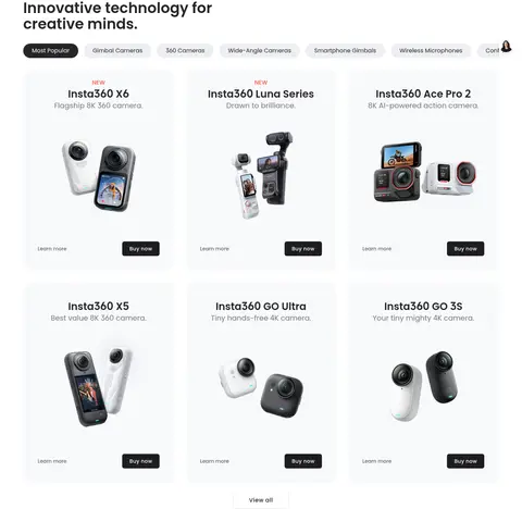
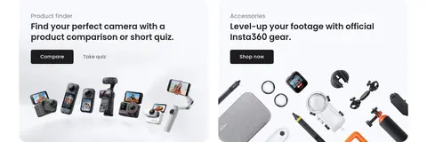
A #f8f9fc tile with a 24px measured radius, centered product image, concise title and detail, plus secondary and purchase actions.
Interest card
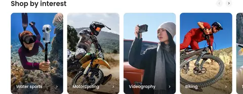
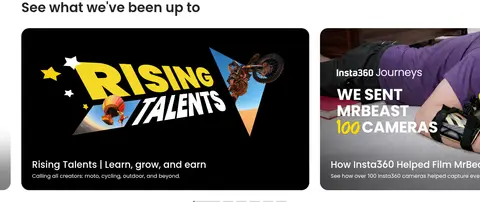
A tall lifestyle image card with a rounded crop and a short category label placed over its lower edge.
Category pills
A horizontal row of rounded category filters; the selected item is dark with light text and inactive items are pale.
Utility panels
Paired pale panels for product finder and accessories, each using a short title, supporting copy, action, and product imagery.
Text action
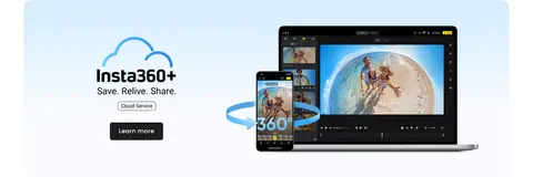
A compact secondary link such as Learn more, used beside the darker purchase button without competing with it.
Imagery · Large campaign areas use photography, video, and product composites to make cameras and creator scenarios the main attraction. Catalog tiles isolate devices against pale surfaces, while interest cards use tall lifestyle photography with labels near the bottom. Imagery is vivid and full-bleed where appropriate; keep overlays limited to legibility and avoid adding ornamental illustrations beyond the source material.
Let product and creator imagery carry promotional impact.
Set headings in Poppins-style semibold with dark ink.
Use rounded cards and controls with restrained borders.
Leave visible whitespace between major homepage blocks.
✕ 不该做
Do not turn the page into a dark interface.
Do not spread the yellow accent across large surfaces.
Do not use heavy shadows on every card.
Do not add decorative gradients as a substitute for imagery.
Do not crowd product cards with long descriptions.
Do not treat illustration-only gray samples as core brand colors.
给 AI 的提示词
想快速出一个同风格的新页面,把这段话连同 DESIGN.md 一起发给 AI。
Build a new consumer-electronics page in the Insta360 visual style. Use Gallery White (#ffffff) as the main canvas and Cloud Panel (#f8f9fc) for product tiles and utility bands. Set headings and body copy in a Poppins-like rounded sans, with Graphite Ink (#262629) for primary text and Quiet Slate (#76767f) for secondary content. Keep Store Yellow (#ffe100) for one high-salience shopping control; use dark purchase buttons with white text for product actions. Organize content in a broad centered frame, alternating full-bleed campaign media with orderly product cards and lifestyle image rows. Keep cards generously rounded, section spacing comfortable, and borders subtle in Soft Divider (#edeff2). Prioritize authentic device photography and creator scenes; avoid heavy shadows, decorative gradients, and unnecessary interface clutter.