North star · Keep the interface quiet and the black canvas uninterrupted so oversized, vividly coloured creative media remains the dominant voice.
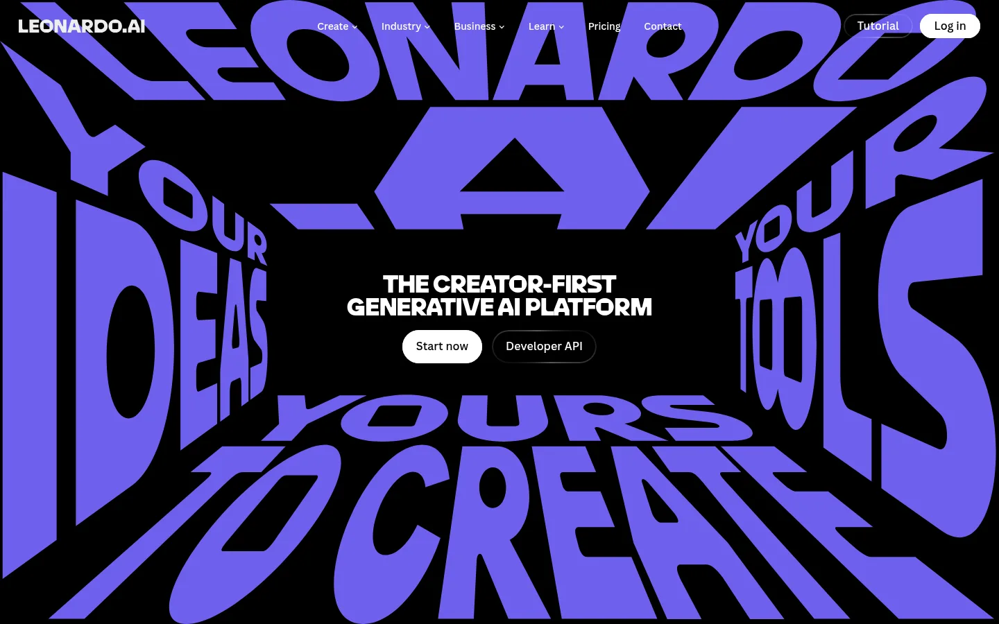
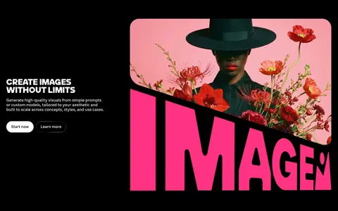
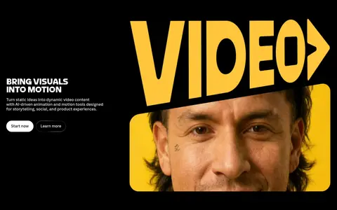
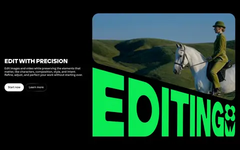
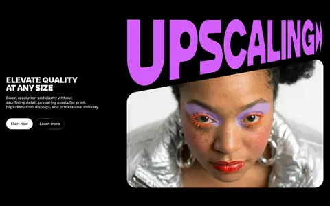
The page is built on a continuous #000000 canvas, letting oversized artwork and typography provide the section-to-section contrast instead of alternating background bands. In the hero, extreme perspective lettering in electric violet fills the viewport around a compact centered headline and two pill CTAs. The measured heading face leoSans supplies heavy, uppercase display impact; canvaSans handles navigation, controls, labels, and compact explanatory copy. White text stays crisp against black, while vivid green, coral, pink, yellow, purple, and violet distinguish capabilities, metrics, and creator-card details. These colours are also prominent within visual assets, so preserve them as accents rather than treating every swatch as a global interface colour. Feature sections pair concise left-aligned copy with large media on the right. Generous black intervals separate content, while rounded media frames and pill controls soften the otherwise sharp, poster-like composition.
Navigation, body copy, buttons, labels, and small supporting text.
Aa 设计
leoSans
网络字体 · 字重 900 / 500 / 800 · 占比 4%
免费替代:Anton
Oversized display lettering and section headings.
角色
示例
字号
字重
行高
字距
特大标题
Immersive oversized hero lettering and campaign-style visual statements.
Leonardo.ai
166px
900
0.85
-0.02em
一级标题
Primary hero headline and dominant page-level statements.
Leonardo.ai
97.5px
900
0.9
-0.01em
二级标题
Large section headings and capability-feature titles.
Leonardo.ai
79px
900
0.8
0
三级标题
Secondary feature and editorial headings.
Leonardo.ai
64.5px
900
0.9
-0.01em
四级标题
Supporting display headings within content sections.
Leonardo.ai
59px
900
0.8
0
正文
Feature descriptions, explanatory copy, and standard interface text.
The quick brown fox 敏捷的狐狸
14px
400
1.25
0
辅助文字
Compact artwork credits, creator roles, and secondary labels.
The quick brown fox 敏捷的狐狸
10.5px
400
1.25
0
按钮
Primary and secondary pill CTA labels.
The quick brown fox 敏捷的狐狸
14px
500
1.25
0
导航
Top-level navigation labels and utility links.
The quick brown fox 敏捷的狐狸
14px
500
1.25
0
间距与布局
基准单位 1px · 密度:适中
54px版块间距
3px元素间距
20px卡片内边距
1152px内容最大宽度
2px
3px
5px
7px
10px
14px
17px
20px
27px
54px
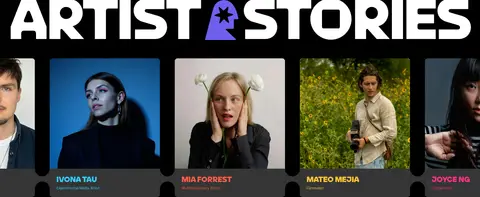
A single dark canvas carries a long, vertically staged homepage. The measured content max width is 1152px, with comfortable density and large section intervals. The hero is a full-bleed, two-column composition whose centered message sits within immersive lettering. Later feature blocks use a split layout: short copy and CTAs on one side, oversized media on the other. A three-column artist-story area and centered brand statements add variety. Keep copy clusters compact and allow generous black negative space between major content moments.
圆角与层次
按钮 · 9999px
卡片 · 20px
图片 · 9999px
徽标 · 9999px
链接 · 9999px
xl · card
The page is mostly flat: black sections have no visible elevation, and the measured card shadow is a deep, soft xl treatment rather than a universal effect. Use subtle outlines for secondary controls and reserve rounded framing for media and pills. Dark charcoal creator cards lift slightly from the canvas without introducing pale panels.
组件
下面的预览按实测的按钮、输入框、徽标、卡片样式重建(字体用替代字体)。
Hero CTA pair
Center a white pill-shaped “Start now” button beside a dark, outlined “Developer API” control beneath the hero headline.
Top navigation
Place compact white navigation labels over the hero artwork; keep utility actions at the right and avoid a separate light navigation band.
Capability feature split
Pair concise explanatory copy and small pill actions with oversized, rounded product imagery, alternating visual emphasis as needed.
Metric artwork
Present large, coloured figures and captions as typographic artwork on black, not as conventional dashboard tiles.
Creator story card
Use creator imagery with a charcoal #353535 information area and small vivid accent labels such as #ff5d4b or #ffc533.
Status badge
Use a compact #03e65b pill with dark text for brief status or emphasis, rather than a large filled panel.
Imagery · Use vivid, polished creative work and product-demo media as the primary visual substance. Hero artwork is typographic and perspective-distorted; feature imagery combines photography, motion, and large capability lettering. Media frames are prominent and rounded, while creator stories use portrait-oriented images and video. The saturated violet, pink, yellow, green, and blue visible across the page largely belong to artwork and capability visuals, not neutral UI chrome.
Use white pills for primary actions and outlined dark pills for secondary actions.
Pair short feature copy with generously sized media.
Reserve saturated hues for artwork, metrics, badges, and small highlights.
Use heavy uppercase display type for key visual statements.
✕ 不该做
Do not add alternating light section backgrounds.
Do not make every interface element brightly coloured.
Do not turn the hero into a conventional text-heavy SaaS banner.
Do not crowd feature media with dense copy.
Do not treat artwork colours as a complete UI palette.
Do not apply heavy shadows to every card or control.
给 AI 的提示词
想快速出一个同风格的新页面,把这段话连同 DESIGN.md 一起发给 AI。
Build a new page in the Leonardo.ai visual style. Use Infinite Black (#000000) as a continuous canvas, Soft Chalk (#ededed) for readable copy, and Paper White (#ffffff) for primary pill CTAs. Set oversized, heavy uppercase display statements in a leoSans-like face, with compact sans-serif interface text. Make one vivid, full-bleed visual the focal point; use saturated Violet Energy (#6e60ee), Studio Pink (#ff3386), Creator Green (#03e65b), or Signal Yellow (#ffc533) selectively in artwork and highlights. Keep navigation quiet, feature descriptions short, and media large with rounded framing. Arrange feature content as split copy-and-media sections, then use editorial creator or proof content for variety. Preserve generous black negative space; avoid light panels, generic dashboard cards, and unnecessary decoration.