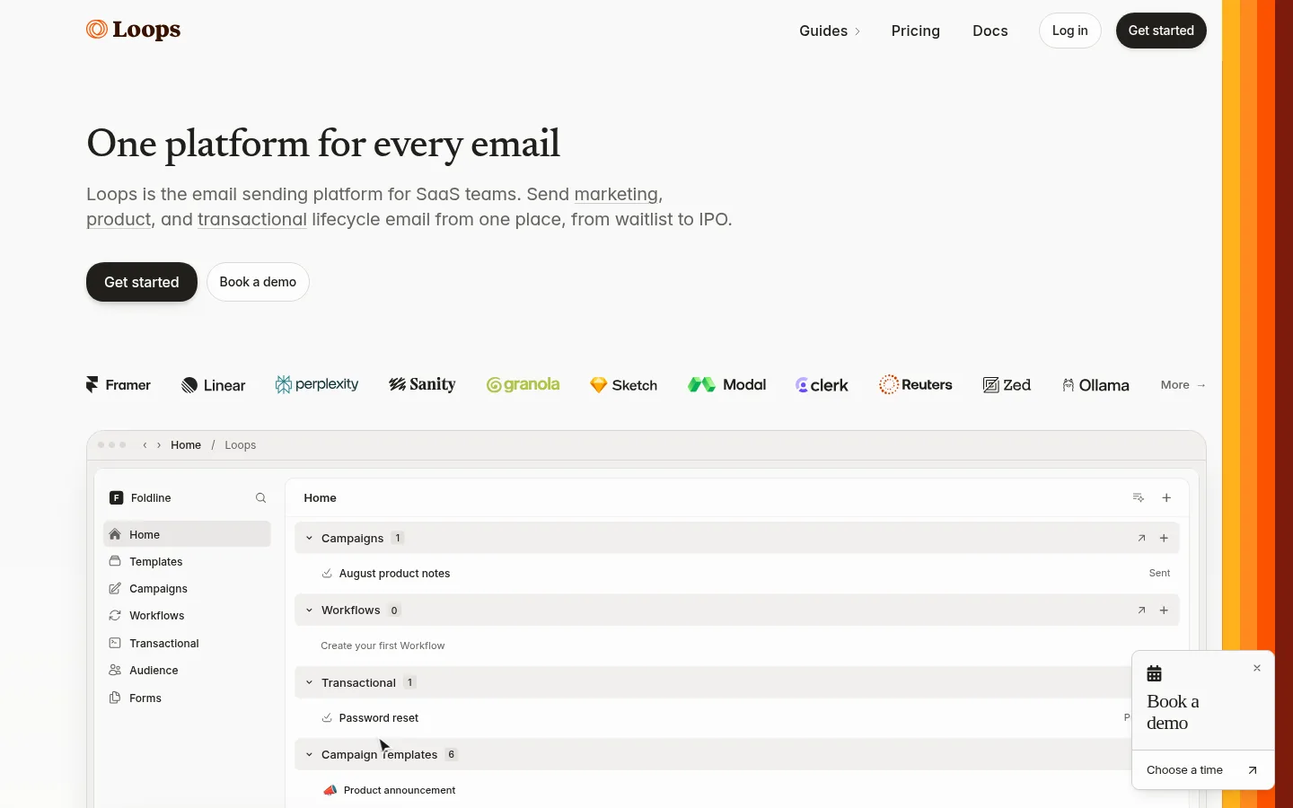
North star · Let warm editorial typography introduce the product, then keep every surrounding element quiet enough for the interface preview to lead.
The page is built on a warm off-white canvas (#f9f9f8), with dark brown-black headlines and muted gray copy providing a calm, readable contrast. Serif display type gives the hero an editorial voice; the supporting text and interface details use clean sans-serif typography. A compact top navigation leads into a left-aligned headline, explanatory copy, and paired pill-shaped calls to action. A row of customer logos bridges the hero and the large product-interface preview, making the software itself the primary visual. Product cards and controls use pale neutral fills, fine borders, and subtle shadows rather than heavy panels. The overall spacing feels open around the hero and more compact within the software mockup. A vivid orange strip along the right edge is a strong visual accent, while secondary orange and ochre tones appear sparingly. Keep the page quiet, legible, and product-led.
Navigation, links, and compact labels in interface-like elements.
Aa 设计
Newsreader
网络字体 · 字重 500 · 占比 7%
免费替代:Newsreader
Primary hero headline and editorial display moments.
Aa 设计
ui-monospace
系统字体 · 字重 400 / 500 · 占比 6%
免费替代:IBM Plex Mono
Code-like or technical snippets where they appear.
Aa 设计
Iowan Old Style
系统字体 · 字重 400 · 占比 3%
免费替代:Lora
Secondary serif heading treatment.
角色
示例
字号
字重
行高
字距
一级标题
Editorial hero headline introducing the email platform.
The quick brown fox 敏捷的狐狸
25.5px
500
1.15
0
二级标题
Secondary serif headings within supporting page content.
The quick brown fox 敏捷的狐狸
21px
400
1.45
-0.01em
正文
Explanatory hero copy and longer descriptive text.
The quick brown fox 敏捷的狐狸
17px
400
1.7
0
辅助文字
Compact labels and secondary interface details.
The quick brown fox 敏捷的狐狸
12px
400
normal
0
链接
Navigation and understated secondary actions.
The quick brown fox 敏捷的狐狸
14px
400
1.2
0
代码
Technical or code-like snippets when needed.
const style = 1;
15.5px
400
1.78
0
间距与布局
基准单位 2px · 密度:紧凑
34px版块间距
10px元素间距
—卡片内边距
—内容最大宽度
1px
2px
4px
5px
6px
7px
8px
9px
10px
12px
13px
14px
16px
18px
20px
24px
A single-column page composition keeps the hero left aligned beneath a compact top navigation. The headline and supporting paragraph sit above paired actions, with customer logos forming a horizontal transition into the large product preview. The preview spans most of the content area and is framed as a light software window. The page has generous separation around the hero, while the interface itself is deliberately dense. A narrow vertical color treatment anchors the far-right edge.
圆角与层次
按钮 · 9999px
卡片 · 14px
徽标 · 4px
导航 · 6px
链接 · 9px
hairline · button
sm · button
inset · card
hairline · button, card
The page remains mostly flat, using thin pale borders to separate the product preview and controls from the canvas. Cards and buttons receive restrained, soft shadows for a slight lift rather than dramatic depth. Layering is concentrated in the framed dashboard and floating demo prompt.
组件
下面的预览按实测的按钮、输入框、徽标、卡片样式重建(字体用替代字体)。
Top navigation
Compact horizontal brand and link row, with a dark filled Get started action and a light outlined Log in control.
Hero introduction
Left-aligned Newsreader headline followed by muted sans-serif explanatory copy and two concise actions.
Primary CTA
Dark, pill-shaped button with light text; pair with a quieter light demo button.
Customer logo row
Single horizontal run of customer marks between the hero actions and the software preview.
Product preview
Large pale dashboard mockup with a fine frame, subtle shadow, sidebar navigation, and grouped content rows.
Demo prompt
Small floating white booking panel layered over the lower-right area of the product preview.
Edge accent
Narrow stacked orange bands at the right edge, contrasting with the otherwise warm neutral canvas.
Imagery · The main visual is a large, framed product-interface mockup rather than photography or illustration. It shows a pale email-platform dashboard with a sidebar, grouped content rows, and a floating demo prompt. A horizontal customer-logo strip supplies small brand marks above it. Keep mockup details crisp and low contrast; the vivid orange edge treatment is decorative, not product imagery.
Use Warm Canvas (#f9f9f8) as the dominant page background.
Set display headlines in Newsreader and supporting copy in a clean sans-serif.
Keep the hero left aligned and its copy concise.
Use Deep Umber (#21201c) for primary text and dark calls to action.
Frame the product UI with subtle borders and restrained shadows.
Keep orange accents narrow and visually subordinate to the content.
✕ 不该做
Don't replace the warm off-white canvas with stark white or a dark theme.
Don't use heavy shadows or thick borders around every element.
Don't center the hero or crowd the navigation.
Don't let orange become a large background field.
Don't use decorative display type for dense interface labels.
Don't treat mockup-only colors as the core page palette.
给 AI 的提示词
想快速出一个同风格的新页面,把这段话连同 DESIGN.md 一起发给 AI。
Build a new SaaS page in the Loops visual style. Use Warm Canvas (#f9f9f8) as the main background, Deep Umber (#21201c) for strong text and primary buttons, and Soft Graphite (#63635e) for supporting copy. Set the lead headline in Newsreader and use Inter or a close sans-serif for body and interface text. Keep the composition left aligned: compact navigation, clear headline, short explanation, paired rounded actions, then a customer-logo row and a prominent framed product preview. Use Cloud Stone (#f1f0ef) and Quiet Border (#e9e8e6) for restrained interface surfaces and separators. Add orange accents such as Flare Orange (#fc5200) sparingly. Favor fine borders, subtle shadows, open hero spacing, and denser product UI. Keep the page warm, crisp, and product-led.