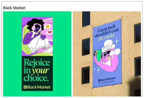
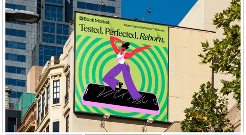
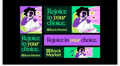
North star · Keep the interface quiet and precisely ruled so the artwork—not the chrome—controls the colour, scale, and mood.
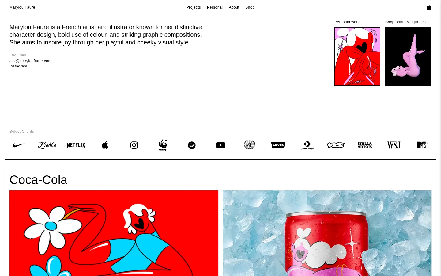
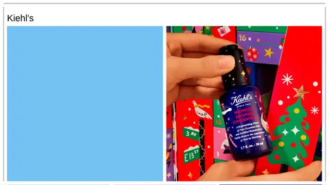
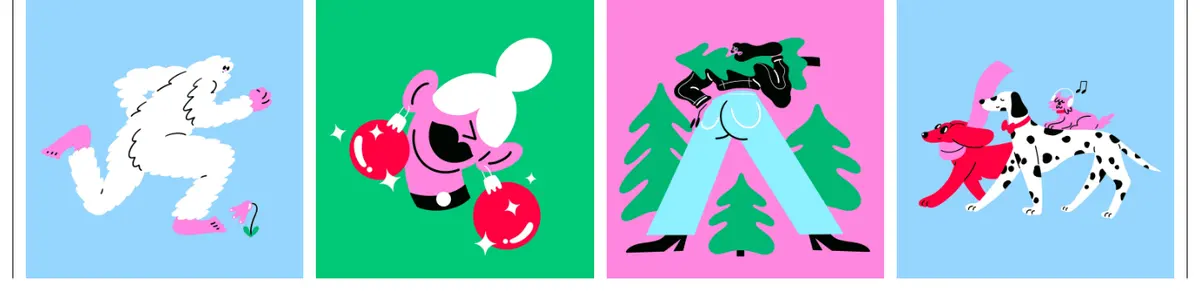
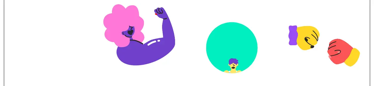
The visual system keeps the portfolio shell deliberately quiet: a white canvas, black typography, compact top navigation, and thin black rules define the page without competing with the artwork. Helvetica Now is used throughout, with regular-weight text and a clear size contrast between the large project headings, introductory copy, and small tracked navigation and captions. The opening is an editorial split: descriptive copy occupies the broad left area while two small visual previews sit at the right, followed by a client-logo row. Project sections use large, asymmetrical image grids that shift between two-, three-, and four-column arrangements, with narrow white gutters and a heading aligned to the left. Red, cyan, pink, green, lavender, and orange are prominent within the work, not a fixed interface palette. Treat those colours as artwork-led accents; do not apply them as recurring site chrome. Images are mostly flat to the page, with clear perimeter rules and little decorative elevation.
All site text, including navigation, introductory copy, project headings, links, and captions.
角色
示例
字号
字重
行高
字距
一级标题
Large introductory or primary heading treatment.
Marylou Faure
40px
400
0.8
0
正文
Introductory artist statement and longer explanatory copy.
The quick brown fox 敏捷的狐狸
20px
400
1.25
0
辅助文字
Small project labels and supporting image captions.
The quick brown fox 敏捷的狐狸
12px
400
1.5
0.042em
按钮
Compact utility and button text.
The quick brown fox 敏捷的狐狸
12px
400
1
0.042em
导航
Small header navigation links.
The quick brown fox 敏捷的狐狸
12px
400
1.5
0.042em
链接
Small contact, social, and inline links.
The quick brown fox 敏捷的狐狸
12px
400
1.5
0.042em
间距与布局
基准单位 1px · 密度:适中
48px版块间距
15px元素间距
—卡片内边距
1410px内容最大宽度
1px
4px
8px
9px
10px
15px
16px
30px
33px
The measured page max width is 1410px, with a comfortable density and broad white canvas. A compact top navigation sits above the introduction; the introductory copy and preview images form a two-column split, followed by a widely distributed client-logo row. Project blocks are separated by thin horizontal rules and use left-aligned headings with grids that vary from two to four columns. The measured spacing scale includes 1, 4, 8, 9, 10, 15, 16, 30, and 33px; use the tighter values for image gutters and controls, and larger values for section breathing room. Keep occasional media blocks full bleed.
圆角与层次
按钮 · 8px
md · card
The page is predominantly flat: thin black rules separate major blocks, and image tiles sit directly on the white canvas. Do not add floating-card styling to ordinary gallery work. A measured card shadow exists, but the screenshots show that image-led layouts and borders—not elevation—define the visual hierarchy.
组件
下面的预览按实测的按钮、输入框、徽标、卡片样式重建(字体用替代字体)。
Top navigation
Compact black text links on white, with the artist name at the left, primary links centered, and a small cart control at the right.
Intro and contact
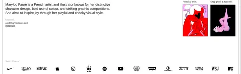
A broad left-aligned artist statement paired with two small preview images at the right; contact and social links sit below the copy.
Client strip
Small muted label followed by a single horizontal row of monochrome client marks.
Project heading
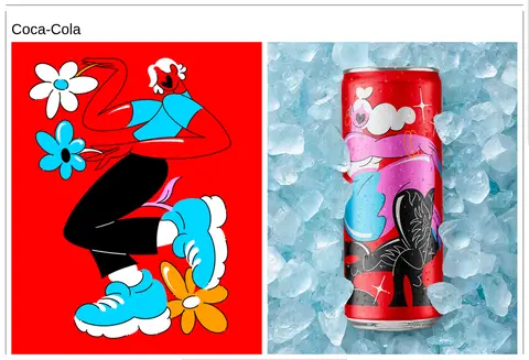
Large regular-weight black client or campaign title, aligned to the left above its image grid.
Variable image grid
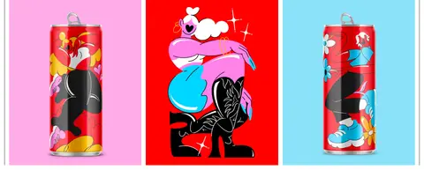
Editorial portfolio gallery switching between two, three, or four columns, with narrow white gutters and image-led colour.
Section divider
Fine black horizontal rules and subtle frame lines create clear boundaries between the white project blocks.
Campaign media
Large stills and video panels, sometimes arranged as a two-column pair and sometimes extending across the available width.
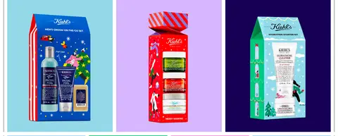
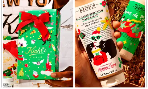
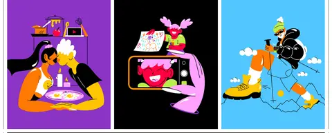
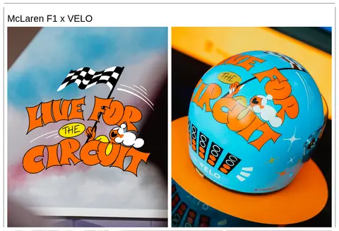
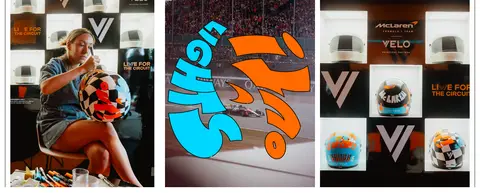
Imagery · The work combines bold character illustration, branded packaging and campaign photography, outdoor advertising, and video. Show images as large, clean tiles with minimal decoration and preserve each asset’s own colour palette. Project grids vary in column count and aspect ratio rather than forcing every image into a uniform card. Some media blocks are full bleed; other tiles sit within the restrained white page frame.
Keep the portfolio canvas white and the site chrome black.
Use Helvetica Now or a close neutral sans-serif substitute.
Align project titles and introductory copy to the left.
Let each project choose a flexible image-grid arrangement.
Use thin rules and narrow gutters to separate gallery blocks.
Preserve the original artwork’s colour and image framing.
✕ 不该做
Do not turn illustration colours into persistent interface accents.
Do not add gradients, ornamental backgrounds, or decorative shadows.
Do not make every gallery tile the same aspect ratio.
Do not center the introductory copy or project headings.
Do not use oversized navigation or heavy typographic decoration.
Do not place artwork inside rounded, floating cards.
给 AI 的提示词
想快速出一个同风格的新页面,把这段话连同 DESIGN.md 一起发给 AI。
Build a new artist portfolio page with the restrained editorial shell of Marylou Faure’s site. Use Gallery White (#ffffff) as the continuous canvas and Portfolio Ink (#000000) for navigation, headings, links, and thin separators. Use Helvetica Now, or Inter as a free substitute, with regular weights and compact tracked utility text. Keep the header small; pair a broad left-aligned introduction with a few image previews, then place client marks in a quiet horizontal strip. Organize projects under left-aligned headings in flexible two-, three-, or four-column image grids with narrow white gutters. Preserve artwork colours as image content: Artwork Red (#ff0000), Vivid Green (#04cd62), and the other vivid tones belong to campaign assets, not repeated UI decoration. Favor flat images, crisp rules, and generous white breathing room over cards, shadows, or effects.
Marylou Faure 设计系统 — 配色、字体与 DESIGN.md | Design DNA