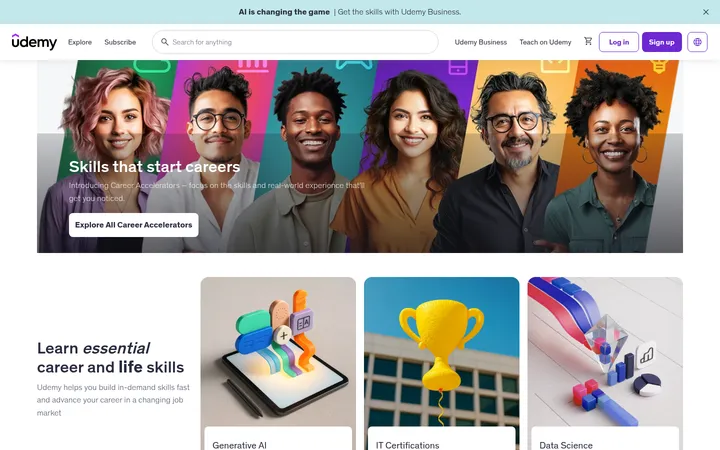
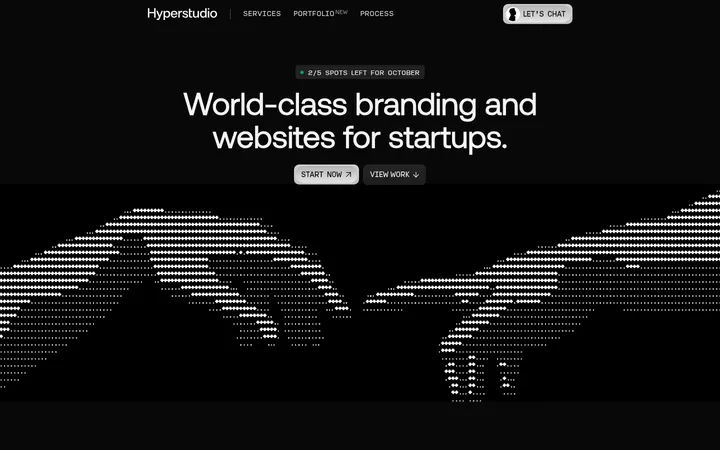
North star · Use a black editorial stage, let instructor imagery carry the color, and reserve pink for the clearest membership action.
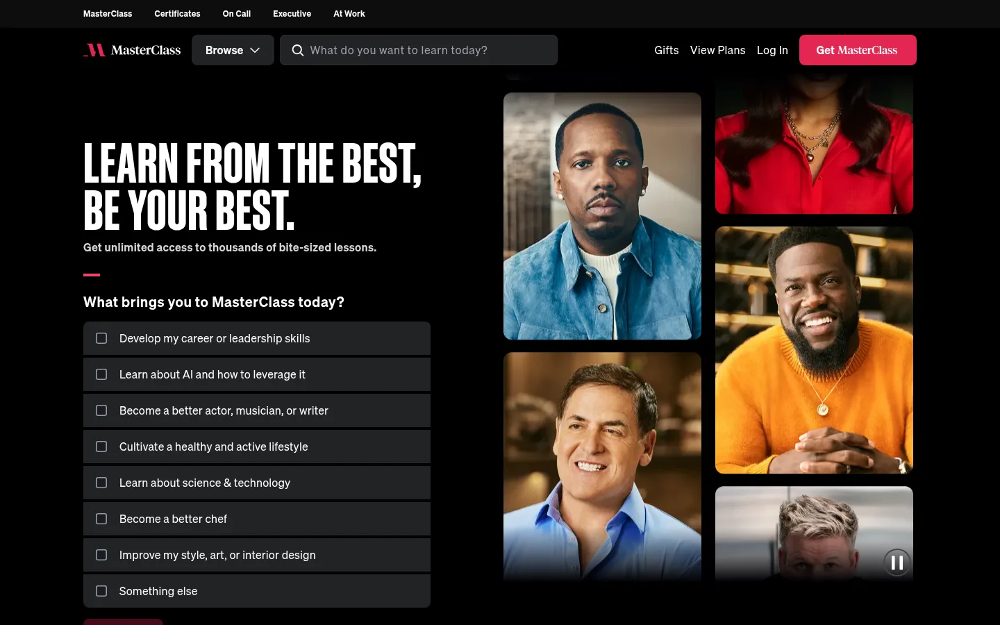
The page is built on a near-black canvas, with white typography providing strong contrast and dark charcoal surfaces separating selectable items, cards, and controls. A vivid pink is reserved for the primary membership action and small brand accents, rather than spread across the interface. The hero uses an oversized condensed uppercase display headline opposite a mosaic of instructor portraits, making the people and the promise of learning the visual focus. Sohne handles navigation, body copy, controls, and most headings; a distinct display face gives the opening statement a poster-like editorial quality. Sections retain generous separation and use centered or split compositions depending on their purpose, while card groups and category choices remain compact and scannable. Photography is richly colored and cinematic against the dark surroundings. Hairline borders and subtle inset outlines define interactive elements without relying on prominent drop shadows.
Navigation, body copy, controls, buttons, and most section headings.
角色
示例
字号
字重
行高
字距
特大标题
Hero statement, set in condensed uppercase display lettering.
MasterClass
80px
500
0.85
0.01em
一级标题
Prominent editorial page heading where a distinct display face is used.
MasterClass
64px
400
1.1
0.005em
二级标题
Primary section titles such as membership and instructor headings.
MasterClass
48px
600
1.25
0.03em
三级标题
Subsection headings for content and discovery areas.
MasterClass
32px
600
1.25
0.03em
四级标题
Compact category or FAQ group headings.
The quick brown fox 敏捷的狐狸
24px
600
1.25
0.03em
正文
Introductory descriptions and longer supporting copy.
The quick brown fox 敏捷的狐狸
20px
400
1.6
0.01em
辅助文字
Supporting notes, card details, and secondary labels.
The quick brown fox 敏捷的狐狸
16px
400
1.5
0.02em
按钮
Membership CTA and selectable action labels.
The quick brown fox 敏捷的狐狸
16px
600
1.25
0.01em
导航
Top navigation and primary site links.
The quick brown fox 敏捷的狐狸
16px
400
1.5
0.02em
链接
Small supporting links and tertiary destinations.
The quick brown fox 敏捷的狐狸
12px
400
1.45
0.02em
间距与布局
基准单位 8px · 密度:宽松
96px版块间距
20px元素间距
72px卡片内边距
1200px内容最大宽度
4px
8px
12px
16px
20px
24px
32px
48px
64px
96px
The page uses a broad desktop composition with a measured maximum width of 1200px and generous section rhythm. The hero is a two-column split: left-aligned headline and interest choices beside a portrait mosaic. Later sections alternate among centered headings, split features, card grids, and full-bleed video. The measured spacing scale is based on an 8px unit, with a spacious density and substantial section gaps. Keep controls and cards grouped into clear, scannable modules.
圆角与层次
按钮 · 8px
卡片 · 8px
图片 · 12px
徽标 · 9999px
导航 · 8px
链接 · 8px
inset · other
inset · button, link
inset · nav, other, footer
inset · other, footer
The interface is mostly flat: dark surfaces sit directly against the black canvas, with restrained inset outlines defining selected controls and links. Avoid floating panels and heavy drop shadows. Rounded card and button edges soften the modular layout, while gradient overlays appear to support image fades and text legibility.
组件
下面的预览按实测的按钮、输入框、徽标、卡片样式重建(字体用替代字体)。
Primary membership CTA
Bright pink button with white semibold Sohne text; the dominant action against the black navigation and page canvas.
Hero interest selector
Stacked charcoal choices with white labels and outlined checkboxes, presented below a short prompt.
Instructor portrait mosaic
Uneven multi-column portrait arrangement with varied image heights, rounded media corners, and cinematic crops.
Class discovery cards
Dark modular cards pair instructor or class imagery with concise titles and discovery affordances.
Category controls
Compact dark category buttons use light text and restrained outlines to support browsing.
FAQ accordion
Grouped question controls on the dark canvas, organized under clear section labels with minimal visual framing.
Email signup
Simple email field and submission action paired with brief explanatory copy and consent text.
Imagery · Photography is the defining media: instructor portraits and class imagery appear as a varied, tightly arranged mosaic in the hero and as card imagery throughout discovery sections. Images retain natural, vivid wardrobe and background color, contrasting with the black canvas rather than receiving a uniform color overlay. The page also includes full-bleed class-highlight video; preserve cinematic framing and let people remain the focal point.
Keep the main canvas black and text high-contrast.
Use pink sparingly for the primary membership action.
Let instructor photography carry most of the page's color.
Use condensed uppercase display type for the hero statement.
Group choices and cards into clear, scannable modules.
Separate sections with generous measured spacing.
Use subtle inset outlines instead of heavy shadows.
✕ 不该做
Do not turn the page into a bright, multicolor interface.
Do not use pink as a broad section background.
Do not flatten instructor photography into generic illustrations.
Do not center every section; preserve intentional split layouts.
Do not add prominent floating shadows or decorative gradients everywhere.
Do not use the rare lime or gold samples as core brand colors.
给 AI 的提示词
想快速出一个同风格的新页面,把这段话连同 DESIGN.md 一起发给 AI。
Build a new page in the MasterClass visual style: a cinematic, editorial learning experience on a Stage Black (#000000) canvas. Use Studio White (#ffffff) for readable copy and reserve Class Pink (#e32652) for the primary action. Set controls and selectable rows on Charcoal Control (#222326), with Slate Panel (#272c33) for cards where needed. Use Sohne-like sans-serif typography for navigation, body, and controls; give the hero a bold condensed uppercase display headline. Compose the opening area as a left-aligned message and choices beside a tightly framed instructor portrait mosaic. Let natural portrait colors provide visual richness. Use spacious section breaks, modular card groups, restrained rounded corners, and subtle inset borders rather than heavy shadows. Keep sections varied: split features, centered discovery headings, video, testimonials, FAQ, and signup.