Monologue以克制的炭灰界面搭配醒目的衬线标题和清晰的等宽字体说明。青绿色产品画面穿插在长篇分区叙事中,展示听写、语音笔记与会议记录功能。
North star · Keep the page quiet and charcoal-led, using serif headlines for editorial emphasis and teal primarily inside product demonstrations.
The page uses a dark, narrow-centered composition framed by subtle vertical and horizontal hairlines. Charcoal (#282828) anchors most sections, while near-black (#121212) marks the product-display band and helps separate major content. Large, centered serif headlines create an editorial voice; compact Geist Mono text handles navigation, labels, body copy, and controls. White and warm off-white foregrounds establish contrast, with muted grays reserved for supporting copy and secondary details. Pale, raised download buttons are the strongest recurring action. Teal appears chiefly in colorful product mockups and restrained accent details, not as a broad page background. The layout alternates spacious explanatory passages with denser feature cards, interface demonstrations, pricing panels, and a comparison table. Thin borders, inset highlights, and soft dark shadows define surfaces without making the page feel glossy or heavily layered.
配色 点色块复制色值。用途说明来自对页面的实测位置(背景、文字、描边、按钮)与截图判读。
品牌色
Charcoal Canvas
#282828
Primary page canvas and the background for most narrative sections.
Warm Paper
#f2f0ed
Primary foreground text, serif headings, and selected links.
强调色
Signal Teal
#1fabbd
Teal gradient and glow detail chiefly visible around product mockups.
Deep Teal
#107b89
Darker teal gradient partner within product-display imagery.
表层色
Near Black
#121212
Dark product-display band, deep card areas, and structural borders.
Slate Surface
#3e3e3e
Raised cards, feature UI panels, and medium-dark component surfaces.
Graphite Panel
#313131
Feature cards and contained dark content panels.
Smoky Charcoal
#363535
Subtle top-to-bottom section gradients and illustrated card details.
Ash Border
#525252
Lighter card edges, selected controls, and interface outlines.
Shadow Black
#202020
Deep gradient stops and recessed interface details.
中性色
Bright White
#ffffff
Navigation, high-contrast text, and selected product-interface details.
Screen White
#f7f7f7
Pale embedded card or app-screen surface in product imagery.
功能色
Soft Silver
#dadada
Muted supporting copy and secondary navigation text.
Quiet Gray
#adadad
Lower-emphasis explanatory text and secondary link treatments.
Pale Gray
#d4d4d4
Secondary heading and supporting text.
Muted Silver
#bababa
Low-emphasis copy, chiefly within supporting interface text.
Interface Blue
#326ec8
Small badge or icon detail within product-interface imagery, not a page-level accent.
Stone Gray
#8f8f8f
Low-contrast heading and supporting text details.
文字 背景 对比度 WCAG #ffffff Bright White#282828 Charcoal Canvas14.74:1 AAA #ffffff Bright White#121212 Near Black18.73:1 AAA #ffffff Bright White#313131 Graphite Panel13.01:1 AAA #ffffff Bright White#3e3e3e Slate Surface10.7:1 AAA #dadada Soft Silver#282828 Charcoal Canvas10.55:1 AAA #dadada Soft Silver#121212 Near Black13.4:1 AAA
字体 字号阶梯:Perfect Fourth(比例约 1.361,正文 14px)。示例用免费替代字体渲染,数值为实测。
Aa 设计
geistMono 网络字体 · 字重 400 / 500 / 600 · 占比 79%
免费替代:Geist Mono
Navigation, body copy, labels, buttons, captions, and code-like UI
Aa 设计
monologueSerifBook 网络字体 · 字重 400 · 占比 10%
免费替代:Instrument Serif
Large editorial headings and brand-like display text
Aa 设计
Arial 系统字体 · 字重 400 / 700 · 占比 6%
免费替代:Arial
Occasional compact badge text in product-interface details
Aa 设计
-apple-system 系统字体 · 字重 400 / 700 / 800 · 占比 5%
免费替代:Inter
Compact bold subheadings and interface labels
角色 示例 字号 字重 行高 字距 一级标题 Centered hero statement in large editorial serif.
Monologue
48px 400 1 -0.03em 二级标题 Major section headings and prominent explanatory statements.
Monologue
32px 400 1 -0.03em 三级标题 Feature and subsection headings in serif.
The quick brown fox 敏捷的狐狸
24px 400 1 -0.03em 四级标题 Compact bold card or interface subheadings.
The quick brown fox 敏捷的狐狸
20px 700 1 -0.04em 正文 Main explanatory copy, primarily monospace.
The quick brown fox 敏捷的狐狸
14px 400 1.45 0 辅助文字 Fine print, helper text, and compact notes.
The quick brown fox 敏捷的狐狸
12px 400 1.45 0 按钮 Monospace text on download and interface controls.
The quick brown fox 敏捷的狐狸
14px 500 1.45 0 导航 Monospace top navigation labels.
The quick brown fox 敏捷的狐狸
14px 500 1.45 0 链接 Inline links and secondary text actions.
The quick brown fox 敏捷的狐狸
14px 500 1 0 眉题 Uppercase monospace category labels above sections.
The quick brown fox 敏捷的狐狸
12px 500 1.45 0.04em 代码 Technical snippets and developer-facing UI text.
const style = 1;
14px 400 1.45 0
间距与布局 基准单位 4px · 密度:适中
48px 版块间距
4px 元素间距
24px 卡片内边距
798px 内容最大宽度
1px
3px
4px
5px
6px
7px
8px
10px
12px
16px
20px
24px
40px
A centered page frame uses a measured maximum content width of 798px, with thin vertical rails and full-width horizontal section rules. Most content aligns to a single central column, shifting into two-column feature explanations and multi-column cards, pricing, and comparison layouts. The hero is centered; later feature sections favor left-aligned headings and copy. Section spacing is generous and consistent, while product panels and pricing areas are comparatively dense. Keep component padding and gaps tied to the measured spacing scale rather than introducing arbitrary values.
圆角与层次 hairline · other, text, card
hairline · card, other, nav
hairline · other
xl · other, text, button
Surfaces rely on thin gray or near-black borders, faint inset highlights, and soft dark shadows rather than pronounced elevation. The bright download button is the most visibly raised control, with a light edge and compact shadow. Product mockups layer over teal media panels, while ordinary content sections remain largely flat.
组件 下面的预览按实测的按钮、输入框、徽标、卡片样式重建(字体用替代字体)。
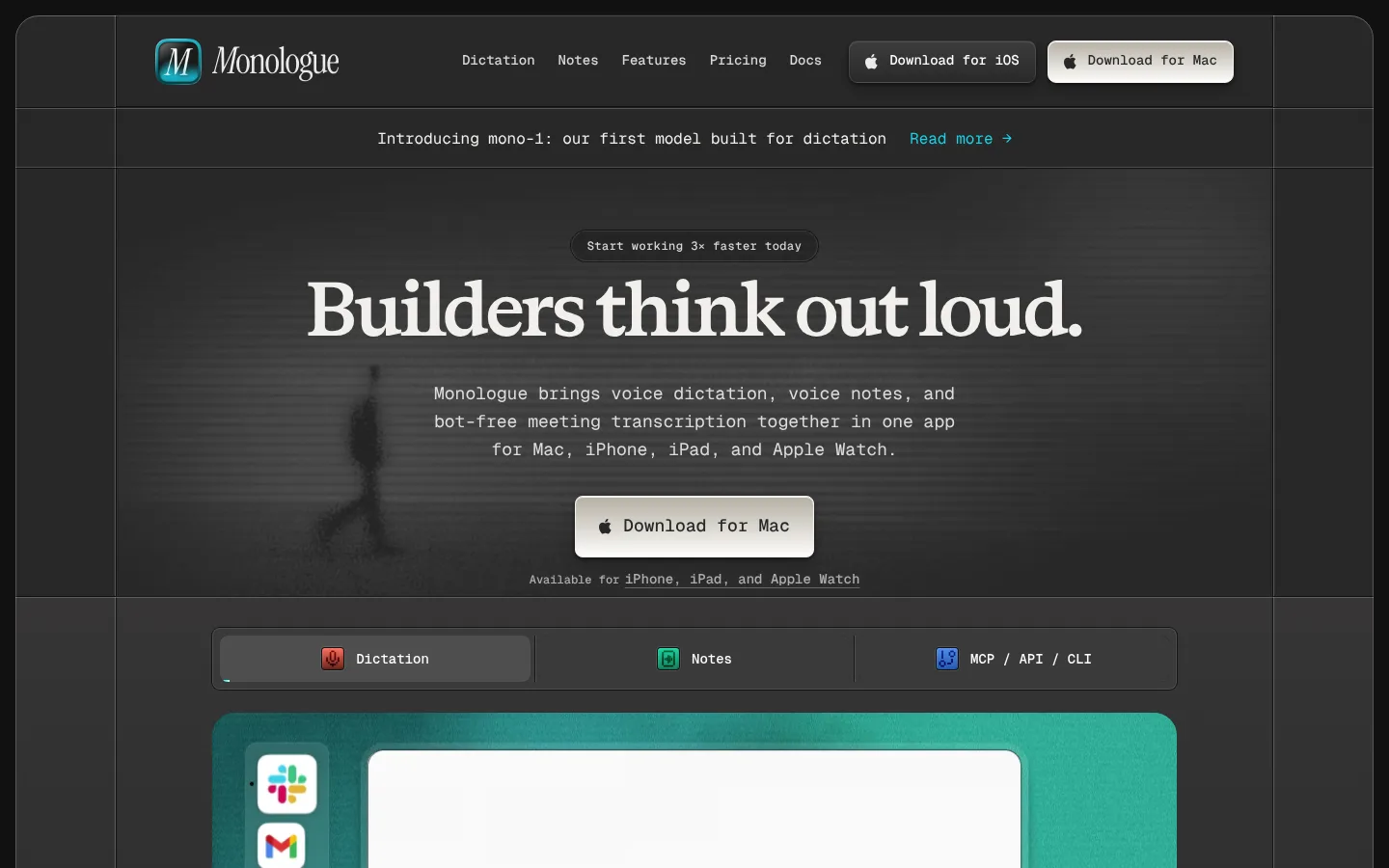
Header and navigation A framed dark header pairs the Monologue wordmark with compact Geist Mono links and pale download actions.
Announcement strip A centered monospace product announcement sits between subtle horizontal rules, ending with a teal read-more link.
Download button Use warm pale fill, charcoal text, a fine warm border, 8px radius, and a restrained shadow.
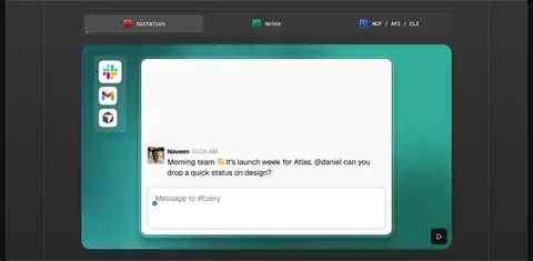
Product demonstration A dark section presents a three-option feature switcher above a large teal-backed application mockup.
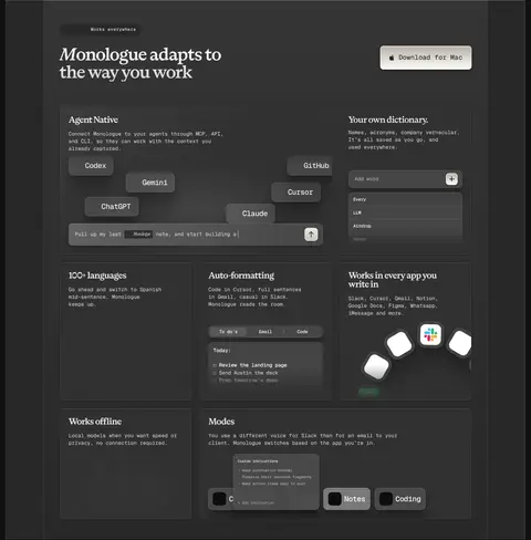
Feature cards Graphite panels combine fine borders, restrained inset highlights, monospace descriptions, and product UI details.
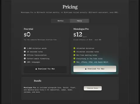
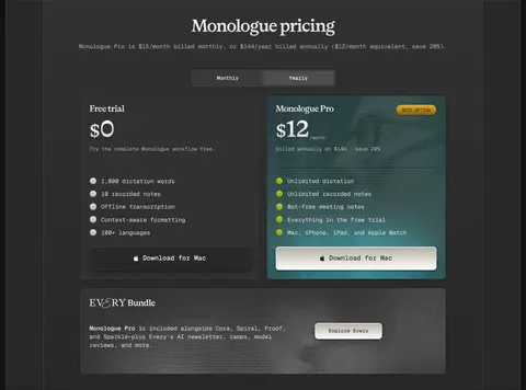
Pricing cards Two side-by-side plans use dark panels, concise monospace feature lists, and a bright primary action on the paid plan.
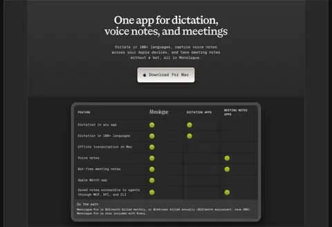
Comparison table A dark bordered matrix contrasts Monologue with alternatives using compact labels and teal status markers.
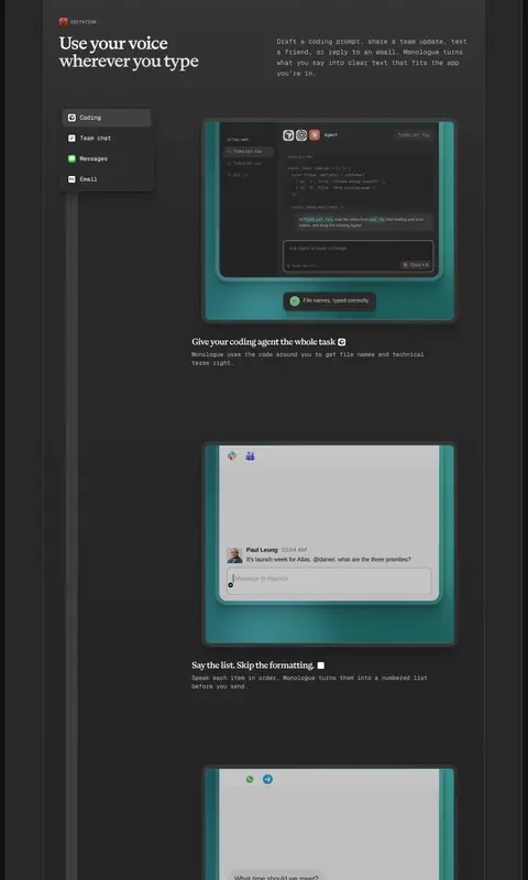
Imagery · Product UI is the primary imagery: framed app screens, message windows, coding-agent panels, and device-related demonstrations. Teal and turquoise surrounds appear in mockups as a vivid contrast against the charcoal page; treat them as illustrative product media rather than recoloring the site canvas. A subdued, blurred human silhouette appears behind the hero copy. Logos and interface details remain small, crisp, and secondary to the headline.
页面版块 共 17 个版块,按页面从上到下排列,每个都标了类型、布局和交互套路。
该做与不该做 ✓ 该做 Keep the charcoal canvas dominant. Set display headlines in the measured serif style. Use monospace for navigation, body copy, and controls. Reserve bright buttons for key download actions. Use teal mainly within product mockups and tiny accents. Separate sections with subtle hairlines and tonal shifts. ✕ 不该做 Do not turn the page into a bright teal layout. Do not use generic sans-serif for the main display headlines. Do not add heavy borders or glossy shadows to every panel. Do not crowd explanatory sections with unnecessary cards. Do not use illustrations as a substitute for the product UI. Do not invent unmeasured colors, radii, or spacing values. 给 AI 的提示词 想快速出一个同风格的新页面,把这段话连同 DESIGN.md 一起发给 AI。
复制 Build a new Monologue-style page with a charcoal-led (#282828) canvas and a narrow centered frame, using subtle rules in Near Black (#121212) to organize sections. Set large statements in a tight-tracked editorial serif and use Geist Mono-style text for navigation, copy, labels, and controls. Keep headings bright and supporting copy in Soft Silver (#dadada) or Quiet Gray (#adadad). Make primary download actions Warm Paper (#f2f0ed) or white with charcoal text and restrained borders and shadows. Use Slate Surface (#3e3e3e) and Graphite Panel (#313131) for cards. Let Signal Teal (#1fabbd) and Deep Teal (#107b89) appear mainly in framed product demonstrations. Alternate spacious narrative blocks with denser feature, pricing, and comparison panels. Follow measured component radii and spacing; do not invent new design tokens.
DESIGN.md Tailwind v4 CSS 变量 Design Tokens
---
title: "Monologue design system"
variant: extended
source: https://www.monologue.to/
captured_at: 2026-10-12
theme: dark
industry: productivity
generator: Design DNA (https://four.wiralomi.com/style/monologue-to)
ai_generated: true
ai_label: "本文件由 AI 辅助生成:数值取自公开网页的实测样式,命名、用途说明与建议为模型解读。商标归原所有者。 / AI-assisted content"
---
# Monologue · Design System
> A quiet dark canvas for voice-first work.
**Theme:** dark · **Industry:** productivity · **Source:** https://www.monologue.to/ · **Captured:** 2026-10-12 (1440×900 desktop)
_AI-assisted content: values are measured from the public page at capture time; names, roles and guidance are model-written interpretations. Trademarks belong to their owners._
Monologue pairs a restrained charcoal interface with expressive serif headlines and precise monospace copy. Teal product mockups punctuate a long, carefully segmented story about dictation, notes, and meetings.
## North star
Keep the page quiet and charcoal-led, using serif headlines for editorial emphasis and teal primarily inside product demonstrations.
## Overview
The page uses a dark, narrow-centered composition framed by subtle vertical and horizontal hairlines. Charcoal (## Colors
| Name | Hex | Token | Group | Role |
|---|---|---|---|---|
| Charcoal Canvas | ` | `--color-charcoal-canvas` | brand | Primary page canvas and the background for most narrative sections. |
| Near Black | ` | `--color-near-black` | surface | Dark product-display band, deep card areas, and structural borders. |
| Soft Silver | ` | `--color-soft-silver` | semantic | Muted supporting copy and secondary navigation text. |
| Quiet Gray | ` | `--color-quiet-gray` | semantic | Lower-emphasis explanatory text and secondary link treatments. |
| Warm Paper | ` | `--color-warm-paper` | brand | Primary foreground text, serif headings, and selected links. |
| Bright White | ` | `--color-bright-white` | neutral | Navigation, high-contrast text, and selected product-interface details. |
| Slate Surface | ` | `--color-slate-surface` | surface | Raised cards, feature UI panels, and medium-dark component surfaces. |
| Graphite Panel | ` | `--color-graphite-panel` | surface | Feature cards and contained dark content panels. |
| Smoky Charcoal | ` | `--color-smoky-charcoal` | surface | Subtle top-to-bottom section gradients and illustrated card details. |
| Ash Border | ` | `--color-ash-border` | surface | Lighter card edges, selected controls, and interface outlines. |
| Shadow Black | ` | `--color-shadow-black` | surface | Deep gradient stops and recessed interface details. |
| Pale Gray | ` | `--color-pale-gray` | semantic | Secondary heading and supporting text. |
| Muted Silver | ` | `--color-muted-silver` | semantic | Low-emphasis copy, chiefly within supporting interface text. |
| Interface Blue | ` | `--color-interface-blue` | semantic | Small badge or icon detail within product-interface imagery, not a page-level accent. |
| Stone Gray | ` | `--color-stone-gray` | semantic | Low-contrast heading and supporting text details. |
| Screen White | ` | `--color-screen-white` | neutral | Pale embedded card or app-screen surface in product imagery. |
| Signal Teal | ` | `--color-signal-teal` | accent | Teal gradient and glow detail chiefly visible around product mockups. |
| Deep Teal | ` | `--color-deep-teal` | accent | Darker teal gradient partner within product-display imagery. |
### Semantic aliases
`--color-canvas` → ` (Charcoal Canvas) · `--color-surface` → ` (Near Black) · `--color-surface-2` → ` (Graphite Panel) · `--color-surface-3` → ` (Slate Surface) · `--color-surface-4` → ` (Ash Border) · `--color-text` → ` (Bright White) · `--color-text-muted` → ` (Soft Silver) · `--color-text-subtle` → ` (Quiet Gray) · `--color-border` → ` (Near Black) · `--color-accent` → ` (Signal Teal) · `--color-accent-2` → ` (Deep Teal)
### Contrast (WCAG 2.x)
| Text | Background | Ratio | Level |
|---|---|---|---|
| ` | ` | 14.74:1 | AAA |
| ` | ` | 18.73:1 | AAA |
| ` | ` | 13.01:1 | AAA |
| ` | ` | 10.7:1 | AAA |
| ` | ` | 10.55:1 | AAA |
| ` | ` | 13.4:1 | AAA |
| ` | ` | 9.31:1 | AAA |
| ` | ` | 7.65:1 | AAA |
| ` | ` | 6.57:1 | AA |
| ` | ` | 8.35:1 | AAA |
### Gradients
- `linear-gradient(rgb(54, 53, 53), rgb(40, 40, 40) 17%, rgb(32, 32, 32) 100%)`
- `linear-gradient(rgb(54, 53, 53), rgb(40, 40, 40))`
- `linear-gradient(rgb(49, 49, 49), rgb(40, 40, 40))`
- `linear-gradient(rgb(54, 53, 53) 0%, rgb(40, 40, 40) 100%)`
## Typography
| Family | Token | Source | Weights | Role | Free substitute |
|---|---|---|---|---|---|
| geistMono | `--font-mono` | webfont | 400, 500, 600 | Navigation, body copy, labels, buttons, captions, and code-like UI | Geist Mono |
| monologueSerifBook | `--font-monologueserifbook` | webfont | 400 | Large editorial headings and brand-like display text | Instrument Serif |
| Arial | `--font-arial` | system | 400, 700 | Occasional compact badge text in product-interface details | Arial |
| -apple-system | `--font-apple-system` | system | 400, 700, 800 | Compact bold subheadings and interface labels | Inter |
- **geistMono:** Compact, practical monospace; medium weight for controls, uppercase tracked eyebrow labels, regular-weight body.
- **monologueSerifBook:** Book-weight serif with tight negative tracking; sentence case and short emphatic lines.
- **Arial:** Small supporting UI labels; regular weight, with no prominent display role.
- **-apple-system:** Bold system sans used sparingly for smaller heading roles; tight tracking.
### Type scale — Perfect Fourth (ratio ≈ 1.361, base 14px)
| Role | Size | Weight | Line height | Letter spacing | Case | Family | Used for |
|---|---|---|---|---|---|---|---|
| h1 | 48px | 400 | 1 | -0.03em | — | monologueSerifBook | Centered hero statement in large editorial serif. |
| h2 | 32px | 400 | 1 | -0.03em | — | monologueSerifBook | Major section headings and prominent explanatory statements. |
| h3 | 24px | 400 | 1 | -0.03em | — | monologueSerifBook | Feature and subsection headings in serif. |
| h4 | 20px | 700 | 1 | -0.04em | — | -apple-system | Compact bold card or interface subheadings. |
| body | 14px | 400 | 1.45 | 0 | — | geistMono | Main explanatory copy, primarily monospace. |
| caption | 12px | 400 | 1.45 | 0 | — | geistMono | Fine print, helper text, and compact notes. |
| button | 14px | 500 | 1.45 | 0 | — | geistMono | Monospace text on download and interface controls. |
| nav | 14px | 500 | 1.45 | 0 | — | geistMono | Monospace top navigation labels. |
| link | 14px | 500 | 1 | 0 | — | geistMono | Inline links and secondary text actions. |
| eyebrow | 12px | 500 | 1.45 | 0.04em | uppercase | geistMono | Uppercase monospace category labels above sections. |
| code | 14px | 400 | 1.45 | 0 | — | geistMono | Technical snippets and developer-facing UI text. |
## Spacing & layout
- Base unit **4px**, density **comfortable**.
- Scale (most used values): 1, 3, 4, 5, 6, 7, 8, 10, 12, 16, 20, 24, 40 px.
- Section rhythm 48px · element gap 4px · card padding 24px · max content width 798px.
A centered page frame uses a measured maximum content width of 798px, with thin vertical rails and full-width horizontal section rules. Most content aligns to a single central column, shifting into two-column feature explanations and multi-column cards, pricing, and comparison layouts. The hero is centered; later feature sections favor left-aligned headings and copy. Section spacing is generous and consistent, while product panels and pricing areas are comparatively dense. Keep component padding and gaps tied to the measured spacing scale rather than introducing arbitrary values.
## Shape & elevation
- Radius: button `8px` · card `8px` · media `4px` · badge `50%` · nav `8px` · xs `3px` · sm `4px` · md `6px` · lg `7px` · xl `8px` · 2xl `9px` · pill `9999px`
- Shadow `hairline` (other, text, card): `rgba(0, 0, 0, 0) 0px 0px 0px 0px, rgba(0, 0, 0, 0) 0px 0px 0px 0px, rgba(0, 0, 0, 0) 0px 0px 0px 0px, rgba(0, 0, 0, 0) 0px 0px 0px 0px, rgba(255, 255, 255, 0.2) 0px 1px 0.5px 0px`
- Shadow `hairline-2` (card, other, nav): `rgba(255, 255, 255, 0.2) -1px 0px 1px 0px, rgba(255, 255, 255, 0.2) 1px 0px 1px 0px`
- Shadow `hairline-3` (other): `rgba(255, 255, 255, 0.1) 0px 0px 0.5px 1px`
- Shadow `xl` (other, text, button): `rgba(0, 0, 0, 0.03) 0px 95.532px 38.213px 0px, rgba(0, 0, 0, 0.1) 0px 54.135px 31.844px 0px, rgba(0, 0, 0, 0.17) 0px 23.883px 23.883px 0px, rgba(0, 0, 0, 0.19) 0px 6.369px 12.738px 0px`
- Shadow `xl-2` (card, other): `rgba(0, 0, 0, 0.16) 0px 4px 8px 0px, rgba(0, 0, 0, 0.14) 0px 15px 15px 0px, rgba(0, 0, 0, 0.08) 0px 34px 21px 0px, rgba(0, 0, 0, 0.02) 0px 61px 24px 0px`
- Shadow `md` (other): `rgba(0, 0, 0, 0.16) 0px 0.515px 0.515px 0px, rgba(0, 0, 0, 0.25) 0px 0.257px 15.448px 0px`
- Motion: standard transition `0.18s ease` on interactive elements.
Surfaces rely on thin gray or near-black borders, faint inset highlights, and soft dark shadows rather than pronounced elevation. The bright download button is the most visibly raised control, with a light edge and compact shadow. Product mockups layer over teal media panels, while ordinary content sections remain largely flat.
## Imagery
Product UI is the primary imagery: framed app screens, message windows, coding-agent panels, and device-related demonstrations. Teal and turquoise surrounds appear in mockups as a vivid contrast against the charcoal page; treat them as illustrative product media rather than recoloring the site canvas. A subdued, blurred human silhouette appears behind the hero copy. Logos and interface details remain small, crisp, and secondary to the headline.
## Components
### Header and navigation
A framed dark header pairs the Monologue wordmark with compact Geist Mono links and pale download actions.
### Announcement strip
A centered monospace product announcement sits between subtle horizontal rules, ending with a teal read-more link.
### Download button
Use warm pale fill, charcoal text, a fine warm border, 8px radius, and a restrained shadow.
### Product demonstration
A dark section presents a three-option feature switcher above a large teal-backed application mockup.
### Feature cards
Graphite panels combine fine borders, restrained inset highlights, monospace descriptions, and product UI details.
### Pricing cards
Two side-by-side plans use dark panels, concise monospace feature lists, and a bright primary action on the paid plan.
### Comparison table
A dark bordered matrix contrasts Monologue with alternatives using compact labels and teal status markers.
### Measured component styles
- **Primary button** (“Download for Mac”): background ## Do
- Keep the charcoal canvas dominant.
- Set display headlines in the measured serif style.
- Use monospace for navigation, body copy, and controls.
- Reserve bright buttons for key download actions.
- Use teal mainly within product mockups and tiny accents.
- Separate sections with subtle hairlines and tonal shifts.
## Don't
- Do not turn the page into a bright teal layout.
- Do not use generic sans-serif for the main display headlines.
- Do not add heavy borders or glossy shadows to every panel.
- Do not crowd explanatory sections with unnecessary cards.
- Do not use illustrations as a substitute for the product UI.
- Do not invent unmeasured colors, radii, or spacing values.
## Agent prompt
Build a new Monologue-style page with a charcoal-led (## Page sections (top to bottom)
| # | Type | Layout | UX patterns | UI patterns |
|---|---|---|---|---|
| 1 | hero | Centered headline, supporting copy, download action, and subdued backdrop within the framed page. | Primary download action, Platform availability note | Serif display headline, Dark atmospheric media, Pale CTA |
| 2 | product-showcase | Dark full-width band with a three-choice feature bar above a centered product demonstration. | Switchable feature tabs, Product preview | Near-black band, Teal media surround, Framed app UI |
| 3 | logo-cloud | A shallow horizontal band of partner logos beneath a small centered caption. | Social proof | Monochrome logos, Centered caption |
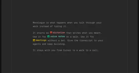
| 4 | feature-split | Single-column, left-aligned editorial copy within a spacious charcoal section. | Product positioning | Serif heading, Monospace paragraphs, Inline feature cues |
| 5 | feature-split | Long feature sequence mixing two-column copy, app screenshots, and stacked demonstrations. | Feature storytelling, Contextual product examples | Eyebrow labels, Teal-framed mockups, Dark interface cards |
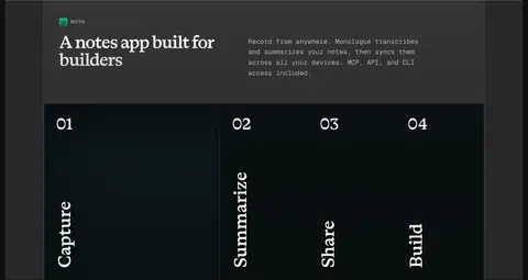
| 6 | how-it-works | Section introduction above a full-bleed, four-part numbered process display. | Four-step sequence | Numbered columns, Vertical serif labels, Dark teal-toned panels |
| 7 | feature-grid | Introductory heading and download action above a dense grid of capability cards. | Capability discovery, Download action | Mixed-size cards, Thin outlines, Embedded interface snippets |
| 8 | product-showcase | Centered title, supporting line, and download prompt in a single-column block. | Platform awareness, Download action | Centered serif heading, Compact supporting copy |
| 9 | testimonials | Compact multi-column social-proof band with quote attribution and brand marks. | Customer endorsement, Logo proof | Quote card, Muted dark surfaces |
| 10 | pricing | Centered pricing heading and billing toggle above two plan cards and a bundle panel. | Monthly/yearly toggle, Plan comparison, Purchase CTA | Two-column plan cards, Feature checklists, Highlighted paid action |
| 11 | comparison | Centered product summary and download action above a wide comparison matrix. | Product comparison, Download action | Dark table, Column dividers, Teal status indicators |
## Source CSS custom properties (selected)
```css
--background: