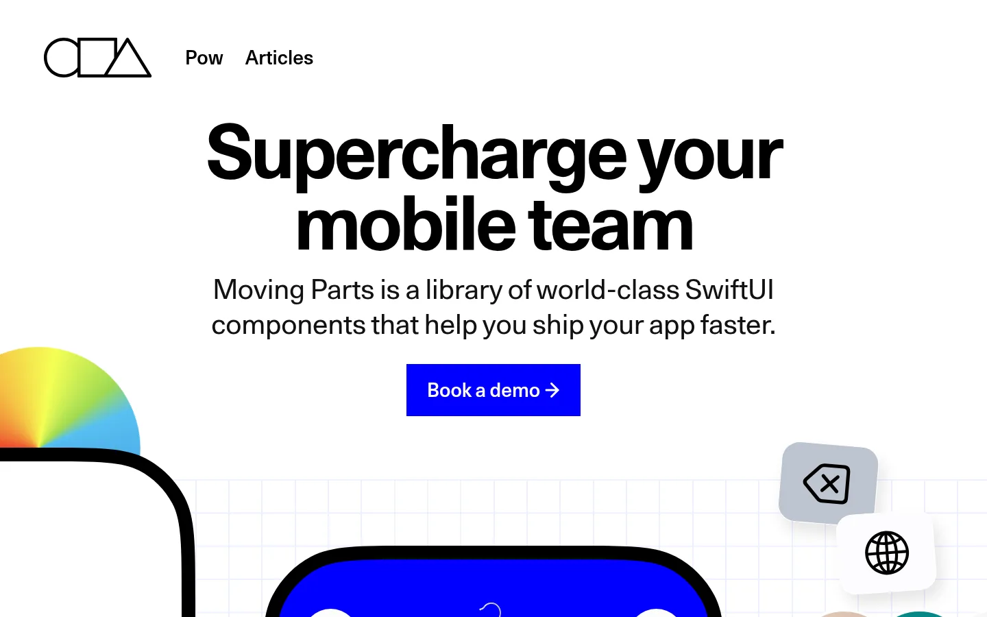
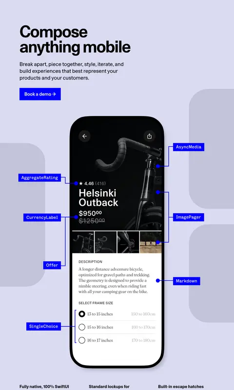
Moving Parts 以编辑式高对比视觉搭配鲜明蓝色点缀和大型原生应用界面预览。宽松的分区节奏与清晰的组件标注,让产品展示本身成为有力说明。
North star · Let vivid blue identify actions and component annotations while oversized, real interface previews do the explaining.
The page uses white as its main canvas, switching decisively into black, pale lavender, and saturated blue section bands. Electric blue is reserved for the primary demo action, annotated component labels, and the testimonial field, so it reads as a functional signal rather than a decorative wash. Typography mixes an oversized, heavy Unica77 display with restrained mono labels and softer serif moments in product mockups. The composition alternates centered introductory content with large, cropped interface showcases and left-aligned feature copy. Generous vertical pauses separate dense demonstrations from concise explanations. App screens, device frames, and product imagery carry most of the visual detail; they sit against simple section grounds and occasional faint grids. Rounded mobile previews contrast with mostly crisp page geometry, while dark cards and fine outlines provide structure without turning the page into a conventional dashboard.
配色
点色块复制色值。用途说明来自对页面的实测位置(背景、文字、描边、按钮)与截图判读。
品牌色
强调色
表层色
中性色
功能色
页面底色 · Gallery White表层 · Hard Ink表层 2 · Lavender Field表层 3 · Soft Black表层 4 · Warm Stone主文字 · Hard Ink次要文字 · Gallery White弱文字 · Near-Black描边 · Hard Ink强调 · Signal Blue强调 2 · Soft Periwinkle强调 3 · Testimonial Blue
Monospaced body copy, uppercase links, labels, and code-like interface text.
Aa 设计
Unica77
网络字体 · 字重 400 / 700 / 500 / 600 · 占比 36%
免费替代:DM Sans
Oversized display headline, section headings, navigation, and prominent interface titles.
Aa 设计
Fraunces 72pt Soft
网络字体 · 字重 200 / 100 · 占比 6%
免费替代:Fraunces
Occasional softer serif heading or editorial text within the page and mockups.
Aa 设计
PP Neue Montreal
网络字体 · 字重 500 / 400 · 占比 6%
免费替代:Inter
Supporting sans-serif text and secondary interface copy.
Aa 设计
Fraunces 72pt SuperSoft
网络字体 · 字重 200 · 占比 1%
免费替代:Fraunces
Lightweight serif display treatment, measured for the h1 role.
Aa 设计
ui-monospace
系统字体 · 字重 400 · 占比 1%
免费替代:IBM Plex Mono
System fallback for small code or technical text.
角色
示例
字号
字重
行高
字距
特大标题
Large bold hero display and high-impact page headline.
Moving Parts
100px
700
0.93
-0.04em
一级标题
Measured lightweight serif heading treatment.
Moving Parts
45.5px
200
1.06
-0.01em
二级标题
Primary section headings, including feature and showcase introductions.
Moving Parts
40px
400
1.27
-0.005em
三级标题
Secondary editorial headings and feature titles.
Moving Parts
36px
200
1.35
0
四级标题
Mono-style subheadings and utility section labels.
Moving Parts
34px
500
1.18
0.01em
正文
Explanatory product copy and supporting paragraphs.
The quick brown fox 敏捷的狐狸
18px
500
1.89
0
按钮
Prominent demo-action label.
Moving Parts
28px
600
0.95
0
导航
Main navigation links and brand navigation text.
Moving Parts
40px
400
1.27
-0.005em
链接
Uppercase editorial and external-link labels.
The quick brown fox 敏捷的狐狸
21px
400
1.36
0
代码
Code snippets and technical component examples.
const style = 1;
25px
500
1.36
0
间距与布局
基准单位 1px · 密度:宽松
148px版块间距
97px元素间距
22px卡片内边距
1200px内容最大宽度
5px
7px
11px
13px
16px
17px
18px
19px
20px
21px
22px
23px
24px
25px
27px
30px
The measured content max-width is 1200px, with sections often spanning the viewport and carrying distinct background bands. The page alternates a centered hero with left-aligned feature introductions, multi-column benefit copy, and large device-led showcases. Vertical pacing is spacious: section and element gaps are notably generous in the measurements, while the interface examples themselves are dense. Use broad margins around headlines and media, then compact groupings inside device screens. The desktop composition is editorial rather than a uniform dashboard grid.
圆角与层次
按钮 · 9999px
卡片 · 16px
图片 · 24px
md · media
hairline · other
md · card
lg · card
Most page surfaces are flat, separated by strong color bands rather than layered card shadows. Device frames and mockup cards create depth through thick dark outlines, rounded silhouettes, and occasional measured soft shadows on media. Keep page borders restrained; the measured black hairline treatment is a structural accent, not a pervasive card grid.
组件
下面的预览按实测的按钮、输入框、徽标、卡片样式重建(字体用替代字体)。
Demo CTA
Bright blue rectangular button with white Unica77 label; repeat as the main conversion action across feature sections.
Device showcase
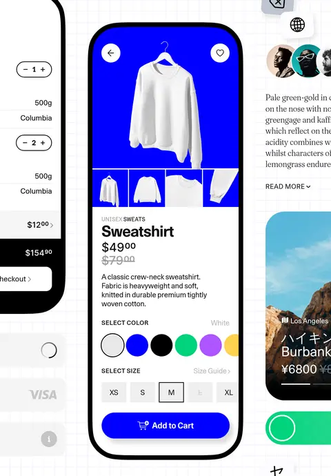
Large mobile-screen preview in a rounded, dark-outlined frame, with realistic UI content and selective cropping.
Feature band
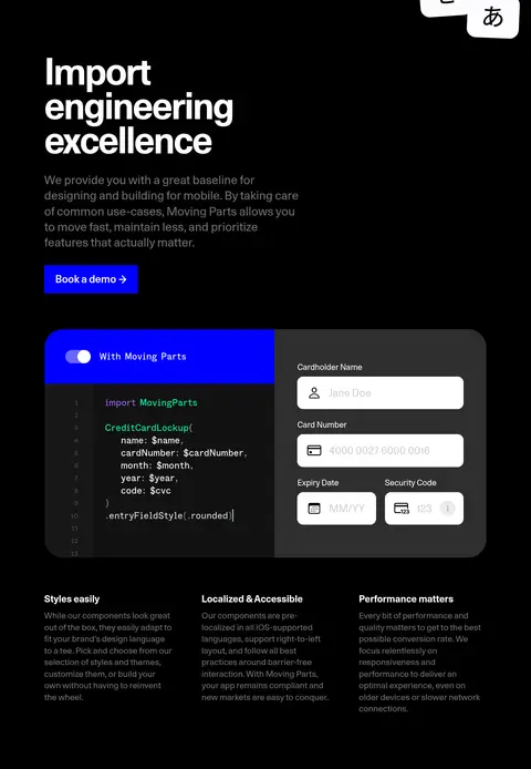
Full-width black or pale-lavender section containing a prominent heading, explanatory copy, and component imagery.
Component callouts
Small blue labels and leader lines point directly to named elements in the mobile UI showcase.
Benefit columns
Compact multi-column feature descriptions sit beneath the primary product preview, with bold short headings.
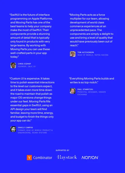
Testimonial panel
Saturated blue section with a two-column arrangement of white quotes, small portraits, names, and supporter marks.
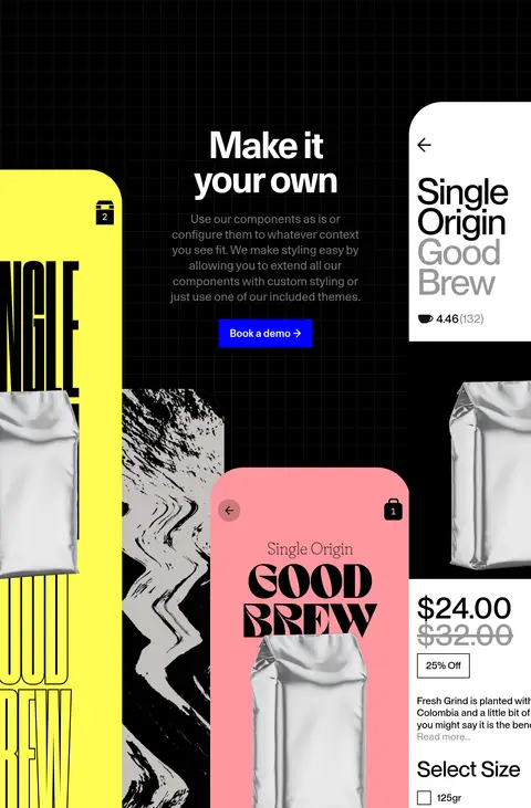
Imagery · Large mobile-device frames and interface mockups dominate the visual storytelling. Screens show commerce, payment, localization, and product-detail patterns, with product photography contained inside the mock device UI. Showcase illustrations may use yellow, coral, gradients, or a faint grid, but these are examples within the product imagery, not the overall brand canvas. Crop oversized screens at section edges to create scale and movement.
Do not use every mockup color as a site-wide brand color.
Do not replace the product interface previews with generic stock imagery.
Do not make blue a continuous background for ordinary content.
Do not add pervasive shadows or ornamental borders.
Do not compress the generous space between major sections.
给 AI 的提示词
想快速出一个同风格的新页面,把这段话连同 DESIGN.md 一起发给 AI。
Build a new Moving Parts-style page with a white Gallery White (#ffffff) canvas, Hard Ink (#000000) typography, and Signal Blue (#0000ff) reserved for the primary action and component callouts. Create broad full-width section bands in black and Lavender Field (#dadbf3), with a saturated blue testimonial area using Testimonial Blue (#2525ff). Use oversized, tightly composed sans-serif headlines, supported by mono labels and restrained body copy. Organize content as an editorial sequence: concise introduction, large device-led interface showcase, feature explanations, then social proof. Make the interface preview detailed and credible, framed as a rounded mobile screen with strong dark edges. Maintain generous section spacing and use the measured max-width of 1200px where content is constrained. Keep mockup-only colors inside the preview.