North star · Keep the interface monochrome and quiet so oversized, carefully cropped project work carries the page.
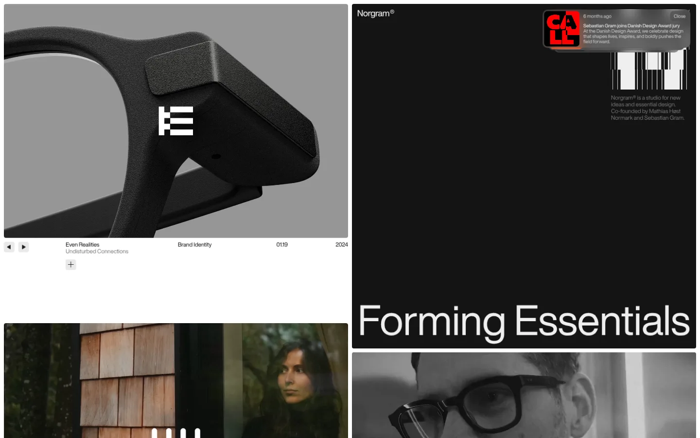
The page uses a deliberately limited monochrome palette: white frames the left-side work, while a near-black project panel dominates the right and carries the studio’s oversized title. Gray supports subdued metadata and secondary copy; small interface controls stay quiet. Helvetica Now Display is used with regular weight, close tracking, and a sharp contrast between very large display text and tiny captions. The composition is an asymmetric, two-column portfolio mosaic with varied image and panel heights rather than a conventional uniform card grid. Photography and rendered project imagery are shown large and cropped boldly, often retaining their own muted or grayscale character. White gutters separate blocks, and generous blank areas let individual projects breathe. The result feels like a curated design publication: high contrast, spacious, image-led, and intentionally sparse.
配色
点色块复制色值。用途说明来自对页面的实测位置(背景、文字、描边、按钮)与截图判读。
表层色
中性色
页面底色 · Gallery White表层 · Studio Black表层 2 · Graphite主文字 · Quiet Gray次要文字 · Soft Silver弱文字 · Gallery White
文字
背景
对比度
WCAG
#777777 Quiet Gray
#ffffff Gallery White
4.48:1
AA-large
#777777 Quiet Gray
#141414 Studio Black
4.11:1
AA-large
#777777 Quiet Gray
#3b3b3b Graphite
2.5:1
不达标
#cecece Soft Silver
#ffffff Gallery White
1.57:1
不达标
#cecece Soft Silver
#141414 Studio Black
11.71:1
AAA
#cecece Soft Silver
#3b3b3b Graphite
7.12:1
AAA
字体
字号阶梯:Custom(比例约 8.75,正文 10px)。示例用免费替代字体渲染,数值为实测。
Aa 设计
Helvetica Now Display - Regular
网络字体 · 字重 400 · 占比 100%
免费替代:Helvetica Neue
Display headlines and compact project labels across the homepage.
角色
示例
字号
字重
行高
字距
特大标题
Oversized project titles on dark portfolio panels.
Norgram
87.5px
400
1.1
-0.008em
正文
Small project captions, metadata, and interface labels.
The quick brown fox 敏捷的狐狸
10px
400
1.1
0
间距与布局
基准单位 2px · 密度:宽松
100px版块间距
8px元素间距
—卡片内边距
—内容最大宽度
3px
5px
6px
7px
8px
9px
10px
11px
12px
16px
30px
100px
Use an asymmetric two-column portfolio grid with white gutters and varied block heights. The first viewport places a large project image on the left and a tall, dark title panel on the right; subsequent work continues as an image-led mosaic. Keep captions aligned close to their project edges and leave substantial blank white areas between some blocks. The measured page feels spacious, but its content remains dense in visual variety. No fixed maximum width is established by the measurements, so preserve the full-width, edge-near composition rather than imposing a narrow centered container.
圆角与层次
按钮 · 7px
卡片 · 4px
没有测到阴影:页面是扁平的,层次靠底色和描边区分。
The interface is primarily flat, with no measured shadows or decorative elevation. White gutters define separation more than borders. Project panels sit beside imagery as clean blocks, with modest measured corner rounding on cards and buttons; avoid adding layered effects that compete with the portfolio.
组件
下面的预览按实测的按钮、输入框、徽标、卡片样式重建(字体用替代字体)。
Portfolio mosaic
Asymmetric two-column composition of large image and title blocks, separated by white gutters.
Project image
Large edge-near visual with a modest card radius; cropping and subject matter carry the visual emphasis.
Project caption
Compact labels for project title, discipline, number, or year, set quietly against the white canvas.
Inverse project panel
Near-black panel with an oversized white project title anchored low in the block.
Notice control
Small dark announcement card with compact text and a rounded Close control.
Gallery controls
Minimal previous/next and add-style controls shown as small, understated interface elements.
Imagery · Use large project-led imagery, mixing product photography, architectural or portrait photography, and bold graphic or rendered work. Crop images assertively within their grid cells, letting the subject fill the frame. Keep image treatments muted or grayscale where the work itself calls for it; the screenshot’s tonal image colours belong to portfolio content, not a broader UI palette.
该做与不该做
✓ 该做
Use the measured monochrome palette for interface surfaces and text.
Give portfolio imagery the largest share of visual attention.
Build an irregular grid instead of uniform repeated cards.
Keep project captions small and close to their associated work.
Use oversized regular-weight display type on selected dark panels.
Separate blocks with clean white space rather than ornament.
✕ 不该做
Do not add bright interface accent colours.
Do not force every portfolio tile to the same size.
Do not add gradients or shadows.
Do not let navigation or controls overpower the work.
Do not treat photographic colours as the site’s brand palette.
Do not add decorative borders where white gutters suffice.
给 AI 的提示词
想快速出一个同风格的新页面,把这段话连同 DESIGN.md 一起发给 AI。
Build a new design-studio page in Norgram’s restrained portfolio style. Use Gallery White (#ffffff) as the main canvas, Studio Black (#141414) for an occasional large inverse panel, Quiet Gray (#777777) and Soft Silver (#cecece) for secondary copy, and Graphite (#3b3b3b) only for compact dark controls. Create an asymmetric, spacious two-column work mosaic with varied image and panel heights, edge-near alignment, and visible white gutters. Let large, carefully cropped project imagery dominate. Use Helvetica Now Display or a close free sans-serif substitute; keep display type regular-weight and markedly larger than compact metadata. Keep surfaces flat, controls discreet, and decorative UI to a minimum. Do not introduce bright accents, gradients, or shadows.