North star · Keep the canvas bright and spacious, using warm product panels and mint only to guide attention toward meaningful actions.
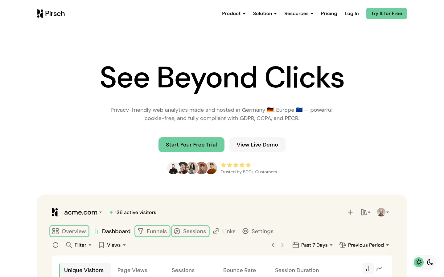
The page uses pure white as its dominant canvas, with warm off-white panels separating product stories and testimonial cards from the surrounding space. Black headings and controls establish sharp contrast, while muted gray supports explanatory copy without competing with the message. Mint green marks the main trial actions and selected dashboard details; soft yellow appears sparingly in a secondary CTA and small product-interface highlights. DM Sans supplies a modern, humanist sans-serif voice: headings are medium weight, large, and centered in major feature sections, while body text remains calm and readable. A centered hero gives way to repeated feature modules, card grids, and broad vertical pauses. Product imagery is primarily interface content, framed inside warm, generously rounded panels rather than treated as decorative photography. The overall effect is orderly and approachable, with color and spacing guiding the eye instead of heavy borders or shadows.
All measured text: display headings, navigation, body copy, links, buttons, and small section labels.
角色
示例
字号
字重
行高
字距
特大标题
Oversized hero or major campaign headline.
Pirsch Analytics
96px
500
1.25
-0.021em
一级标题
Primary hero heading.
Pirsch Analytics
64px
500
1.25
-0.016em
二级标题
Centered feature-section headings and CTA title.
Pirsch Analytics
36px
500
1.5
0
三级标题
Card titles and secondary feature headings.
Pirsch Analytics
28px
500
1.25
0
四级标题
Smaller subfeature titles and footer group headings.
The quick brown fox 敏捷的狐狸
24px
500
1.25
0
正文
Main explanatory paragraphs and feature descriptions.
The quick brown fox 敏捷的狐狸
18px
400
1.5
0
辅助文字
Supporting labels, small notes, and footer details.
The quick brown fox 敏捷的狐狸
16px
400
1.5
0
按钮
Primary and secondary call-to-action labels.
The quick brown fox 敏捷的狐狸
18px
500
1.5
0
导航
Header navigation and brand navigation text.
The quick brown fox 敏捷的狐狸
16px
500
1.5
0
链接
Text links and emphasized secondary actions.
The quick brown fox 敏捷的狐狸
18px
500
1.5
0
眉题
Uppercase numbered labels above feature sections.
The quick brown fox 敏捷的狐狸
14px
500
1.5
0.286em
间距与布局
基准单位 8px · 密度:宽松
192px版块间距
32px元素间距
48px卡片内边距
1200px内容最大宽度
4px
6px
8px
12px
16px
24px
32px
48px
192px
Use a centered page frame with a measured maximum width of 1200px and a spacious, low-density rhythm. The hero is centered with a two-column product presentation below; subsequent sections alternate between centered headings, multi-column card grids, and broad feature panels. The measured section gap is 192px, with 32px element gaps and 48px card padding. Align most content centrally, reserving left alignment for card copy and footer navigation. Let white space clearly separate feature chapters.
圆角与层次
按钮 · 6px
输入框 · 6px
卡片 · 24px
图片 · 50%
链接 · 12px
hairline · other
The visual system is mostly flat: warm card fills separate content from the white canvas, while strong outlines and deep shadows are absent. Rounded card corners provide the main sense of containment. Keep layering limited to dashboard screenshots within panels and subtle interface highlights; do not add heavy shadows or decorative borders.
组件
下面的预览按实测的按钮、输入框、徽标、卡片样式重建(字体用替代字体)。
Header navigation
Compact horizontal brand and link row on white, with black text and a mint free-trial button.
Hero actions
Centered mint primary trial CTA beside a pale neutral demo link, followed by customer portraits and a muted trust note.
Dashboard preview
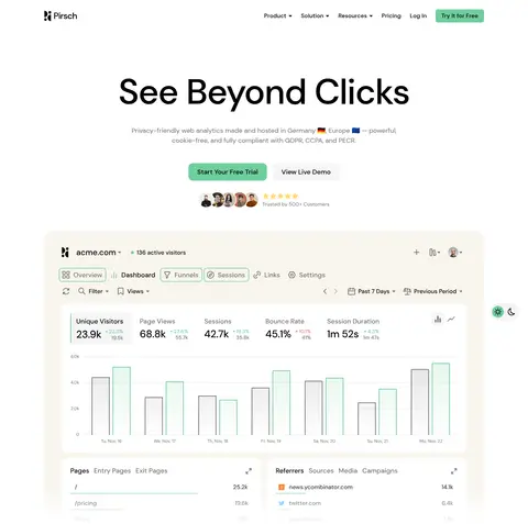
Large analytics interface preview inside a warm #f8f5ed panel, showing navigation, metrics, charts, and tables.
Feature cards
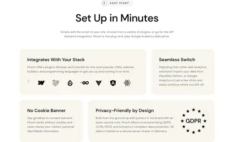
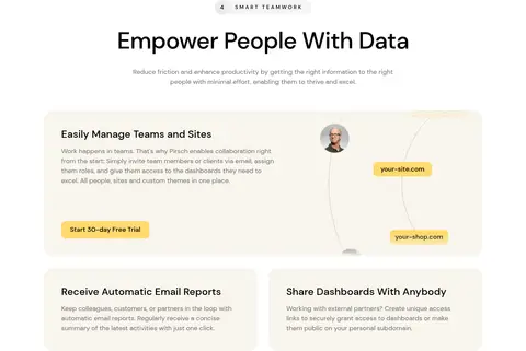
Warm off-white cards with rounded 24px corners, generous measured 48px padding, black titles, and muted explanatory copy.
Numbered section label
Small uppercase, widely tracked eyebrow above centered feature-section headings.
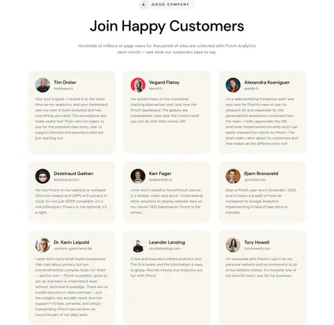
Testimonial grid
Repeated warm-background review cards with small customer portraits, names, affiliations, and compact muted copy.
Trial CTA
Centered closing prompt with brand mark, concise supporting copy, and a mint or soft-yellow rounded trial button.
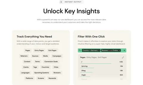
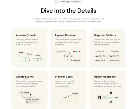
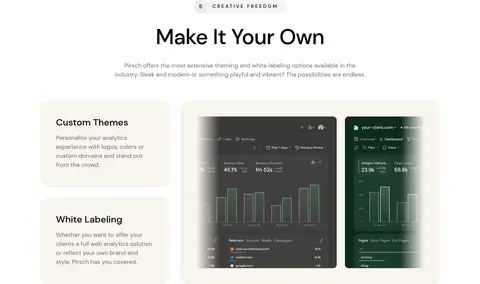
Imagery · Use product-interface previews as the main visual material: dashboard charts, filters, tables, and analytics panels shown inside warm, softly rounded frames. Small customer portraits appear in trust and testimonial areas; logos form a restrained customer strip. Supporting illustrations are simple, diagrammatic interface details rather than realistic 3D or cinematic imagery. Keep screenshots legible and avoid letting mockup colors redefine the site palette.
Place feature and review content on warm off-white panels.
Reserve mint green for the primary action and selected product details.
Set major feature headings centrally with ample surrounding space.
Use DM Sans with medium-weight headings and regular body copy.
Show analytics as product-interface previews, not generic decoration.
✕ 不该做
Do not introduce colors beyond the measured palette.
Do not fill large areas with mint or soft yellow.
Do not add heavy shadows, thick borders, or dense framing.
Do not crowd feature sections together.
Do not use loud gradients or oversized decorative illustrations.
Do not let mockup colors replace the page's white-and-warm palette.
给 AI 的提示词
想快速出一个同风格的新页面,把这段话连同 DESIGN.md 一起发给 AI。
Build a new SaaS page in Pirsch Analytics' spacious, privacy-focused visual style. Use Gallery White (#ffffff) as the main canvas, Pure Ink (#000000) for headings and controls, and Soft Graphite (#707070) for supporting copy. Place product information in Warm Parchment (#f8f5ed) rounded cards; use Fresh Mint (#6ece9d) sparingly for primary actions and Soft Marigold (#ffda6e) only for a secondary emphasis. Set all text in DM Sans or a close substitute, with medium-weight headings, regular body copy, and uppercase tracked section labels. Center the hero and section titles, then organize content into generous feature grids and interface-preview panels. Favor analytics UI, charts, and compact customer proof over decorative imagery. Keep the page flat, legible, and open, with restrained borders and no heavy shadows.