Signal 以明亮清爽的页面、鲜明蓝色点缀和亲切的产品视觉呈现隐私优先的品牌气质。页面从宽阔的首屏延伸至清晰的功能介绍、富有表现力的插画和深色页脚。
North star · Use generous white space and clear, human product storytelling, with Signal blue reserved for meaningful interaction.
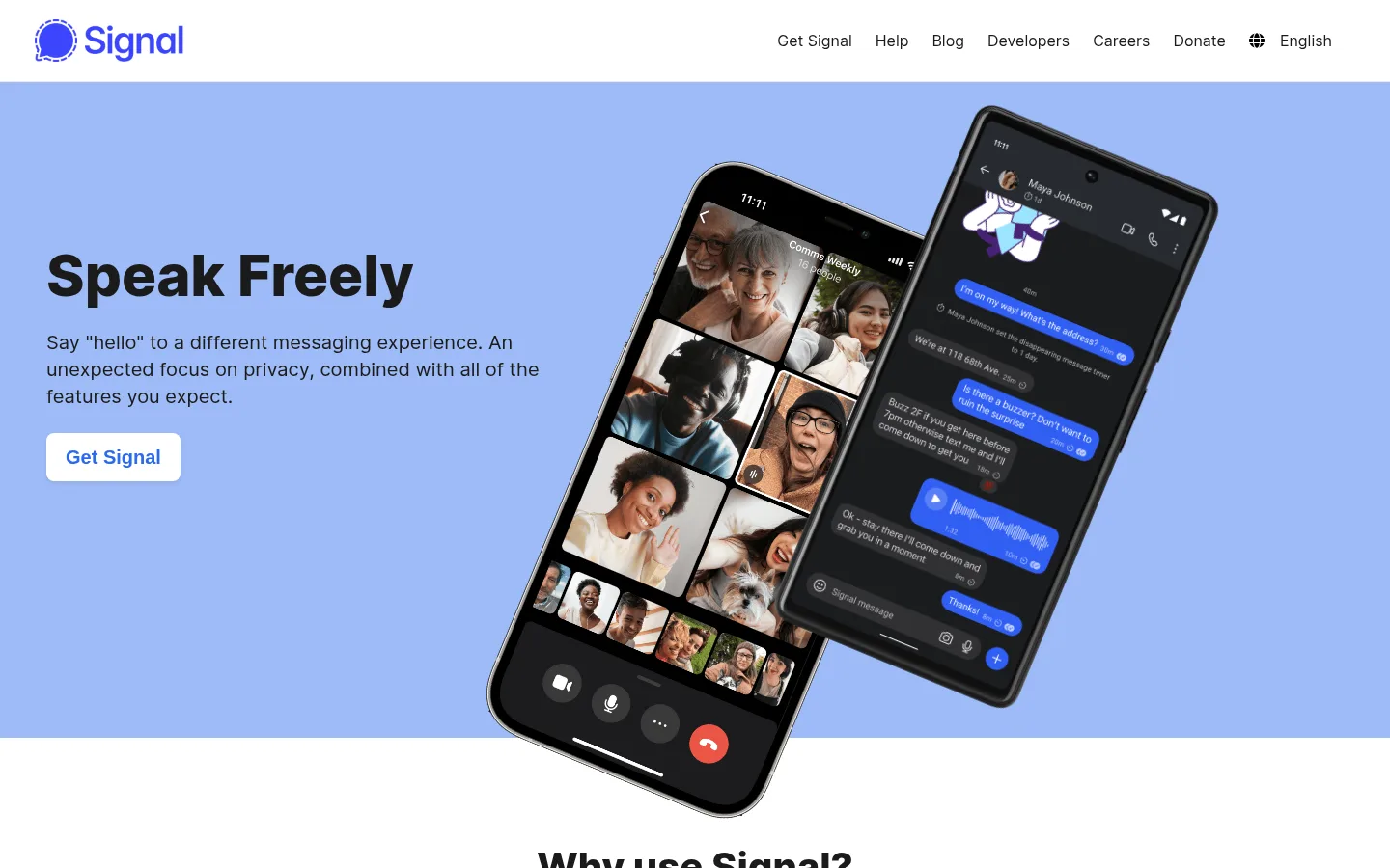
The page builds its identity around a white canvas and a large periwinkle-blue hero band, giving the product a friendly, open feel without diluting the privacy message. Near-black headings establish strong hierarchy; muted charcoal supports readable body copy, while Signal blue is reserved for interactive emphasis such as CTA text and outlined donation controls. Inter supplies a compact, modern sans-serif voice, with heavy display headings and regular-weight supporting text. The layout moves between centered introductions and two-column feature sections, then gathers benefits into a soft-gray card grid. Product screenshots and illustrations sit prominently beside concise copy: imagery feels expressive and human, but remains contained in rounded media panels. Generous whitespace separates the major content bands, while the dark plum footer creates a clear visual endpoint. Keep decorative color variation inside illustrations rather than expanding the site palette.
配色
点色块复制色值。用途说明来自对页面的实测位置(背景、文字、描边、按钮)与截图判读。
品牌色
强调色
表层色
中性色
功能色
页面底色 · Gallery White表层 · Soft Fog表层 2 · Open Periwinkle表层 3 · Calm Teal表层 4 · Plum Footer主文字 · Signal Ink次要文字 · Slate Copy弱文字 · Quiet Line描边 · Quiet Line强调 · Open Periwinkle强调 2 · Signal Blue
Display and section headings, body copy, and navigation.
Aa 设计
BlinkMacSystemFont
系统字体 · 字重 600 · 占比 1%
免费替代:Inter
Prominent CTA button labels.
角色
示例
字号
字重
行高
字距
特大标题
Oversized hero headline, notably “Speak Freely.”
Signal
60px
800
1.07
0
一级标题
Primary section headlines and major content statements.
Signal
40px
800
1.1
0
二级标题
Feature titles and secondary section headings.
Signal
28px
800
1.14
0
三级标题
Smaller feature or explanatory headings.
The quick brown fox 敏捷的狐狸
20px
400
1.4
0
正文
Paragraphs explaining privacy, messaging, and nonprofit support.
The quick brown fox 敏捷的狐狸
16px
400
1.38
0
按钮
Prominent CTA labels such as “Get Signal.”
The quick brown fox 敏捷的狐狸
20px
600
1.4
0
导航
Header navigation links and language selector.
The quick brown fox 敏捷的狐狸
16px
400
1.5
0
间距与布局
基准单位 4px · 密度:适中
48px版块间距
12px元素间距
30px卡片内边距
1344px内容最大宽度
4px
8px
12px
16px
18px
24px
30px
32px
48px
The measured content uses a wide page frame, with a two-column hero and feature splits that balance concise copy against product media. The opening hero aligns text to the left and lets oversized phone imagery occupy the opposite side. Centered section introductions lead into alternating feature content, while the benefits sit in a two-column card grid. Major bands are separated by generous vertical breathing room; the overall density is comfortable rather than compressed. Keep the desktop composition balanced and let columns stack cleanly on smaller screens.
圆角与层次
按钮 · 8px
卡片 · 16px
图片 · 16px
md · card
sm · button
The page is mostly flat: color bands and whitespace do the structural work. Feature cards use soft, restrained shadows rather than heavy outlines, with rounded corners on cards and media. Keep layering intentional, especially where the hero phones overlap the blue band and the following white section.
组件
下面的预览按实测的按钮、输入框、徽标、卡片样式重建(字体用替代字体)。
Top navigation
White horizontal header with the Signal mark at left and compact text links, donation link, globe, and language control aligned at right.
Hero CTA
White rounded button with Signal-blue label and semibold system-sans text, positioned below the hero introduction.
Hero product media
Overlapping, angled phone mockups sit against the periwinkle hero field and extend toward the next section.
Feature split
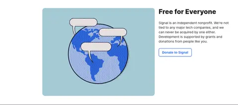
Pair a bold, left-aligned title and concise supporting copy with a large rounded product or illustration panel.
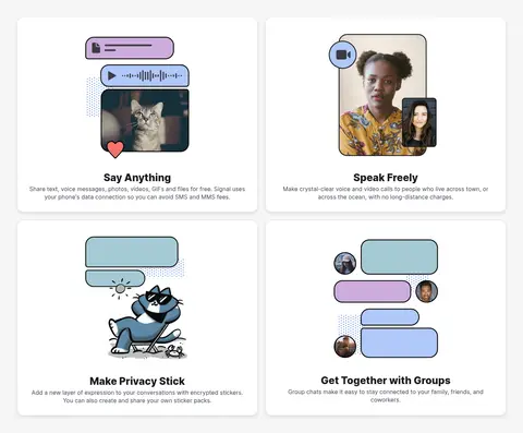
Benefits card grid
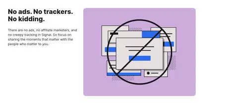
Four white feature cards arranged in two columns within a pale-gray section band, combining centered artwork, title, and brief copy.
Donation button
White-background outlined control with a two-pixel Signal-blue border, rounded corners, and blue semibold label.
Footer
Full-width plum band with small, muted legal copy and grouped link columns.
Imagery · Use authentic app screenshots on tilted phone mockups for the hero, with clear interface detail and dark device frames. Supporting feature sections mix friendly illustrations and human product imagery, contained in rounded panels with calm, solid backdrops. Keep artwork colorful where needed, but treat those illustration colors as content rather than extending the core palette.
Use periwinkle as a broad hero surface, not a tiny accent.
Reserve Signal blue for actionable controls and emphasis.
Pair concise copy with clear product imagery.
Use strong, near-black headings with readable supporting text.
Separate content bands with generous whitespace.
✕ 不该做
Do not introduce gradients into the core page surfaces.
Do not make every section blue or teal.
Do not use heavy shadows as the main layout device.
Do not crowd feature copy against its imagery.
Do not use decorative all-caps or widely tracked headings.
Do not mistake illustration colors for additional brand colors.
给 AI 的提示词
想快速出一个同风格的新页面,把这段话连同 DESIGN.md 一起发给 AI。
Build a new Signal-style page with a clean white canvas (#ffffff), near-black headings (#1b1b1b), and muted supporting copy (#404654). Use Open Periwinkle (#9dbbf8) for a prominent hero band and Signal Blue (#2c6bed) for meaningful interactive emphasis, not decoration. Set type in Inter, with bold, compact headlines and comfortable regular body copy. Create a broad two-column hero with concise text, a white CTA, and expressive app imagery; continue with alternating feature splits and a soft-gray (#f6f6f6) benefits-card section. Use Calm Teal (#a5cad5) only as a supporting media backdrop and Plum Footer (#3c3744) for the final footer band. Favor spacious alignment, rounded media and cards, and restrained shadows. Keep illustration colors within their artwork and ensure the layout adapts cleanly to narrow screens.