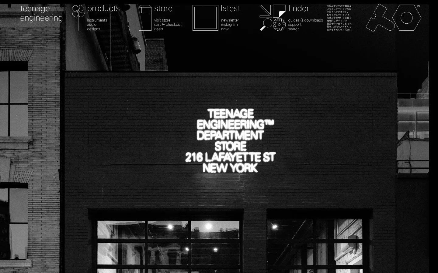
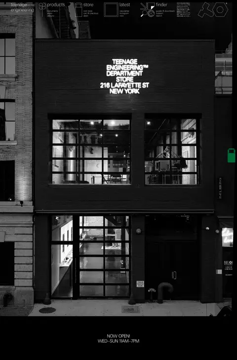
首页以纽约 teenage engineering department store 的黑白建筑照片开场。细线风格导航和克制的文字叠加在通栏影像上,下方展示营业时间与简洁的页脚链接。
North star · Let one atmospheric monochrome photograph carry the page, and keep every interface element quiet, precise, and legible against black.
The visual strategy is built around a near-black canvas and a single full-bleed black-and-white photograph of the New York store. The palette stays tightly controlled: #000000 anchors the page, while #f1f2f2 supplies the light navigation and key text; #e5e5e5 appears in footer text rather than acting as a broad surface colour. The photograph provides most of the tonal variation and texture, so the interface avoids competing decoration. Navigation is arranged as a horizontal line of compact groups, with thin outlined pictograms and wordmarks integrated into the image. The bespoke sans-serif typography is light and spacious in feel, with uppercase treatment reserved for the measured heading role. The page uses a single-column, full-bleed composition with a central store-hours message beneath the image. Spacing is comfortable, but interface chrome remains sparse, flat, and functional.
Main site typography for body copy, navigation, and captions.
Aa 设计
te-40
网络字体 · 字重 300 · 占比 8%
免费替代:Oswald
Measured heading face; used for the uppercase h1 role.
角色
示例
字号
字重
行高
字距
一级标题
Uppercase display heading role; use sparingly for prominent page titles.
The quick brown fox 敏捷的狐狸
26.5px
300
1.11
0
正文
Store announcements and primary supporting copy.
The quick brown fox 敏捷的狐狸
19px
100
1.15
0
辅助文字
Small secondary labels and compact supporting details.
The quick brown fox 敏捷的狐狸
16px
100
1.5
0
导航
Top-level navigation and utility links.
The quick brown fox 敏捷的狐狸
16px
100
1.5
0
间距与布局
基准单位 2px · 密度:适中
66px版块间距
22px元素间距
—卡片内边距
1308px内容最大宽度
15px
22px
33px
66px
Use a single-column, full-bleed page with a wide photographic hero and no visible card grid. The measured content max width is 1308px, while the screenshot’s image fills the viewport. Arrange navigation in compact horizontal groups across the top, then let the photograph dominate the page. Keep the store-hours message centered below the image and place the small footer links in a restrained horizontal row. Measured spacing follows a comfortable rhythm, with a 66px section gap and 22px element gap.
圆角与层次
没有测到阴影:页面是扁平的,层次靠底色和描边区分。
The interface is flat: measurements report no shadows, gradients, or corner-radius scale. Separate content through placement and contrast rather than raised panels. Thin outlined navigation illustrations sit directly over the image, and text remains unboxed against the black canvas.
组件
下面的预览按实测的按钮、输入框、徽标、卡片样式重建(字体用替代字体)。
Image-overlay navigation
A compact horizontal set of grouped brand, product, store, latest, and finder links, rendered in light text over the top of the photograph.
Outlined navigation pictograms
Thin, monochrome line drawings accompany navigation groups; keep them unfilled and visually subordinate to the labels.
Full-bleed storefront image
The dominant page element is a grayscale architectural photograph, shown edge to edge without a card frame.
Store-hours announcement
Centered light text below the image announces opening and weekly hours on the black canvas.
Compact footer links
A small, low-emphasis row of locale, newsletter, retailers, store, terms, press, contact, and returns links.
Search utility
A measured text-style search button uses #f1f2f2 without a filled background, visible border, or padding.
Imagery · Use real architectural photography as the page’s defining visual: a street-level storefront, photographed straight on and framed vertically to show the facade. Treat it in high-contrast grayscale, with deep shadows and visible masonry texture. Avoid decorative product mockups or colourful illustration; the measured screenshot’s tonal variation comes from the photograph itself.
Reserve #f1f2f2 for navigation and primary light text.
Let grayscale photography provide most of the visual texture.
Keep navigation light, compact, and grouped across the top.
Use thin outlined pictograms rather than filled icons.
Center store information beneath the main image.
✕ 不该做
Do not add bright accent colours absent from the measured palette.
Do not place the photograph inside a rounded card.
Do not add gradients, drop shadows, or decorative elevation.
Do not crowd the hero with promotional copy or buttons.
Do not make navigation heavy or oversized.
Do not treat photograph-only tonal grays as interface brand colours.
给 AI 的提示词
想快速出一个同风格的新页面,把这段话连同 DESIGN.md 一起发给 AI。
Build a new page in the teenage engineering visual style. Use Deep Stage (#000000) as the main canvas and Studio Chalk (#f1f2f2) for navigation, primary copy, and fine outlined graphics; reserve Quiet Silver (#e5e5e5) for subdued footer details. Lead with a single edge-to-edge, high-contrast grayscale architectural photograph, with compact grouped navigation overlaid along its upper edge. Use lightweight sans-serif typography, keeping headings uppercase and supporting text understated. Follow a single-column composition, let imagery dominate, and keep the store or page message centered below it. Use generous measured spacing, flat surfaces, square geometry, and no shadows or gradients. Avoid adding new accent colours, card grids, or decorative UI that competes with the photograph.
teenage engineering 设计系统 — 配色、字体与 DESIGN.md | Design DNA