North star · Let spacious white editorial layouts and light typography lead; use coral only to direct attention to key actions and details.
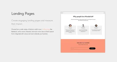
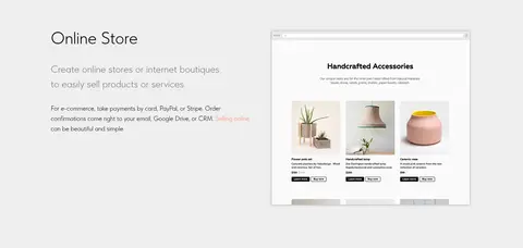
The page uses white as its dominant canvas, with black text and occasional light-gray bands to create a calm, editorial rhythm. Coral is reserved for the primary free-start CTA, selected inline links, and details inside illustrations; the brighter coral gradient is subtle rather than a page-wide effect. TildaSans carries the identity: light-weight, generously sized headlines contrast with compact uppercase navigation and small, quiet body copy. The hero pairs an expansive illustrated composition with a centered text-and-action area, while later feature sections alternate text and line-art or product previews. Large gaps between content blocks keep the long page from feeling crowded, and gray feature bands provide structure without heavy dividers. Product screenshots sit within the content as examples, not as the source of the brand palette. Overall, prioritize open white space, precise alignment, thin typographic character, and selective coral emphasis.
Page-wide display, headings, body, navigation, links, and labels.
角色
示例
字号
字重
行高
字距
特大标题
Large, light-weight hero or statement headlines.
Tilda
78px
300
1.17
0
一级标题
Primary page headline and top-level messaging.
Tilda
72px
300
1.56
0
二级标题
Major feature-section titles.
Tilda
60px
300
1.23
0
三级标题
Feature and category headings.
Tilda
48px
300
1.23
0
四级标题
Emphasized subsection or card headings.
Tilda
46px
600
1.13
0
正文
Light-weight explanatory paragraphs.
The quick brown fox 敏捷的狐狸
16px
300
1.55
0
辅助文字
Small uppercase eyebrow labels with wide tracking.
The quick brown fox 敏捷的狐狸
14px
400
normal
0.179em
导航
Compact bold uppercase header navigation.
The quick brown fox 敏捷的狐狸
13px
700
normal
0.038em
链接
Prominent lightweight links and feature links.
The quick brown fox 敏捷的狐狸
26px
300
1.45
0
眉题
Small uppercase section preheadings.
The quick brown fox 敏捷的狐狸
14px
400
normal
0.179em
间距与布局
基准单位 2px · 密度:适中
90px版块间距
8px元素间距
—卡片内边距
1200px内容最大宽度
2px
5px
8px
9px
10px
11px
13px
14px
15px
20px
26px
30px
34px
40px
44px
45px
Use a centered content frame capped at the measured 1200px maximum, while letting hero artwork and selected dark or gray bands feel broad. The hero is a two-column composition with illustration on the left and copy with paired actions on the right. Subsequent feature stories alternate image and text alignment, then settle into full-width feature bands and centered showcases. Preserve the measured 90px section rhythm and comfortable density; align text deliberately, with centered statement sections and left-aligned product explanations.
圆角与层次
按钮 · 50%
卡片 · 6px
链接 · 9999px
lg · card
md · card
The page is predominantly flat: broad white and gray bands, thin outlines, and cleanly framed mockups do most of the work. Avoid adding ambient shadows to ordinary content cards. Layer illustrations and screenshots where needed for the hero or product demonstrations, keeping their edges and overlap visually restrained.
组件
下面的预览按实测的按钮、输入框、徽标、卡片样式重建(字体用替代字体)。
Primary CTA
Solid #fa8669 button with white TildaSans text; use for free-start actions and repeat it at key conversion points.
Header navigation
Compact, bold, uppercase black TildaSans links across the top; sign-up is an outlined black button.
Hero split
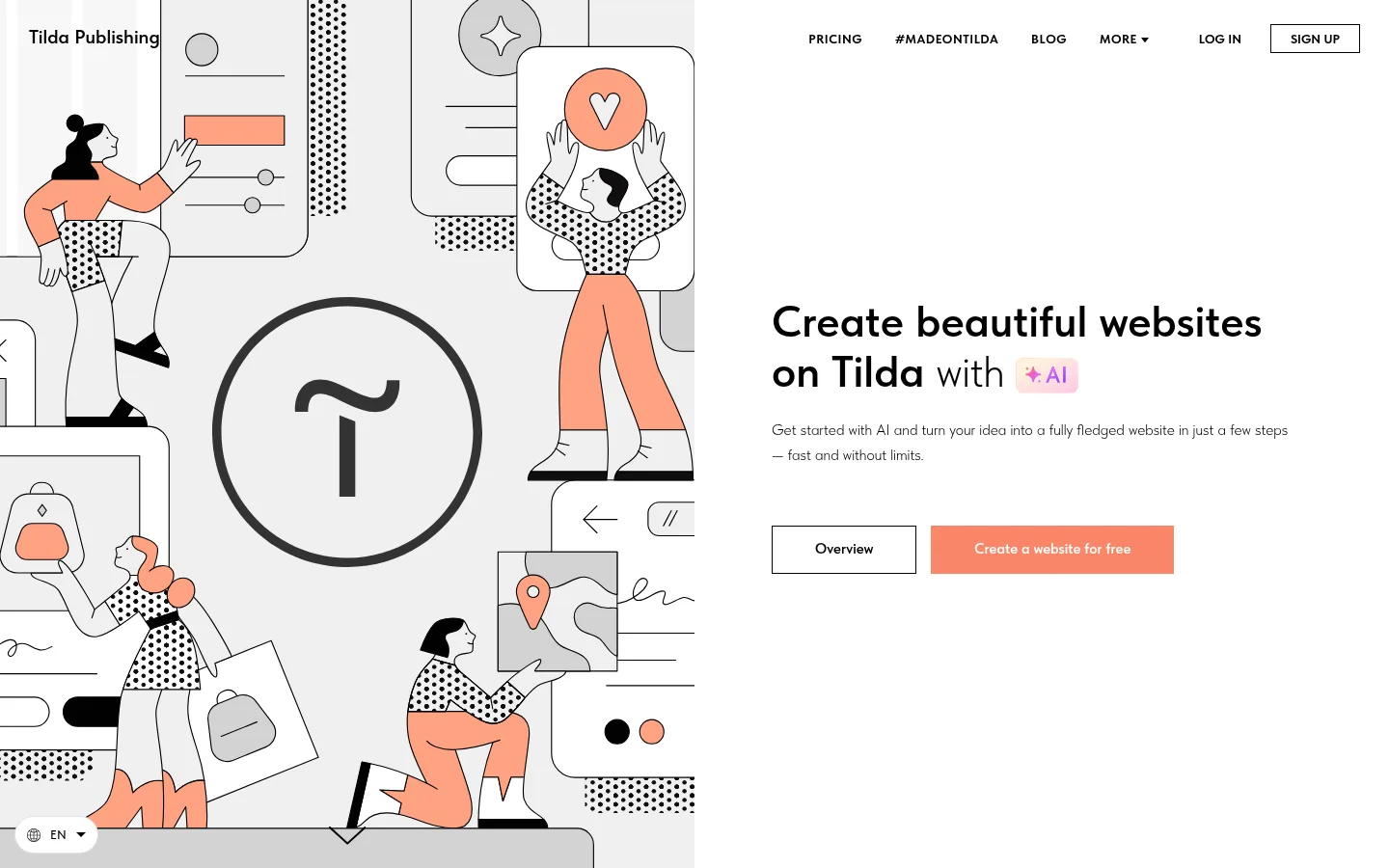
Large illustrative field beside a clear headline, short supporting copy, and paired outlined and coral actions.
Alternating feature row
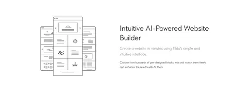
Use a product illustration or preview beside left-aligned heading and explanatory copy; alternate sides as the story progresses.
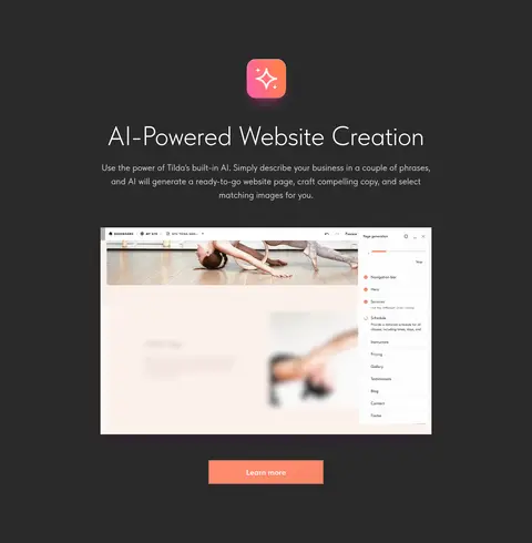
Dark AI showcase
A #2a2a2a band with centered light text, an interface preview, and a coral action.
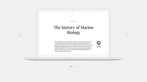
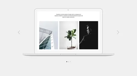
Feature carousel
Light-gray feature area with laptop-style preview, side arrows, and small pagination dots.
Feature cards
Compact preview cards on white, with concise descriptions and restrained #fa8669 details.
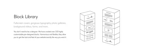
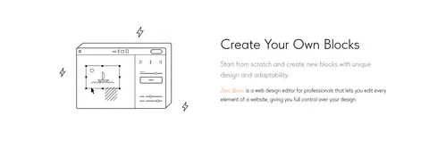
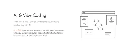
Imagery · Use fine black line-art illustrations and playful character scenes for the product story, with coral details that echo the main CTA. Product screenshots and website mockups appear as demonstrations within feature sections, generally framed cleanly rather than styled as dramatic photography. Include video as a contained showcase. Keep imagery crisp, mostly monochrome, and surrounded by generous white or gray space; colors inside mockups are illustrative, not core brand colors.
Use TildaSans or a close neutral sans-serif substitute.
Set large headings in a light weight.
Reserve coral for primary actions and select accents.
Alternate feature copy and visual alignment.
Use gray bands to group related feature content.
✕ 不该做
Do not turn the page into a dark theme.
Do not use coral as a dominant background across sections.
Do not add unmeasured radii or spacing values.
Do not overdecorate screenshots with shadows.
Do not use heavy display typography throughout.
Do not mistake colorful mockup content for brand palette.
给 AI 的提示词
想快速出一个同风格的新页面,把这段话连同 DESIGN.md 一起发给 AI。
Build a new Tilda-style page with an editorial, spacious SaaS feel. Use Gallery White (#ffffff) as the primary canvas, Tilda Ink (#000000) for typography and outlines, and Soft Feature Gray (#efefef) for occasional full-width content bands. Make Coral Action (#fa8669) the selective CTA color, with Warm Coral (#ff8c6f) only as a subtle accent. Use a clean sans-serif close to TildaSans, light-weight large headings, compact uppercase bold navigation, and quiet supporting copy. Organize the page around an illustrated hero, alternating feature rows, and one focused dark showcase in Charcoal Panel (#2a2a2a). Keep generous measured section spacing, clear alignment, thin borders, and clean product previews. Let whitespace and restrained contrast—not decoration—establish hierarchy.