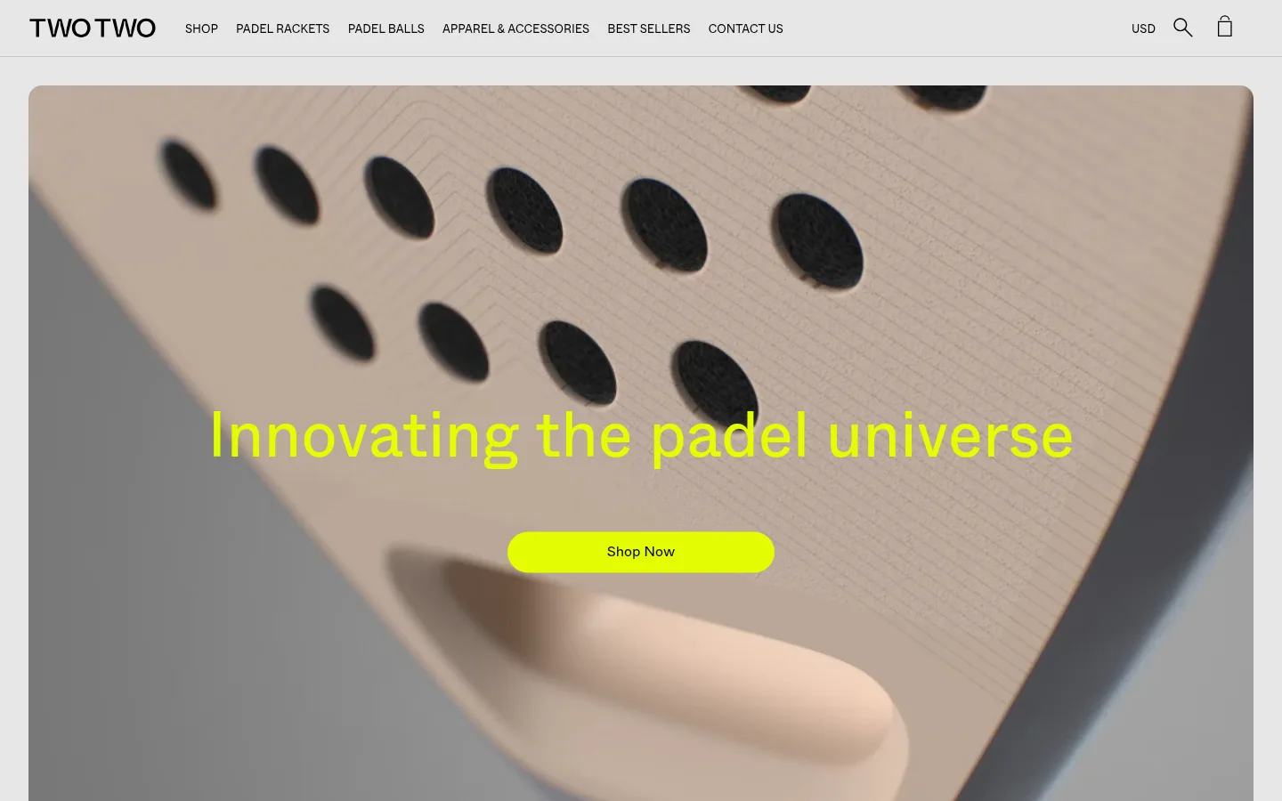
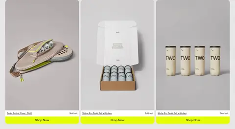
North star · Keep the interface calm and neutral, letting product photography and lime shopping actions provide the energy.
The page is built on a light gray canvas (#e6e6e6), creating a continuous backdrop from navigation through product collections and footer. Black (#000000) carries the wordmark, navigation, headings and product details; muted charcoal (#323232) softens secondary copy. A vivid lime (#e3fc03) is reserved for prominent shopping and signup actions, so it reads as a clear signal rather than a broad decorative fill. White (#ffffff) appears in the newsletter input, while the pale gray border (#c2c6cc) provides a quiet navigation divider. Whyte’s clean sans-serif forms and regular weights keep headings and interface labels direct, with uppercase navigation adding structure. A centered, full-bleed-feeling hero gives way to aligned three-column product grids, a social image strip, a photo-backed signup area and a compact multi-column footer. Product photography supplies most of the page’s warm and colorful variation; those image hues are not the core interface palette.
Primary interface and content face for navigation, body copy, headings, captions and product links.
Aa 设计
WhyteRegular
网络字体 · 字重 400 · 占比 6%
免费替代:Inter
Display and selected larger section headings.
角色
示例
字号
字重
行高
字距
特大标题
Large centered hero headline over the racket video.
TWOTWO
72px
400
1.1
0
一级标题
Primary page or collection heading.
TWOTWO
38px
400
1.3
0
二级标题
Product collection and major section titles.
TWOTWO
32px
400
1.1
0
三级标题
Secondary promotional and signup headings.
The quick brown fox 敏捷的狐狸
22px
400
1.3
0
四级标题
Compact footer group headings and supporting sections.
The quick brown fox 敏捷的狐狸
20px
400
1.4
0
正文
Descriptions, newsletter copy and general content.
The quick brown fox 敏捷的狐狸
16px
400
1.4
0
辅助文字
Product prices, fine print and small supporting labels.
The quick brown fox 敏捷的狐狸
13px
400
1.4
0
按钮
Shopping actions and secondary controls.
The quick brown fox 敏捷的狐狸
16px
400
normal
0
导航
Uppercase header navigation labels.
The quick brown fox 敏捷的狐狸
13px
400
1.4
0
间距与布局
基准单位 2px · 密度:适中
32px版块间距
—元素间距
—卡片内边距
1376px内容最大宽度
3px
4px
5px
7px
10px
14px
16px
20px
32px
64px
75px
A wide desktop storefront uses a measured page maximum of 1376px, with a full-width header and a centered hero. The hero is followed by product collections arranged in three columns, then a dense social gallery, newsletter panel and four-column footer. Section spacing follows a comfortable rhythm, with generous breathing room around product imagery and headings. Collection titles and copy align centrally or to the section start, while product cards remain consistent in width. Preserve the long, scroll-led retail sequence rather than compressing all content into a single screen.
圆角与层次
按钮 · 9999px
输入框 · 9999px
图片 · 16px
没有测到阴影:页面是扁平的,层次靠底色和描边区分。
The interface is predominantly flat: no measured shadows or gradients. Use the canvas itself to unify sections, with the navigation hairline as a restrained separator. Rounded product media and pill-shaped actions provide the main shape contrast; use image layering only where campaign photography or the newsletter background calls for it.
组件
下面的预览按实测的按钮、输入框、徽标、卡片样式重建(字体用替代字体)。
Header navigation
Wordmark at left, uppercase category links across the header, and currency, search and bag controls at right; black on the gray canvas with a fine divider.
Campaign hero
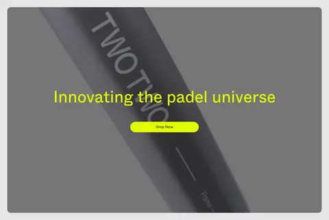
Large media-led banner with centered display headline and a pill-shaped lime Shop Now action in black text.
Product cards
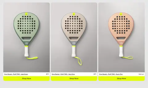
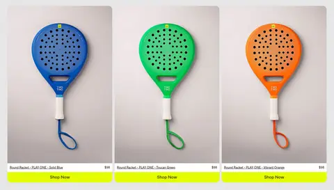
Three-column retail grid with rounded product imagery, black product-name links, compact price or sold-out status and a full-width lime Shop Now bar.
Collection heading
Simple section title with a short supporting description, set above product grids without a separate colored panel.
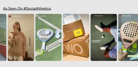
Social gallery
Horizontal strip of customer and lifestyle imagery under an underlined social heading.
Newsletter signup
Photo-backed two-column signup area with concise offer copy, a white pill email field and lime pill signup action.
Footer
Four-column information area on the light canvas, with compact group headings, small links, brand mark and social icons.
Imagery · Lead with a large, close-cropped padel racket video or campaign image, with the headline and lime button layered centrally. Product grids use straightforward packshot photography on pale, quiet backgrounds, preserving the products’ color and shape. A narrow social gallery adds candid lifestyle and customer images. Warm beige, green and charcoal tones visible in photos belong to the imagery, not the brand interface palette.
Reserve #e3fc03 for clear shopping and signup actions.
Keep navigation uppercase, compact and black.
Give product photography the largest share of visual attention.
Build collection grids in three aligned product columns.
Use pill-shaped primary actions and restrained image rounding.
✕ 不该做
Do not turn product-image colors into interface colors.
Do not add gradients or drop shadows.
Do not place every section inside a separate white card.
Do not use lime as a large page background.
Do not crowd product images with decorative labels.
Do not replace the calm gray canvas with stark white.
给 AI 的提示词
想快速出一个同风格的新页面,把这段话连同 DESIGN.md 一起发给 AI。
Build a new TWOTWO storefront page with the same calm, sporty retail language. Use Court Mist (#e6e6e6) as the continuous canvas, Racket Ink (#000000) for navigation and product text, and Electric Lime (#e3fc03) only for prominent actions. Use Clean Court (#ffffff) for form fields and Quiet Divider (#c2c6cc) for subtle header separation; Soft Graphite (#323232) can carry secondary copy. Set clean regular-weight sans-serif typography, compact uppercase navigation and clear heading scale. Make the main content image-led, with rounded product photography, aligned three-column product grids, simple collection titles and generous breathing room. Use pill-shaped buttons with black labels. If adding a campaign or signup image, let its colors remain photographic rather than extending them into the interface palette. Keep surfaces flat, with no shadows or gradients.