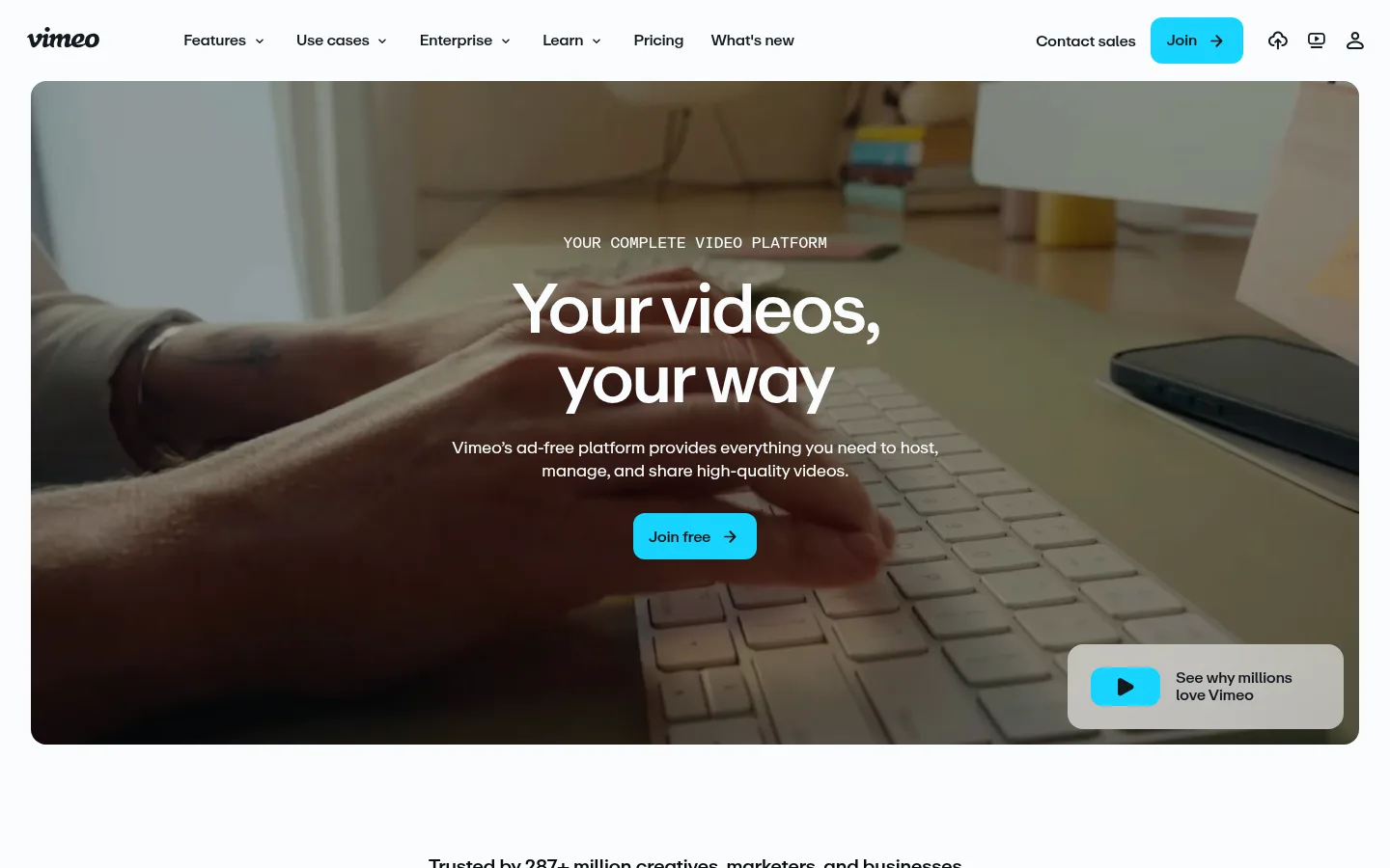
Vimeo以明亮克制的界面搭配电影感视频,并用深色区块清晰划分内容。紧凑导航、居中主文案和醒目的青色按钮,引导访客浏览内容丰富的首页。
North star · Keep the interface quiet and legible so cinematic video carries the emotion, while cyan marks the next action.
The page balances a pale near-white canvas with alternating ink-dark feature bands, letting large video frames supply most of the atmosphere and color. Cyan is reserved for high-intent actions and small highlights, while near-black text and muted slate copy keep the interface legible without competing with the footage. ABCRepro drives a consistent typographic voice: compact navigation and supporting copy, with centered, tightly tracked headlines that feel direct rather than ornamental. The layout moves from a full-width rounded hero into logo proof, a soft enterprise introduction, a dark three-column feature grid, and further alternating feature, testimonial, security, and creator-story sections. Comfortable gaps and generous section breathing room offset dense lower-page content. Photography and video are framed as product evidence, not decoration; cards and media use rounded corners, with little reliance on shadow. Dark bands provide contrast and structure across the long scroll.
配色 点色块复制色值。用途说明来自对页面的实测位置(背景、文字、描边、按钮)与截图判读。
品牌色
Midnight Slate
#141a20
Signature inverse surface for platform features, AI content, and the creator community band.
强调色
Vimeo Cyan
#17d5ff
Primary Join actions and small New badges; pair with dark text.
Deep Cyan
#00b8e0
Secondary measured cyan accent in supporting media or details; primary buttons use Vimeo Cyan.
表层色
Gallery White
#fafcfd
Primary canvas for the header, hero surroundings, light feature sections, and footer.
Cloud Gray
#f1f5f9
Soft testimonial band and pale card or section surfaces.
Stone Gray
#9a9d9f
Measured secondary surface, appearing in supporting section or media treatments rather than core chrome.
Deep Panel
#192028
Occasional dark card surface within the interface.
中性色
Slate Copy
#4c5864
Muted supporting text and navigation copy on light surfaces.
Haze Gray
#a9b2bc
Secondary muted text, especially subdued copy on dark or mixed surfaces.
Graphite Slate
#3d4751
Occasional dark button or footer detail; secondary to the primary cyan CTA.
功能色
Ink Black
#0a0e12
Core text and measured border color; used for headings, card outlines, and compact labels.
Pure Black
#000000
Measured within gradients and media treatments; not a defining interface color.
Olive Shadow
#666655
Gradient or video-derived tone; treat as incidental imagery, not brand chrome.
Neutral Gray
#777777
Appears in measured gradients and image-derived tones, not a primary UI color.
Muted Teal
#556666
Section or media gradient tone; preserve only when reproducing that visual treatment.
Moss Gray
#667766
Measured section-related color likely associated with imagery or gradient, not core interface.
文字 背景 对比度 WCAG #0a0e12 Ink Black#fafcfd Gallery White18.82:1 AAA #0a0e12 Ink Black#141a20 Midnight Slate1.11:1 不达标 #0a0e12 Ink Black#f1f5f9 Cloud Gray17.68:1 AAA #0a0e12 Ink Black#9a9d9f Stone Gray7.1:1 AAA #4c5864 Slate Copy#fafcfd Gallery White7.07:1 AAA #4c5864 Slate Copy#141a20 Midnight Slate2.41:1 不达标
字体 字号阶梯:Major Third(比例约 1.257,正文 16px)。示例用免费替代字体渲染,数值为实测。
Aa 设计
ABCRepro 网络字体 · 字重 400 / 500 / 700 · 占比 100%
免费替代:Inter
Site-wide typography for navigation, headings, body copy, labels, and buttons.
角色 示例 字号 字重 行高 字距 一级标题 Centered hero headline; large, tightly tracked two-line messaging.
Vimeo
40px 500 1 -0.04em 二级标题 Major section titles across feature, AI, and community bands.
The quick brown fox 敏捷的狐狸
24px 500 1.1 -0.04em 三级标题 Feature-card and subsection headings.
The quick brown fox 敏捷的狐狸
22px 500 1.1 -0.039em 四级标题 Supporting section headings and descriptive content titles.
The quick brown fox 敏捷的狐狸
20px 400 1.4 -0.03em 正文 Introductory copy, feature explanations, and testimonial text.
The quick brown fox 敏捷的狐狸
16px 400 1.3 -0.03em 辅助文字 Compact labels, ratings, metadata, and badges.
The quick brown fox 敏捷的狐狸
12px 400 1.2 -0.03em 按钮 Primary actions such as Join free and demo requests.
The quick brown fox 敏捷的狐狸
16px 400 normal 0 导航 Compact top-level navigation and menu labels.
The quick brown fox 敏捷的狐狸
12px 400 1.2 -0.03em
间距与布局 基准单位 8px · 密度:适中
56px 版块间距
8px 元素间距
20px 卡片内边距
1376px 内容最大宽度
4px
8px
10px
12px
16px
20px
24px
32px
56px
A wide desktop canvas is organized around a measured 1376px page maximum, with centered hero and trust content followed by mixed one-, two-, three-, and four-column sections. The hero is a prominent full-bleed video inside a rounded frame. A comfortable rhythm separates alternating light and dark bands, while internal cards and copy remain compact enough to support a long landing page. Align section headings to the center for broad introductions and to the left for detail-heavy enterprise content.
圆角与层次 hairline · other
hairline · other
hairline · other
hairline · other
The page is predominantly flat: contrast between light and dark section bands creates hierarchy instead of pronounced shadows. Media and cards are separated through rounded corners and tonal surfaces; measured card borders use near-black. A floating video prompt sits above the hero footage on a pale panel, providing the clearest layered element.
组件 下面的预览按实测的按钮、输入框、徽标、卡片样式重建(字体用替代字体)。
Top navigation Compact horizontal header on the pale canvas, with brand mark, grouped menu links, sales contact, icon actions, and a cyan Join button.
Hero video Large rounded video frame with centered white overlaid messaging and a cyan Join free action; a pale floating video prompt sits at the lower right.
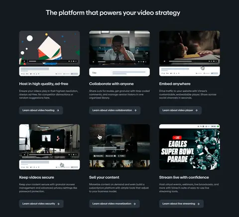
Feature card Dark-band card with rounded media preview, concise title and description, and a subdued learning link.
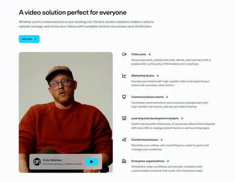
Audience list Light section pairs a creator portrait/video card with a vertically stacked set of audience types and short explanations.
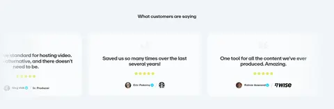
Testimonial card Pale gray testimonial band presents compact review cards with quotation, rating, reviewer identity, and logo or verification detail.
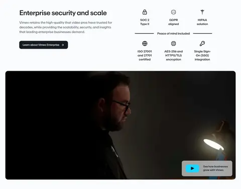
Enterprise CTA Light enterprise section combines concise copy, a dark action button, a grid of security credentials, and a wide rounded video.
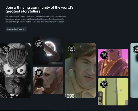
Creator gallery Dark community section uses editorial copy above a horizontally expansive grid of varied video thumbnails and staff-pick badges.
Imagery · Use cinematic product and creator video as the dominant visual material, including a large hero frame and smaller media previews inside feature cards. Photography and video show real people, workspaces, interfaces, and community stories rather than abstract illustration. Apply a dark overlay behind white hero copy when footage is busy. Keep media cropped and rounded, and treat varied colors inside thumbnails as image content rather than interface palette.
页面版块 共 11 个版块,按页面从上到下排列,每个都标了类型、布局和交互套路。
该做与不该做 ✓ 该做 Use Gallery White for the main canvas and preserve clear dark-band contrast. Reserve Vimeo Cyan for primary actions and concise highlights. Let real video footage lead the visual storytelling. Center the hero message over legible footage. Alternate light and dark sections to organize the long page. Use ABCRepro-style compact copy and tightly tracked headlines. ✕ 不该做 Do not add decorative gradients as a substitute for video. Do not use cyan as a large, continuous background. Do not crowd the hero with secondary links or dense copy. Do not apply heavy shadows to every card. Do not treat thumbnail colors as core brand colors. Do not make every section use the same column layout. 给 AI 的提示词 想快速出一个同风格的新页面,把这段话连同 DESIGN.md 一起发给 AI。
复制 Build a new SaaS page in Vimeo’s visual style: quiet, high-contrast interface with cinematic video as the primary visual. Use Gallery White (#fafcfd) for the main canvas, Midnight Slate (#141a20) for selected full-width feature bands, Ink Black (#0a0e12) for text, and Vimeo Cyan (#17d5ff) for primary CTAs. Use ABCRepro, or Inter as a free substitute, with compact navigation, tightly tracked headlines, and restrained supporting copy. Organize content into spacious alternating bands with varied one- to three-column layouts. Frame real product or creator footage in rounded media panels; use pale cards and limited borders rather than heavy shadows. Keep actions obvious, avoid decorative color overload, and ensure overlays maintain readable contrast over moving imagery.
DESIGN.md Tailwind v4 CSS 变量 Design Tokens
---
title: "Vimeo design system"
variant: extended
source: https://vimeo.com/
captured_at: 2026-10-12
theme: light
industry: saas
generator: Design DNA (https://four.wiralomi.com/style/vimeo-com)
ai_generated: true
ai_label: "本文件由 AI 辅助生成:数值取自公开网页的实测样式,命名、用途说明与建议为模型解读。商标归原所有者。 / AI-assisted content"
---
# Vimeo · Design System
> A clean canvas for stories in motion
**Theme:** light · **Industry:** saas · **Source:** https://vimeo.com/ · **Captured:** 2026-10-12 (1440×900 desktop)
_AI-assisted content: values are measured from the public page at capture time; names, roles and guidance are model-written interpretations. Trademarks belong to their owners._
Vimeo pairs a bright, restrained interface with cinematic video and sharply defined dark sections. Compact navigation, centered messaging, and vivid cyan actions guide visitors through a broad, content-rich homepage.
## North star
Keep the interface quiet and legible so cinematic video carries the emotion, while cyan marks the next action.
## Overview
The page balances a pale near-white canvas with alternating ink-dark feature bands, letting large video frames supply most of the atmosphere and color. Cyan is reserved for high-intent actions and small highlights, while near-black text and muted slate copy keep the interface legible without competing with the footage. ABCRepro drives a consistent typographic voice: compact navigation and supporting copy, with centered, tightly tracked headlines that feel direct rather than ornamental. The layout moves from a full-width rounded hero into logo proof, a soft enterprise introduction, a dark three-column feature grid, and further alternating feature, testimonial, security, and creator-story sections. Comfortable gaps and generous section breathing room offset dense lower-page content. Photography and video are framed as product evidence, not decoration; cards and media use rounded corners, with little reliance on shadow. Dark bands provide contrast and structure across the long scroll.
## Colors
| Name | Hex | Token | Group | Role |
|---|---|---|---|---|
| Gallery White | ` | `--color-gallery-white` | surface | Primary canvas for the header, hero surroundings, light feature sections, and footer. |
| Midnight Slate | ` | `--color-midnight-slate` | brand | Signature inverse surface for platform features, AI content, and the creator community band. |
| Ink Black | ` | `--color-ink-black` | semantic | Core text and measured border color; used for headings, card outlines, and compact labels. |
| Vimeo Cyan | ` | `--color-vimeo-cyan` | accent | Primary Join actions and small New badges; pair with dark text. |
| Slate Copy | ` | `--color-slate-copy` | neutral | Muted supporting text and navigation copy on light surfaces. |
| Haze Gray | ` | `--color-haze-gray` | neutral | Secondary muted text, especially subdued copy on dark or mixed surfaces. |
| Cloud Gray | ` | `--color-cloud-gray` | surface | Soft testimonial band and pale card or section surfaces. |
| Stone Gray | ` | `--color-stone-gray` | surface | Measured secondary surface, appearing in supporting section or media treatments rather than core chrome. |
| Graphite Slate | ` | `--color-graphite-slate` | neutral | Occasional dark button or footer detail; secondary to the primary cyan CTA. |
| Pure Black | ` | `--color-pure-black` | semantic | Measured within gradients and media treatments; not a defining interface color. |
| Olive Shadow | ` | `--color-olive-shadow` | semantic | Gradient or video-derived tone; treat as incidental imagery, not brand chrome. |
| Deep Panel | ` | `--color-deep-panel` | surface | Occasional dark card surface within the interface. |
| Neutral Gray | ` | `--color-neutral-gray` | semantic | Appears in measured gradients and image-derived tones, not a primary UI color. |
| Muted Teal | ` | `--color-muted-teal` | semantic | Section or media gradient tone; preserve only when reproducing that visual treatment. |
| Moss Gray | ` | `--color-moss-gray` | semantic | Measured section-related color likely associated with imagery or gradient, not core interface. |
| Deep Cyan | ` | `--color-deep-cyan` | accent | Secondary measured cyan accent in supporting media or details; primary buttons use Vimeo Cyan. |
### Semantic aliases
`--color-canvas` → ` (Gallery White) · `--color-surface` → ` (Midnight Slate) · `--color-surface-2` → ` (Cloud Gray) · `--color-surface-3` → ` (Stone Gray) · `--color-text` → ` (Ink Black) · `--color-text-muted` → ` (Slate Copy) · `--color-text-subtle` → ` (Haze Gray) · `--color-border` → ` (Ink Black) · `--color-accent` → ` (Vimeo Cyan) · `--color-accent-2` → ` (Deep Cyan) · `--color-on-accent` → ` (Midnight Slate)
### Contrast (WCAG 2.x)
| Text | Background | Ratio | Level |
|---|---|---|---|
| ` | ` | 18.82:1 | AAA |
| ` | ` | 1.11:1 | fail |
| ` | ` | 17.68:1 | AAA |
| ` | ` | 7.1:1 | AAA |
| ` | ` | 7.07:1 | AAA |
| ` | ` | 2.41:1 | fail |
| ` | ` | 6.64:1 | AA |
| ` | ` | 2.67:1 | fail |
| ` | ` | 2.09:1 | fail |
| ` | ` | 8.16:1 | AAA |
### Gradients
- `linear-gradient(rgb(255, 255, 238), rgb(255, 255, 221), rgb(221, 221, 187), rgb(187, 187, 153), rgb(153, 153, 119), rgb(119, 136, 119), rgb(102, 119, 119), rgb(102, 119, 102)), linear-gradient(rgb(238, 238, 221), rgb(238`
- `linear-gradient(rgb(241, 245, 249), rgb(241, 245, 249) 50%, rgba(0, 0, 0, 0))`
- `linear-gradient(rgb(221, 221, 204), rgb(221, 221, 187), rgb(204, 204, 170), rgb(187, 170, 136), rgb(153, 119, 102), rgb(102, 85, 68), rgb(85, 68, 68), rgb(102, 85, 85)), linear-gradient(rgb(204, 221, 187), rgb(204, 204, `
- `linear-gradient(rgb(17, 17, 17), rgb(68, 68, 68), rgb(119, 119, 119), rgb(136, 136, 136), rgb(119, 119, 119), rgb(85, 85, 85), rgb(51, 51, 51), rgb(34, 34, 34)), linear-gradient(rgb(51, 51, 51), rgb(85, 85, 85), rgb(119,`
## Typography
| Family | Token | Source | Weights | Role | Free substitute |
|---|---|---|---|---|---|
| ABCRepro | `--font-body` | webfont | 400, 500, 700 | Site-wide typography for navigation, headings, body copy, labels, and buttons. | Inter |
- **ABCRepro:** Measured weights 400, 500, and 700. Headlines and body copy use tight negative tracking; navigation is compact, while buttons remain sentence case.
### Type scale — Major Third (ratio ≈ 1.257, base 16px)
| Role | Size | Weight | Line height | Letter spacing | Case | Family | Used for |
|---|---|---|---|---|---|---|---|
| h1 | 40px | 500 | 1 | -0.04em | — | ABCRepro | Centered hero headline; large, tightly tracked two-line messaging. |
| h2 | 24px | 500 | 1.1 | -0.04em | — | ABCRepro | Major section titles across feature, AI, and community bands. |
| h3 | 22px | 500 | 1.1 | -0.039em | — | ABCRepro | Feature-card and subsection headings. |
| h4 | 20px | 400 | 1.4 | -0.03em | — | ABCRepro | Supporting section headings and descriptive content titles. |
| body | 16px | 400 | 1.3 | -0.03em | — | ABCRepro | Introductory copy, feature explanations, and testimonial text. |
| caption | 12px | 400 | 1.2 | -0.03em | — | ABCRepro | Compact labels, ratings, metadata, and badges. |
| button | 16px | 400 | normal | 0 | — | ABCRepro | Primary actions such as Join free and demo requests. |
| nav | 12px | 400 | 1.2 | -0.03em | — | ABCRepro | Compact top-level navigation and menu labels. |
OpenType features in use: `"lnum"` .
## Spacing & layout
- Base unit **8px**, density **comfortable**.
- Scale (most used values): 4, 8, 10, 12, 16, 20, 24, 32, 56 px.
- Section rhythm 56px · element gap 8px · card padding 20px · max content width 1376px.
A wide desktop canvas is organized around a measured 1376px page maximum, with centered hero and trust content followed by mixed one-, two-, three-, and four-column sections. The hero is a prominent full-bleed video inside a rounded frame. A comfortable rhythm separates alternating light and dark bands, while internal cards and copy remain compact enough to support a long landing page. Align section headings to the center for broad introductions and to the left for detail-heavy enterprise content.
## Shape & elevation
- Radius: button `12px` · card `16px` · media `50%` · badge `4px` · nav `8px` · xs `4px` · sm `6px` · md `8px` · lg `12px` · xl `16px` · pill `9999px`
- Shadow `hairline` (other): `rgb(85, 85, 85) 0px 0px 0px 10000px`
- Shadow `hairline-2` (other): `rgb(34, 51, 34) 0px 0px 0px 10000px`
- Shadow `hairline-3` (other): `rgb(17, 17, 17) 0px 0px 0px 10000px`
- Shadow `hairline-4` (other): `rgb(51, 51, 51) 0px 0px 0px 10000px`
- Shadow `hairline-5` (other): `rgb(102, 102, 102) 0px 0px 0px 10000px`
- Shadow `hairline-6` (other): `rgb(119, 119, 119) 0px 0px 0px 10000px`
- Motion: standard transition `0.35s cubic-bezier(0.33, 0, 0.25, 1)` on interactive elements.
The page is predominantly flat: contrast between light and dark section bands creates hierarchy instead of pronounced shadows. Media and cards are separated through rounded corners and tonal surfaces; measured card borders use near-black. A floating video prompt sits above the hero footage on a pale panel, providing the clearest layered element.
## Imagery
Use cinematic product and creator video as the dominant visual material, including a large hero frame and smaller media previews inside feature cards. Photography and video show real people, workspaces, interfaces, and community stories rather than abstract illustration. Apply a dark overlay behind white hero copy when footage is busy. Keep media cropped and rounded, and treat varied colors inside thumbnails as image content rather than interface palette.
## Components
### Top navigation
Compact horizontal header on the pale canvas, with brand mark, grouped menu links, sales contact, icon actions, and a cyan Join button.
### Hero video
Large rounded video frame with centered white overlaid messaging and a cyan Join free action; a pale floating video prompt sits at the lower right.
### Feature card
Dark-band card with rounded media preview, concise title and description, and a subdued learning link.
### Audience list
Light section pairs a creator portrait/video card with a vertically stacked set of audience types and short explanations.
### Testimonial card
Pale gray testimonial band presents compact review cards with quotation, rating, reviewer identity, and logo or verification detail.
### Enterprise CTA
Light enterprise section combines concise copy, a dark action button, a grid of security credentials, and a wide rounded video.
### Creator gallery
Dark community section uses editorial copy above a horizontally expansive grid of varied video thumbnails and staff-pick badges.
### Measured component styles
- **Primary button** (“Join”): background ## Do
- Use Gallery White for the main canvas and preserve clear dark-band contrast.
- Reserve Vimeo Cyan for primary actions and concise highlights.
- Let real video footage lead the visual storytelling.
- Center the hero message over legible footage.
- Alternate light and dark sections to organize the long page.
- Use ABCRepro-style compact copy and tightly tracked headlines.
## Don't
- Do not add decorative gradients as a substitute for video.
- Do not use cyan as a large, continuous background.
- Do not crowd the hero with secondary links or dense copy.
- Do not apply heavy shadows to every card.
- Do not treat thumbnail colors as core brand colors.
- Do not make every section use the same column layout.
## Agent prompt
Build a new SaaS page in Vimeo’s visual style: quiet, high-contrast interface with cinematic video as the primary visual. Use Gallery White (## Page sections (top to bottom)
| # | Type | Layout | UX patterns | UI patterns |
|---|---|---|---|---|
| 1 | hero | Centered copy over a large rounded, full-bleed video; floating video prompt at lower right. | primary signup CTA, secondary video explainer | darkened video overlay, centered headline, cyan button, rounded media |
| 2 | logo-cloud | Centered trust statement above a single horizontal row of customer logos. | social proof | monochrome logo row, centered label |
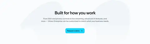
| 3 | cta | Centered heading and supporting copy with a single demo-request action. | request a demo | soft pale backdrop, centered text, cyan CTA |
| 4 | feature-grid | Dark full-width band with centered heading and six feature cards in three columns. | feature discovery, learn-more links | dark section, media thumbnails, three-column cards |
| 5 | feature-split | Light section with heading and CTA above a portrait media card beside a stacked audience list. | audience selection, signup CTA | two-column split, portrait video, icon-led list |
| 6 | testimonials | Pale gray horizontal band with a row of compact review cards. | customer quotes, ratings | testimonial cards, reviewer details, star ratings |
| 7 | feature-split | Dark section with left-aligned copy and an accordion-style feature list beside video preview. | expandable feature details, AI answers CTA | dark band, plus toggles, video preview |
| 8 | feature-split | Light enterprise copy and credentials above a wide rounded video. | learn-more CTA, credential scanning | security icon grid, wide video, left-aligned copy |
| 9 | gallery | Dark full-width section with left-aligned introduction and a broad multi-column thumbnail gallery. | discover staff picks, browse creator work | dark gallery, mixed thumbnail crops, staff-pick badges |
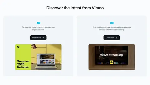
| 10 | content-feed | Centered title above two light-toned release cards in a two-column layout. | learn more links, product updates | release cards, New badges, media previews |
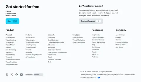
| 11 | footer | Light footer with an upper support and signup area followed by multiple columns of grouped links. | free signup, contact support, site navigation | multi-column link groups, compact actions, legal and social row |
---
本文件由 AI 辅助生成:数值取自公开网页的实测样式,命名、用途说明与建议为模型解读。商标归原所有者。
Generated by Design DNA · https://four.wiralomi.com/style/vimeo-com