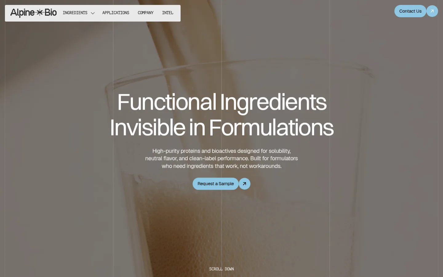
North star · Keep the interface quiet and editorial, letting ingredient photography lead while reserving color for clear calls to action and section changes.
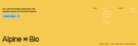
The visual strategy balances scientific restraint with tactile ingredient imagery. A light gray canvas (#f5f5f5) carries most content, with warm cream (#f8f4e6) reserved for a contact invitation and pale gray (#e9e9e9) used on ingredient tiles and navigation details. Black typography establishes a direct hierarchy; muted black and white text variants adapt to light panels and the darkened hero photograph. Yellow (#f7ca50) is a strong footer band rather than a general-purpose highlight, while sky blue (#8ec7e2) marks compact calls to action and small directional controls. Switzer and Geist give headings and body copy a contemporary sans-serif character; PT Mono adds technical, uppercase labels. The page uses broad, calm section fields, compact controls, and large editorial headlines. Photography supplies most of the texture, with a subdued overlay supporting legibility over the full-screen hero.
Main body copy, secondary headings, and general interface text.
Aa 设计
Switzer
网络字体 · 字重 500 / 400 · 占比 10%
免费替代:Manrope
Display headline, hero title, and selected prominent section headings.
Aa 设计
PT Mono
网络字体 · 字重 400 · 占比 9%
免费替代:IBM Plex Mono
Small technical labels, navigation captions, and uppercase metadata.
角色
示例
字号
字重
行高
字距
特大标题
Oversized hero headline over the opening image.
Alpine Bio
76px
400
1.1
-0.05em
一级标题
Primary page headline when a section needs top-level emphasis.
Alpine Bio
48px
400
1.1
-0.05em
二级标题
Prominent section titles, including introduction or showcase headings.
Alpine Bio
42px
400
1.2
-0.05em
三级标题
Secondary feature or ingredient titles.
Alpine Bio
32px
400
1.2
-0.05em
四级标题
Compact subheadings and emphasized supporting labels.
The quick brown fox 敏捷的狐狸
22px
500
1.2
-0.05em
正文
Introduction copy, explanatory text, and CTA supporting copy.
The quick brown fox 敏捷的狐狸
15px
400
1.35
-0.03em
辅助文字
Small uppercase section labels and image captions.
The quick brown fox 敏捷的狐狸
13px
400
1.2
-0.04em
导航
Uppercase main navigation labels.
The quick brown fox 敏捷的狐狸
13px
400
1.2
-0.04em
代码
Technical-style uppercase microcopy and metadata.
const style = 1;
13px
400
1.2
-0.04em
间距与布局
基准单位 2px · 密度:紧凑
32px版块间距
10px元素间距
—卡片内边距
1392px内容最大宽度
2px
4px
8px
10px
12px
16px
20px
24px
32px
48px
64px
The page is organized as a vertically stacked sequence of broad full-width bands, with a full-bleed image hero followed by open introduction, ingredient tiles, application photography, contact CTA, and footer. Content uses a measured maximum width of 1392px; the screenshot shows generous horizontal fields with compact controls and restrained column groupings. Headings and the hero copy are centrally aligned, while supporting content and footer details shift to left-aligned, multi-column arrangements. The measured spacing system is compact, but section changes provide visual breathing room.
圆角与层次
按钮 · 3px
导航 · 4px
没有测到阴影:页面是扁平的,层次靠底色和描边区分。
The interface is predominantly flat, relying on large color fields and image contrast instead of shadows. Measured shadow styles are absent. Light gray tile surfaces and the cream CTA band distinguish sections without visible borders; navigation and buttons use subtly rounded corners, while pill-like blue controls and circular arrow buttons create small layered accents.
组件
下面的预览按实测的按钮、输入框、徽标、卡片样式重建(字体用替代字体)。
Floating navigation
A pale, compact rounded panel at the hero’s upper left holds the logo and uppercase monospace navigation; a separate blue contact pill and circular arrow sit at the upper right.
Hero
Full-bleed ingredient photography is darkened behind a large centered white headline, concise supporting copy, a blue sample CTA, and a small scroll cue.
Ingredient tiles
Three pale gray rectangular tiles pair monochrome icons with concise ingredient or pipeline labels and small circular affordances.
Application gallery
A horizontal row of large photographic use-case cards, with small captions and compact carousel controls, sits within a light section.
CTA band
A centered contact invitation uses a warm cream field, small mono label, dark heading, and compact blue action control.
Footer
A saturated yellow closing band combines a sample prompt, small grouped links, a large black wordmark, and fine-print legal text.
Imagery · Photography carries the page’s sensory character: the hero uses a close-up of a pale ingredient or formulation, darkened to support white centered text. Lower application cards show food and beverage use cases in close, tactile crops. Ingredient tiles pair simple monochrome line icons with short labels. Images are rectangular and edge-aligned; no prominent gradients or decorative 3D effects define the identity.
Let large, high-quality ingredient photography anchor the hero.
Keep headline typography clean, large, and tightly tracked.
Use PT Mono for small uppercase labels and navigation.
Reserve Alpine Blue for compact, actionable controls.
Use cream and yellow as distinct section fields, not scattered decoration.
✕ 不该做
Do not add gradients or prominent drop shadows.
Do not turn every section into a bordered card.
Do not use the footer yellow as a general highlight color.
Do not let hero copy compete with the background photograph.
Do not replace the restrained palette with saturated multicolor UI.
Do not make technical labels large or sentence-case.
给 AI 的提示词
想快速出一个同风格的新页面,把这段话连同 DESIGN.md 一起发给 AI。
Build a new Alpine Bio page using a calm, scientific editorial style. Use Soft Canvas (#f5f5f5) as the primary content background, Carbon Ink (#000000) for strong text, and Graphite (#1e1e1f) for supporting copy. Set Warm Cream (#f8f4e6) aside for a clear CTA band, Harvest Yellow (#f7ca50) for a distinct footer field, and Alpine Blue (#8ec7e2) for compact action pills and arrow controls; use Cloud Gray (#e9e9e9) for restrained tiles. Use Switzer or a close sans-serif for display headings, Geist-like sans-serif for body text, and PT Mono-like uppercase labels. Pair full-bleed, subdued ingredient photography with centered hero copy, then use spacious section bands, simple icon-led ingredient tiles, and close-cropped application imagery. Keep surfaces flat, corners subtly rounded, and controls compact.