North star · Keep the interface calm and spacious: use evergreen for decisive actions, let warm pale surfaces dominate, and treat product visuals as the focal points.
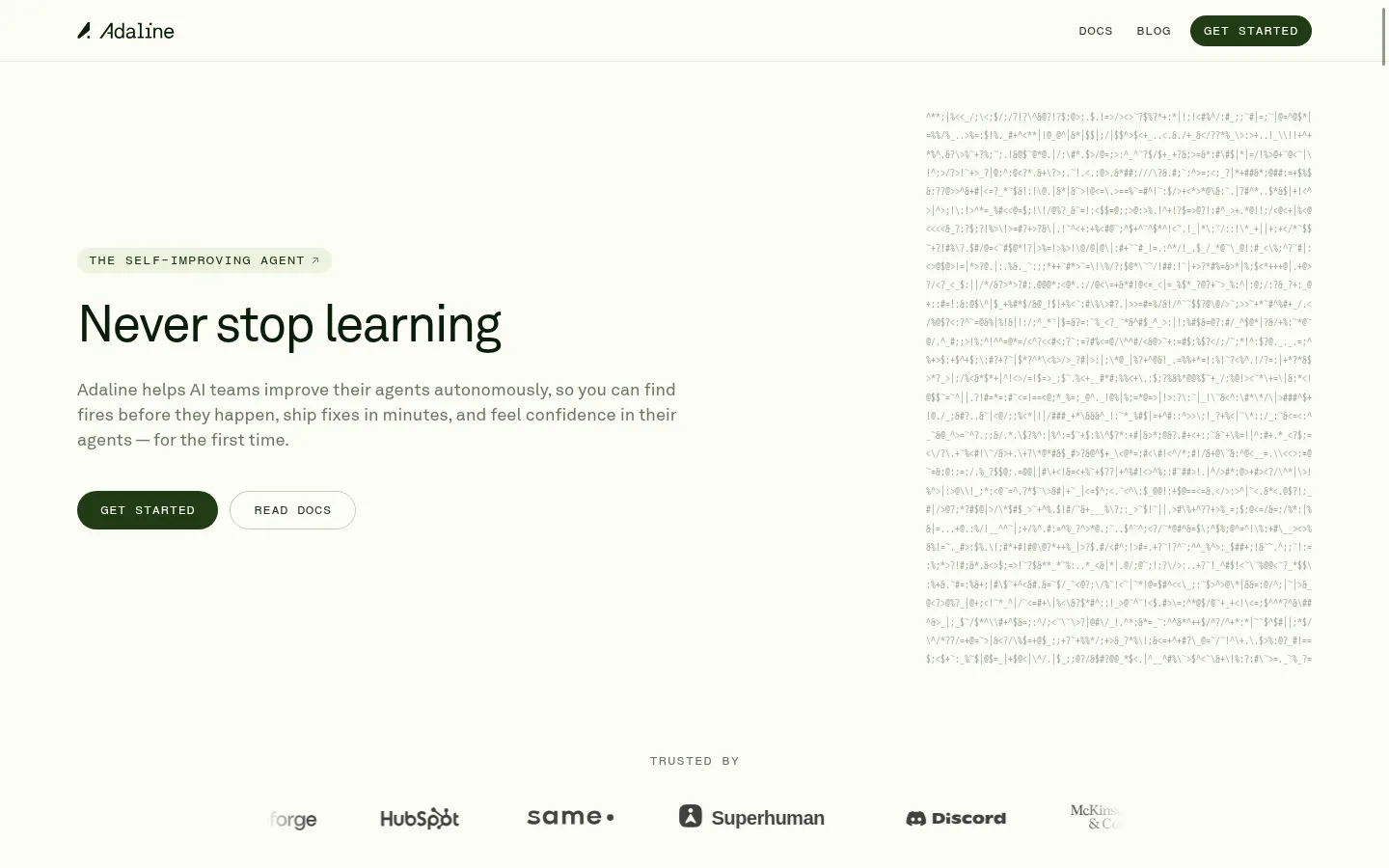
The page is anchored by a warm, near-white canvas (#fbfdf6), with soft green-gray surfaces and fine muted borders providing structure without making the interface feel boxed in. Deep evergreen marks the main text and primary actions; subdued gray-green supports paragraphs, utility text, and secondary details. The opening hero places a large, clean headline and compact calls to action on the left, balancing a vertical field of faint code-like text on the right. Akkurat supplies the readable sans-serif voice, while Fragment Mono and GT America Mono add a precise technical register to buttons, labels, and code. Product sections use broad media panels and concise copy, alternating content with ample breathing room. Landscape illustrations bring muted, painterly color that is distinct from the core brand palette. Near the bottom, a dark footer treatment creates a deliberate cinematic contrast and gives the page a clear visual endpoint.
Primary interface and editorial sans-serif for body text and headings.
Aa 设计
Fragment Mono
系统字体 · 字重 400 / 500 · 占比 35%
免费替代:IBM Plex Mono
Technical UI voice for calls to action, navigation details, and compact product labels.
Aa 设计
GT America Mono
系统字体 · 字重 400 · 占比 13%
免费替代:IBM Plex Mono
Small code, captions, and product-interface annotations.
Aa 设计
ui-monospace
系统字体 · 字重 400 / 500 / 600 · 占比 2%
免费替代:IBM Plex Mono
System monospace fallback for technical details.
角色
示例
字号
字重
行高
字距
正文
Main explanatory copy and paragraph text.
The quick brown fox 敏捷的狐狸
16px
400
1.5
-0.015em
辅助文字
Tiny supporting captions and compact media annotations.
The quick brown fox 敏捷的狐狸
10px
400
1.2
0
按钮
Text inside calls to action and interface buttons.
The quick brown fox 敏捷的狐狸
10px
400
1.2
0
眉题
Uppercase section labels and small introductory tags.
The quick brown fox 敏捷的狐狸
9px
500
1.22
0.1em
代码
Code-like text and technical product interface details.
const style = 1;
10px
400
1.2
0
间距与布局
基准单位 2px · 密度:宽松
96px版块间距
6px元素间距
20px卡片内边距
1280px内容最大宽度
1px
2px
3px
4px
6px
8px
10px
12px
18px
20px
The page uses a spacious, centered composition within a measured maximum width of 1280px. The hero is a two-column arrangement: headline and actions align left, with a tall code-like visual opposite. Later product features pair concise copy with broad media panels, with generous section gaps separating each story. Most content aligns to a clear left edge rather than using centered marketing copy. The overall density is deliberately low, allowing large uninterrupted canvas areas to carry the rhythm.
圆角与层次
按钮 · 50%
卡片 · 10px
徽标 · 3px
链接 · 50%
hairline · other
hairline · other
inset · button
inset · card
The page is mostly flat: spacing and hairline borders do the structural work rather than heavy shadows. Cards have restrained rounded corners and soft separation from the canvas. Reserve subtle inset or layered treatment for product-interface mockups, with the dark closing visual providing depth through contrast and gradients rather than elevated UI.
组件
下面的预览按实测的按钮、输入框、徽标、卡片样式重建(字体用替代字体)。
Primary CTA
Deep Moss (#203b14) pill-shaped Get Started button with pale text and compact monospaced lettering.
Secondary CTA
Quiet outlined pill link beside the primary action, using a fine muted border and small uppercase mono label.
Eyebrow badge
Small pale green badge above the hero headline with uppercase monospaced text and a subtle directional cue.
Hero code texture
Tall, low-contrast column of code-like characters balances the hero copy without competing with it.
Feature media panel
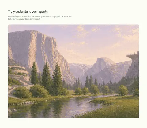
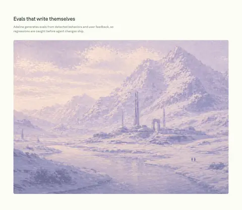
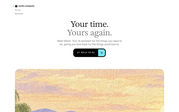
Broad product-section image panel with rounded corners; use muted landscapes or product visuals as the section's visual anchor.
Product interface card
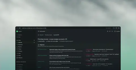
Compact dark software surface with dense mono annotations, restrained borders, and subtle depth against atmospheric imagery.
Trust logo row
Centered, understated customer marks beneath a small mono label; keep logos visually secondary to the hero.
Imagery · Use atmospheric, painterly landscape visuals as large product-section media, framed as broad rounded panels. The hero's pale code-like texture is a subtle technical counterweight, not a high-contrast illustration. Later, a dark interface showcase sits over a cinematic, misty landscape; preserve its subdued treatment and avoid introducing bright, unrelated imagery.
Pair clean sans-serif copy with compact monospace details.
Give each section generous breathing room.
Use broad media panels to anchor feature stories.
Keep borders subtle and shadows restrained.
✕ 不该做
Do not make the page feel dense or dashboard-like.
Do not use bright colors as primary brand accents.
Do not let the technical texture overpower the hero.
Do not add heavy shadows to ordinary cards.
Do not center every heading and paragraph.
Do not treat illustration colors as core brand colors.
给 AI 的提示词
想快速出一个同风格的新页面,把这段话连同 DESIGN.md 一起发给 AI。
Build a new page in Adaline’s calm, product-led visual style. Use Gallery Cream (#fbfdf6) as the main canvas, Forest Ink (#2e4320) for prominent text, and Deep Moss (#203b14) for primary pill-shaped actions with pale text. Keep supporting copy in Olive Text (#6a795f), with Quiet Border (#e4e7df) used sparingly for hairlines. Use Akkurat or Inter for editorial copy; reserve Fragment Mono or IBM Plex Mono for compact labels, buttons, and technical details. Create a clear left-aligned content hierarchy, generous whitespace, and broad media-led feature sections. Use muted atmospheric visuals rather than vivid stock imagery. Keep cards mostly flat, adding only subtle separation. A dark closing section may use the measured near-black greens, but keep those colors out of the main light canvas.