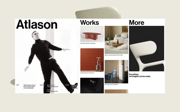
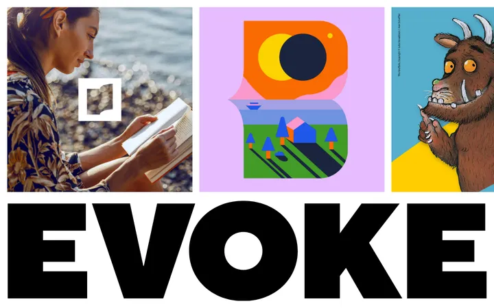
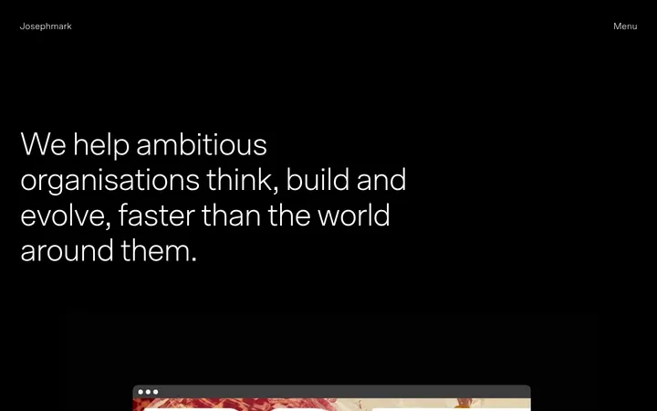
North star · Keep the stone canvas quiet and spacious so craft photography and refined uppercase serif headings carry the story.
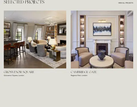
The visual strategy is restrained and editorial: a warm stone canvas (#e0ded8) runs through most of the page, letting workshop and interior photographs provide the changing colour and texture. Dark charcoal (#262626) carries body copy and headings, while deep oxblood (#38141b) anchors the opening full-bleed workshop video and the navigation treatment. A near-black shade appears as part of the hero overlay rather than a general content colour; white is reserved for legibility over the darkened video. Display headings use an elegant uppercase serif with generous tracking, set against compact, plain sans-serif copy. The layout alternates quiet, spacious text-and-image splits with broader photographic moments. Project imagery is arranged in a simple two-column presentation, with titles and location captions kept close to each image. The page feels comfortable rather than dense: broad section pauses, open stone-coloured fields, and little visible decoration keep attention on materials, people, and finished interiors.
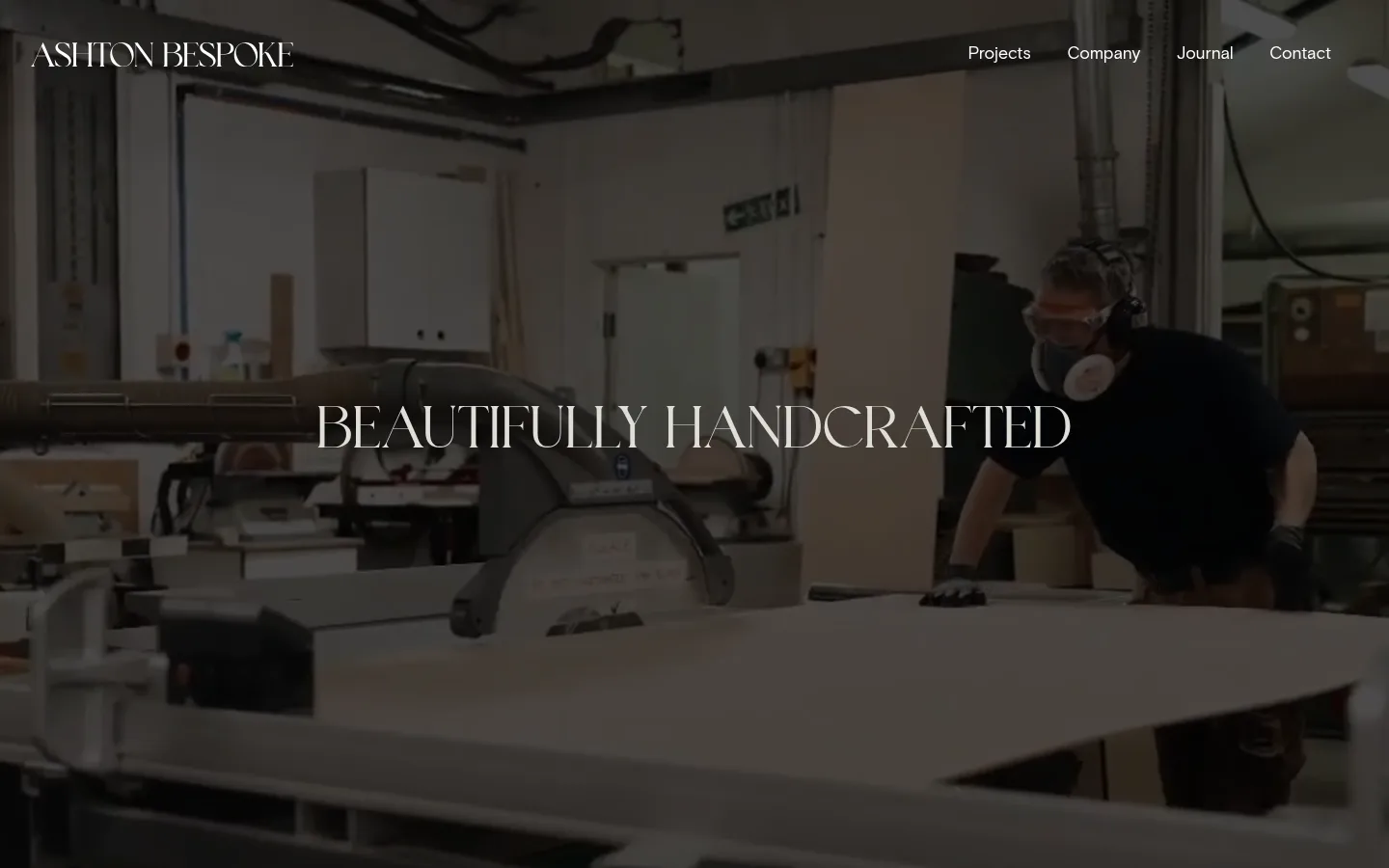
Large centered uppercase statement over the opening workshop video.
Ashton Bespoke
60px
500
1.1
0.017em
一级标题
Primary page-level uppercase serif heading.
Ashton Bespoke
46.5px
500
1.1
0.022em
二级标题
Editorial section headings in the text-and-image blocks.
Ashton Bespoke
32px
500
1.1
0.031em
正文
Descriptive copy explaining craft, process, and services.
The quick brown fox 敏捷的狐狸
17.5px
400
1.3
0
辅助文字
Compact uppercase labels and small project metadata.
The quick brown fox 敏捷的狐狸
15px
400
1.1
0.021em
导航
Simple navigation links over the hero.
The quick brown fox 敏捷的狐狸
17.5px
400
1
0
眉题
Uppercase introductory or supporting section label.
Ashton Bespoke
32px
500
1.1
0.031em
间距与布局
基准单位 4px · 密度:适中
60px版块间距
6px元素间距
—卡片内边距
1360px内容最大宽度
1px
3px
4px
5px
6px
8px
12px
16px
18px
20px
24px
32px
40px
48px
60px
Use a centered content frame capped at the measured 1360px maximum width, with comfortable spacing and generous section pauses. The opening is full bleed; subsequent sections sit on the stone canvas in mostly single-column or two-column arrangements. Align split-section copy to the left and let images balance it rather than placing everything in cards. Project features form a simple two-column grid. Preserve broad negative space and avoid dense content packing.
圆角与层次
导航 · 4px
没有测到阴影:页面是扁平的,层次靠底色和描边区分。
The page is predominantly flat, with no measured shadow system or visible card treatment. Separate content through open space and image placement rather than borders. The navigation uses a dark gradient treatment, while the hero video is darkened to support overlaid text. A small measured radius is associated with navigation only.
组件
下面的预览按实测的按钮、输入框、徽标、卡片样式重建(字体用替代字体)。
Hero video
Full-bleed workshop footage with a dark overlay, centered uppercase serif statement, and navigation over the image.
Overlay navigation
White text links across the dark hero treatment; keep the navigation quiet and visually light.
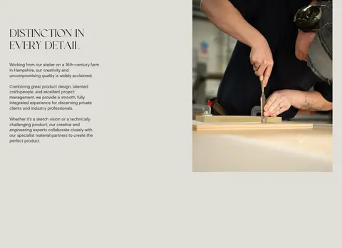
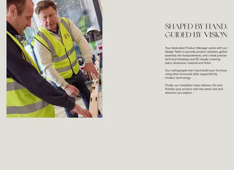
Editorial feature split
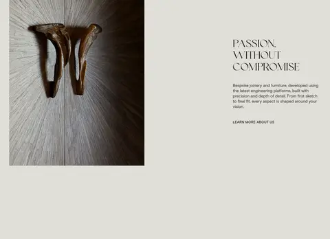
Pair a craft or process image with left-aligned serif heading, concise body copy, and a plain text link where appropriate.
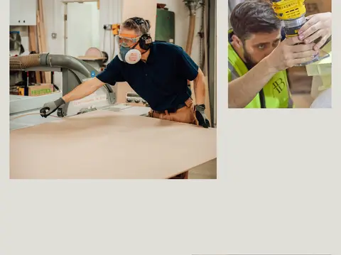
Process image spread
Arrange workshop photographs in an open two-column composition without enclosing cards.
Project gallery
Present selected interiors in two columns, with uppercase serif project titles and small location captions.
Imagery · Use authentic workshop video and photography of makers, tools, materials, joinery details, and completed interiors. The hero is full bleed with a dark overlay for readable white navigation and centered serif text. Content images sit directly within the stone layout, often in asymmetrical split compositions; project photography is larger and cleanly paired with short captions. Imagery supplies most of the page's colour.
Use Workshop Stone (#e0ded8) as the dominant content canvas.
Reserve Oxblood (#38141b) for the dark opening and dark surface moments.
Set display headings in an uppercase, tracked serif.
Keep body copy in a clean, unembellished sans-serif.
Let real workshop and interior photography define the visual texture.
Use open space to separate sections instead of card borders.
✕ 不该做
Do not introduce bright accent colours absent from the measured palette.
Do not turn every image and text group into a card.
Do not use heavy shadows or decorative borders.
Do not crowd the page with dense copy or controls.
Do not use white as the main content canvas.
Do not let the hero text compete with the workshop footage.
给 AI 的提示词
想快速出一个同风格的新页面,把这段话连同 DESIGN.md 一起发给 AI。
Build a new page in the Ashton Bespoke visual style: quiet, spacious, and focused on skilled making. Use Workshop Stone (#e0ded8) as the main canvas and Charcoal Ink (#262626) for text. Use Oxblood (#38141b) for a dark hero or navigation surface, with white text only where it sits over that dark treatment; Blackened Merlot (#110608) belongs in the dark overlay gradient. Pair elegant, tracked uppercase serif headings with plain sans-serif body copy. Structure content as open editorial splits, broad photography-led moments, and a clean two-column project gallery. Choose authentic workshop, material, and finished-interior photography. Keep surfaces flat, avoid decorative cards and shadows, and use generous measured spacing rather than invented visual ornament.