North star · Balance cinematic imagery and generous editorial whitespace with a precise mono-text voice and deliberate orange accents.
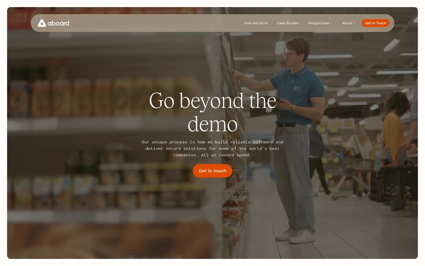
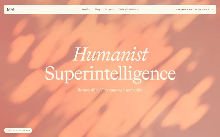
The visual strategy alternates calm, light editorial sections with a deep near-black process narrative and a high-energy orange contact/footer finish. The hero is a full-bleed video with a darkened treatment, centered white serif headline, compact monospaced copy, and orange pill CTA. Tobias supplies the elegant, lightweight display voice; Atkinson Hyperlegible Mono gives body copy a technical, deliberate texture, while Work Sans handles navigation and controls. Layouts favor broad whitespace, clear two-column text blocks, centered headings in the company section, and image-led storytelling rather than dense card grids. The case-study band uses warm parchment, followed by a soft off-white company section and saturated orange contact area. Thin rules and restrained outlines separate sections; the page relies on contrast, photography, and generous spacing rather than shadows.
Body copy, captions, and technical-feeling explanatory text.
Aa 设计
Tobias
网络字体 · 字重 300 · 占比 12%
免费替代:Cormorant Garamond
Display and section headings, with a refined editorial serif voice.
Aa 设计
Work Sans
网络字体 · 字重 400 / 500 · 占比 5%
免费替代:Work Sans
Navigation and buttons.
角色
示例
字号
字重
行高
字距
特大标题
Large centered hero headline over the video.
Aboard
72px
300
1.1
-0.02em
一级标题
Primary page headline and major section headings.
Aboard
40px
300
1.1
-0.02em
二级标题
Section titles and secondary editorial headings.
Aboard
32px
300
1.3
0
三级标题
Supporting subsection and case-study titles.
The quick brown fox 敏捷的狐狸
24px
300
1.3
0.02em
正文
Explanatory paragraphs and descriptive content.
The quick brown fox 敏捷的狐狸
14px
400
1.57
-0.02em
辅助文字
Small supporting labels and metadata.
The quick brown fox 敏捷的狐狸
12px
300
1.83
-0.02em
按钮
Contact and secondary action labels.
The quick brown fox 敏捷的狐狸
16px
500
1.63
-0.02em
导航
Compact header navigation labels.
The quick brown fox 敏捷的狐狸
12px
400
1.17
-0.02em
代码
Technical or process-oriented explanatory copy.
const style = 1;
14px
400
1.57
-0.02em
间距与布局
基准单位 4px · 密度:宽松
64px版块间距
64px元素间距
—卡片内边距
1120px内容最大宽度
2px
3px
4px
8px
10px
12px
16px
20px
24px
32px
40px
64px
120px
The page uses a spacious, editorial rhythm with a measured max content width of 1120px and broad section gaps. The hero and process story use full-bleed media or dark canvas, while content sections shift to two-column reading layouts. The company section centers its heading and arranges copy and client marks below. Density stays low: short text blocks, large open areas, and distinct horizontal bands make the long homepage easy to scan.
圆角与层次
按钮 · 9999px
导航 · 4px
链接 · 8px
没有测到阴影:页面是扁平的,层次靠底色和描边区分。
The design is predominantly flat: section backgrounds and full-bleed media establish depth instead of shadows. Fine horizontal rules divide the dark narrative and orange footer areas. Rounded pill buttons and the rounded navigation container are the main soft-edged elements; avoid adding card shadows or layered panels.
组件
下面的预览按实测的按钮、输入框、徽标、卡片样式重建(字体用替代字体)。
Floating navigation
Compact Work Sans links sit inside a translucent light rounded bar over the hero video; the contact action is a small orange pill.
Hero
Full-bleed video with dark overlay, centered lightweight serif headline, mono supporting copy, and a prominent orange contact pill.
Process narrative
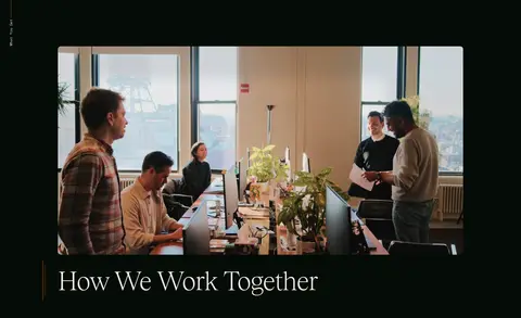
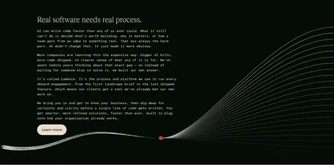
Near-black section pairs workplace imagery and serif headings with narrow mono paragraphs, a pale secondary pill CTA, and a delicate wave motif.
Case-study band
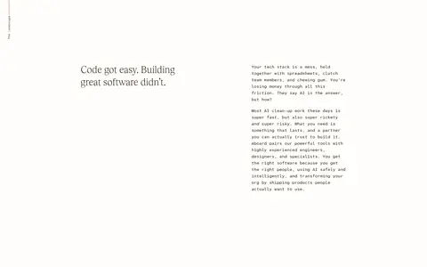
Warm parchment section presents client solutions in a two-column, image-led layout with editorial headings and minimal card framing.
Company and client marks
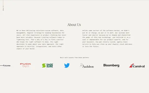
Soft off-white section centers its heading, places two text columns beneath, and finishes with a horizontal client-logo row.
Contact form
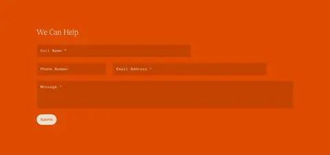
Orange full-width band with a serif heading, wide darkened form fields, and a small pale submit pill.
Footer
Orange footer separated by a thin rule, with brand mark, compact multi-column link lists, and oversized low-contrast wordmark treatment.
Imagery · The hero is full-bleed video, darkened enough for white type to remain legible. Later content uses large workplace photography and client imagery, especially in the process and case-study sections. A fine wave-like graphic appears as a decorative process motif; it is secondary to photography. Keep image framing broad and editorial, with restrained overlays rather than cards or heavy effects.
Use Tobias-style lightweight serif for major headlines.
Keep explanatory copy in a legible mono face.
Let full-width imagery define major transitions.
Use orange for decisive contact actions and the closing band.
Alternate light editorial sections with the dark process section.
Separate long sections with subtle rules and open space.
✕ 不该做
Do not turn every section into a card grid.
Do not add drop shadows to flat content blocks.
Do not use orange as a general text color.
Do not crowd the hero with extra controls or copy.
Do not replace the editorial serif with heavy geometric headings.
Do not invent colors outside the measured palette.
给 AI 的提示词
想快速出一个同风格的新页面,把这段话连同 DESIGN.md 一起发给 AI。
Build a new Aboard-style page with an editorial, cinematic feel. Use Forest Ink (#040c06) for a deep narrative canvas, Gallery White (#fffefb) for light sections and reverse text, Soft Parchment (#fbf3ec) for warm content bands, and Signal Orange (#de4c00) for primary actions and a bold closing contact area. Set large headings in a light Tobias-like serif, supporting copy in a compact mono face, and navigation/buttons in Work Sans. Use full-width video or photography with restrained dark overlays, then return to spacious two-column editorial layouts. Keep section transitions clear, favor thin divider rules over shadows, and reserve rounded shapes for pills and the navigation container. Maintain broad whitespace and avoid dense card grids.