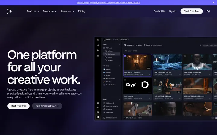
North star · Keep the page anchored in a continuous midnight canvas, using bold white type and restrained pink-blue accents to make product interfaces the brightest focal points.
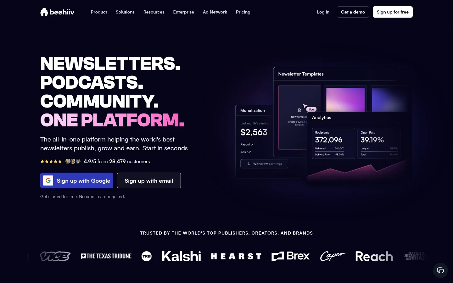
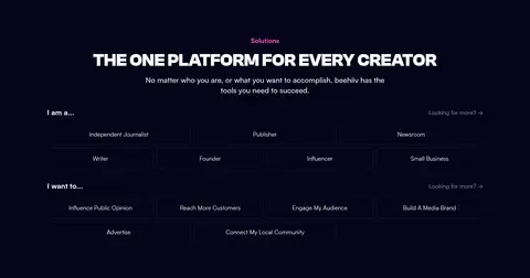
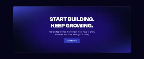
The page uses a near-black violet canvas throughout, giving the long homepage a continuous, immersive backdrop rather than alternating light and dark bands. White and pale-lavender typography carries most of the content, while saturated blue and pink accents highlight links, interface frames, and selected words. Display headlines are heavy, uppercase, and compact; supporting copy uses a calmer sans serif with comfortable line spacing. The hero pairs a left-aligned message and signup actions with overlapping product dashboards on the right, followed by a compact publisher-logo strip. Below, repeated product showcases, pricing cards, feature tiles, testimonials, and FAQs establish a clear modular rhythm. Generous vertical breathing room separates sections, while thin violet-gray borders define cards and FAQ rows. Product screenshots remain bright, rectangular focal points against the dark canvas; subtle glows and gradients make them feel integrated without turning the page into a decorative effects showcase.
配色
点色块复制色值。用途说明来自对页面的实测位置(背景、文字、描边、按钮)与截图判读。
品牌色
强调色
表层色
中性色
功能色
页面底色 · Midnight Canvas表层 · Signal White主文字 · Signal White次要文字 · Cool Silver弱文字 · Muted Lavender描边 · Slate Violet强调 · Neon Orchid强调 2 · Electric Indigo强调 3 · Periwinkle Glow
Primary interface and reading type: navigation, body copy, labels, links, buttons, and supporting headings.
Aa 设计
ClashGroteskFont
网络字体 · 字重 700 · 占比 5%
免费替代:Space Grotesk
Display headlines and major section titles.
角色
示例
字号
字重
行高
字距
特大标题
Oversized uppercase campaign headline and major hero statement.
beehiiv
60px
700
1
0
一级标题
Large uppercase section titles, including feature, pricing, FAQ, and CTA headings.
beehiiv
48px
700
1
0
二级标题
Supporting section headings and prominent product-card titles.
The quick brown fox 敏捷的狐狸
24px
500
1.33
0
正文
Hero description, explanatory feature copy, and testimonial text.
The quick brown fox 敏捷的狐狸
20px
500
1.4
0
辅助文字
Supporting notes, card details, and compact descriptive copy.
The quick brown fox 敏捷的狐狸
16px
500
1.5
0
按钮
Signup actions and other prominent calls to action.
The quick brown fox 敏捷的狐狸
18px
500
1.56
0
导航
Header navigation labels and menu items.
The quick brown fox 敏捷的狐狸
14px
600
1.43
0
链接
Inline actions such as feature links and footer destinations.
The quick brown fox 敏捷的狐狸
16px
400
1.5
0
眉题
Small uppercase feature categories and section labels.
The quick brown fox 敏捷的狐狸
14px
700
1.43
0.08em
间距与布局
基准单位 8px · 密度:适中
64px版块间距
16px元素间距
24px卡片内边距
1184px内容最大宽度
4px
8px
10px
12px
16px
24px
32px
40px
64px
96px
128px
A long, vertically paced landing page sits on a consistent dark canvas within a centered content region capped at the measured 1184px. The hero aligns copy left and layered product UI right, with a logo strip below. Feature showcases repeat a compact text-and-action row above wide interface imagery. Pricing uses three parallel cards; later blocks shift to two-column tiles, testimonial panels, and multi-column link groups. Section spacing follows the measured 64px rhythm, with comfortable density and clear breathing room.
圆角与层次
按钮 · 12px
卡片 · 8px
图片 · 50%
导航 · 6px
链接 · 12px
md · card
md · button
The overall treatment is mostly flat: the dark canvas does the work, while thin violet-gray borders define cards, pricing columns, and FAQ separators. Product panels gain depth through overlapping interface layers and restrained glow rather than heavy drop shadows. Keep CTA contrast clear and avoid introducing broad, light-colored card surfaces.
组件
下面的预览按实测的按钮、输入框、徽标、卡片样式重建(字体用替代字体)。
Header navigation
Compact horizontal nav on the dark canvas, with muted light labels, a restrained demo action, and a high-contrast white signup button.
Hero signup group
Large uppercase statement, supporting copy, customer-rating proof, and adjacent blue Google signup and outlined email actions.
Product showcase
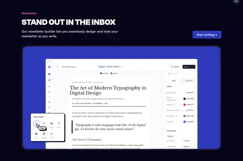
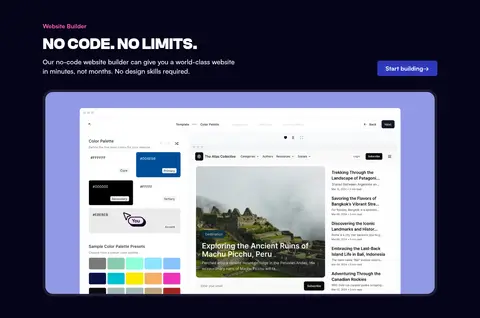
Eyebrow and uppercase heading sit above a short description and action link; a large bright product UI image anchors the section.
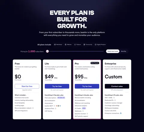
Pricing cards
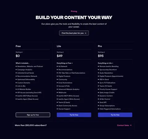
Three aligned dark plan cards use fine violet borders, white pricing copy, feature lists, and contrasting signup actions.
Feature tile grid
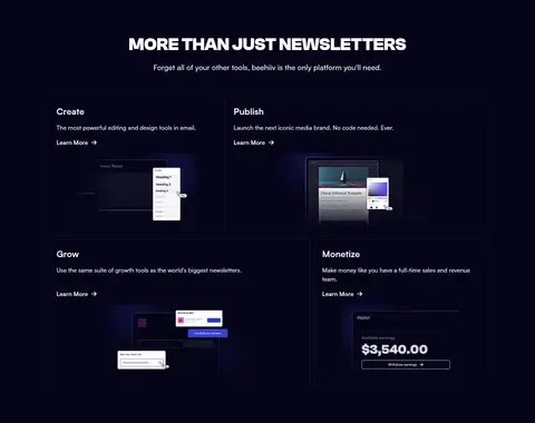
A two-column set of dark bordered content tiles pairs concise headings and links with small product UI illustrations.
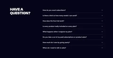
FAQ list
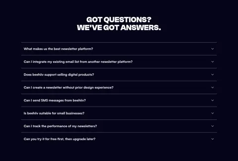
Centered bold title above stacked questions, each separated by a thin slate-violet hairline and ending in a compact disclosure icon.
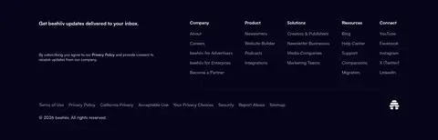
Footer link columns
Dense but ordered multi-column navigation and legal links, with subdued text and a short newsletter signup prompt.
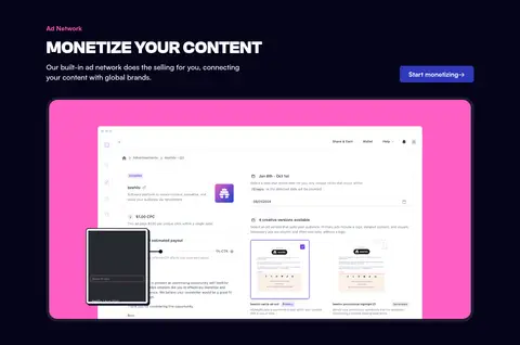
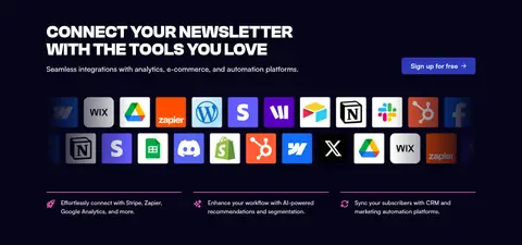
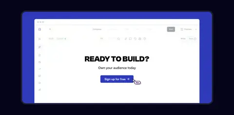
Imagery · The page relies on product screenshots and interface mockups rather than lifestyle photography. Bright newsletter, website-builder, and monetization interfaces are framed by saturated blue or pink panels, then layered with smaller floating controls or dashboard cards. Brand logos and integration marks form compact supporting strips. Keep real UI surfaces crisp and legible; dark surroundings, faint edge glow, and occasional gradient framing provide contrast without flattening the product detail.
Use the midnight canvas as the page-wide foundation.
Set major display headlines in bold uppercase.
Reserve vivid blue and pink for emphasis and action.
Show product interfaces as bright focal points.
Use thin borders to define dark cards and FAQ rows.
Keep generous space between major page sections.
✕ 不该做
Do not alternate the page into large light-background bands.
Do not use accent colors for long passages of body text.
Do not overdecorate interfaces with strong shadows.
Do not make every section a centered card grid.
Do not soften display headlines into lightweight title case.
Do not mistake colors inside product mockups for brand surfaces.
给 AI 的提示词
想快速出一个同风格的新页面,把这段话连同 DESIGN.md 一起发给 AI。
Build a new SaaS page using beehiiv’s dark editorial visual system. Use Midnight Canvas (#060419) continuously as the main background, with Signal White (#ffffff) for primary text and Lilac Mist (#f7f5ff) or Cool Silver (#d9dbdf) for secondary copy. Set oversized section headlines in a heavy uppercase display face; use a clean sans serif for body, navigation, and actions. Apply Electric Indigo (#2f39ba) and Neon Orchid (#ff5ec4) selectively to CTAs, links, labels, and interface framing. Keep content in a centered, measured-width layout with generous section breathing room. Pair concise feature copy with crisp, bright product UI imagery, and use fine Slate Violet (#4e4e6c) borders for cards and dividers. Favor layered mockups over decorative illustration, and keep elevation restrained.