North star · Let clear navy typography and generous white space lead; use blue-violet glow and product mockups only to support the story.
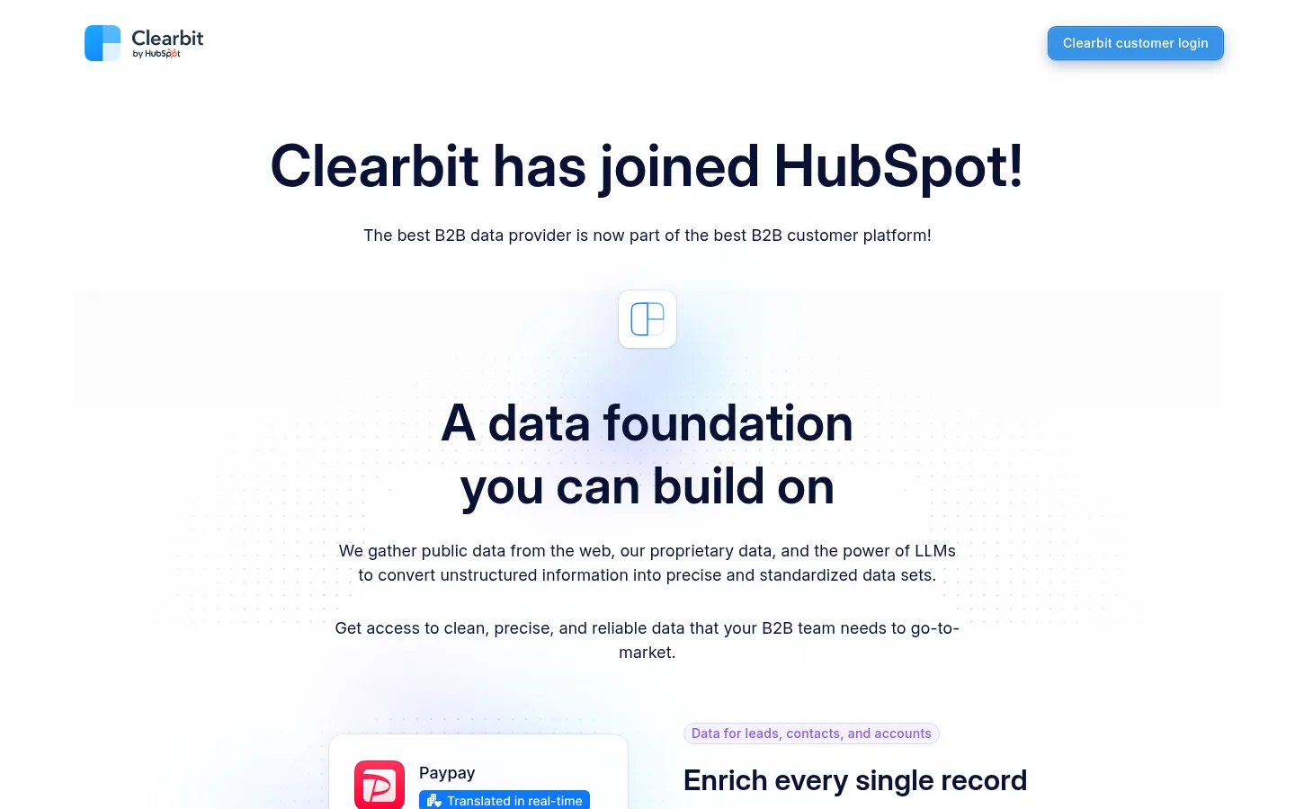
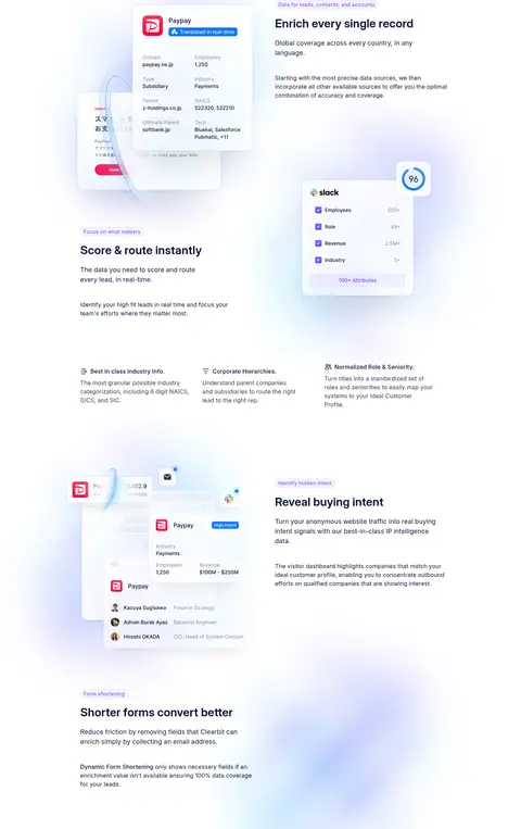
The visual strategy is built on a white canvas and deep navy typography, with muted gray supporting copy and sparse violet accents. A bright blue login CTA provides the strongest functional color cue; lavender badge styling marks short feature labels rather than large sections. Inter Variable gives the page a consistent, modern voice, using large centered headlines for the opening and smaller, left-aligned headings for feature stories. The content sits in a centered, constrained column, while the long feature sequence alternates text and product-interface imagery to maintain a measured editorial rhythm. Generous whitespace separates the announcement, capability overview, feature examples, and footer. Product mockups are layered over pale blue and violet atmospheric glows, but these gradients stay soft and subordinate to the interface details. Hairline borders and subtle shadows define badges and floating UI without turning the page into a card-heavy dashboard.
配色
点色块复制色值。用途说明来自对页面的实测位置(背景、文字、描边、按钮)与截图判读。
品牌色
强调色
表层色
中性色
功能色
页面底色 · Cloud White主文字 · Midnight Ink次要文字 · Slate Copy描边 · Lavender Line强调 · Focus Violet强调 2 · Signal Blue
All headings, body copy, labels, navigation, and buttons.
角色
示例
字号
字重
行高
字距
特大标题
Large central statement introducing the data foundation.
Clearbit
64px
600
1.25
0.004em
一级标题
Primary announcement headline at the top of the page.
Clearbit
56px
600
1.25
0.004em
二级标题
Feature titles such as enrichment and buying intent.
Clearbit
32px
600
1.25
0.008em
正文
Supporting explanations and feature descriptions.
The quick brown fox 敏捷的狐狸
16px
400
1.5
0.016em
辅助文字
Compact badge labels and small secondary text.
The quick brown fox 敏捷的狐狸
14px
500
1.25
0.018em
按钮
Customer-login CTA label.
The quick brown fox 敏捷的狐狸
14px
500
1.43
0.018em
间距与布局
基准单位 8px · 密度:适中
64px版块间距
8px元素间距
—卡片内边距
996px内容最大宽度
2px
8px
16px
20px
24px
44px
48px
64px
80px
128px
142px
Use a centered page frame with a measured maximum width of 996px. The opening announcement and data-foundation statement are centered; subsequent feature stories shift into a two-column split, pairing copy with product imagery and alternating emphasis down the page. Keep the overall density comfortable, with broad whitespace between blocks and a measured section gap of 64px. Feature details may break into smaller supporting columns. Finish with a compact, single-row footer rather than a large closing panel.
圆角与层次
按钮 · 8px
徽标 · 9999px
md · button
hairline · other
The page is mostly flat: white canvas, minimal surface changes, and no heavy card system. Use light hairline treatment around compact UI elements and badges. Product mockups can sit above the background with restrained shadows; reserve the stronger blue-accent shadow treatment for the customer-login button.
组件
下面的预览按实测的按钮、输入框、徽标、卡片样式重建(字体用替代字体)。
Customer login CTA
Use a #127ee3 button with white text, 14px medium InterVar, an 8px radius, and measured 8px 16px padding.
Feature label badge
A compact pill using #f5f3ff fill, #8b5cf6 text, a 1px solid #ddd6fe border, and a 9999px radius.
Feature split
Pair a left- or right-positioned product mockup with a concise, left-aligned heading and explanatory copy.
Floating product UI
Present data records and scoring details as layered interface panels with subtle borders, shadows, and soft glow behind them.
Opening announcement
Center the joined-HubSpot headline and its short supporting line near the page top, beneath the compact header.
Footer utility row
Keep brand mark, policy and support links, cookie control, and copyright in a compact single-row layout.
Imagery · Use crisp product-interface mockups instead of lifestyle photography. Show data records, scoring panels, and visitor-intent views as layered UI cards with readable labels and restrained borders. Float the mockups beside feature copy, adding soft pale-blue or violet atmospheric glows behind them. Keep decoration subtle and avoid full-bleed media.
Use navy for the main headline and feature titles.
Center the opening announcement and data-foundation message.
Alternate feature copy and interface mockups down the page.
Use blue for the primary customer-login action.
Reserve lavender for small labels and accents.
Give major content blocks generous breathing room.
✕ 不该做
Do not add large saturated background bands.
Do not turn every feature into a boxed card.
Do not let decorative glows obscure product UI.
Do not use photography where interface examples tell the story.
Do not use violet as a full-page CTA color.
Do not crowd the headline or feature copy.
Do not invent additional palette colors for core UI.
给 AI 的提示词
想快速出一个同风格的新页面,把这段话连同 DESIGN.md 一起发给 AI。
Build a new B2B SaaS page in Clearbit’s restrained product-led style. Use a white canvas (#ffffff), Midnight Ink (#091135) for primary headings, and Slate Copy (#36394a) for supporting text. Keep Signal Blue (#127ee3) for the main action, with Focus Violet (#8b5cf6) and Lavender Line (#ddd6fe) reserved for compact feature badges. Set all type in Inter or InterVar, with bold, sentence-case headings and readable body copy. Center the opening statement, then use alternating text-and-interface feature splits within a constrained centered frame. Create detailed product UI mockups with subtle borders, soft shadows, and pale atmospheric blue-violet glows. Maintain generous whitespace, avoid heavy card framing, and close with a concise utility footer.