North star · Keep the surrounding page quiet and dark so crisp product-interface previews and clear conversion actions carry the visual emphasis.
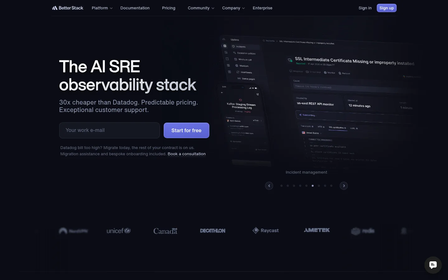
The page uses a near-black canvas (#0f101a) and even darker section surfaces (#0b0c14) to make interface captures and white headings stand out without a bright, high-contrast frame. Muted blue-grays handle supporting copy, navigation, and metadata; pale periwinkle is reserved for links and selected controls, while the brightest violet-blue appears on primary conversion buttons. Helvetica Now Display gives headlines compact authority, paired with the more neutral Helvetica Now Text for body copy and controls. The hero balances a left-aligned promise and email signup against a large, angled product interface on the right. Below, long feature bands repeat a heading, compact explore control, and horizontally arranged product cards. Generous vertical pauses separate sections; fine borders and slightly lifted card surfaces distinguish interface samples without heavy shadows. Customer logos, testimonial cards, and a dense multi-column footer complete the page.
Body copy, navigation, links, captions, and buttons.
Aa 设计
Helvetica Now Display
网络字体 · 字重 500 / 700 · 占比 15%
免费替代:Inter
Primary and secondary section headlines.
角色
示例
字号
字重
行高
字距
一级标题
Hero headline introducing the AI SRE observability stack.
Better Stack
40px
700
0.6
0
二级标题
Feature-section and major conversion headings.
Better Stack
36px
700
1.17
0
三级标题
Product-card titles and smaller content headings.
The quick brown fox 敏捷的狐狸
20px
400
1.2
0
正文
Product descriptions, explanatory copy, and testimonial text.
The quick brown fox 敏捷的狐狸
16px
400
1.5
0
辅助文字
Fine print, product metadata, and secondary annotations.
The quick brown fox 敏捷的狐狸
14px
400
1.55
0
按钮
Compact labels on signup and feature-explore controls.
The quick brown fox 敏捷的狐狸
13px
400
1.6
0
导航
Top-level navigation and footer link groups.
The quick brown fox 敏捷的狐狸
14px
400
1.55
0
链接
Inline actions, product links, and supporting calls to action.
The quick brown fox 敏捷的狐狸
16px
400
1.5
0
间距与布局
基准单位 4px · 密度:宽松
192px版块间距
16px元素间距
20px卡片内边距
1126px内容最大宽度
4px
6px
8px
12px
16px
20px
24px
32px
36px
40px
192px
Use a centered content area with a measured maximum width of 1126px, generous side breathing room, and predominantly left-aligned text. The hero is a two-column composition: signup messaging on the left, product interface on the right. Follow it with customer marks and repeated feature bands containing a section title, compact navigation controls, and product cards. Maintain spacious vertical section breaks, while keeping card interiors and testimonial grids comparatively compact. Finish with a conversion block, social proof, and multi-column footer.
圆角与层次
按钮 · 50%
输入框 · 12px
卡片 · 16px
图片 · 50%
链接 · 16px
inset · button
The design is mostly flat: dark surfaces and fine borders establish grouping instead of pronounced shadows. Product captures sit in layered, subtly differentiated panels; testimonial cards use a slightly raised dark fill and thin outline. Keep elevation restrained, reserving the measured inset highlight for the signup button treatment.
组件
下面的预览按实测的按钮、输入框、徽标、卡片样式重建(字体用替代字体)。
Hero signup form
Left-aligned headline and supporting copy with a dark rounded email input and vivid primary signup button; product UI occupies the opposite side.
Feature band
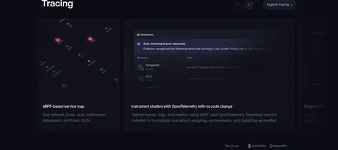
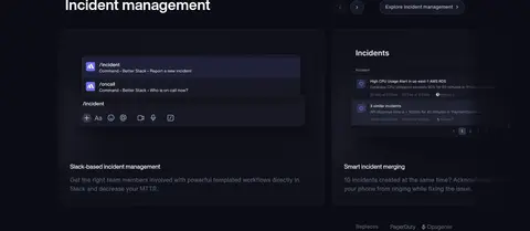
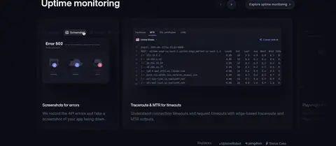
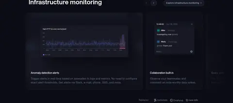
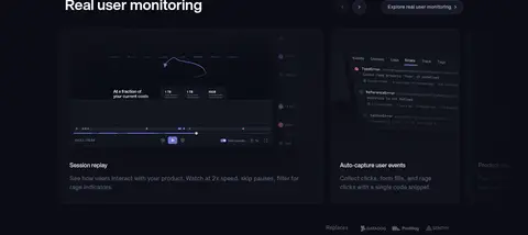
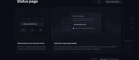
Section heading paired with small carousel controls and an explore pill, followed by product preview cards and concise descriptions.
Product preview card
Dark interface capture above a compact title and muted description, separated from adjacent previews by subtle borders.
Explore pill
Small dark pill control with a restrained outline, pale periwinkle label, and compact text.
Customer logo row
Low-contrast customer marks spread across the page as a quiet credibility cue.
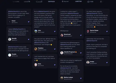
Testimonial card
Raised near-black card with muted review copy, a small author identity, and a subtle accent icon.
Footer link columns
Compact grouped navigation on the dark surface, followed by brand details, contact information, and legal links.
Imagery · Product UI is the primary visual asset: dark dashboards, logs, incident views, maps, and monitoring charts appear as large interface captures inside feature cards. The hero uses a prominent angled dashboard preview rather than lifestyle photography. Keep imagery dark, low-glare, and integrated into the canvas, with lavender highlights visible within charts and controls. Customer logos and testimonial avatars provide small, secondary points of contrast.
Use #0f101a and #0b0c14 as the dominant dark foundations.
Keep primary copy white and supporting copy muted blue-gray.
Reserve vivid lavender and violet-blue for interactive emphasis.
Show realistic product interfaces as the main illustrative content.
Use thin borders to define panels without adding heavy shadows.
Preserve generous vertical pauses between feature bands.
✕ 不该做
Do not introduce bright section backgrounds.
Do not use saturated accents as large background fills.
Do not let product previews overpower the surrounding page hierarchy.
Do not replace product UI with lifestyle photography.
Do not add heavy shadows or decorative gradients across every section.
Do not center all headings; the page is primarily left-aligned.
给 AI 的提示词
想快速出一个同风格的新页面,把这段话连同 DESIGN.md 一起发给 AI。
Build a new page in Better Stack’s dark, product-led visual style. Use Deep Canvas (#0f101a) for the page and Midnight Surface (#0b0c14) for broad section bands. Set headings in a bold Helvetica Now Display-like sans serif and body, navigation, and controls in an Inter-like text face. Keep primary text white, supporting copy Blue Gray Text (#939db8) or Slate Caption (#646e87), and reserve Lavender Signal (#98a4f7) or Frosted Periwinkle (#c9d3ee) for links and control labels. Structure the hero as left-aligned copy and signup beside a prominent dark product-interface preview. Repeat spacious feature bands with preview cards, thin borders, compact explore pills, and concise descriptions. Use understated customer proof, restrained layering, and a dense multi-column footer; avoid bright surfaces and heavy shadows.