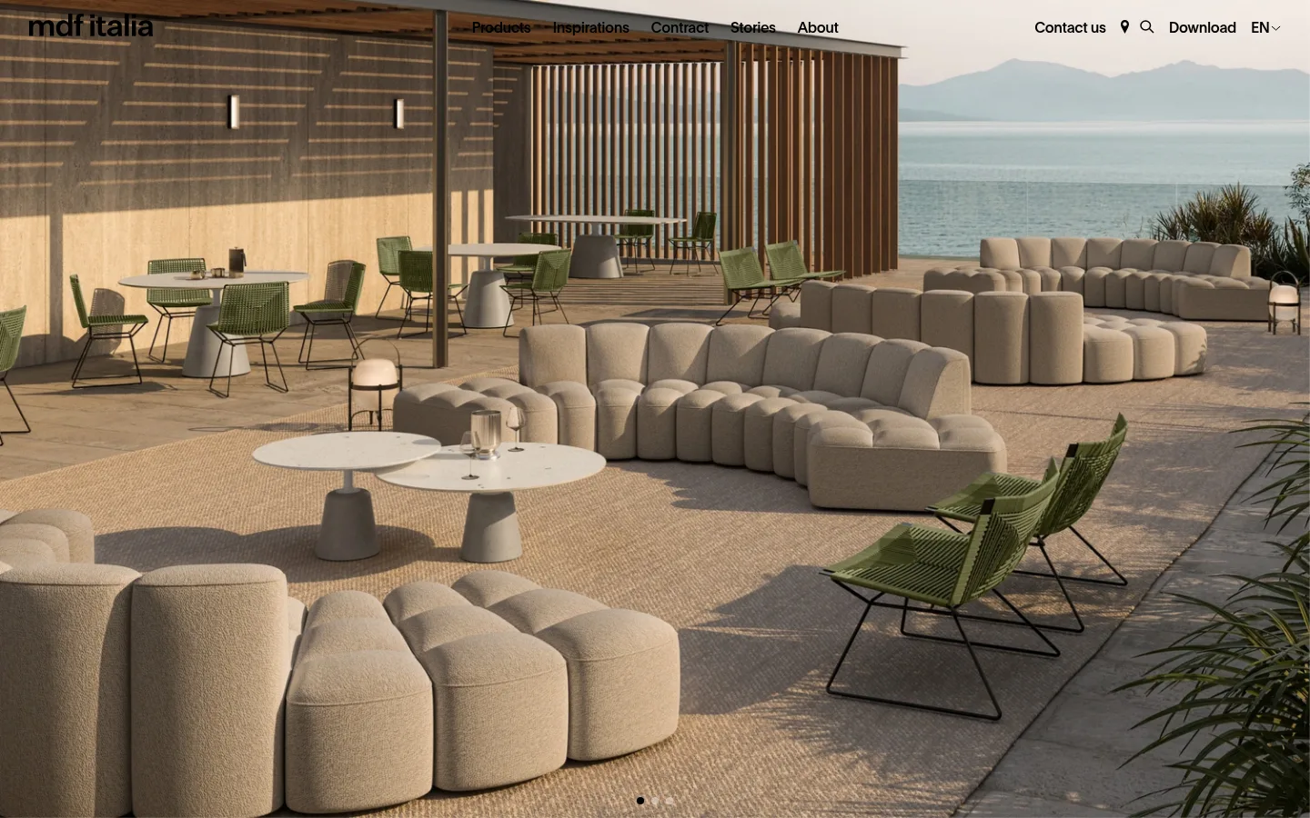
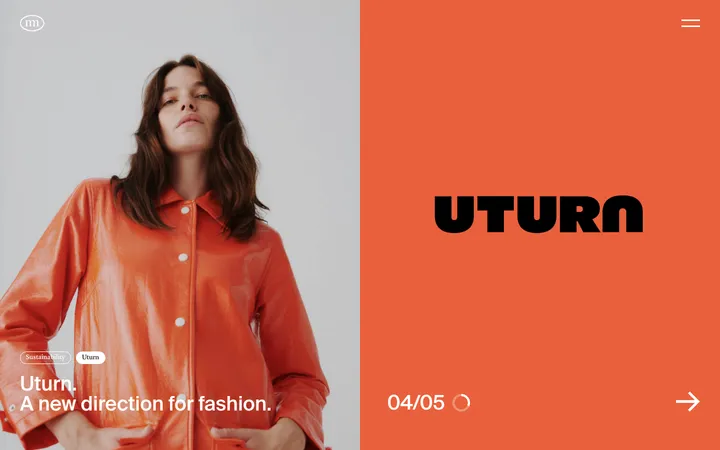
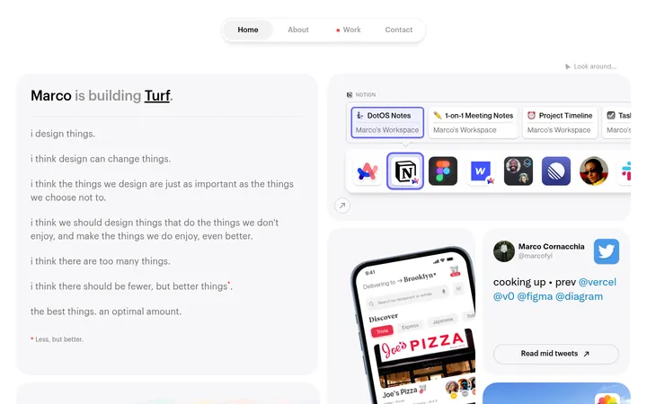
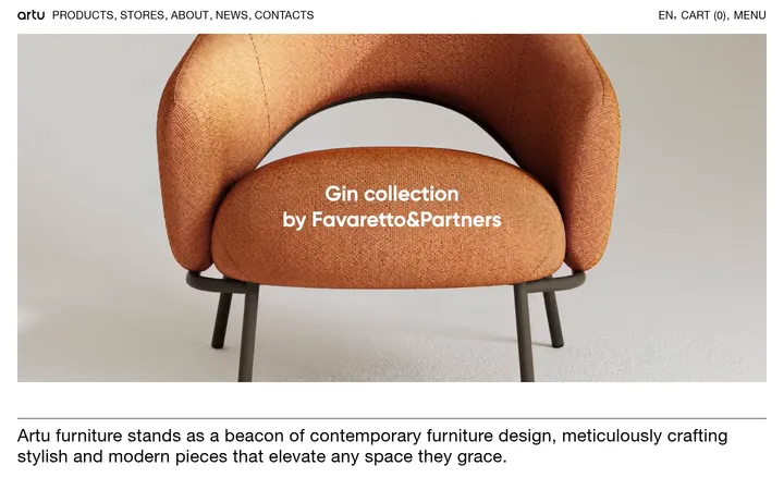
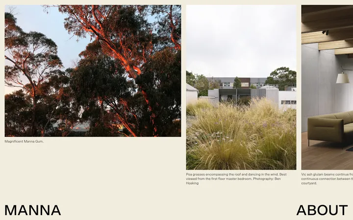
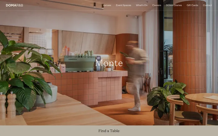
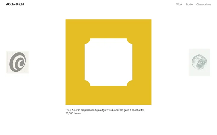
North star · Keep the interface quiet and precisely structured so full-scale interior photography, not decoration, defines the page.
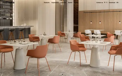
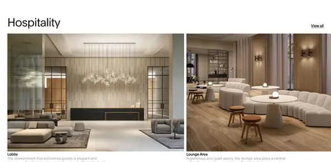
The visual strategy is deliberately quiet: a white canvas (#ffffff) and black typography (#000000) let large architectural photographs carry most of the visual character. Warm wood, stone, upholstery, and muted landscape tones come from the photography rather than from a separate brand-colour system. Headings use Plain in light weights, with compact tracking and close line spacing; body copy and links stay small and functional. The opening is a full-bleed image with navigation laid directly over it, followed by a large editorial statement and a sequence of open, white sections. Product and project imagery is organized in clear grids, with generous separation between category bands. Pale grey (#f9f9f9) appears on selected cards and buttons, while muted grey (#b2b2b2) softens secondary copy. The interface avoids decorative borders, strong shadows, gradients, and rounded controls, preserving a clean architectural presentation.
Brand-wide interface type for headings, navigation, body copy, buttons, and links.
角色
示例
字号
字重
行高
字距
特大标题
Oversized editorial display treatment where the page needs a strong statement.
MDF Italia
100px
300
1
-0.05em
一级标题
Primary page and section-level headline, including the contract introduction.
MDF Italia
50px
300
1
-0.025em
二级标题
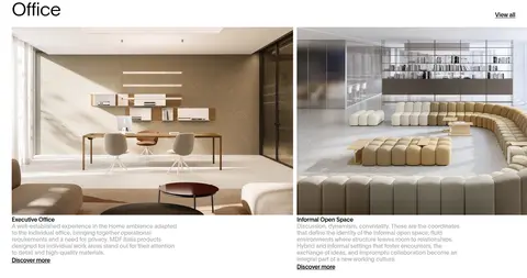
Major content headings such as Office and Hospitality.
MDF Italia
30px
400
1.07
-0.025em
三级标题
Project card titles and supporting content subheads.
The quick brown fox 敏捷的狐狸
24px
400
1.08
-0.025em
正文
Introductory descriptions, project summaries, and form copy.
The quick brown fox 敏捷的狐狸
16px
500
1.13
-0.025em
按钮
Compact action labels on calls to action and form controls.
The quick brown fox 敏捷的狐狸
16px
500
1.13
-0.025em
导航
Primary navigation labels and expanded menu category names.
The quick brown fox 敏捷的狐狸
24px
400
1.08
-0.025em
链接
Text links such as View all, Discover more, and catalogue downloads.
The quick brown fox 敏捷的狐狸
16px
500
1.13
-0.025em
间距与布局
基准单位 4px · 密度:适中
48px版块间距
12px元素间距
—卡片内边距
1376px内容最大宽度
4px
5px
6px
8px
10px
12px
16px
18px
20px
24px
32px
48px
69px
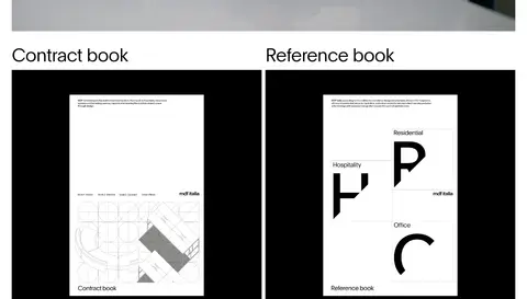
The page uses a wide desktop composition with measured maximum content width of 1376px and a comfortable density. A full-bleed hero precedes mostly white, left-aligned content sections. Editorial copy occupies a single column; values and project areas use multi-column grids, with image-led cards and compact descriptions. Section changes rely on substantial vertical breathing room rather than coloured bands. Keep headings anchored to the content edge, while the hero title is centered. The lower catalogue area pairs two columns before the contact form and a restrained footer.
圆角与层次
lg · nav
The interface is predominantly flat: white space, square image edges, and minimal visible rules do the structural work. Do not add prominent shadows or floating panels. Keep cards unframed unless their pale surface distinguishes them from the canvas; the measured interface includes only a very subtle navigation shadow.
组件
下面的预览按实测的按钮、输入框、徽标、卡片样式重建(字体用替代字体)。
Overlay navigation
Place the wordmark and compact navigation directly over the full-bleed hero image; use black Plain text and restrained utility icons.
Hero carousel
Use a full-width interior photograph as the first-view canvas, with discreet pagination indicators near the bottom edge.
Editorial introduction
Pair a large, light-weight heading with concise supporting copy and a simple text action on a white background.
Value tiles
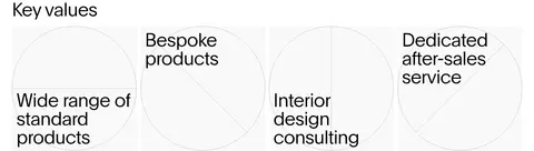
Arrange four value statements in a multi-column row, using sparse line-art circles and minimal text rather than boxed cards.
Project gallery cards
Show large rectangular project images in a grid, followed by compact titles, muted descriptions, and understated discovery links.
Contact form
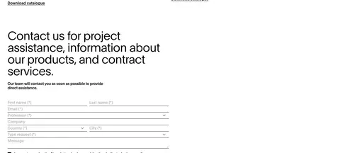
Use plain, square-cornered form fields with thin rules, compact labels, clear required indicators, and a light submit button.
Catalogue pair
Set two catalogue features side by side, each with a dark-backed preview image, short description, and download link.
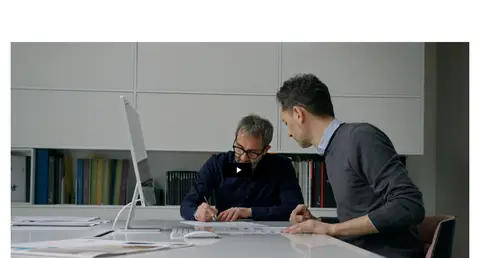
Imagery · Use large, high-quality photographs of furnished offices, hospitality interiors, and architectural spaces. Images are warm and naturally toned, with material texture and real-world lighting; they are the main source of colour rather than graphic overlays. The first image fills the viewport width, while project images sit in clean rectangular grids. Include the embedded workplace video as an image-led media block with a simple central play cue. Avoid decorative illustration as a competing visual language.
Let architectural photography lead the first impression.
Use white canvas and black text as the core interface palette.
Keep heading weights light and letter spacing subtly tight.
Use clean rectangular image grids for office and hospitality projects.
Separate sections with generous whitespace rather than coloured bands.
Keep links and form controls understated and easy to scan.
✕ 不该做
Do not introduce bright accent colours absent from the measured palette.
Do not put decorative gradients behind headings or cards.
Do not use rounded, pill-shaped buttons or image frames.
Do not compete with the interior photography using decorative graphics.
Do not make secondary text as prominent as the primary headings.
Do not add heavy borders, shadows, or dense dashboard-like panels.
给 AI 的提示词
想快速出一个同风格的新页面,把这段话连同 DESIGN.md 一起发给 AI。
Build a new MDF Italia-style page with a restrained architectural editorial feel. Use Gallery White (#ffffff) as the primary canvas and Architect Ink (#000000) for navigation, headings, and links. Reserve Porcelain Mist (#f9f9f9) for subtle card or button surfaces, Soft Graphite (#b2b2b2) for supporting copy, and Slate Hairline (#6b7280) only for sparse interface rules. Use Plain or a close sans-serif substitute, with light display headings, natural casing, and subtly tight tracking. Start with a full-bleed interior photograph and overlay simple navigation. Follow with left-aligned editorial content, open multi-column image grids, and generous whitespace. Keep imagery warm and realistic, controls square and understated, and decoration minimal. Build semantic responsive sections without inventing bright brand accents or heavy elevation.