A Color Bright 以大幅留白和项目展示呈现设计工作室,页面尾部集中提供联系信息。克制的黑白界面让客户项目作品承担主要的视觉表达。
North star · Keep the interface quiet and spacious so the featured work—not decorative UI—provides the page’s strongest color and visual character.
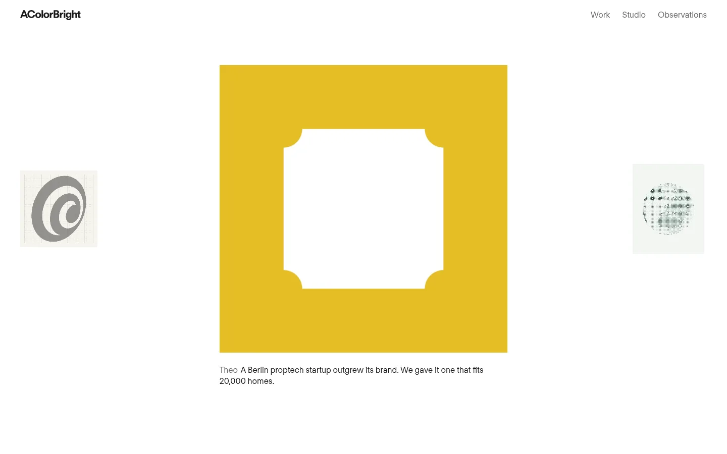
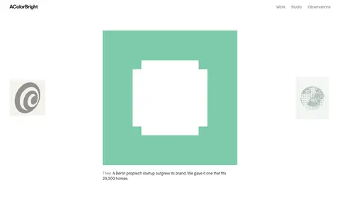
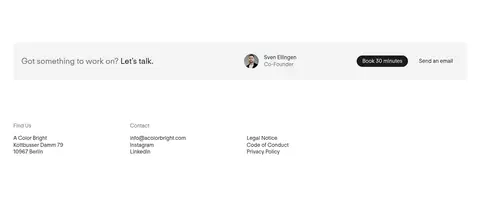
The homepage is built around a near-white canvas, dark text, and generous unoccupied space. FT Regola Neue appears consistently at regular weight, with a large, lightly tracked main heading and quieter supporting copy. Navigation and links remain understated; the dark booking pill is the clearest interface emphasis. The first section centers a large square project image, with smaller neighboring project images creating a carousel-like frame; the vivid yellow artwork belongs to the featured project rather than the site’s core palette. A short caption sits directly below the showcase. The lower contact area shifts to a pale-gray band, pairing a brief invitation with a founder profile and two contact actions. The footer distributes location, contact, and policy links in a compact two-column arrangement. Hairline borders and flat surfaces preserve the editorial, low-chrome feel.
Shared typeface for navigation, headings, body copy, captions, and buttons.
角色
示例
字号
字重
行高
字距
一级标题
Homepage brand heading and main introductory display text.
A Color Bright
46px
400
1.2
-0.02em
二级标题
Section headings, including contact and location labels.
The quick brown fox 敏捷的狐狸
24px
400
1.35
0
三级标题
Supporting subheadings and smaller content headings.
The quick brown fox 敏捷的狐狸
20px
400
1.45
0
正文
Project captions, contact details, and general page copy.
The quick brown fox 敏捷的狐狸
16px
400
1.3
0
按钮
Booking and email contact action labels.
The quick brown fox 敏捷的狐狸
16px
400
1.3
0
导航
Primary header navigation and site links.
The quick brown fox 敏捷的狐狸
16px
400
1.3
0
间距与布局
基准单位 8px · 密度:适中
60px版块间距
16px元素间距
—卡片内边距
1360px内容最大宽度
4px
8px
16px
24px
40px
42px
60px
128px
The page uses a restrained, centered composition within a measured maximum width of 1360px. The opening project area is a single-column showcase: a large square image sits centrally between smaller side previews, followed by a left-aligned caption. The header keeps the wordmark at the left and navigation at the right. After substantial whitespace, a contact band introduces a two-column lower section. Comfortable density and generous section separation let each content group read independently.
圆角与层次
按钮 · 9999px
图片 · 50%
导航 · 4px
没有测到阴影:页面是扁平的,层次靠底色和描边区分。
The interface is predominantly flat, with no measured shadows or gradients. Subtle hairline borders outline selected pill-shaped actions, while the contact area uses a pale surface band rather than a raised card. Keep layering minimal and let image content establish depth and contrast.
组件
下面的预览按实测的按钮、输入框、徽标、卡片样式重建(字体用替代字体)。
Header navigation
Place the compact wordmark at the left and Work, Studio, and Observations links at the right; use dark and muted text without a strong enclosing bar.
Project showcase
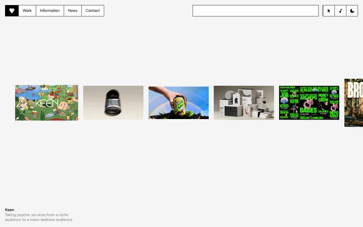
Center one large square project image, flank it with smaller previews, and put a short, left-aligned project caption directly beneath.
Carousel controls
Provide paired Next slide and Previous slide controls with simple text treatment and no filled button background.
Booking action
Use a dark pill with white 16px regular text for Book 30 minutes; retain a fine light outline and generous horizontal inset.
Email action
Present Send an email as a text-led pill action with dark text, a fine light border, and no dark fill.
Contact band and footer
Set the invitation, founder detail, booking action, and email action in a pale-gray band; follow with location, contact, and legal information.
Imagery · Project imagery is the visual centerpiece: a large square featured work is flanked by smaller previews, with a concise caption below. The screenshot shows graphic, brand-led artwork rather than conventional lifestyle photography. Its vivid yellow and supporting colors are part of the showcased client work, not the measured interface palette. The contact area includes a small founder portrait; media remains neatly framed against the open page.
Keep interface text in FT Regola Neue or a close sans-serif substitute.
Give the project showcase generous whitespace.
Let client artwork provide vivid color rather than tinting the interface.
Use #1a1a1a for primary text and the booking CTA.
Reserve #6a6a6a for secondary navigation and quieter copy.
Keep the contact area visually distinct with #f4f4f4.
✕ 不该做
Do not treat project-art colors as the site’s brand palette.
Do not add gradients or decorative shadows.
Do not crowd the hero with extra copy or controls.
Do not make secondary navigation as dark or prominent as primary content.
Do not turn every contact action into a filled button.
Do not add heavy cards or strong dividers.
给 AI 的提示词
想快速出一个同风格的新页面,把这段话连同 DESIGN.md 一起发给 AI。
Build a design-studio page with the calm, editorial feel of A Color Bright. Use Gallery White (#ffffff) as the dominant canvas, Studio Ink (#1a1a1a) for primary text and the key booking action, Quiet Gray (#6a6a6a) for secondary navigation, Soft Rule (#e8e8e8) for fine outlines, and Mist Surface (#f4f4f4) for a restrained contact band. Use a regular-weight humanist sans-serif close to FT Regola Neue, with understated headings and compact, readable supporting copy. Keep the header simple, place one large featured project image centrally with smaller neighboring previews, and add a concise caption. End with a pale contact strip and a tidy location/contact footer. Favor whitespace, flat surfaces, and thin borders; allow the project artwork to supply its own color.