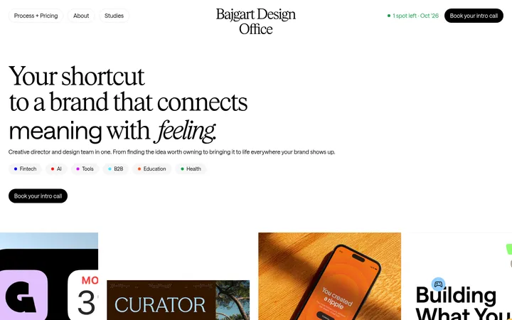
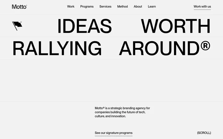
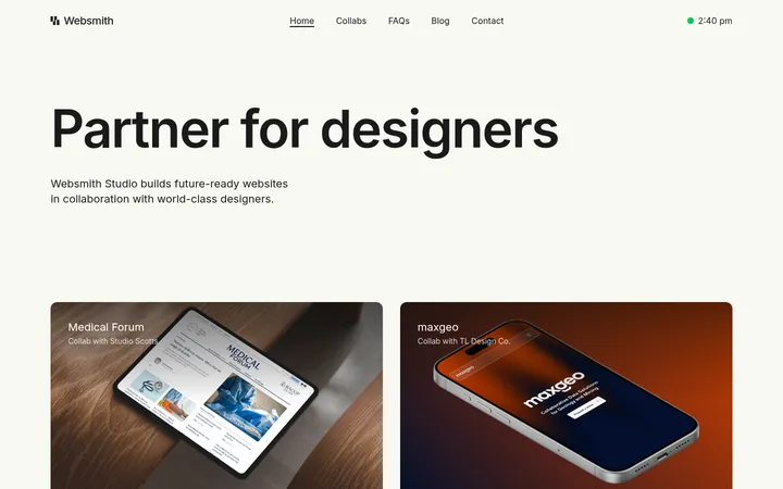
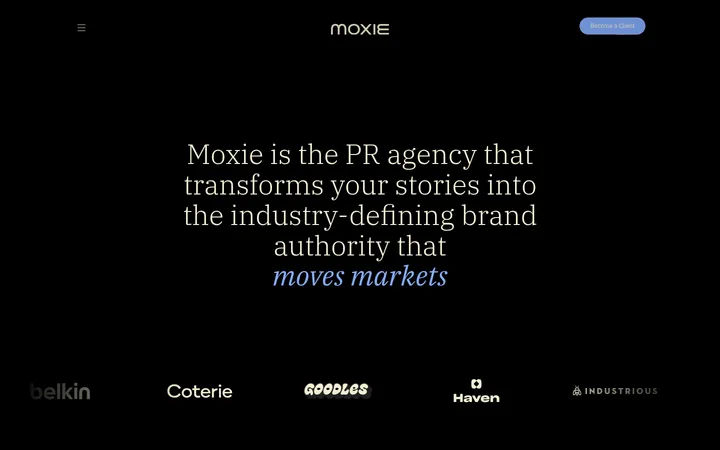
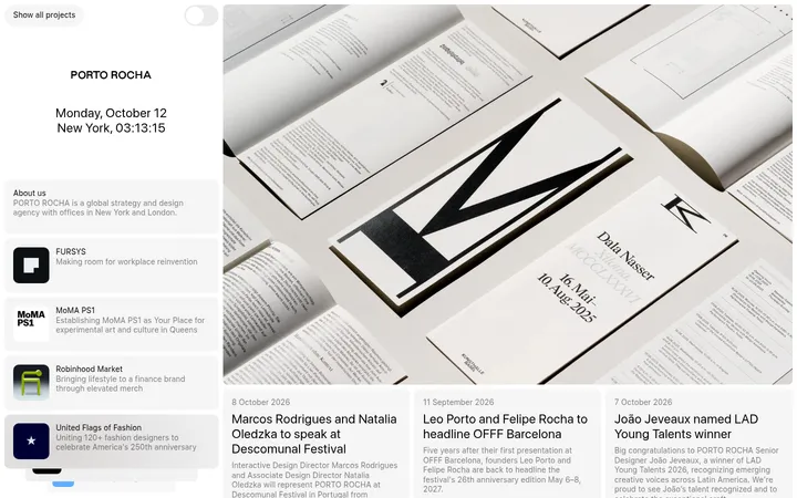
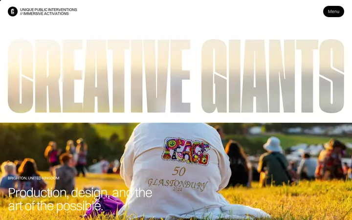
North star · Keep interface chrome monochrome and quiet so oversized, expressive campaign imagery leads every section.
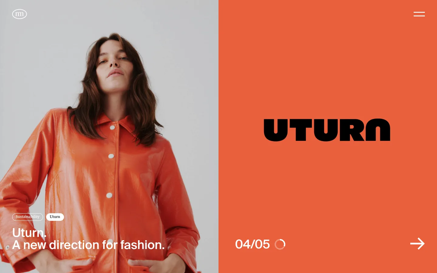
The interface stays mostly monochrome: a #f5f5f5 canvas and white content bands support black text, with muted gray reserved for secondary copy and restrained hairlines. Saturated colors belong primarily to campaign photography and project artwork, rather than to interface accents; let the assets provide the color. Suisse carries the clear, modern interface voice across navigation, headings, body copy, and project labels. Lyon appears sparingly in light, small caption and pill treatments. The first viewport is an intentionally dramatic split hero: full-bleed campaign photography on one side and a solid black or image-led counterpart on the other, with compact overlaid metadata and controls. Below, the introduction sits in a single column before feed cards and a varied portfolio grid. Generous vertical pauses keep the dense project catalogue feeling editorial, while flat surfaces and minimal borders avoid competing with imagery.
配色
点色块复制色值。用途说明来自对页面的实测位置(背景、文字、描边、按钮)与截图判读。
品牌色
表层色
中性色
功能色
页面底色 · Gallery Mist表层 · Paper White表层 2 · Studio Ink主文字 · Studio Ink次要文字 · Soft Graphite弱文字 · Paper White描边 · Silver Rule
Navigation, headlines, body copy, project names, links, and general interface text.
Aa 设计
Lyon
网络字体 · 字重 100 · 占比 11%
免费替代:Cormorant Garamond
Small, light captions and rounded category or status pills, including compact CTA labels.
角色
示例
字号
字重
行高
字距
一级标题
Prominent page or campaign heading where present; hero lettering may be part of the artwork.
Moffitt.Moffitt.
40px
600
1
0
二级标题
Section headings such as Feed and portfolio section titles.
The quick brown fox 敏捷的狐狸
24px
500
1.17
0
正文
Studio introduction, project summaries, and descriptive content.
The quick brown fox 敏捷的狐狸
16px
400
1.39
0
辅助文字
Small project metadata and category or status labels.
The quick brown fox 敏捷的狐狸
13px
100
1
0
链接
Prominent project names and larger editorial navigation links.
The quick brown fox 敏捷的狐狸
24px
500
1.17
0
间距与布局
基准单位 2px · 密度:宽松
140px版块间距
40px元素间距
20px卡片内边距
—内容最大宽度
10px
11px
20px
40px
50px
140px
The first section fills the viewport with an asymmetrical, two-part hero, using full-bleed imagery and a contrasting panel. Subsequent content sits on broad white bands: a single-column studio statement, a compact horizontal feed, then a long, varied project grid. The portfolio mixes two-up cards with occasional full-width features rather than enforcing a uniform tile rhythm. Measured spacing is spacious, with a pronounced section gap and generous card padding; no measured maximum content width is available. Keep text aligned to the start and let media establish the grid.
圆角与层次
按钮 · 9999px
图片 · 5px
徽标 · 9999px
没有测到阴影:页面是扁平的,层次靠底色和描边区分。
The page is visually flat: measured data contains no shadows, and the content relies on white and pale-gray surfaces rather than raised cards. Use subtle hairlines where separation is needed, with small-radius media frames and pill-shaped badges or buttons. Preserve the feeling of images sitting directly within the editorial grid rather than floating above it.
组件
下面的预览按实测的按钮、输入框、徽标、卡片样式重建(字体用替代字体)。
Split campaign hero
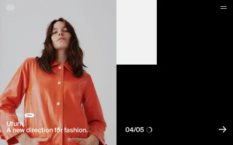
A full-bleed two-column opening with oversized campaign artwork, small overlaid labels, and minimal navigation controls; campaign colors are image-led.
Studio statement
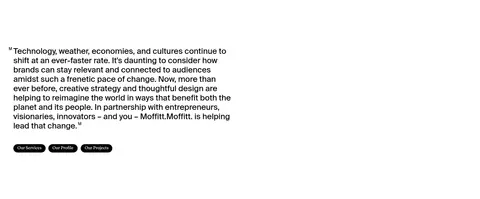
A single-column paragraph on a white band, followed by compact black pill CTAs for studio-related destinations.
Feed cards
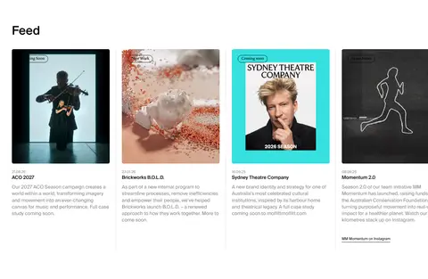
A horizontally arranged set of project updates with thumbnail imagery, small badges, concise names, and muted supporting text.
Project gallery
A spacious portfolio grid that alternates paired cards with occasional wide image features; titles and gray descriptions sit below media.
Category badge
Small rounded status or category label with a thin outline and light Lyon styling; keep it visually secondary to the project image.
Filter control
A quiet pale-gray filter button with black Suisse text, placed as a compact utility beside the portfolio heading.
Imagery · Campaign photography and branded project artwork dominate the page, mixing fashion portraits, architecture, identity graphics, and motion-led work. The hero uses a large cropped photograph beside an intensely colored campaign panel; subsequent portfolio images vary between paired tiles and wide, full-bleed features. Treat imagery as the main source of color and personality. Use clean crops and minimally styled frames; do not add illustration or effects that compete with the supplied work.
Keep interface surfaces in the measured monochrome palette.
Let campaign assets provide the vivid color.
Use an asymmetric, image-led hero.
Give the portfolio generous vertical breathing room.
Use Suisse for clear, neutral interface typography.
Keep captions and badges small and understated.
✕ 不该做
Do not introduce unmeasured accent colors into interface chrome.
Do not add decorative gradients or shadows.
Do not force every portfolio image into identical proportions.
Do not crowd the page with persistent interface elements.
Do not make category badges more prominent than their imagery.
Do not treat colors inside project artwork as brand UI colors.
给 AI 的提示词
想快速出一个同风格的新页面,把这段话连同 DESIGN.md 一起发给 AI。
Build a new Moffitt.Moffitt.-style agency page with quiet monochrome interface chrome and expressive project imagery. Use Gallery Mist (#f5f5f5) and Paper White (#ffffff) for broad surfaces, Studio Ink (#000000) for navigation, headings, links, and primary controls, and Soft Graphite (#888888) for supporting copy. Reserve Silver Rule (#d8d8da) and Mist Badge (#ebecec) for subtle borders and labels. Set interface copy in Suisse or a close sans-serif substitute, with Lyon-like light captions used sparingly. Start with an asymmetric, full-bleed campaign hero; follow with a compact studio statement, editorial feed, and varied portfolio grid. Use generous section pauses, restrained outlines, pill controls, and no shadows. Let provided photography and artwork supply saturated color; do not reinterpret those asset colors as interface tokens.