North star · Let generous warm-neutral space and confident typography carry the page, reserving vivid yellow for unmistakable bookends.
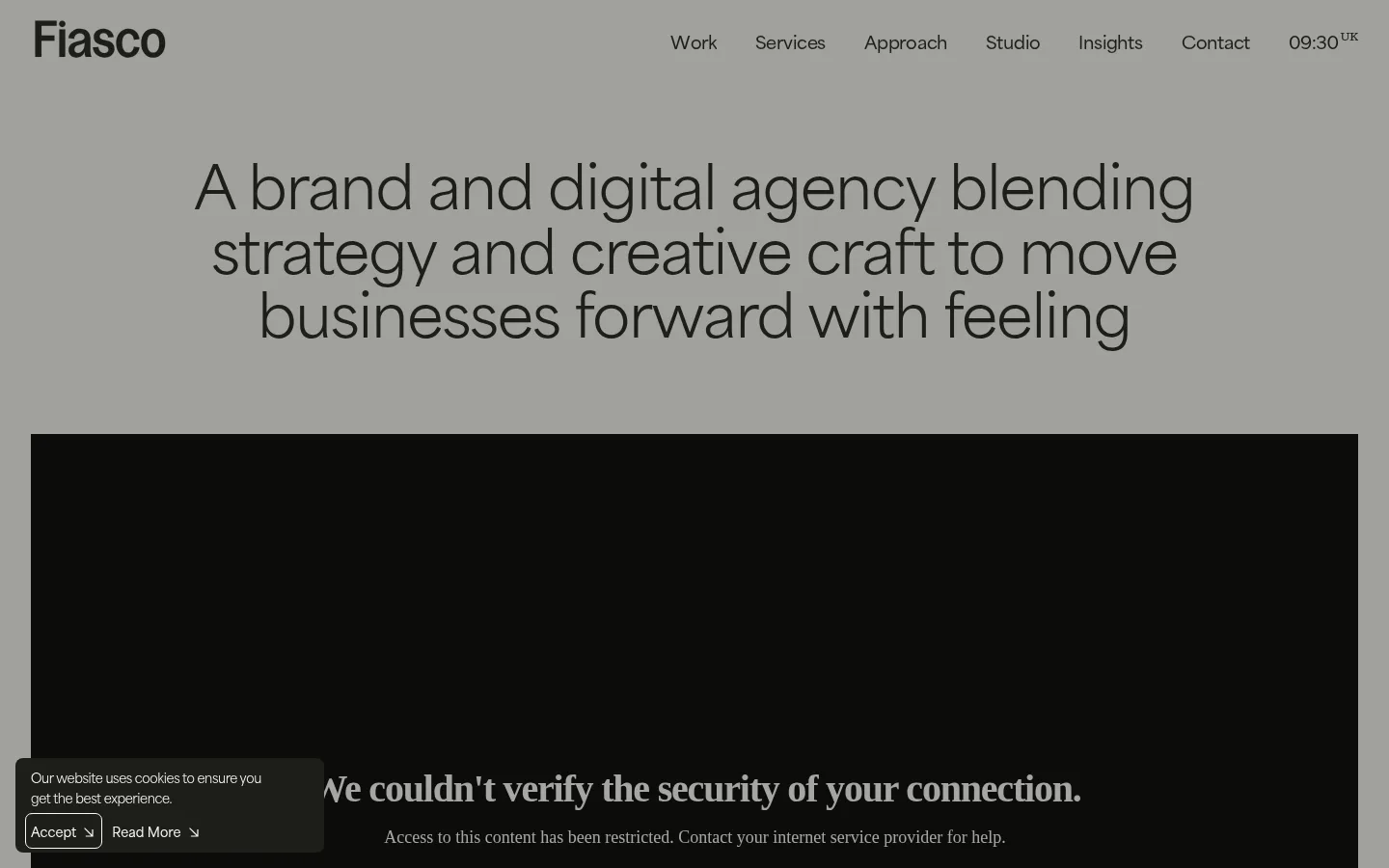
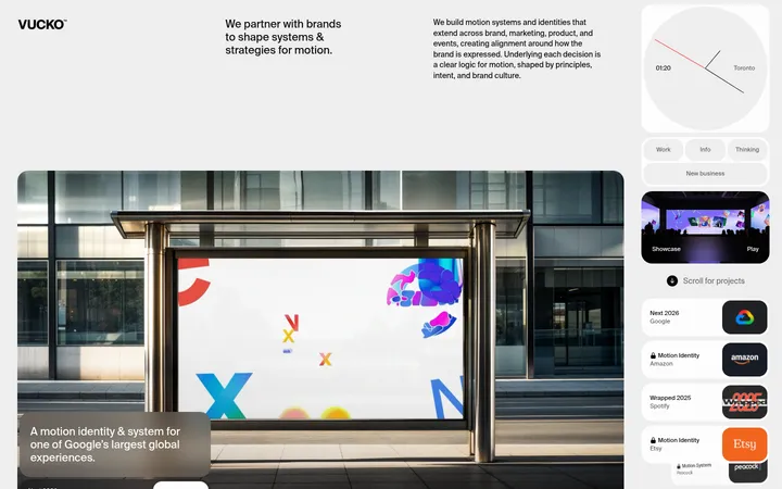
The visual strategy balances a quiet, warm-neutral canvas with near-black typography and generously spaced content. The screenshot shows a muted gray opening field and a large dark media panel; measured section data identifies the brand’s vivid yellow at the opening and final call to action, so reproduce that yellow as a deliberate, high-impact band rather than a pervasive accent. The work section relies on large project imagery, staggered presentation, and concise serif-led labels, giving the portfolio an editorial cadence. Area Normal supplies clean, contemporary sans-serif navigation, body copy, and large statements; HAL Timezone adds a contrasting serif voice to captions and selected headings. Content sits in open, largely borderless layouts with wide gaps between sections. The page moves from a bold introductory frame through selected work, process, client marks, and insights, then closes with a centered yellow contact prompt.
Display statements, navigation, body copy, and primary buttons.
Aa 设计
HAL Timezone
网络字体 · 字重 500 / 400 / 100 · 占比 47%
免费替代:Cormorant Garamond
Editorial headings, project labels, captions, and small category links.
角色
示例
字号
字重
行高
字距
特大标题
Large introductory agency statement.
Fiasco
80px
400
1.1
-0.005em
一级标题
Primary page headline and prominent closing call to action.
Fiasco
60.5px
400
1.1
-0.02em
二级标题
Editorial section statements and featured project titles.
Fiasco
34px
400
1.2
-0.012em
三级标题
Work, insight, and process section headings.
Fiasco
30px
400
1.2
-0.013em
四级标题
Secondary project and editorial headings.
The quick brown fox 敏捷的狐狸
22px
500
1.2
-0.018em
正文
Project descriptions and agency explanatory copy.
The quick brown fox 敏捷的狐狸
18px
400
1.6
-0.022em
辅助文字
Project categories, metadata, and small editorial labels.
The quick brown fox 敏捷的狐狸
12px
400
2
0.01em
按钮
Filled approach CTA and prominent action links.
The quick brown fox 敏捷的狐狸
18px
600
1
-0.022em
导航
Header navigation links.
The quick brown fox 敏捷的狐狸
18px
600
1.5
-0.022em
链接
Small category links and insight metadata links.
The quick brown fox 敏捷的狐狸
12px
400
2
0.01em
间距与布局
基准单位 4px · 密度:宽松
120px版块间距
4px元素间距
—卡片内边距
940px内容最大宽度
1px
4px
8px
10px
12px
16px
18px
20px
24px
30px
32px
36px
120px
Use a spacious, mostly single-column page with content constrained to the measured 940px maximum width. Keep the header unobtrusive and let a centered, oversized statement establish the opening. The portfolio uses a loose two-column rhythm with varied image placements; later client marks form a three-column grid and insights run as a compact horizontal feed. Maintain generous vertical separation between major bands, using the measured 120px section gap as the rhythm reference and small, deliberate gaps within components.
圆角与层次
按钮 · 9999px
卡片 · 8px
链接 · 9999px
xl · section
Favor flat, borderless surfaces over card chrome. Portfolio images and insight thumbnails provide the primary visual layering; use clear whitespace instead of outlines to separate content. The measured extra-large shadow is confined to a section-level treatment, so avoid applying prominent shadows to every card. Keep tags and the approach CTA pill-shaped.
组件
下面的预览按实测的按钮、输入框、徽标、卡片样式重建(字体用替代字体)。
Header navigation
Compact wordmark at left with inline dark links across the top; use semibold Area Normal navigation on the light canvas.
Hero statement
Large centered sans-serif agency statement with tight tracking, generous surrounding space, and a broad dark media panel below.
Project gallery
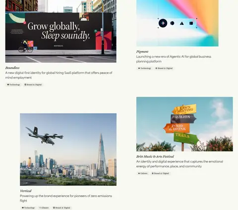
A loose two-column portfolio presentation with large image-led work, short serif project labels, concise descriptions, and small rounded category tags.
Approach CTA
Centered supporting statement followed by a dark, rounded pill with light semibold text.
Client logo grid
Monochrome client marks arranged in an airy three-column grid without decorative card borders.
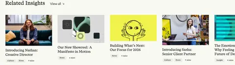
Insights feed
Compact row of image-led editorial cards with serif headlines and small category and reading-time metadata.
Contact close
Centered project invitation on the vivid yellow closing band, with dark text and a simple line of action.
Imagery · Treat project imagery as the main visual content: large, crisp portfolio photographs and branded project visuals sit directly within open layouts. Let each project retain its own color and identity rather than applying a shared filter. Use staggered image placement and concise adjacent captions to create an editorial gallery; client logos remain monochrome marks. The opening dark media panel is a prominent framed feature, not a cue to make the whole site dark.
Preserve the warm off-white canvas across content sections.
Use Olive Ink for primary text and dark filled actions.
Reserve Electric Citron for emphatic page framing.
Pair sans-serif statements with selective serif editorial details.
Let portfolio imagery retain its own colors and character.
Use whitespace instead of borders to separate most content.
✕ 不该做
Do not turn the whole page into a dark theme.
Do not use yellow as a routine link or button color.
Do not surround every project with a bordered card.
Do not force all portfolio images into uniform crops or treatments.
Do not replace the loose portfolio rhythm with a dense dashboard grid.
Do not use serif styling for every text role.
给 AI 的提示词
想快速出一个同风格的新页面,把这段话连同 DESIGN.md 一起发给 AI。
Build a new agency page in Fiasco’s editorial visual style. Use Gallery White (#f8f9f3) as the spacious content canvas and Olive Ink (#1d1e19) for navigation, copy, and dark pill CTAs. Introduce Electric Citron (#fff714) only as a bold framing band or decisive closing section; use Soft Stone (#e9eae2) for quiet tags and occasional light surfaces. Set large statements and practical UI in a clean sans-serif close to Area Normal, with a restrained serif such as Cormorant Garamond for project labels and editorial details. Keep layouts open, mostly borderless, and aligned to a measured 940px content maximum. Use generous vertical section spacing, image-led project work, an airy client-logo grid, and a compact insights feed. Avoid generic card chrome and do not recolor project imagery.