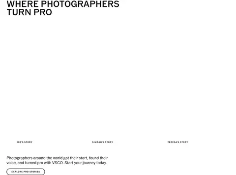
North star · Let bold uppercase typography and real photography lead, using color blocks sparingly to distinguish each product story.
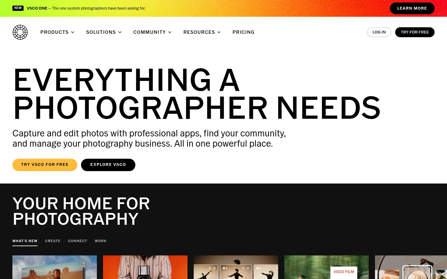
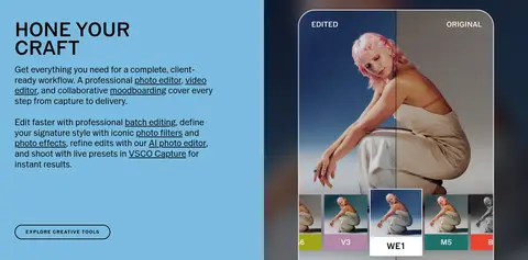
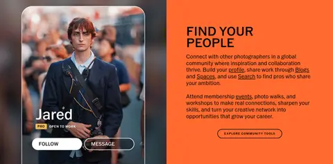
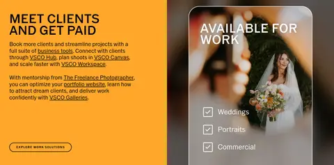
The visual system is built around a white canvas, nearly black content bands, and photography that supplies most of the page’s texture and color. The opening is deliberately spare: a compact announcement strip and navigation give way to a large, uppercase headline, short explanatory copy, and two rounded calls to action. VSCO Gothic carries the full interface, from oversized, tightly led display headings to small uppercase navigation and captions. Below the hero, the page alternates dark ecosystem and pricing sections with paired feature panels in blue, orange, and white; these bold colors distinguish product stories rather than replacing the neutral foundation. Image cards, campaign tiles, and video previews create an editorial portfolio feel. Content is aligned to the left and arranged in broad bands, split layouts, and compact card rows, with generous white space around major stories. Borders stay subtle, and the interface relies on contrast, imagery, and clean structure rather than depth effects.
配色
点色块复制色值。用途说明来自对页面的实测位置(背景、文字、描边、按钮)与截图判读。
品牌色
强调色
表层色
中性色
功能色
页面底色 · Gallery White表层 · Deep Ink表层 2 · Soft Black表层 3 · Mist Gray表层 4 · Sky Blue主文字 · Deep Ink次要文字 · Gallery White描边 · Hairline Gray强调 · Campaign Red强调 2 · Golden Button强调 3 · Sky Blue
Site-wide display, headings, body copy, navigation, buttons, captions, and links.
角色
示例
字号
字重
行高
字距
特大标题
Oversized uppercase campaign and hero statements.
VSCO
100px
500
0.9
0
一级标题
Primary page headline in the opening hero.
VSCO
54px
500
0.93
0
二级标题
Major section headings across feature and story bands.
VSCO
50px
500
0.93
0
三级标题
Feature, testimonial, and card-level headings.
VSCO
36px
400
1
0
四级标题
Smaller supporting headings within content blocks.
VSCO
29px
400
1.14
0
正文
Explanatory paragraphs and product descriptions.
The quick brown fox 敏捷的狐狸
15px
400
1.24
0
辅助文字
Compact uppercase labels on cards and image stories.
The quick brown fox 敏捷的狐狸
13px
600
1.1
0.1em
导航
Uppercase primary navigation labels.
The quick brown fox 敏捷的狐狸
15px
500
1.5
0.08em
链接
Prominent text links within product and content areas.
The quick brown fox 敏捷的狐狸
24px
400
1.2
0
眉题
Short uppercase introductory labels above headings.
The quick brown fox 敏捷的狐狸
13px
600
1.1
0.1em
间距与布局
基准单位 4px · 密度:紧凑
40px版块间距
8px元素间距
20px卡片内边距
1360px内容最大宽度
2px
4px
6px
8px
10px
12px
16px
20px
24px
28px
30px
32px
40px
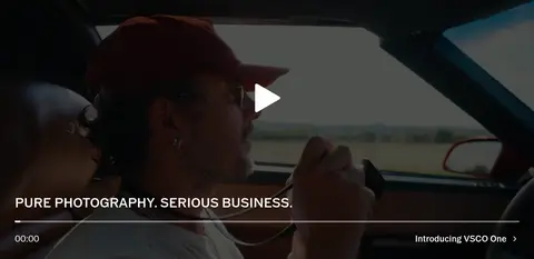
Use broad, full-width horizontal sections with content aligned to a consistent left edge. The opening hero is a two-column text-led composition, followed by a dark product carousel, full-bleed video, and a multi-column pricing comparison. Later stories alternate paired text-and-image panels, editorial campaign tiles, and open testimonial space. The measured page max width is 1360px; keep the page compact within components while leaving clear breathing room between major bands. Maintain strong left alignment and distinct section transitions.
圆角与层次
按钮 · 9999px
卡片 · 10px
徽标 · 4px
链接 · 9999px
hairline · link
Keep the interface mostly flat. Use dark and colored section bands, image crops, and strong contrast to create hierarchy rather than layered shadows. Card edges are restrained, with measured light gray borders on pricing surfaces and small pill-shaped buttons. A subtle hairline treatment appears on links; avoid floating panels or heavy depth effects.
组件
下面的预览按实测的按钮、输入框、徽标、卡片样式重建(字体用替代字体)。
Announcement strip
A narrow full-width promotional banner with a multicolor campaign gradient, compact announcement copy, and a black pill-shaped Learn More action.
Primary navigation
White horizontal header with VSCO mark, uppercase product and resource links, and compact outlined or black pill actions at the right.
Hero actions
Pair a golden filled TRY VSCO FOR FREE pill with a black EXPLORE VSCO pill beneath the large uppercase headline and supporting copy.
Photography product rail
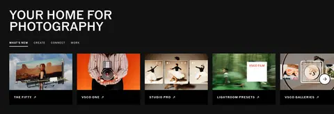
Dark section with a white uppercase title, small category tabs, and a horizontal row of image-led product cards with compact captions.
Membership plans
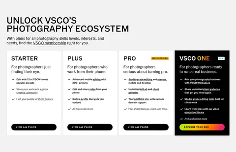
Dark membership section with a pale card band, side-by-side plan cards, compact feature lists, and black pill plan actions; distinguish featured labels with a small amber badge.
Split feature story
Two-column product story alternating a saturated text panel with a large photography or app-preview image; use outline pill actions.
Editorial story tiles
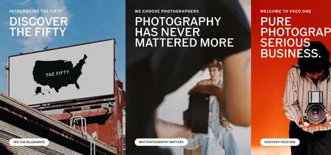
A row of campaign images with short uppercase overlays and small contrasting pill links, treated as a photographic editorial gallery.
Footer link directory
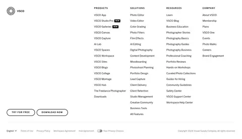
Black footer organized into multiple dense product, solution, resource, and company columns, with white links and compact bottom utility text.
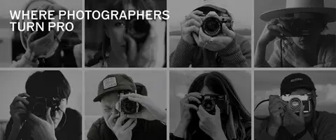
Imagery · Photography is the main visual material: use candid portraits, working photographers, profile cards, app previews, and campaign imagery. Images appear in cropped horizontal cards, paired feature panels, and large video frames. Favor natural, documentary-feeling scenes with varied color and subject matter; dark sections may frame images, while the lower monochrome photographer strip gives the gallery a quieter editorial finish. No illustration or 3D style defines the page.
Use VSCO Gothic or a close geometric sans-serif substitute throughout.
Set major headings in uppercase with tight line spacing.
Keep the hero white, text-led, and left aligned.
Use black bands to frame product discovery and membership content.
Pair saturated feature panels with relevant photography.
Use rounded pill actions for primary and secondary calls to action.
✕ 不该做
Do not add gradients to ordinary content sections.
Do not treat sampled illustration colors as core interface colors.
Do not rely on shadows to separate cards or sections.
Do not center every heading or paragraph.
Do not turn the photographic homepage into a generic icon-led SaaS dashboard.
Do not overcrowd the hero with product imagery.
给 AI 的提示词
想快速出一个同风格的新页面,把这段话连同 DESIGN.md 一起发给 AI。
Build a new photography-platform page in the VSCO visual style. Use a Gallery White (#ffffff) canvas, Deep Ink (#000000) text, and Soft Black (#111111) bands to establish contrast. Reserve Golden Button (#ffbc3c) for the primary action; use Sky Blue (#7bbce0), Studio Orange (#ff6a2f), and Warm Orange (#ffa72a) only as distinct feature-story panels. Set the page in a geometric sans-serif similar to VSCO Gothic, with bold uppercase display headings, restrained body copy, and compact uppercase navigation. Organize content in broad horizontal bands: a spare text-led hero, image-rich product rail, feature splits, and editorial story cards. Use real photography as the main visual texture. Keep borders subtle, surfaces flat, and buttons pill-shaped; avoid excessive shadows, decorative UI chrome, or invented brand colors.