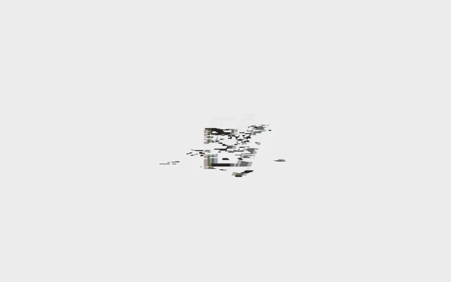
Elva 首页以近乎空白的浅灰画布开场,中央放置一枚小巧、错位感明显的图形。克制的黑白灰配色与紧凑的大写文字,让页面更像极简设计工作室的视觉标识,而非传统代理机构首页。
North star · Keep the canvas nearly empty and let one small, experimental visual carry the attention.
The page builds its identity through reduction: a nearly uninterrupted #ececec field holds the viewport, while #262523 supplies the site's legible text and defining dark marks. The measured #cecccc is a minor supporting tone rather than a competing brand accent; the screenshot's central graphic contains its own noisy tonal variation, which should not be mistaken for a broader palette. Basis is used throughout, with compact uppercase navigation and body labels contrasted against an oversized, tightly tracked display role in the measured system. In the visible opening, the composition is unusually spacious and centered: the small abstract graphic sits alone amid extensive negative space, and the navigation remains visually quiet. There are no prominent cards, colored CTA blocks, or photographic bands in the supplied view. Reproduce the impression with a flat canvas, restrained type, sparse content, and a carefully isolated piece of experimental media.
配色
点色块复制色值。用途说明来自对页面的实测位置(背景、文字、描边、按钮)与截图判读。
品牌色
表层色
中性色
页面底色 · Gallery Mist主文字 · Studio Ink次要文字 · Gallery Mist描边 · Studio Ink
Site-wide face for display, body copy, navigation, and links.
角色
示例
字号
字重
行高
字距
特大标题
Oversized uppercase studio or hero display when present.
Elva
160px
500
0.82
-0.04em
正文
Compact uppercase supporting copy and labels.
The quick brown fox 敏捷的狐狸
12px
400
1.3
0
导航
Small uppercase primary navigation labels.
The quick brown fox 敏捷的狐狸
12px
400
2
0
链接
Compact uppercase text links such as “SEE WHATS NEXT”.
The quick brown fox 敏捷的狐狸
12px
400
1.3
0
间距与布局
基准单位 8px · 密度:适中
48px版块间距
—元素间距
—卡片内边距
—内容最大宽度
40px
48px
The supplied opening uses a single-column, full-viewport canvas with the abstract graphic centered and substantial negative space around it. Navigation is present in the measured data but visually unobtrusive. The section measurement reports one column and no prominent content blocks. Keep alignment calm and deliberate, avoid crowding the central mark, and preserve a comfortable, low-density rhythm. The measured spacing scale includes 40 and 48, with a 48 section gap; use these only where the composition needs separation rather than filling the open field.
圆角与层次
inset · section
The page reads as flat: there are no visible card stacks or pronounced shadows. The measured inset shadow is a large canvas-matching inset treatment, not a reason to introduce raised surfaces. Keep edges and layering quiet, using dark hairlines only when the interface needs a defined boundary.
组件
下面的预览按实测的按钮、输入框、徽标、卡片样式重建(字体用替代字体)。
Canvas
A continuous #ececec background dominates the measured viewport; avoid unnecessary surface changes.
Navigation
Measured navigation is text-only, with compact Basis labels and no filled background or visible border.
Central graphic
A small, centered glitch-like visual provides the opening's sole focal point; keep its tonal variation confined to the artwork.
Text link
The measured “SEE WHATS NEXT” link uses regular 12px Basis, uppercase text, and #262523 with no visible fill.
Display typography
The measured display role is 160px Basis, medium weight, uppercase, with tight negative tracking and a compact line height.
Imagery · The visible media is a small abstract, glitch-like graphic centered on the pale canvas, not conventional photography. Its black, gray, and muted fragments appear broken up and digitally distorted. Keep it isolated with generous surrounding space; treat its internal tonal noise as artwork, not as a signal to add new interface colors.
Do not enlarge the central graphic without evidence.
Do not turn artwork tones into interface colors.
Do not add decorative shadows or gradients.
Do not use dense, sentence-case navigation.
给 AI 的提示词
想快速出一个同风格的新页面,把这段话连同 DESIGN.md 一起发给 AI。
Build a new page in Elva’s restrained studio style. Use Gallery Mist (#ececec) as the dominant, nearly uninterrupted canvas and Studio Ink (#262523) for text and links; Quiet Ash (#cecccc) should remain a minor supporting neutral, not an accent. Use Basis throughout, or a close geometric sans substitute, with compact uppercase navigation and labels. Compose the page with generous negative space, a quiet single-column feel, and one carefully isolated experimental visual if the content calls for it. Keep surfaces flat, borders understated, and controls text-led rather than boxed. Do not introduce gradients, colorful CTA panels, dense card grids, or extra palette colors. Preserve a deliberate, editorial sense of scale and let the content—not decoration—set the focal point.