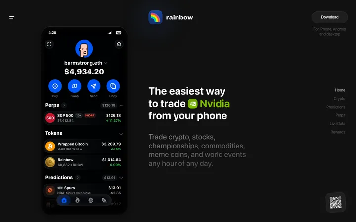
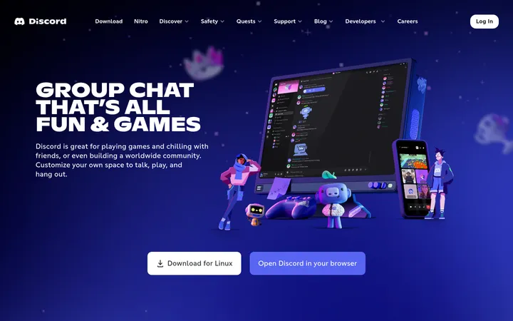
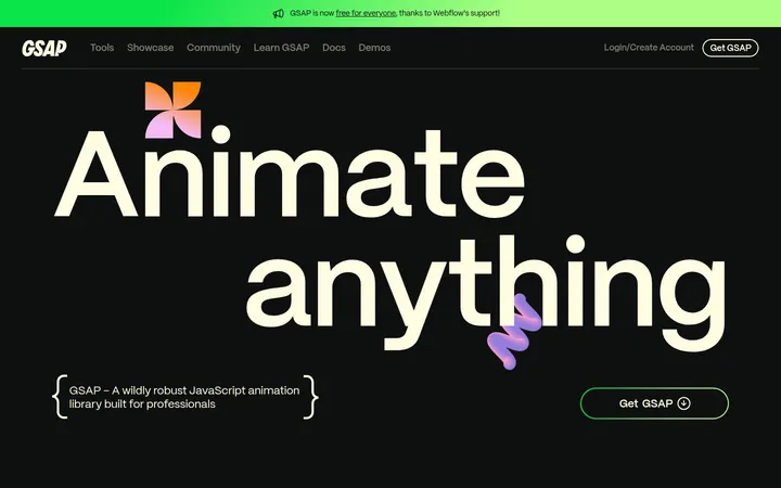
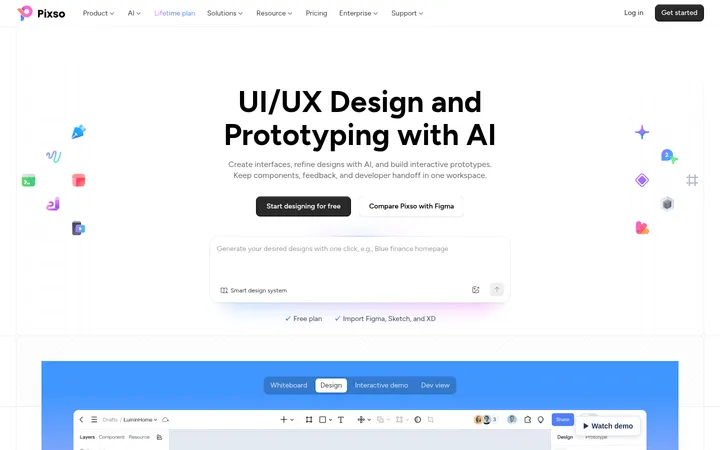
North star · Keep the interface nearly black and let tracked monospace type, pink calls to action, and product imagery carry the personality.
The page builds its identity around a #000000 canvas, allowing white uppercase headlines and pink emphasis to read sharply without competing with the product imagery. #262626 appears in navigation and as a fine outline around large content panels; it separates sections without introducing bright bands. Source Code Pro carries the system: headlines are bold, uppercase, and widely tracked, while compact labels and explanatory copy retain a technical, arcade-like cadence. The layout stays within a centered content frame, alternating product visuals and copy inside broad, outlined panels. App-store badges, phone mockups, profile cards, and review notes provide colorful detail, but their colors belong to the imagery rather than the core interface palette. Repeated pink download buttons create a clear action cue. Generous vertical gaps preserve breathing room across the long page, and rounded navigation and cards soften the otherwise sharp, dark presentation.
Site-wide display, navigation, body, eyebrow, caption, and code-like microcopy.
角色
示例
字号
字重
行高
字距
一级标题
Hero headline and major section titles.
Kippo
42px
700
1.19
0.119em
正文
Uppercase promotional copy and feature descriptions.
The quick brown fox 敏捷的狐狸
16px
700
1.88
0.313em
辅助文字
Compact supporting notes and small secondary labels.
The quick brown fox 敏捷的狐狸
10px
400
2
0.1em
导航
Small, widely tracked uppercase navigation links.
The quick brown fox 敏捷的狐狸
10px
600
2
0.5em
眉题
Section labels and short uppercase introductions.
The quick brown fox 敏捷的狐狸
10px
400
2
0.4em
代码
Tiny technical-style labels and pro-tip copy.
const style = 1;
10px
400
2
0.1em
间距与布局
基准单位 1px · 密度:宽松
150px版块间距
10px元素间距
15px卡片内边距
1108px内容最大宽度
5px
10px
15px
20px
25px
30px
35px
50px
100px
150px
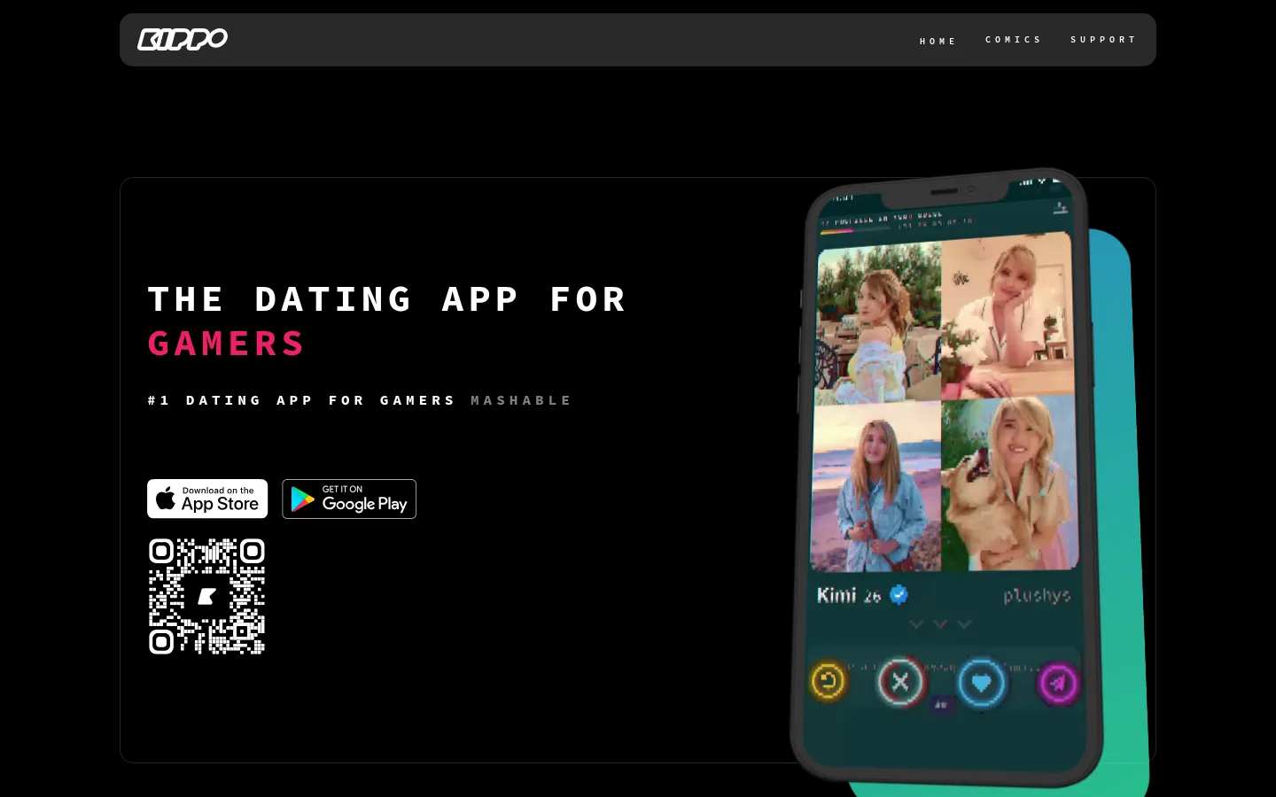
A centered content frame reaches the measured 1108px maximum width, with navigation above a large hero panel. The hero aligns copy to the left and a phone mockup to the right. Below it, a logo cloud leads into repeated, broad outlined feature panels, alternating image and copy placement; one connection panel uses two columns. Sections share a spacious vertical rhythm, with the measured 150px section gap and compact 10px element gap. The overall composition is intentionally sparse rather than grid-dense.
圆角与层次
按钮 · 10px
卡片 · 15px
图片 · 50%
导航 · 15px
没有测到阴影:页面是扁平的,层次靠底色和描边区分。
The visual system is mostly flat: no measured shadows, with dark panels and thin #262626 outlines providing structure. Rounded navigation and card corners soften the frames. Create depth through overlapping phones, profile cards, and collage imagery rather than drop shadows or stacked interface surfaces.
组件
下面的预览按实测的按钮、输入框、徽标、卡片样式重建(字体用替代字体)。
Top navigation
A rounded charcoal bar with the Kippo mark at left and small, widely tracked uppercase links at right.
Hero panel
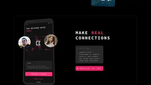
A large, subtly outlined black panel pairing a bold two-line headline and app-store badges with a phone mockup.
Feature panel
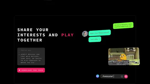
A broad dark section framed by a fine #262626 border, with product imagery and uppercase copy arranged in alternating sides.
Pro-tip card
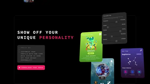
Compact charcoal card with tiny, spaced monospace copy and a numbered tip, used as supporting feature detail.
Download CTA
Bright #ee1f66 rounded button with white uppercase monospace label; repeated after feature descriptions.
Press logo cloud
A small uppercase introduction followed by a dense, multi-column row of publication marks.
Footer panel
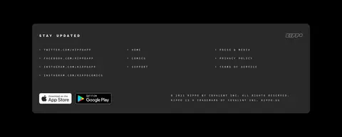
Rounded charcoal block combining social and site links, app badges, copyright text, and a small brand mark.
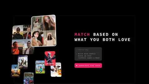
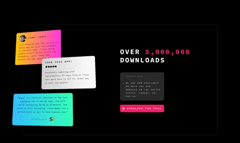
Imagery · Use product-first visuals: angled phone mockups, collages of profile cards, app UI, messaging snippets, and testimonial notes. Images are vivid and varied against the black page, with cutout-like floating layers and occasional overlap beyond panel edges. Keep imagery in its own framed zone; colorful cyan, green, and multicolor gradients belong to the screenshots or artwork, not the base interface.
Set prominent headings in bold, tracked uppercase monospace.
Reserve #ee1f66 for clear actions and selective emphasis.
Use thin #262626 outlines to frame large content panels.
Alternate product imagery and copy across feature sections.
Let app mockups and profile cards provide the vivid color.
✕ 不该做
Do not turn illustration gradient colors into broad UI backgrounds.
Do not add prominent shadows or glossy interface effects.
Do not crowd the page with dense grids or tight section spacing.
Do not use a conventional sans-serif for the main typographic voice.
Do not replace the dark canvas with alternating bright section bands.
Do not make every heading pink; keep white as the primary text color.
给 AI 的提示词
想快速出一个同风格的新页面,把这段话连同 DESIGN.md 一起发给 AI。
Build a new Kippo page using a near-black #000000 canvas, with #ffffff text and the measured Source Code Pro style (IBM Plex Mono is a suitable free substitute). Use widely tracked uppercase display headings, restrained small labels, and a centered content frame. Frame major feature panels with fine #262626 outlines and alternate copy with colorful phone, profile, or app-screen imagery. Use #ee1f66 for primary download actions and occasional headline emphasis; keep #ffc400, #ff33e0, #33beff, #33ffb8, and #cfcfcf confined to illustrative artwork or gradients. Maintain broad vertical breathing room, minimal elevation, and rounded navigation and cards. Favor overlapping product cutouts over shadows, and keep each section clear, sparse, and focused on one product benefit.