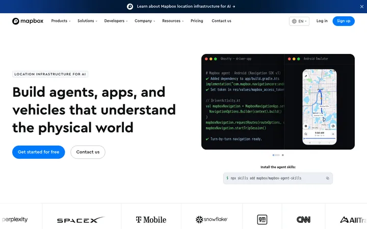
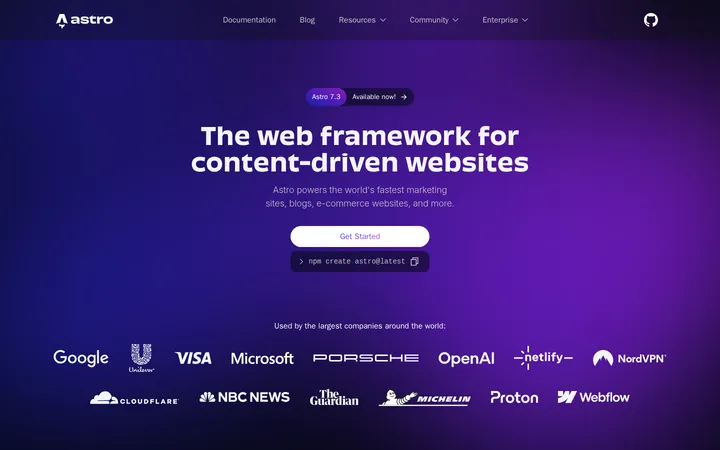
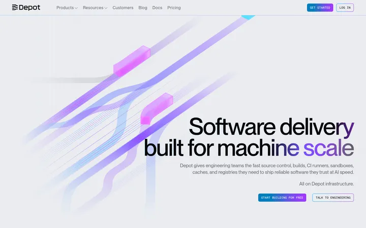
North star · Keep the canvas quiet and spacious so bold type and clear product evidence do the explaining.
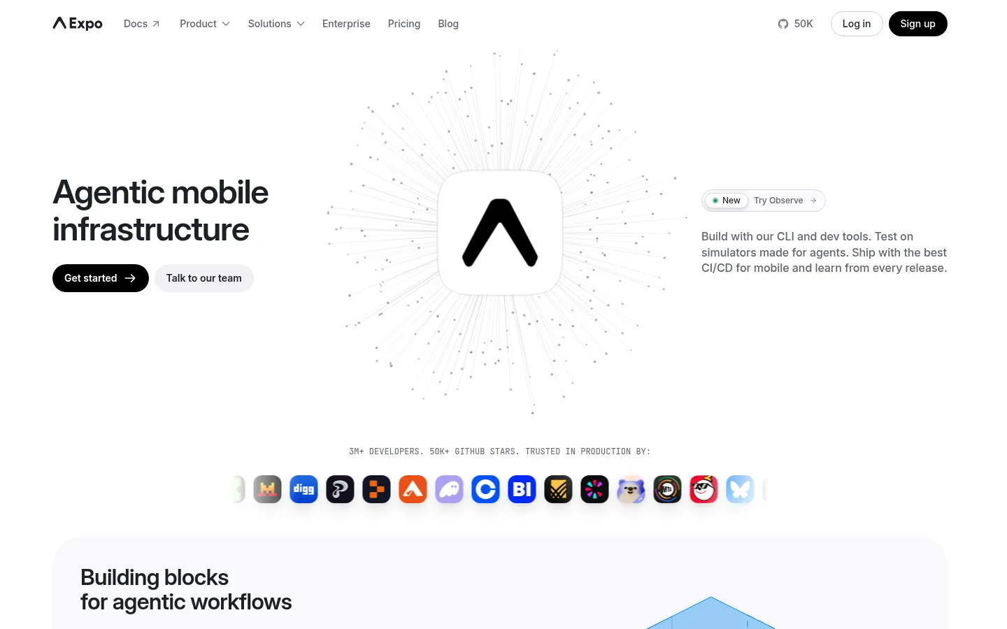
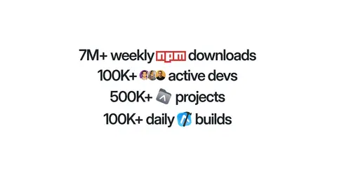
The page relies on a white canvas and alternating very pale gray section bands to create a calm, uncluttered foundation. Near-black headings provide strong contrast; muted gray copy keeps supporting explanations secondary, while blue accents are sparse and reserved for links or small interface details. Inter is used throughout, with substantial, tightly tracked display headings balanced by readable body copy and compact navigation. A wide, centered composition gives the hero and product panels room to breathe, then shifts into carefully arranged two-column features, cards, statistics, and testimonials. Large rounded panels soften the technical subject matter without making the interface feel decorative. Product screenshots, diagrams, and small customer marks provide most of the visual texture; they sit against quiet surfaces with restrained shadowing. The overall rhythm alternates generous open areas with denser product demonstrations, guiding users from platform overview toward evidence, community, and conversion.
配色
点色块复制色值。用途说明来自对页面的实测位置(背景、文字、描边、按钮)与截图判读。
品牌色
强调色
表层色
中性色
功能色
页面底色 · Gallery White表层 · Cloud Surface主文字 · Graphite Ink次要文字 · Slate Copy描边 · Divider Gray强调 · Link Blue强调 2 · Signal Blue
Display and section headings, body copy, navigation, links, and buttons.
Aa 设计
JetBrains Mono
网络字体 · 字重 400 / 500 / 600 · 占比 2%
免费替代:Roboto Mono
Small uppercase technical labels, metrics captions, and compact code-like details.
角色
示例
字号
字重
行高
字距
特大标题
Oversized hero and closing CTA headlines.
Expo
64px
600
1.1
-0.047em
一级标题
Primary page or major section headlines.
Expo
48px
600
1.1
-0.042em
二级标题
Feature-section titles and prominent product headings.
Expo
32px
600
1.1
-0.016em
三级标题
Card titles and smaller feature headings.
The quick brown fox 敏捷的狐狸
24px
600
1.2
-0.021em
正文
Explanatory paragraphs and general content.
The quick brown fox 敏捷的狐狸
16px
500
1.4
0
辅助文字
Small supporting labels and compact interface copy.
The quick brown fox 敏捷的狐狸
14px
500
1.4
0
按钮
Prominent CTA labels.
The quick brown fox 敏捷的狐狸
24px
600
1.2
-0.021em
导航
Header and footer navigation links.
The quick brown fox 敏捷的狐狸
14px
400
1.63
0
链接
Inline links and feature-card actions.
The quick brown fox 敏捷的狐狸
16px
500
1.4
0
代码
Compact uppercase technical labels and metrics.
const style = 1;
12px
400
1.6
0
间距与布局
基准单位 8px · 密度:宽松
200px版块间距
8px元素间距
64px卡片内边距
—内容最大宽度
4px
6px
8px
12px
16px
24px
32px
40px
48px
64px
Use a wide centered content area, with the hero arranged in three visual zones: headline and actions, central Expo mark, and supporting copy. The measured section structure alternates broad single-column bands with two-column feature groups, then narrows into centered statistics and community content. Preserve generous vertical pauses between major groups and keep card content spacious rather than tightly packed. The measured page width is unspecified, so follow the screenshot’s broad desktop composition without asserting a fixed maximum.
圆角与层次
按钮 · 9999px
卡片 · 40px
图片 · 12px
导航 · 9999px
链接 · 16px
lg · media
hairline · button, footer
lg · card, other, button
md · other
Most sections and cards read as flat pale surfaces, with subtle separation provided by background bands and occasional fine borders. Reserve soft shadows for product mockups and layered media, not text containers. Use clear overlap only within interface previews; keep primary content visually grounded and avoid heavy drop shadows.
组件
下面的预览按实测的按钮、输入框、徽标、卡片样式重建(字体用替代字体)。
Primary CTA
Black, white-text pill button for actions such as Get started and Learn more; use high contrast and a compact, direct label.
Top navigation
A restrained horizontal header with the Expo mark, Inter navigation links, and compact account actions.
Feature card
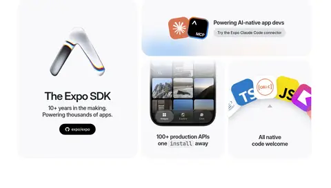
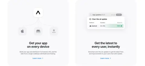
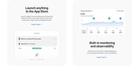
Pale #f9f9fb surface with a large rounded form, spacious internal padding, a clear heading, supporting copy, and product media.
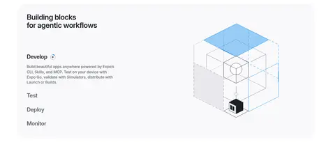
Product showcase
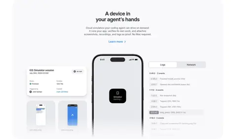
Screenshots, device imagery, or a diagram arranged beside or beneath concise explanatory text inside a soft panel.
Testimonial tile
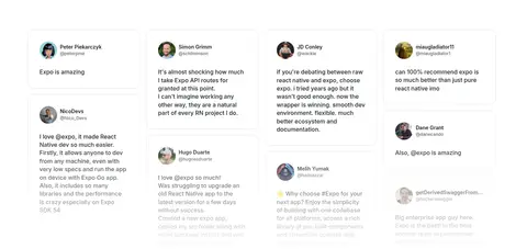
Light link-like card with a fine #e0e1e6 border, rounded corners, author identification, and short quote.
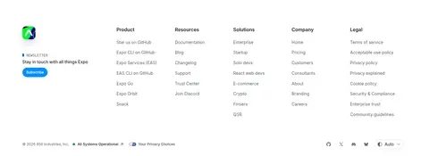
Newsletter subscribe
Compact footer signup with a bright #0090ff subscribe button and otherwise muted, minimal presentation.
Imagery · Favor product UI screenshots, device previews, workflow panels, and clean technical diagrams over lifestyle photography. Frame media inside pale, generously rounded cards, often paired with centered headings or explanatory copy. The hero’s radial technical illustration is delicate and low contrast. Customer logos and testimonial avatars add small bursts of color; treat those as supporting media rather than the brand palette.
Use white as the primary canvas and pale gray bands to separate major groups.
Make headline hierarchy bold and compact with Inter.
Give technical product panels generous internal breathing room.
Use black pill CTAs for the most important actions.
Let screenshots and diagrams explain product capabilities.
Keep bright blue accents sparse and purposeful.
✕ 不该做
Do not introduce saturated full-page color backgrounds.
Do not crowd feature cards with dense paragraphs.
Do not use heavy shadows on every container.
Do not replace the calm layout with a dense dashboard grid.
Do not treat illustration-only colors as core brand colors.
Do not make secondary copy compete with the headings.
给 AI 的提示词
想快速出一个同风格的新页面,把这段话连同 DESIGN.md 一起发给 AI。
Build a new developer-tools page in Expo’s visual style. Use Gallery White (#ffffff) as the main canvas, alternating Cloud Surface (#f9f9fb) bands for feature groups, Graphite Ink (#1c2024) for headings, and Slate Copy (#60646c) for supporting text. Keep Link Blue (#0d74ce) and Signal Blue (#0090ff) rare; use Button Black (#000000) for primary pill CTAs. Set Inter across navigation, headings, body, and buttons, with tight tracking on bold headings; reserve JetBrains Mono for small technical labels. Compose a spacious centered desktop layout with clear hero zones, rounded product cards, and varied two-column and centered sections. Use product screenshots, device previews, and restrained diagrams as evidence. Favor fine borders and subtle media shadows over heavy elevation. Keep copy concise and hierarchy unmistakable.