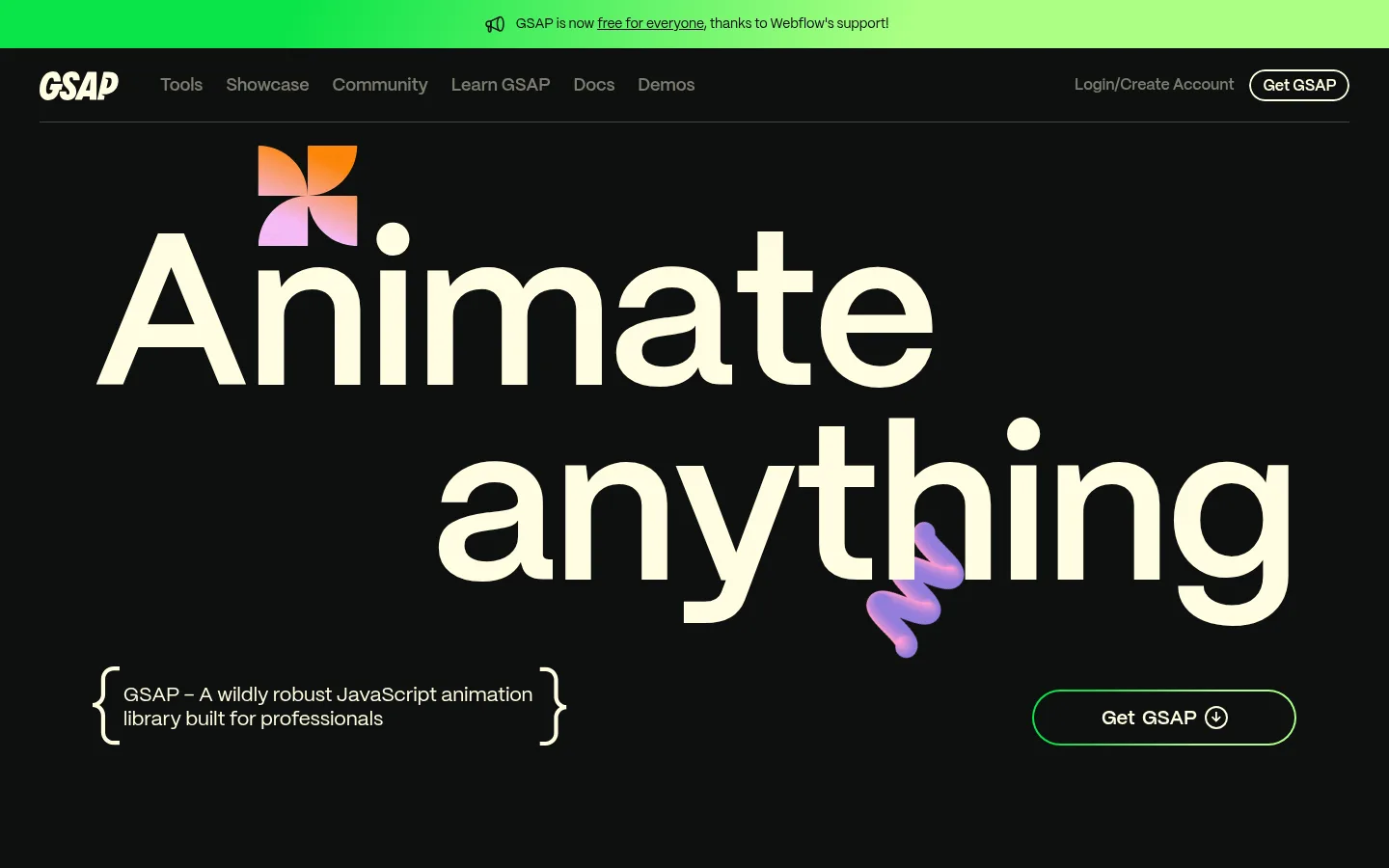
GSAP以近黑色画布、暖象牙色文字和鲜亮绿色点缀,搭配活泼多彩的动效图形。超大标题、宽松的区块节奏、精简导航与浅色订阅页脚,共同塑造鲜明的开发者工具主页风格。
North star · Keep the canvas nearly black and let expressive type, sparse green accents, and vivid animated artwork provide the contrast.
The page is built on a near-black canvas (#0e100f), with warm ivory (#fffce1) carrying the main navigation, oversized display headlines, and body copy. Signal green (#0ae448) and light green (#abff84) appear in announcement and CTA treatments, while pink, orange, and lilac hues add character to animated marks and tool illustrations rather than replacing the dark brand foundation. Mori is used throughout: very large, heavy headlines create a dramatic hero, while smaller navigation and body text remain clean and direct. The layout alternates broad, quiet stretches with focused content: centered explanatory copy, a large open feature area, then compact two-column tool rows separated by fine rules. Showcase work appears as a horizontal visual gallery. Cards and buttons stay simple, rounded, and mostly flat. The pale ivory newsletter footer provides a decisive contrast at the end of the long dark page.
配色 点色块复制色值。用途说明来自对页面的实测位置(背景、文字、描边、按钮)与截图判读。
品牌色
Motion Black
#0e100f
Dominant page canvas for the header, hero, feature sections, showcase, and dark footer navigation.
强调色
Signal Green
#0ae448
Brand accent for announcement and CTA details, plus occasional highlighted words and gradient artwork.
Lime Light
#abff84
Lighter endpoint of the green gradient used for announcement and button accents.
Petal Pink
#fec5fb
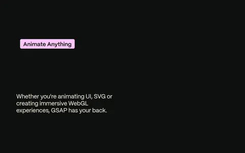
Highlight surface for the Animate Anything feature label and occasional expressive graphic details.
Tangerine Pop
#ff8709
Color within decorative SVG and gradient artwork, notably the warm tool-illustration palette.
Lilac Glow
#f7bdf8
Illustration and gradient color; it appears in decorative art rather than the core interface palette.
表层色
Warm Ivory
#fffce1
Primary text on dark sections, navigation and links; also the contrasting newsletter and legal footer surface.
中性色
Quiet Rule
#42433d
Subtle hairlines, especially the divider beneath the header and separators between content rows.
功能色
Muted Olive
#7c7c6f
Secondary navigation and subdued utility text against the dark canvas.
文字 背景 对比度 WCAG #fffce1 Warm Ivory#0e100f Motion Black18.43:1 AAA #fffce1 Warm Ivory#fec5fb Petal Pink1.39:1 不达标 #0e100f Motion Black#fffce1 Warm Ivory18.43:1 AAA #0e100f Motion Black#fec5fb Petal Pink13.27:1 AAA #7c7c6f Muted Olive#0e100f Motion Black4.52:1 AA #7c7c6f Muted Olive#fffce1 Warm Ivory4.08:1 AA-large
字体 字号阶梯:Custom(比例约 1.741,正文 14px)。示例用免费替代字体渲染,数值为实测。
Aa 设计
Mori 网络字体 · 字重 400 / 600 · 占比 100%
免费替代:DM Sans
Site-wide typeface for display headlines, navigation, body text, links, and controls.
角色 示例 字号 字重 行高 字距 特大标题 Oversized hero headline, with compressed line spacing.
GSAP
224px 600 0.9 -0.02em 一级标题 Primary page and section headline treatment.
GSAP
101px 600 1 0 二级标题 Large feature and content section headings.
GSAP
89px 600 1 0 三级标题 Tool and showcase section headings.
GSAP
76.5px 600 1 -0.01em 四级标题 Supporting headings and lower-level feature titles.
GSAP
66px 400 1.2 -0.01em 正文 Compact supporting copy and explanatory text.
The quick brown fox 敏捷的狐狸
14px 400 1.4 -0.01em 按钮 Emphasized CTA labels.
The quick brown fox 敏捷的狐狸
18px 600 1.05 -0.01em 导航 Primary header navigation links.
The quick brown fox 敏捷的狐狸
19px 400 1.15 0 链接 Prominent text links, including showcase and tool exploration.
The quick brown fox 敏捷的狐狸
23px 400 1.38 -0.01em
间距与布局 基准单位 2px · 密度:宽松
108px 版块间距
7px 元素间距
17px 卡片内边距
1249px 内容最大宽度
3px
5px
7px
8px
10px
14px
15px
16px
18px
20px
22px
24px
32px
49px
59px
65px
A spacious, long-form page centered within a measured 1249px maximum width. The hero is left-led and typographic, followed by centered explanatory copy and expansive feature space. Tool content shifts into two-column rows, with artwork on one side and copy and pill links on the other; thin rules separate rows. Showcase content uses a horizontally arranged gallery, while the footer changes to a two-column light panel. The overall density is spacious, with measured section gaps of 108px and a 2px base spacing unit.
圆角与层次 没有测到阴影:页面是扁平的,层次靠底色和描边区分。
The interface is mostly flat, with no measured shadow system. Separate content using fine muted borders and generous dark space rather than stacked panels. The feature label is a simple rounded pink surface; buttons and navigation use pill outlines or plain text. Showcase media supplies the main sense of depth.
组件 下面的预览按实测的按钮、输入框、徽标、卡片样式重建(字体用替代字体)。
Header navigation A horizontal dark header with ivory logo and links, muted utility items, a thin bottom rule, and a pill-shaped Get GSAP action.
Announcement strip A vivid green-to-light-green banner above the header with a compact announcement and inline link.
Hero Oversized ivory Mori headline on the near-black canvas, punctuated by decorative colorful art and a rounded outlined CTA.
Tool rows Tool categories pair large colorful illustrations with a title, concise description, and small outlined pill link; hairlines divide the rows.
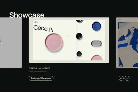
Showcase gallery A horizontal collection of project video and image previews with supporting labels, a showreel link, and navigation controls.
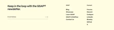
Newsletter footer A warm ivory footer panel with a newsletter message, email field, grouped site links, social links, and compact legal details.
Imagery · Decorative motion graphics and colorful abstract tool marks punctuate the dark canvas, including gradient forms that read as expressive SVG or 3D-like objects. The hero pairs oversized ivory text with a small bright geometric mark and a lilac flourish. Tool rows use large, isolated illustrations; the showcase shifts to framed project imagery and video thumbnails. Keep artwork vivid and let it contrast against generous dark negative space.
页面版块 共 12 个版块,按页面从上到下排列,每个都标了类型、布局和交互套路。
该做与不该做 ✓ 该做 Use #0e100f as the dominant canvas. Set primary dark-surface text in #fffce1. Reserve green accents for focused emphasis and CTA details. Use generous negative space between major sections. Let oversized Mori typography lead the hero. Separate tool rows with subtle hairlines. Keep decorative art colorful and isolated against the dark ground. ✕ 不该做 Do not turn every section into a card. Do not use colorful gradients as the page-wide background. Do not make utility navigation compete with the hero. Do not add heavy shadows or elaborate elevation. Do not use pink or orange as the main interface accent. Do not compress the page into a dense dashboard. 给 AI 的提示词 想快速出一个同风格的新页面,把这段话连同 DESIGN.md 一起发给 AI。
复制 Build a new page in the GSAP visual style: use Motion Black (#0e100f) as the main canvas and Warm Ivory (#fffce1) for prominent text. Set Mori throughout, or use DM Sans as a close free substitute; create an expressive oversized headline and restrained compact navigation. Use Signal Green (#0ae448) and Lime Light (#abff84) sparingly for announcement or CTA accents. Keep colorful artwork—Petal Pink (#fec5fb), Tangerine Pop (#ff8709), and Lilac Glow (#f7bdf8)—within decorative illustrations rather than broad UI surfaces. Favor spacious sections, open dark negative space, thin Quiet Rule (#42433d) dividers, simple pill controls, and flat surfaces without shadows. Arrange feature content in clear rows and place a contrasting ivory newsletter or closing panel at the bottom. Prioritize typography and artwork over decorative containers.
DESIGN.md Tailwind v4 CSS 变量 Design Tokens
---
title: "GSAP design system"
variant: extended
source: https://gsap.com/
captured_at: 2026-10-12
theme: dark
industry: devtools
generator: Design DNA (https://four.wiralomi.com/style/gsap-com)
ai_generated: true
ai_label: "本文件由 AI 辅助生成:数值取自公开网页的实测样式,命名、用途说明与建议为模型解读。商标归原所有者。 / AI-assisted content"
---
# GSAP · Design System
> A dark canvas for expressive motion and oversized type.
**Theme:** dark · **Industry:** devtools · **Source:** https://gsap.com/ · **Captured:** 2026-10-12 (1440×900 desktop)
_AI-assisted content: values are measured from the public page at capture time; names, roles and guidance are model-written interpretations. Trademarks belong to their owners._
GSAP pairs a near-black canvas and warm ivory typography with vivid green accents and playful, colorful motion graphics. Oversized headlines, spacious section breaks, compact navigation, and a pale newsletter footer give the developer-focused homepage a distinctive editorial rhythm.
## North star
Keep the canvas nearly black and let expressive type, sparse green accents, and vivid animated artwork provide the contrast.
## Overview
The page is built on a near-black canvas (## Colors
| Name | Hex | Token | Group | Role |
|---|---|---|---|---|
| Motion Black | ` | `--color-motion-black` | brand | Dominant page canvas for the header, hero, feature sections, showcase, and dark footer navigation. |
| Warm Ivory | ` | `--color-warm-ivory` | surface | Primary text on dark sections, navigation and links; also the contrasting newsletter and legal footer surface. |
| Signal Green | ` | `--color-signal-green` | accent | Brand accent for announcement and CTA details, plus occasional highlighted words and gradient artwork. |
| Quiet Rule | ` | `--color-quiet-rule` | neutral | Subtle hairlines, especially the divider beneath the header and separators between content rows. |
| Muted Olive | ` | `--color-muted-olive` | semantic | Secondary navigation and subdued utility text against the dark canvas. |
| Lime Light | ` | `--color-lime-light` | accent | Lighter endpoint of the green gradient used for announcement and button accents. |
| Petal Pink | ` | `--color-petal-pink` | accent | Highlight surface for the Animate Anything feature label and occasional expressive graphic details. |
| Tangerine Pop | ` | `--color-tangerine-pop` | accent | Color within decorative SVG and gradient artwork, notably the warm tool-illustration palette. |
| Lilac Glow | ` | `--color-lilac-glow` | accent | Illustration and gradient color; it appears in decorative art rather than the core interface palette. |
### Semantic aliases
`--color-canvas` → ` (Motion Black) · `--color-surface` → ` (Warm Ivory) · `--color-surface-2` → ` (Petal Pink) · `--color-text` → ` (Warm Ivory) · `--color-text-muted` → ` (Motion Black) · `--color-text-subtle` → ` (Muted Olive) · `--color-border` → ` (Quiet Rule) · `--color-accent` → ` (Signal Green) · `--color-accent-2` → ` (Lime Light) · `--color-accent-3` → ` (Petal Pink)
### Contrast (WCAG 2.x)
| Text | Background | Ratio | Level |
|---|---|---|---|
| ` | ` | 18.43:1 | AAA |
| ` | ` | 1.39:1 | fail |
| ` | ` | 18.43:1 | AAA |
| ` | ` | 13.27:1 | AAA |
| ` | ` | 4.52:1 | AA |
| ` | ` | 4.08:1 | AA-large |
| ` | ` | 2.94:1 | fail |
| ` | ` | 11.1:1 | AAA |
| ` | ` | 1.66:1 | fail |
| ` | ` | 1.2:1 | fail |
### Gradients
- `linear-gradient(114.41deg, rgb(10, 228, 72) 20.74%, rgb(171, 255, 132) 65.5%)`
- `linear-gradient(111.45deg, rgb(255, 135, 9) 19.42%, rgb(247, 189, 248) 73.08%)`
- `linear-gradient(rgb(14, 16, 15), rgb(14, 16, 15)), linear-gradient(114.41deg, rgb(10, 228, 72) 20.74%, rgb(171, 255, 132) 65.5%)`
- `linear-gradient(153.58deg, rgb(247, 189, 248) 32.25%, rgb(47, 60, 192) 92.68%)`
## Typography
| Family | Token | Source | Weights | Role | Free substitute |
|---|---|---|---|---|---|
| Mori | `--font-body` | webfont | 400, 600 | Site-wide typeface for display headlines, navigation, body text, links, and controls. | DM Sans |
- **Mori:** Use weight 600 for prominent headlines and controls, 400 for body and navigation; keep tracking tight on large display text and preserve natural casing.
### Type scale — Custom (ratio ≈ 1.741, base 14px)
| Role | Size | Weight | Line height | Letter spacing | Case | Family | Used for |
|---|---|---|---|---|---|---|---|
| display | 224px | 600 | 0.9 | -0.02em | — | Mori | Oversized hero headline, with compressed line spacing. |
| h1 | 101px | 600 | 1 | 0 | — | Mori | Primary page and section headline treatment. |
| h2 | 89px | 600 | 1 | 0 | — | Mori | Large feature and content section headings. |
| h3 | 76.5px | 600 | 1 | -0.01em | — | Mori | Tool and showcase section headings. |
| h4 | 66px | 400 | 1.2 | -0.01em | — | Mori | Supporting headings and lower-level feature titles. |
| body | 14px | 400 | 1.4 | -0.01em | — | Mori | Compact supporting copy and explanatory text. |
| button | 18px | 600 | 1.05 | -0.01em | — | Mori | Emphasized CTA labels. |
| nav | 19px | 400 | 1.15 | 0 | — | Mori | Primary header navigation links. |
| link | 23px | 400 | 1.38 | -0.01em | — | Mori | Prominent text links, including showcase and tool exploration. |
## Spacing & layout
- Base unit **2px**, density **spacious**.
- Scale (most used values): 3, 5, 7, 8, 10, 14, 15, 16, 18, 20, 22, 24, 32, 49, 59, 65 px.
- Section rhythm 108px · element gap 7px · card padding 17px · max content width 1249px.
A spacious, long-form page centered within a measured 1249px maximum width. The hero is left-led and typographic, followed by centered explanatory copy and expansive feature space. Tool content shifts into two-column rows, with artwork on one side and copy and pill links on the other; thin rules separate rows. Showcase content uses a horizontally arranged gallery, while the footer changes to a two-column light panel. The overall density is spacious, with measured section gaps of 108px and a 2px base spacing unit.
## Shape & elevation
- Radius: button `50%` · card `8px` · nav `9999px` · link `9999px` · xs `8px` · pill `9999px`
- No box shadows measured: the page is flat.
- Motion: standard transition `0.3s cubic-bezier(0.645, 0.045, 0.355, 1)` on interactive elements.
The interface is mostly flat, with no measured shadow system. Separate content using fine muted borders and generous dark space rather than stacked panels. The feature label is a simple rounded pink surface; buttons and navigation use pill outlines or plain text. Showcase media supplies the main sense of depth.
## Imagery
Decorative motion graphics and colorful abstract tool marks punctuate the dark canvas, including gradient forms that read as expressive SVG or 3D-like objects. The hero pairs oversized ivory text with a small bright geometric mark and a lilac flourish. Tool rows use large, isolated illustrations; the showcase shifts to framed project imagery and video thumbnails. Keep artwork vivid and let it contrast against generous dark negative space.
## Components
### Header navigation
A horizontal dark header with ivory logo and links, muted utility items, a thin bottom rule, and a pill-shaped Get GSAP action.
### Announcement strip
A vivid green-to-light-green banner above the header with a compact announcement and inline link.
### Hero
Oversized ivory Mori headline on the near-black canvas, punctuated by decorative colorful art and a rounded outlined CTA.
### Tool rows
Tool categories pair large colorful illustrations with a title, concise description, and small outlined pill link; hairlines divide the rows.
### Showcase gallery
A horizontal collection of project video and image previews with supporting labels, a showreel link, and navigation controls.
### Newsletter footer
A warm ivory footer panel with a newsletter message, email field, grouped site links, social links, and compact legal details.
### Measured component styles
- **Primary button** (“Get GSAP”): transparent background · text ## Do
- Use ## Don't
- Do not turn every section into a card.
- Do not use colorful gradients as the page-wide background.
- Do not make utility navigation compete with the hero.
- Do not add heavy shadows or elaborate elevation.
- Do not use pink or orange as the main interface accent.
- Do not compress the page into a dense dashboard.
## Agent prompt
Build a new page in the GSAP visual style: use Motion Black (## Page sections (top to bottom)
| # | Type | Layout | UX patterns | UI patterns |
|---|---|---|---|---|
| 1 | hero | Dark header and large left-led headline, with supporting copy and CTA aligned across the lower hero. | Primary download CTA, Top-level navigation | Oversized ivory typography, Decorative gradient mark, Pill outline button |
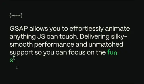
| 2 | feature-split | Centered explanatory statement with ample vertical space on the uninterrupted dark canvas. | Value proposition, Progressive reading | Centered large copy, Subtle divider, Green emphasis |
| 3 | feature-split | Open feature area with an accent label and supporting copy arranged across a spacious dark section. | Capability overview, Feature introduction | Pink label surface, Minimal supporting copy, Large negative space |
| 4 | feature-split | Two-column tool row with illustration on one side and title, description, and action on the other. | Explore tool, Category navigation | Gradient illustration, Pill link, Hairline divider |
| 5 | feature-split | Two-column tool row separated from neighboring rows by a thin rule. | Explore tool, Category navigation | Warm gradient illustration, Pill link, Hairline divider |
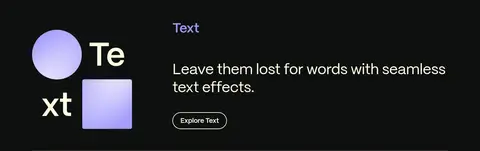
| 6 | feature-split | Two-column tool row pairing graphic typography with concise copy and an action. | Explore tool, Category navigation | Lilac graphic accents, Pill link, Hairline divider |
| 7 | feature-split | Tool row with a graphic block opposite title, short description, and pill-shaped action. | Explore tool, Category navigation | Cyan-tinted geometric art, Pill link, Open spacing |
| 8 | logo-cloud | Centered heading above a single horizontal band of brand marks. | Social proof | Logo row, Monochrome marks, Centered alignment |
| 9 | gallery | Large gallery area with horizontally arranged media previews and carousel-style controls. | Browse projects, Watch showreel | Video thumbnails, Horizontal gallery, Pill action |
| 10 | category-nav | Compact multi-column directory of tool categories and links on the dark background. | Browse documentation, Jump to tool category | Grouped text links, Small category labels, Multi-column list |
| 11 | newsletter | Two-column ivory footer panel with newsletter form on the left and grouped links on the right. | Email signup, Explore site links | Light surface, Email input, Grouped navigation |
| 12 | footer | Compact final legal row continuing the ivory footer surface. | Privacy navigation, Terms navigation | Small legal text, Inline links, Simple horizontal layout |
## Source CSS custom properties (selected)
```css
--color-shockingly-green: