North star · Keep the interface as quiet as an architectural gallery: black space first, precise uppercase type and fine rules second.
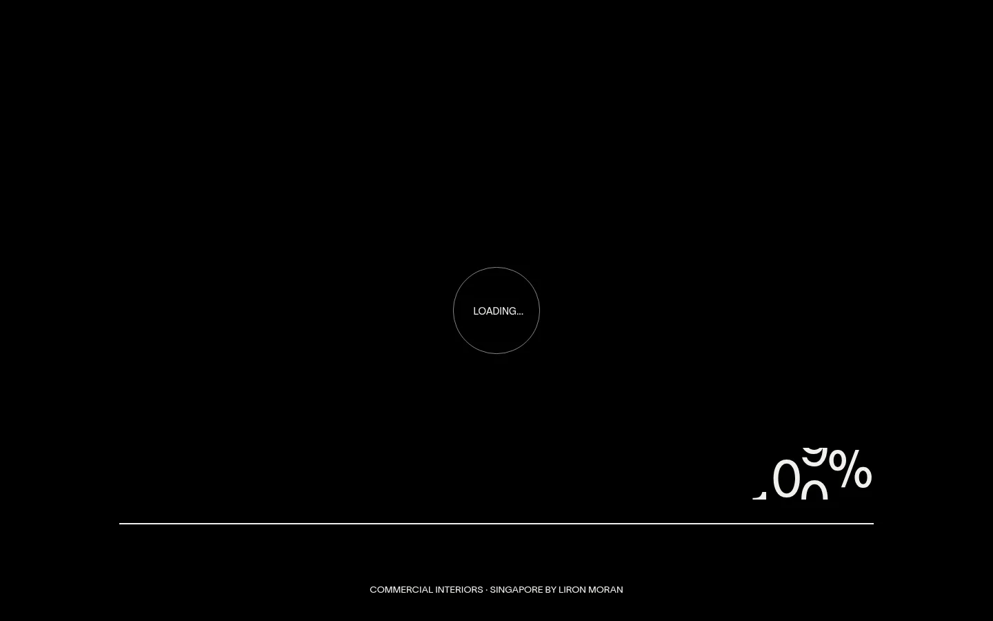
The visible identity is built around a nearly pure-black canvas and restrained white typography, giving the loading view an architectural, gallery-like quietness. Measured text uses #eeeeee, while a fine circular loader and long horizontal rule keep the interface legible without introducing cards or decorative framing. Lausanne-300 supplies the principal uppercase sans-serif voice; cardinalfruit-regular is reserved for oversized display moments elsewhere in the measured type system. The measured palette also includes muted olive-grey and white surfaces, plus a vivid green WhatsApp accent, but these are secondary to the black-and-white first viewport; the green appears as a compact contact affordance rather than a dominant brand field. Layout relies on broad negative space, a centered loader, and a low-set progress line and studio descriptor. Treat the whole page as motion-led and image-conscious, while avoiding assumptions about photography from this loading-only screenshot.
配色
点色块复制色值。用途说明来自对页面的实测位置(背景、文字、描边、按钮)与截图判读。
品牌色
强调色
表层色
中性色
功能色
页面底色 · Gallery Black表层 · Olive Slate表层 2 · Clean White主文字 · Soft Chalk描边 · Stone Hairline强调 · WhatsApp Green
Main uppercase interface, navigation, body copy, and headings.
Aa 设计
cardinalfruit-regular
网络字体 · 字重 400 · 占比 23%
免费替代:Cormorant Garamond
Oversized display typography and expressive editorial accents.
角色
示例
字号
字重
行高
字距
特大标题
Oversized editorial display lettering for prominent brand moments.
Liron Moran Interiors
259.5px
400
1
0
一级标题
Primary page headline, set in large uppercase sans-serif.
Liron Moran Interiors
185.5px
400
1
0
二级标题
Section headings with a bold scale contrast and uppercase treatment.
Liron Moran Interiors
92.5px
400
1
0
正文
Compact uppercase supporting copy and interface labels.
The quick brown fox 敏捷的狐狸
13.5px
400
1
0
导航
Uppercase navigation labels and oversized menu presentation.
Liron Moran Interiors
92.5px
400
1
0
间距与布局
基准单位 1px · 密度:适中
89px版块间距
—元素间距
—卡片内边距
1361px内容最大宽度
1px
5px
6px
30px
35px
36px
39px
89px
130px
The measured content uses a centered maximum-width frame of 1361px, with a comfortable density and section rhythm based on the measured 89px gap. In the screenshot, the loading viewport is full-bleed black: a small circular loader sits near the center, while a thin progress rule and studio descriptor occupy the lower area. Navigation is minimal and pushed to the edges in the scaled preview. Favor generous negative space, asymmetrical placement for secondary details, and avoid conventional card grids unless content requires them.
圆角与层次
按钮 · 50%
没有测到阴影:页面是扁平的,层次靠底色和描边区分。
The visual language is flat, with no measured shadows or gradients. Use thin, low-contrast outlines and separators rather than raised panels. Circular controls are the notable outlined component; keep layering minimal and reserve the bright accent for the contact affordance.
组件
下面的预览按实测的按钮、输入框、徽标、卡片样式重建(字体用替代字体)。
Loading indicator
Small circular outline centered in the viewport, containing a compact uppercase loading label.
Progress rule
Long, fine horizontal line across the lower viewport, paired with a large percentage readout.
Minimal navigation
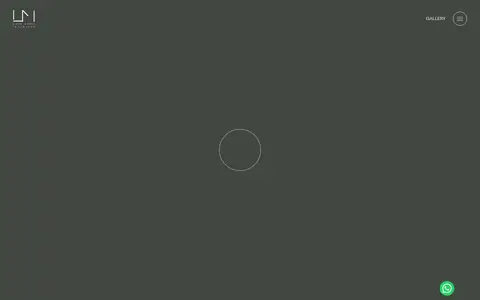
Small uppercase Gallery label and circular menu control sit at the page edge in the scaled preview.
WhatsApp contact
Compact circular #25d366 control with white icon treatment; keep it as a single vivid accent.
Outline pill controls
Measured controls use a 50% radius and a thin #eeeeee outline, with no shadow.
Studio descriptor
Small uppercase line naming commercial interiors, Singapore, and the studio near the bottom of the loading view.
Imagery · The first viewport is a loading state rather than a portfolio image: it uses no visible photography, illustration, or 3D. The scaled preview hints at a full-bleed studio presentation but does not provide enough evidence to prescribe image subjects. When introducing project imagery, let architectural photography carry the page and keep framing broad and uncluttered; retain the dark, restrained interface around it.
Set interface copy in restrained uppercase sans-serif.
Preserve generous negative space around focal elements.
Use thin rules and circular outlines for lightweight structure.
Reserve #25d366 for a compact WhatsApp contact control.
Use project imagery as broad architectural compositions when available.
✕ 不该做
Do not add gradients or drop shadows.
Do not fill the page with card-like panels.
Do not make the WhatsApp green a large section background.
Do not crowd the loading or hero area with explanatory copy.
Do not substitute heavy bold typography for the light measured voice.
Do not infer project photography from the loading screen alone.
给 AI 的提示词
想快速出一个同风格的新页面,把这段话连同 DESIGN.md 一起发给 AI。
Build a new page for Liron Moran Interiors with the restraint of an architectural gallery. Make #000000 Gallery Black the dominant canvas, use #eeeeee Soft Chalk for uppercase Lausanne-like interface text, and rely on generous empty space rather than boxed cards. Keep the hierarchy editorial: a striking display moment may use a refined serif-like accent, while navigation and supporting copy stay clean and light. Use fine rules and circular outline controls in place of shadows or raised surfaces. If a muted section is needed, use #424740 Olive Slate; keep #978f84 Stone Hairline subtle. Limit #25d366 WhatsApp Green to a compact contact action. Let project photography dominate only when actual project assets are available, with minimal interface chrome around it.