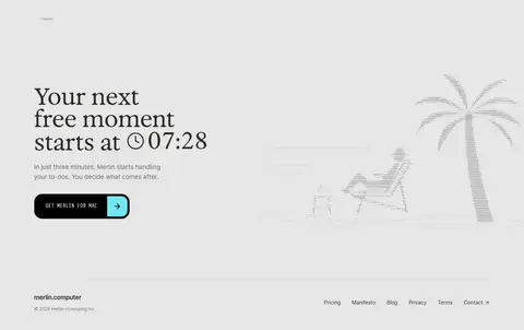
Merlin 首页以克制的编辑式字体和充足留白,搭配温暖、有质感的产品场景。黑色主按钮、青色强调和一段深色隐私区,为整体安静的页面建立清晰节奏。
North star · Keep the page calm and editorial: let generous white space and clear product evidence lead, with color reserved for purposeful emphasis.
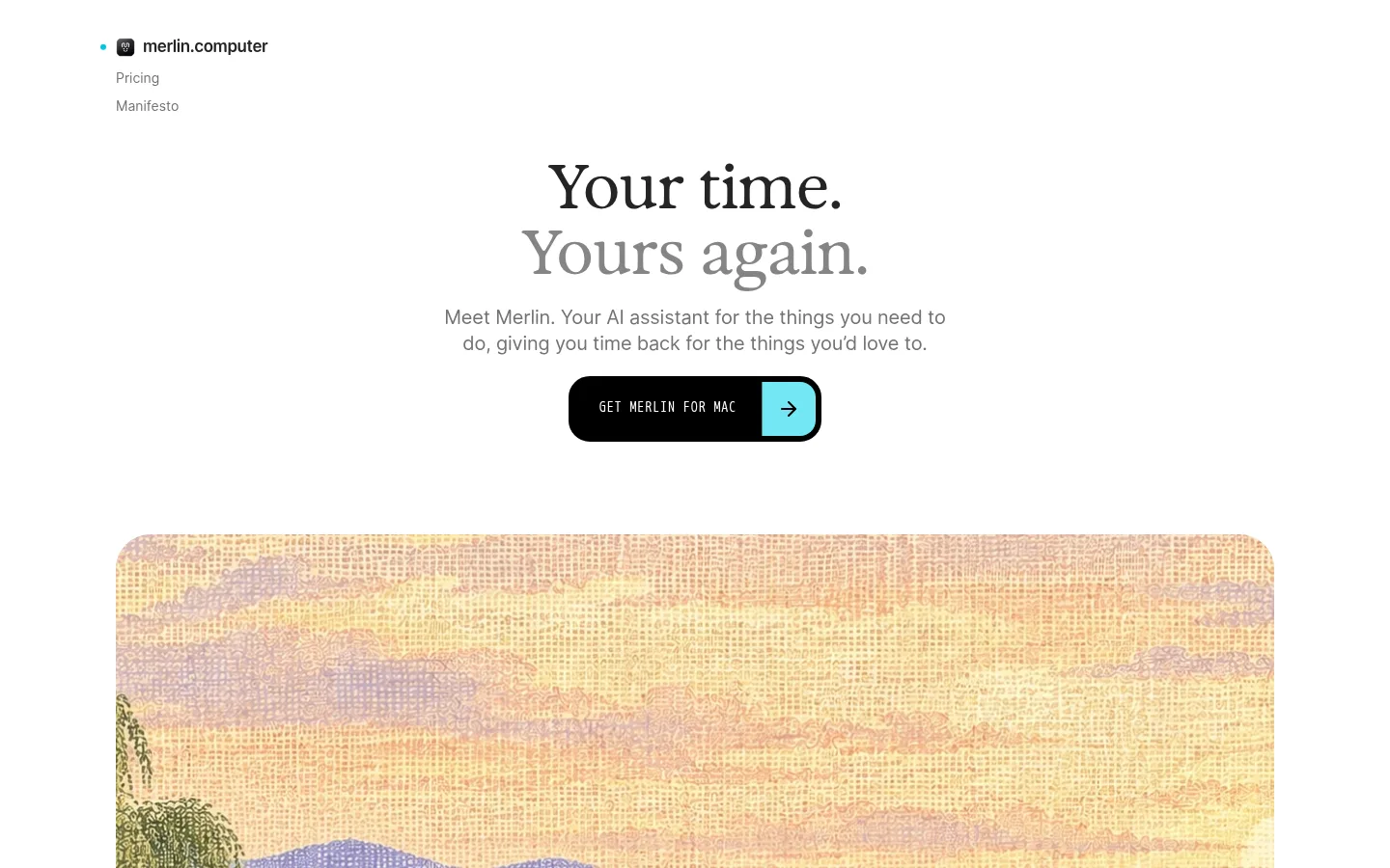
The page is built on a white canvas, with pale gray used for occasional feature bands and a full black privacy block as its strongest contrast. Most interface copy is charcoal or muted gray; cyan appears in selected links, product highlights, and CTA details, while burgundy is a sparse badge accent rather than a dominant brand field. The headline combines a display serif with Open Runde’s rounded, approachable sans-serif for supporting text and navigation. Content alternates centered statements with spacious split layouts, keeping product UI and explanatory copy visually distinct. Warm, softly textured landscape imagery anchors the hero, while later sections use cropped lifestyle photography and floating app-window mockups to make capabilities tangible. Handwritten cyan annotations add a human note without displacing the calm editorial tone. Hairline borders, restrained shadows, pill-shaped controls, and comfortable section spacing keep the interface light and legible.
配色 点色块复制色值。用途说明来自对页面的实测位置(背景、文字、描边、按钮)与截图判读。
品牌色
Merlot Accent
#5c0632
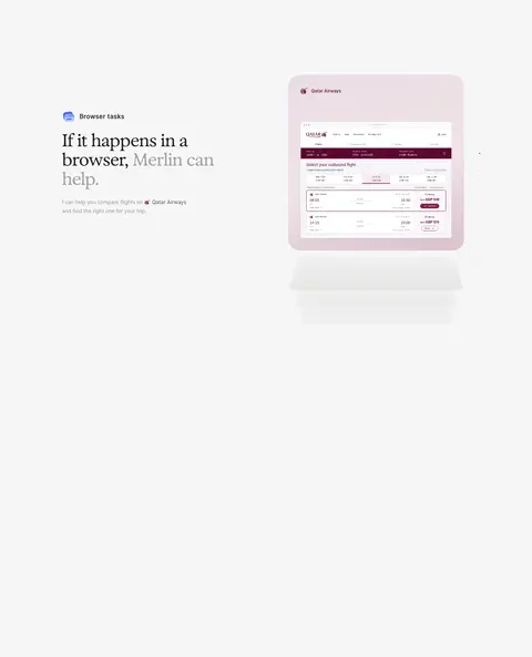
Sparse burgundy text and badge accent; also visible in the airline interface mockup.
强调色
Berry Outline
#802250
Thin outline around the burgundy Select badge; use sparingly for small UI details.
Signal Cyan
#20b8cf
Bright cyan text and CTA arrow detail; highlights links and selected product annotations.
表层色
Gallery White
#ffffff
Main page canvas, cards, and light content areas; the dominant background throughout.
Cloud Gray
#f6f6f6
Soft gray feature band behind browser-task content and selected media surfaces.
Parchment Tint
#ece3c7
Pale warm product-card surface; keep to small card or illustration contexts.
中性色
Sage Gray
#74786f
Muted supporting text, including explanatory copy and secondary interface labels.
Divider Gray
#e6e6e6
Hairline borders, pale card edges, footer band, and subtle section separation.
Pitch Black
#000000
Primary CTA background and full-width privacy section; creates the page’s strongest contrast.
Soft Ink
#242424
Primary body and heading text, including navigation and dark labels.
Graphite UI
#333338
Occasional interface text and product mockup detail rather than a defining page surface.
Quiet Gray
#737373
Secondary navigation, muted button copy, and lower-priority supporting text.
Charcoal UI
#282828
Small text and button details in product UI; secondary to the main ink color.
功能色
Mint Note
#85ceab
Badge-only color in measured UI; treat as a small illustrative or status detail, not a core page color.
Violet UI
#5c49bb
Rare button detail detected in interface elements; not a recurring page-level accent.
Link Blue
#1369d9
Badge detail within UI mockups only; avoid promoting it to a primary brand color.
Forest UI
#28523b
Badge detail seen in product UI; use only within illustrated or mock interface content.
文字 背景 对比度 WCAG #242424 Soft Ink#ffffff Gallery White15.52:1 AAA #242424 Soft Ink#f6f6f6 Cloud Gray14.36:1 AAA #242424 Soft Ink#000000 Pitch Black1.35:1 不达标 #242424 Soft Ink#e6e6e6 Divider Gray12.44:1 AAA #74786f Sage Gray#ffffff Gallery White4.51:1 AA #74786f Sage Gray#f6f6f6 Cloud Gray4.17:1 AA-large
字体 字号阶梯:Augmented Fourth(比例约 1.39,正文 15px)。示例用免费替代字体渲染,数值为实测。
Aa 设计
Open Runde 网络字体 · 字重 400 / 500 / 600 · 占比 59%
免费替代:Nunito Sans
Main sans-serif for navigation, body copy, feature headings, and interface text.
Aa 设计
Arial 系统字体 · 字重 400 / 700 / 500 / 600 / 800 · 占比 26%
免费替代:Arimo
Small captions and a few UI or badge labels.
Aa 设计
Exposure 网络字体 · 字重 400 · 占比 8%
免费替代:Cormorant Garamond
Editorial display headlines, especially the hero and large section statements.
Aa 设计
-apple-system 系统字体 · 字重 400 / 500 / 700 · 占比 5%
免费替代:Inter
Compact button and utility labels.
Aa 设计
caveat 网络字体 · 字重 600 / 500 · 占比 1%
免费替代:Caveat
Handwritten annotations and informal feature callouts.
角色 示例 字号 字重 行高 字距 一级标题 Large editorial serif hero headline, split across short lines.
Merlin
29px 400 1.2 -0.02em 二级标题 Feature and section headings in rounded Open Runde sans-serif.
The quick brown fox 敏捷的狐狸
20px 400 1.35 -0.01em 正文 Explanatory copy, feature descriptions, and product context.
The quick brown fox 敏捷的狐狸
15px 400 1.6 -0.01em 辅助文字 Small labels and compact supporting details.
The quick brown fox 敏捷的狐狸
10px 400 1.45 0 按钮 Compact CTA or utility control text.
The quick brown fox 敏捷的狐狸
9px 400 1.4 0 导航 Simple top navigation and secondary menu labels.
The quick brown fox 敏捷的狐狸
14px 400 1.6 0
间距与布局 基准单位 2px · 密度:适中
58px 版块间距
8px 元素间距
17px 卡片内边距
1018px 内容最大宽度
3px
4px
5px
6px
7px
8px
9px
10px
11px
12px
13px
14px
15px
16px
20px
22px
Use a centered content column capped at the measured 1018px, with generous side margins and comfortable vertical pacing. The hero is centered above a wide rounded media panel; subsequent sections alternate one-column statements and two- or three-column feature compositions. Align text to the left in feature blocks, but center the hero and major editorial headline. Keep the measured base spacing system and section rhythm rather than compressing the page; the overall density is comfortable, with clear separation between content and product demonstrations.
圆角与层次 md · other
lg · other, card
hairline · card
inset · text
The page is mostly flat, relying on white space and pale borders rather than heavy shadows. Product cards use a fine gray edge and a small offset shadow, while interface windows sit gently above their surroundings. Keep corners rounded on media and cards, with pill-shaped buttons and badges; reserve sharp, unadorned edges for selected dark panels.
组件 下面的预览按实测的按钮、输入框、徽标、卡片样式重建(字体用替代字体)。
Primary CTA Black pill-shaped button with white uppercase monospaced label and a cyan arrow area; keep the contrast crisp and the treatment simple.
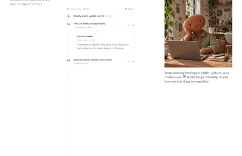
Feature card Rounded white or transparent workflow card with a pale gray border and subtle offset shadow; product rows read like practical files or tasks.
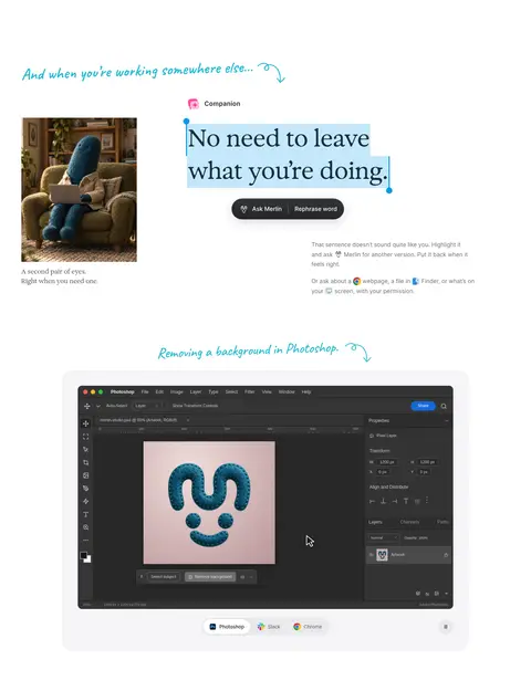
Cyan annotation Short handwritten callout paired with a curved arrow or underline to direct attention to a feature demo.
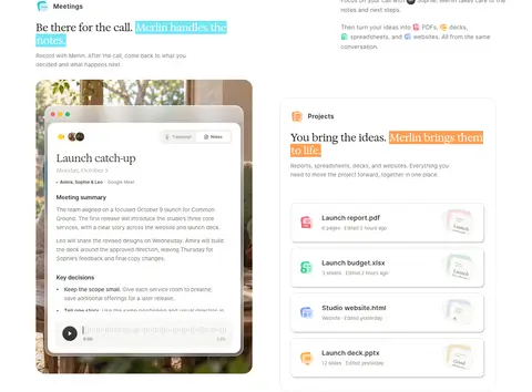
Product mockup Layered app-window or browser capture, framed lightly and placed beside explanatory copy rather than treated as a decorative hero alone.
Privacy band Full-width black section with light text, a restrained eyebrow, and a two-column grid of security details.
FAQ rows Quiet accordion-style question rows separated by fine horizontal rules, with small disclosure indicators.
Imagery · Lead with a wide, softly rounded landscape video or still that feels warm and textured, not glossy. Use candid lifestyle photography and realistic app-window mockups to show workflows in context. Keep interface captures clean and readable, with restrained framing and subtle depth; handwritten cyan annotations can point toward product moments. The closing visual is a delicate, pale illustration rather than a high-contrast campaign image.
页面版块 共 9 个版块,按页面从上到下排列,每个都标了类型、布局和交互套路。
该做与不该做 ✓ 该做 Preserve the white canvas and generous negative space. Use the serif display face for high-level editorial statements. Keep body copy and navigation in a rounded, readable sans-serif. Reserve black for primary actions and the privacy section. Use cyan as a small, deliberate highlight. Show product workflows in realistic interface mockups. ✕ 不该做 Do not fill the page with saturated accent colors. Do not add heavy gradients or glossy decoration. Do not crowd feature copy against its product imagery. Do not turn mockup-only badge colors into brand-wide accents. Do not use deep shadows as the main way to separate content. Do not replace editorial typography with oversized sans-serif headlines. 给 AI 的提示词 想快速出一个同风格的新页面,把这段话连同 DESIGN.md 一起发给 AI。
复制 Build a new page in Merlin’s quiet editorial style. Use Gallery White (#ffffff) as the main canvas, Cloud Gray (#f6f6f6) for occasional feature bands, Soft Ink (#242424) for copy, and Quiet Gray (#737373) for secondary labels. Use Pitch Black (#000000) for the primary pill CTA and any high-contrast privacy panel; Signal Cyan (#20b8cf) should appear only as a small arrow, link, or annotation accent. Pair an elegant serif display headline with rounded, friendly sans-serif body text. Organize content in a centered, comfortable-width column with generous section spacing and alternating editorial statements and product-led split layouts. Show realistic app screens and warm lifestyle imagery with subtle borders, light shadows, and rounded media. Keep the result calm, readable, and specific rather than decorative.
DESIGN.md Tailwind v4 CSS 变量 Design Tokens
---
title: "Merlin design system"
variant: extended
source: https://www.merlin.computer/
captured_at: 2026-10-12
theme: light
industry: ai
generator: Design DNA (https://four.wiralomi.com/style/merlin-computer)
ai_generated: true
ai_label: "本文件由 AI 辅助生成:数值取自公开网页的实测样式,命名、用途说明与建议为模型解读。商标归原所有者。 / AI-assisted content"
---
# Merlin · Design System
> Quiet editorial design for getting time back
**Theme:** light · **Industry:** ai · **Source:** https://www.merlin.computer/ · **Captured:** 2026-10-12 (1440×900 desktop)
_AI-assisted content: values are measured from the public page at capture time; names, roles and guidance are model-written interpretations. Trademarks belong to their owners._
Merlin’s homepage pairs restrained editorial typography with generous white space and warm, tactile product imagery. Black calls to action, cyan highlights, and a single dark privacy section give the otherwise quiet experience a clear visual rhythm.
## North star
Keep the page calm and editorial: let generous white space and clear product evidence lead, with color reserved for purposeful emphasis.
## Overview
The page is built on a white canvas, with pale gray used for occasional feature bands and a full black privacy block as its strongest contrast. Most interface copy is charcoal or muted gray; cyan appears in selected links, product highlights, and CTA details, while burgundy is a sparse badge accent rather than a dominant brand field. The headline combines a display serif with Open Runde’s rounded, approachable sans-serif for supporting text and navigation. Content alternates centered statements with spacious split layouts, keeping product UI and explanatory copy visually distinct. Warm, softly textured landscape imagery anchors the hero, while later sections use cropped lifestyle photography and floating app-window mockups to make capabilities tangible. Handwritten cyan annotations add a human note without displacing the calm editorial tone. Hairline borders, restrained shadows, pill-shaped controls, and comfortable section spacing keep the interface light and legible.
## Colors
| Name | Hex | Token | Group | Role |
|---|---|---|---|---|
| Berry Outline | ` | `--color-berry-outline` | accent | Thin outline around the burgundy Select badge; use sparingly for small UI details. |
| Gallery White | ` | `--color-gallery-white` | surface | Main page canvas, cards, and light content areas; the dominant background throughout. |
| Cloud Gray | ` | `--color-cloud-gray` | surface | Soft gray feature band behind browser-task content and selected media surfaces. |
| Sage Gray | ` | `--color-sage-gray` | neutral | Muted supporting text, including explanatory copy and secondary interface labels. |
| Mint Note | ` | `--color-mint-note` | semantic | Badge-only color in measured UI; treat as a small illustrative or status detail, not a core page color. |
| Divider Gray | ` | `--color-divider-gray` | neutral | Hairline borders, pale card edges, footer band, and subtle section separation. |
| Merlot Accent | ` | `--color-merlot-accent` | brand | Sparse burgundy text and badge accent; also visible in the airline interface mockup. |
| Pitch Black | ` | `--color-pitch-black` | neutral | Primary CTA background and full-width privacy section; creates the page’s strongest contrast. |
| Soft Ink | ` | `--color-soft-ink` | neutral | Primary body and heading text, including navigation and dark labels. |
| Graphite UI | ` | `--color-graphite-ui` | neutral | Occasional interface text and product mockup detail rather than a defining page surface. |
| Parchment Tint | ` | `--color-parchment-tint` | surface | Pale warm product-card surface; keep to small card or illustration contexts. |
| Quiet Gray | ` | `--color-quiet-gray` | neutral | Secondary navigation, muted button copy, and lower-priority supporting text. |
| Charcoal UI | ` | `--color-charcoal-ui` | neutral | Small text and button details in product UI; secondary to the main ink color. |
| Violet UI | ` | `--color-violet-ui` | semantic | Rare button detail detected in interface elements; not a recurring page-level accent. |
| Link Blue | ` | `--color-link-blue` | semantic | Badge detail within UI mockups only; avoid promoting it to a primary brand color. |
| Forest UI | ` | `--color-forest-ui` | semantic | Badge detail seen in product UI; use only within illustrated or mock interface content. |
| Signal Cyan | ` | `--color-signal-cyan` | accent | Bright cyan text and CTA arrow detail; highlights links and selected product annotations. |
### Semantic aliases
`--color-canvas` → ` (Gallery White) · `--color-surface` → ` (Cloud Gray) · `--color-surface-2` → ` (Pitch Black) · `--color-surface-3` → ` (Divider Gray) · `--color-surface-4` → ` (Parchment Tint) · `--color-text` → ` (Soft Ink) · `--color-text-muted` → ` (Sage Gray) · `--color-text-subtle` → ` (Quiet Gray) · `--color-border` → ` (Divider Gray) · `--color-accent` → ` (Merlot Accent) · `--color-accent-2` → ` (Signal Cyan)
### Contrast (WCAG 2.x)
| Text | Background | Ratio | Level |
|---|---|---|---|
| ` | ` | 15.52:1 | AAA |
| ` | ` | 14.36:1 | AAA |
| ` | ` | 1.35:1 | fail |
| ` | ` | 12.44:1 | AAA |
| ` | ` | 4.51:1 | AA |
| ` | ` | 4.17:1 | AA-large |
| ` | ` | 4.66:1 | AA |
| ` | ` | 3.61:1 | AA-large |
| ` | ` | 4.74:1 | AA |
| ` | ` | 4.39:1 | AA-large |
### Gradients
- `linear-gradient(165deg, rgb(234, 221, 229), rgb(240, 228, 230) 55%, rgb(218, 192, 207))`
- `conic-gradient(rgb(222, 222, 222) 25%, rgb(247, 247, 247) 0deg, rgb(247, 247, 247) 50%, rgb(222, 222, 222) 0deg, rgb(222, 222, 222) 75%, rgb(247, 247, 247) 0deg)`
- `radial-gradient(at 35% 22%, rgb(240, 221, 218), rgb(185, 149, 153))`
- `linear-gradient(150deg, rgb(236, 229, 252), rgb(222, 214, 243))`
## Typography
| Family | Token | Source | Weights | Role | Free substitute |
|---|---|---|---|---|---|
| Open Runde | `--font-body` | webfont | 400, 500, 600 | Main sans-serif for navigation, body copy, feature headings, and interface text. | Nunito Sans |
| Arial | `--font-arial` | system | 400, 700, 500, 600, 800 | Small captions and a few UI or badge labels. | Arimo |
| Exposure | `--font-display` | webfont | 400 | Editorial display headlines, especially the hero and large section statements. | Cormorant Garamond |
| -apple-system | `--font-apple-system` | system | 400, 500, 700 | Compact button and utility labels. | Inter |
| caveat | `--font-caveat` | webfont | 600, 500 | Handwritten annotations and informal feature callouts. | Caveat |
- **Open Runde:** Rounded and friendly; use regular to semibold weights, restrained tracking, and natural sentence case.
- **Arial:** Keep compact captions legible and neutral; measured use includes regular and bold.
- **Exposure:** Use regular-weight serif display text with close, elegant tracking and sentence case.
- **-apple-system:** Small system-style labels; uppercase CTA lettering is separately set in a monospaced treatment.
- **caveat:** Use sparingly for short, loose cyan notes; measured weights are medium and semibold.
### Type scale — Augmented Fourth (ratio ≈ 1.39, base 15px)
| Role | Size | Weight | Line height | Letter spacing | Case | Family | Used for |
|---|---|---|---|---|---|---|---|
| h1 | 29px | 400 | 1.2 | -0.02em | — | Exposure | Large editorial serif hero headline, split across short lines. |
| h2 | 20px | 400 | 1.35 | -0.01em | — | Open Runde | Feature and section headings in rounded Open Runde sans-serif. |
| body | 15px | 400 | 1.6 | -0.01em | — | Open Runde | Explanatory copy, feature descriptions, and product context. |
| caption | 10px | 400 | 1.45 | 0 | — | Arial | Small labels and compact supporting details. |
| button | 9px | 400 | 1.4 | 0 | — | -apple-system | Compact CTA or utility control text. |
| nav | 14px | 400 | 1.6 | 0 | — | Open Runde | Simple top navigation and secondary menu labels. |
## Spacing & layout
- Base unit **2px**, density **comfortable**.
- Scale (most used values): 3, 4, 5, 6, 7, 8, 9, 10, 11, 12, 13, 14, 15, 16, 20, 22 px.
- Section rhythm 58px · element gap 8px · card padding 17px · max content width 1018px.
Use a centered content column capped at the measured 1018px, with generous side margins and comfortable vertical pacing. The hero is centered above a wide rounded media panel; subsequent sections alternate one-column statements and two- or three-column feature compositions. Align text to the left in feature blocks, but center the hero and major editorial headline. Keep the measured base spacing system and section rhythm rather than compressing the page; the overall density is comfortable, with clear separation between content and product demonstrations.
## Shape & elevation
- Radius: button `9999px` · input `9999px` · card `12px` · media `9999px` · badge `9999px` · nav `50%` · xs `3px` · sm `4px` · md `6px` · lg `7px` · xl `8px` · 2xl `9px` · pill `9999px`
- Shadow `md` (other): `rgba(0, 0, 0, 0.016) 0px 5px 12px 0px`
- Shadow `lg` (other, card): `rgba(0, 0, 0, 0.02) 0px 1px 3px 0px, rgba(0, 0, 0, 0.14) 0px 16px 36px -24px`
- Shadow `hairline` (card): `rgb(214, 214, 214) 2px 3px 0px 0px`
- Shadow `inset` (text): `rgba(255, 255, 255, 0.19) 0px 1px 1px 0px inset, rgba(0, 0, 0, 0.082) 0px 1px 2px 0px`
- Shadow `hairline-2` (other): `rgb(255, 255, 255) 0px 0px 0px 4px`
- Shadow `sm` (other): `rgba(0, 0, 0, 0.133) 0px 2px 5px 0px`
- Motion: standard transition `0.18s ease` on interactive elements.
The page is mostly flat, relying on white space and pale borders rather than heavy shadows. Product cards use a fine gray edge and a small offset shadow, while interface windows sit gently above their surroundings. Keep corners rounded on media and cards, with pill-shaped buttons and badges; reserve sharp, unadorned edges for selected dark panels.
## Imagery
Lead with a wide, softly rounded landscape video or still that feels warm and textured, not glossy. Use candid lifestyle photography and realistic app-window mockups to show workflows in context. Keep interface captures clean and readable, with restrained framing and subtle depth; handwritten cyan annotations can point toward product moments. The closing visual is a delicate, pale illustration rather than a high-contrast campaign image.
## Components
### Primary CTA
Black pill-shaped button with white uppercase monospaced label and a cyan arrow area; keep the contrast crisp and the treatment simple.
### Feature card
Rounded white or transparent workflow card with a pale gray border and subtle offset shadow; product rows read like practical files or tasks.
### Cyan annotation
Short handwritten callout paired with a curved arrow or underline to direct attention to a feature demo.
### Product mockup
Layered app-window or browser capture, framed lightly and placed beside explanatory copy rather than treated as a decorative hero alone.
### Privacy band
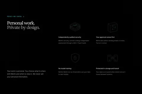
Full-width black section with light text, a restrained eyebrow, and a two-column grid of security details.
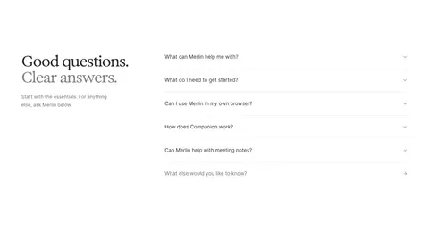
### FAQ rows
Quiet accordion-style question rows separated by fine horizontal rules, with small disclosure indicators.
### Measured component styles
- **Primary button** (“GET MERLIN FOR MAC”): background ## Do
- Preserve the white canvas and generous negative space.
- Use the serif display face for high-level editorial statements.
- Keep body copy and navigation in a rounded, readable sans-serif.
- Reserve black for primary actions and the privacy section.
- Use cyan as a small, deliberate highlight.
- Show product workflows in realistic interface mockups.
## Don't
- Do not fill the page with saturated accent colors.
- Do not add heavy gradients or glossy decoration.
- Do not crowd feature copy against its product imagery.
- Do not turn mockup-only badge colors into brand-wide accents.
- Do not use deep shadows as the main way to separate content.
- Do not replace editorial typography with oversized sans-serif headlines.
## Agent prompt
Build a new page in Merlin’s quiet editorial style. Use Gallery White (## Page sections (top to bottom)
| # | Type | Layout | UX patterns | UI patterns |
|---|---|---|---|---|
| 1 | logo-cloud | Compact centered row of customer logos on white, separated from the neighboring feature content by ample whitespace. | Social proof | Small monochrome logos, Centered caption |
| 2 | feature-split | Two-column routine feature with explanatory content and workflow interface or supporting media. | Recurring task automation, Workflow preview | Routine label, Handwritten cyan annotation, Embedded task list |
| 3 | feature-split | Pale gray band with a two-column browser-task demonstration and supporting text. | In-browser assistance, Interactive task demo | Soft gray background, Browser mockup, Form controls |
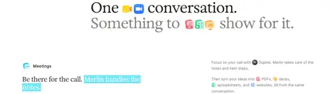
| 4 | how-it-works | Single-column editorial statement centered above or alongside a compact flow from conversation to deliverables. | Conversation-to-output flow | Serif headline, Small app icons, Generous whitespace |
| 5 | feature-grid | White feature area with meeting and project content arranged in a spacious multi-column composition. | Meeting capture, Project file generation | Transcript card, Deliverable list, Highlighted phrases |
| 6 | product-showcase | Broad white showcase with several capability examples across multiple columns and large product captures. | Contextual assistant, App companion | Lifestyle photo, Desktop app mockup, Handwritten callouts |
| 7 | feature-grid | Full-width black band with a left introductory column and a two-column grid of trust details. | User approval, Privacy reassurance | Black surface, Light typography, Minimal security icons |
| 8 | faq | White two-column FAQ with editorial heading on the left and stacked disclosure rows on the right. | Expandable answers, Self-service discovery | Thin dividers, Small chevrons, Muted supporting text |
| 9 | footer | Pale gray closing band with CTA content, illustration, and a low-profile footer navigation row. | Closing CTA, Footer navigation | Large serif statement, Black pill CTA, Fine footer divider |
## Source CSS custom properties (selected)
```css
--font-open-runde: "Open Runde";
--mantine-webkit-font-smoothing: antialiased;
--mantine-color-scheme: light;
--mantine-moz-font-smoothing: grayscale;
--mantine-color-white: #fff;
--mantine-color-black: #000;
--mantine-font-family: "Open Runde", sans-serif;
--mantine-font-family-monospace: ui-monospace,SFMono-Regular,Menlo,Monaco,Consolas,Liberation Mono,Courier New,monospace;
--mantine-font-family-headings: "Open Runde", sans-serif;
--mantine-heading-font-weight: 700;
--mantine-radius-default: calc(0.25rem * 1);
--mantine-primary-color-0: