North star · Keep the canvas near-black plum and let bold white typography and softly glowing product visuals carry the story.
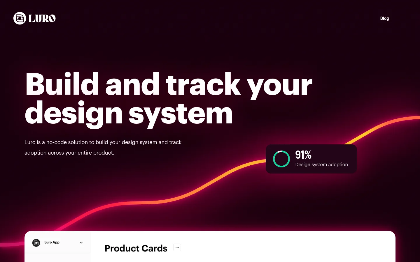
The page uses a nearly continuous deep-plum canvas (#10020a), giving its long sequence of sections a unified, immersive backdrop. White (#ffffff) carries the logo, navigation, headlines, body copy, and calls to action; the measured palette is deliberately restrained, while vivid pink and orange glows visible in the screenshots belong to decorative chart lines and illuminated product panels rather than the measured brand palette. Graphik web provides a clean, confident sans-serif voice. Headlines are heavy, large, and tightly tracked; supporting text stays smaller and open. The hero leads with a left-aligned statement and a rising analytics graphic, followed by broad product imagery, alternating feature content, diagrams, a testimonial, and grouped capability cards. Spacious section breaks keep the long page from feeling crowded. Rounded dark panels and soft neon halos separate product evidence from the background without relying on prominent borders. Preserve the contrast between bold copy, dark negative space, and detailed interface imagery.
配色
点色块复制色值。用途说明来自对页面的实测位置(背景、文字、描边、按钮)与截图判读。
品牌色
表层色
中性色
页面底色 · Deep Plum表层 · Mulberry Panel主文字 · Gallery White
Primary typeface for display, headings, body copy, navigation, links, and buttons.
角色
示例
字号
字重
行高
字距
特大标题
Oversized hero statement and high-impact introductory display copy.
Luro
104px
700
0.95
-0.012em
一级标题
Primary page and major section headlines.
Luro
61.5px
700
1.1
-0.021em
二级标题
Prominent feature and section headings.
Luro
50.5px
700
1.1
-0.025em
三级标题
Secondary headings within feature blocks and cards.
Luro
40px
700
1.2
-0.032em
四级标题
Select lower-level headings in a condensed face.
Luro
38.5px
400
1
0
正文
Feature descriptions and explanatory paragraphs.
The quick brown fox 敏捷的狐狸
18px
400
2
0
辅助文字
Small labels and supporting image or interface captions.
The quick brown fox 敏捷的狐狸
16px
400
1.3
0
按钮
Primary Discord call-to-action text.
The quick brown fox 敏捷的狐狸
18px
400
1.5
0
导航
Header navigation, including the Blog link.
The quick brown fox 敏捷的狐狸
18px
400
1.5
0
链接
Inline links and footer navigation.
The quick brown fox 敏捷的狐狸
18px
400
2
0
间距与布局
基准单位 2px · 密度:宽松
54px版块间距
32px元素间距
32px卡片内边距
1272px内容最大宽度
3px
8px
10px
12px
14px
15px
16px
18px
22px
24px
27px
28px
32px
36px
41px
45px
A spacious, vertically flowing page organized within a measured 1272px maximum content width. The hero starts with left-aligned copy and large product media; later sections alternate between centered introductions, two-column feature groupings, and multi-card capability layouts. Generous section breaks give the dark canvas room to breathe, while cards use consistent inset padding. Keep feature copy short and close to the interface or diagram it explains; use centered alignment for social proof and calls to action, and a compact footer.
圆角与层次
按钮 · 9999px
卡片 · 24px
图片 · 24px
xl · card, media, button
lg · media
lg · other
xl · card
The canvas stays visually flat between sections, while rounded product cards and media are raised with conspicuous soft magenta glows. Borders are not a defining measured treatment. Use depth to spotlight interface evidence, preserving dark panel fills and avoiding hard, bright outlines that compete with the halo.
组件
下面的预览按实测的按钮、输入框、徽标、卡片样式重建(字体用替代字体)。
Hero
Pair a large, left-aligned white headline and short supporting copy with a rising analytics visual against the Deep Plum canvas.
Product showcase
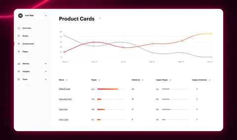
Present large dashboard captures in rounded media panels, using a soft neon halo and enough space for interface details to read.
Feature card
Use Mulberry Panel (#1e0313) for measured card surfaces, white text, generous inset spacing, and a 24px measured card radius.
How-it-works diagram
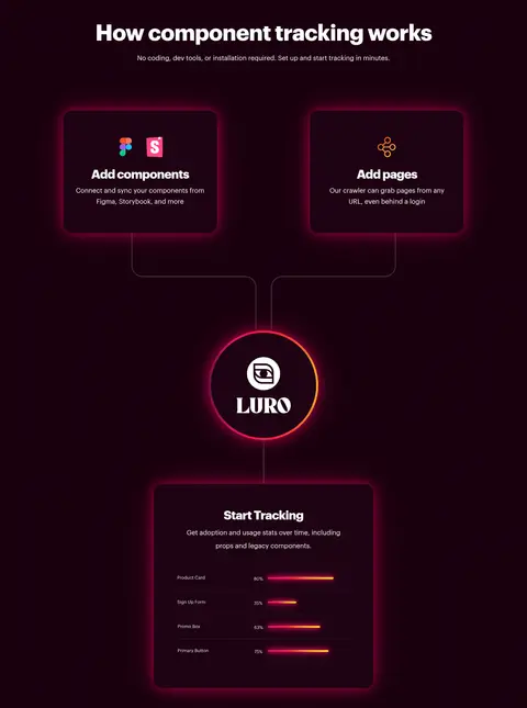
Connect component and page inputs to a central Luro mark and a tracking outcome with fine paths and illuminated data accents.
Testimonial
Center one concise endorsement on the dark canvas, framed by glowing horizontal decorative lines.
Discord CTA
Center a short invitation and a pill-shaped Discord link, with a magenta glow separating it from the canvas.
Footer
Keep copyright, legal links, and social links in a compact, single-row layout on the dark canvas.
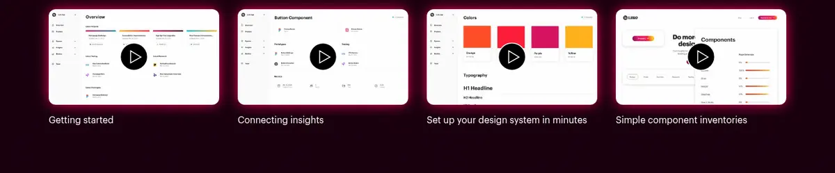
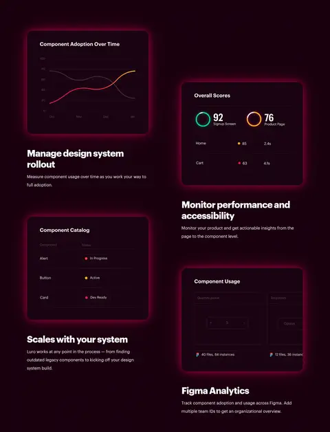
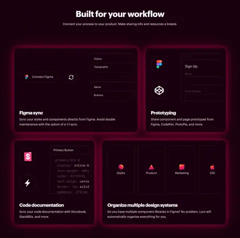
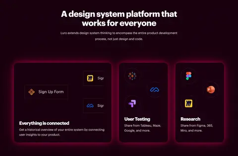
Imagery · Use product UI captures, analytics charts, component catalog views, and simple connected-system diagrams; photography is not the visual focus. Frame software screens inside rounded panels and let them occupy substantial space. The screenshots show vivid magenta halos and pink-to-orange graph lines, plus varied colors inside interface mockups. Treat these as illustrative product content, not replacements for the restrained measured brand palette.
Set key headlines in bold white Graphik-style sans serif.
Give the hero and section introductions ample negative space.
Show real-looking product interfaces as the main visual evidence.
Use soft magenta glow to lift selected media and cards.
Keep supporting copy concise and close to its related visual.
✕ 不该做
Do not introduce extra measured brand colors.
Do not turn the page into a bright, white-background layout.
Do not apply neon glows indiscriminately to every text element.
Do not replace product UI evidence with generic lifestyle photography.
Do not crowd cards with long blocks of copy.
Do not add prominent borders where soft elevation does the work.
给 AI 的提示词
想快速出一个同风格的新页面,把这段话连同 DESIGN.md 一起发给 AI。
Build a new SaaS page in Luro’s visual style. Use Deep Plum (#10020a) for the main canvas, Gallery White (#ffffff) for typography and controls, and Mulberry Panel (#1e0313) for selected card surfaces. Keep the palette restrained; reserve vivid pink and orange gradients for illustrative chart or mockup details, not invented semantic tokens. Use a Graphik-like sans serif, oversized bold tightly tracked headlines, and readable regular-weight supporting text. Create a spacious long-form layout with a confident hero, large product UI panels, clear feature groupings, and centered CTA moments. Use rounded cards and soft magenta halos to lift product evidence from the background. Maintain generous gaps between sections, keep copy concise, and make the software interface the visual proof. Avoid bright section bands, heavy borders, and generic stock photography.