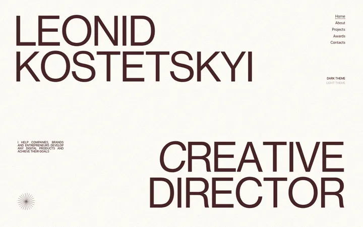
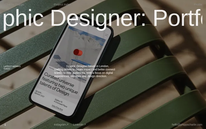
North star · Let bold typography and layered project imagery dominate a quiet neutral canvas, using orange only as a precise signal.
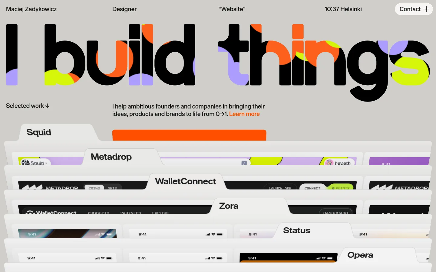
The page uses a warm, pale grey canvas as a quiet stage for near-black typography and a broad, oversized headline. Die Grotesk carries the entire experience: compact, evenly distributed navigation sits above the display type, while the short introduction and project labels remain crisp and readable. A vivid orange accent marks the contact control and a text link, with additional bright colours appearing mainly within the headline artwork and project previews rather than defining the core interface palette. The composition is editorial but tightly controlled: a single horizontal header, a large typographic hero, concise supporting copy, then a full-width stack of overlapping portfolio previews. Generous visual scale contrasts with compact spacing and dense media. Softly rounded preview layers and restrained shadows create depth without adding decorative framing; the overall effect is direct, graphic, and portfolio-led.
配色
点色块复制色值。用途说明来自对页面的实测位置(背景、文字、描边、按钮)与截图判读。
品牌色
强调色
表层色
中性色
页面底色 · Gallery White表层 · Stone Grey表层 2 · Haze Grey表层 3 · Carbon主文字 · Carbon强调 · Signal Orange
文字
背景
对比度
WCAG
#191919 Carbon
#f5f5f4 Gallery White
16.12:1
AAA
#191919 Carbon
#cbcbc9 Stone Grey
10.82:1
AAA
#191919 Carbon
#d1d1d0 Haze Grey
11.51:1
AAA
#ff4f00 Signal Orange
#f5f5f4 Gallery White
3.02:1
AA-large
#ff4f00 Signal Orange
#cbcbc9 Stone Grey
2.03:1
不达标
#ff4f00 Signal Orange
#d1d1d0 Haze Grey
2.16:1
不达标
字体
字号阶梯:Custom(比例约 3.041,正文 20px)。示例用免费替代字体渲染,数值为实测。
Aa 设计
Die Grotesk
网络字体 · 字重 500 / 700 · 占比 100%
免费替代:DM Sans
All page typography, from compact navigation and body copy to the oversized display headline.
角色
示例
字号
字重
行高
字距
特大标题
Oversized opening statement spanning the hero width.
Maciej Zadykowicz
185px
700
normal
0
一级标题
Primary page heading and prominent section titles.
Maciej Zadykowicz
32px
700
1.1
0
正文
Introductory copy and project descriptions.
The quick brown fox 敏捷的狐狸
20px
500
1.25
0
辅助文字
Compact project labels and supporting metadata.
The quick brown fox 敏捷的狐狸
16px
500
1.2
0
导航
Header identity, role, location, and contact control.
The quick brown fox 敏捷的狐狸
20px
500
1.25
0
间距与布局
基准单位 4px · 密度:紧凑
40px版块间距
4px元素间距
40px卡片内边距
1400px内容最大宽度
4px
10px
20px
40px
80px
A compact horizontal header distributes the designer name, role, site label, local time, and contact action across the top. The hero aligns to a wide, centered page frame, with a headline spanning nearly the full viewport before the supporting label and introduction form a two-column row. Portfolio media then expands into a full-bleed, tightly stacked composition. The measured page max width is 1400px. The overall rhythm pairs compact gaps with distinct section breaks; the visual density comes from layered project previews rather than crowded text.
圆角与层次
卡片 · 20px
图片 · 5px
hairline · card, media
md · card
The page is largely flat, with no heavy panel borders. Portfolio sheets gain depth from overlap, pale surfaces, softly rounded corners, and subtle measured hairline-to-medium shadows. Keep the background calm and let stacked media provide the strongest sense of elevation.
组件
下面的预览按实测的按钮、输入框、徽标、卡片样式重建(字体用替代字体)。
Top navigation
A single-line header distributes identity, designer role, site label, local time, and a contact action; labels use medium-weight Die Grotesk.
Contact action
A compact, pill-like contact control sits at the top right, with a plus symbol and orange used as a restrained accent elsewhere.
Display headline
A very large, bold typographic statement spans almost the full viewport and includes vivid colour details within the letterforms.
Introductory copy
A short selected-work prompt sits opposite a concise founder-focused statement, ending with an orange text link.
Layered project showcase
Full-width portfolio previews stack like overlapping sheets, each with a prominent project label and visible interface imagery.
Imagery · The hero’s oversized lettering incorporates vivid cropped colour details, while the main visual is a dense montage of web and product interface previews. Project sheets overlap in successive horizontal layers, with tab-like project names and small interface details visible within each. The screenshot shows portfolio mockups, not photography or video; colour inside these previews should remain artwork rather than becoming interface palette.
Use a warm pale-grey canvas and near-black type as the foundation.
Make the opening statement oversized and visually dominant.
Keep navigation compact and distributed across one horizontal row.
Reserve orange for concise calls to action and selected emphasis.
Present portfolio work as overlapping, full-width visual layers.
Use Die Grotesk or a close geometric sans-serif substitute.
✕ 不该做
Do not turn project-artwork colours into the general interface palette.
Do not add gradients or decorative colour fields.
Do not crowd the hero with lengthy explanatory copy.
Do not use heavy borders or deep, dramatic shadows.
Do not make the navigation compete with the headline.
Do not replace the layered project montage with generic stock photography.
给 AI 的提示词
想快速出一个同风格的新页面,把这段话连同 DESIGN.md 一起发给 AI。
Build a portfolio page in the style of Maciej Zadykowicz: editorial, typography-led, and focused on layered digital work. Use Gallery White (#f5f5f4) as the calm canvas with Display Ink (#1e1e1e) and Carbon (#191919) for high-contrast text. Apply Signal Orange (#ff4f00) sparingly to links and contact cues; keep Stone Grey (#cbcbc9), Haze Grey (#d1d1d0), Ash Type (#9d9d9c), and Pale Slate (#d6d6d5) as subtle surface variations. Set all text in Die Grotesk or DM Sans, with a huge bold opening statement, compact medium-weight navigation, and concise supporting copy. Place the intro in a two-column row, then let overlapping, softly rounded portfolio previews fill the width. Keep ornament, borders, and shadows restrained; preserve generous visual scale with compact spacing.