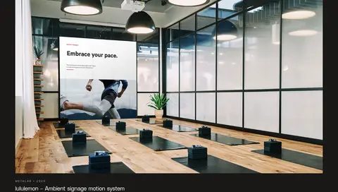
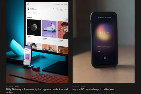
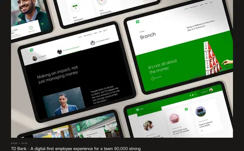
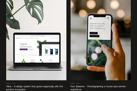
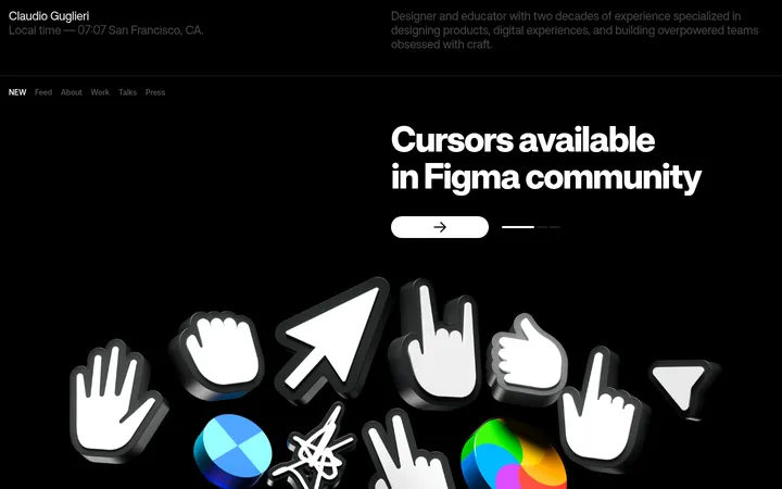
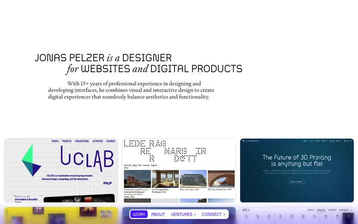
North star · Keep the warm near-black canvas quiet; let oversized type, selective capsule accents, and unoverdecorated project imagery provide all the emphasis.
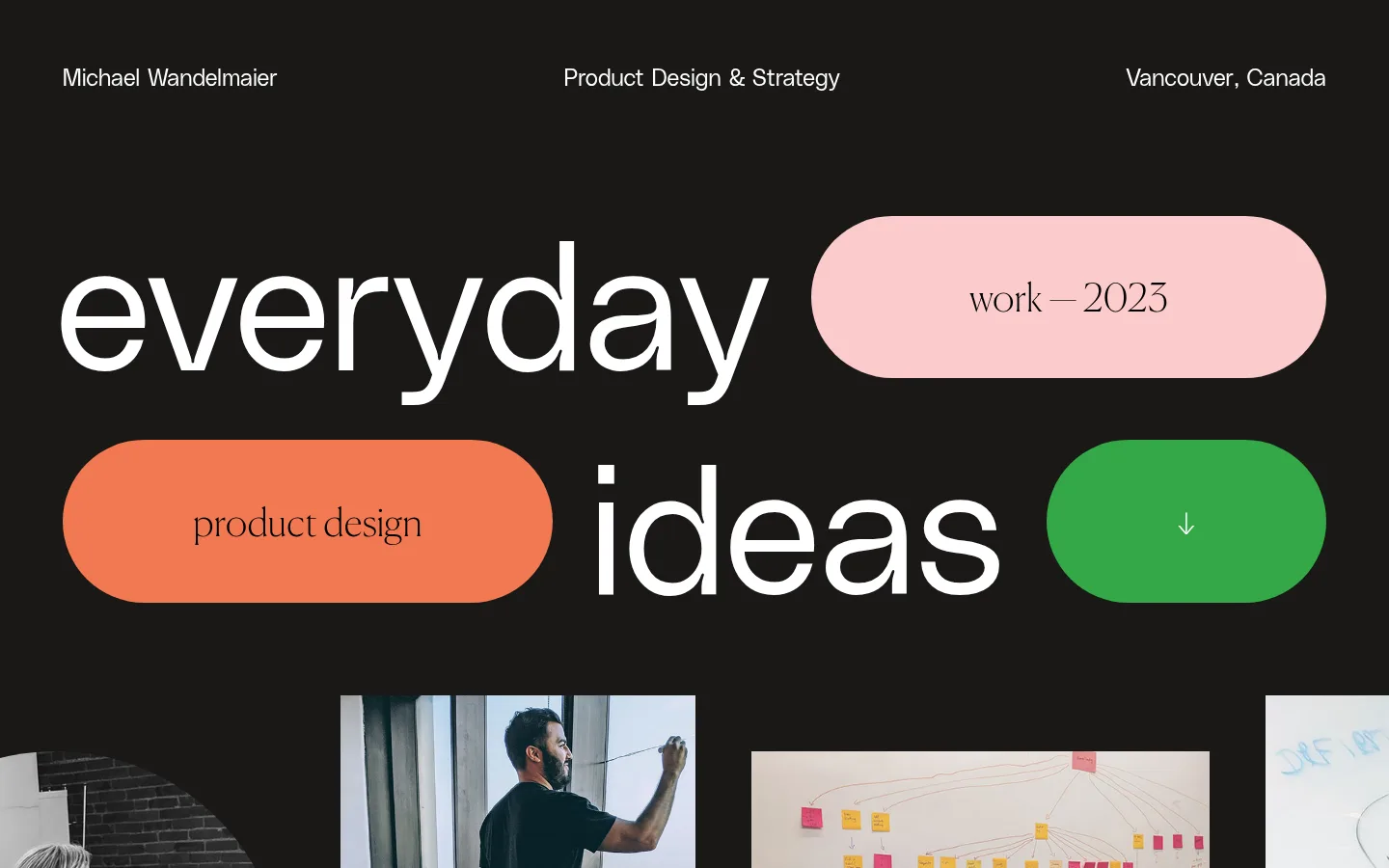
The page uses a near-black warm canvas (#191816) across every section, letting white typography and project imagery carry most of the contrast. The opening composition turns the words “everyday ideas” into oversized PolySans display lettering, interrupted by soft pink, orange, and green capsule forms. Those accents are sparse and purposeful rather than a general color system: they emphasize selected phrases, an arrow, and contact action. Canela Web adds an editorial, literary voice to section headings and longer statements, while PolySans handles the navigation, labels, and oversized sans-serif display. A spacious, single-page rhythm alternates the opening statement and a three-column image strip with long-form work galleries, paired project cards, and ruled client lists. Photography is shown as substantial rectangular evidence of the work, with small, quiet captions. Hairline separators and outlined pills provide structure without shadows or heavy card chrome.
配色
点色块复制色值。用途说明来自对页面的实测位置(背景、文字、描边、按钮)与截图判读。
品牌色
强调色
中性色
功能色
页面底色 · Warm Charcoal主文字 · Paper White次要文字 · Soft Ash描边 · Quiet Graphite强调 · Signal Green强调 2 · Coral Orange
Display lettering, navigation, body text, labels, and contact UI.
Aa 设计
Canela Web
网络字体 · 字重 100 · 占比 27%
免费替代:Cormorant Garamond
Editorial headings and reflective statement copy.
角色
示例
字号
字重
行高
字距
特大标题
Oversized lowercase words forming the opening “everyday ideas” composition.
Michael Wandelmaier
187px
100
0.9
0
一级标题
Main editorial-scale section or statement heading.
Michael Wandelmaier
80px
100
1.2
0
二级标题
Secondary editorial headings in narrative and portfolio sections.
Michael Wandelmaier
50.5px
100
1.3
0
三级标题
Smaller serif subheadings and supporting editorial statements.
Michael Wandelmaier
40px
100
2.4
0
四级标题
Sans-serif project or content titles.
Michael Wandelmaier
32px
100
1
0
正文
Introductory biography and longer supporting page copy.
The quick brown fox 敏捷的狐狸
24px
100
1.33
0
辅助文字
Compact uppercase project metadata and image captions.
The quick brown fox 敏捷的狐狸
12px
100
2.67
0.2em
导航
Top-row name, discipline, and location labels.
The quick brown fox 敏捷的狐狸
24px
100
1.33
0
眉题
Small uppercase section and project labels.
The quick brown fox 敏捷的狐狸
12px
100
2.67
0.2em
间距与布局
基准单位 8px · 密度:宽松
96px版块间距
32px元素间距
16px卡片内边距
1310px内容最大宽度
16px
22px
29px
32px
43px
48px
58px
61px
64px
96px
A spacious single-column page uses a measured 1310px maximum width and 96px section rhythm. The top navigation aligns three text groups across the width; the hero is a deliberately irregular typographic arrangement rather than a conventional centered headline. Work imagery begins in a three-column strip, then shifts between full-width project images and paired cards. Later client lists use a two-column editorial layout with headings aligned against ruled rows. Large gaps keep transitions calm, while the overall content remains image-dense.
圆角与层次
卡片 · 9999px
图片 · 50%
没有测到阴影:页面是扁平的,层次靠底色和描边区分。
The interface is predominantly flat: there are no measured shadows or gradients. Separate content with whitespace and subtle graphite hairlines, and use thin white outlines for selected pill controls. Capsule accents are solid-color shapes rather than elevated buttons. Project images provide their own visual depth through photographic content, not interface layering.
组件
下面的预览按实测的按钮、输入框、徽标、卡片样式重建(字体用替代字体)。
Three-part header
A restrained row places the designer name, discipline, and Vancouver location across the canvas in white PolySans.
Typographic hero
Oversized lowercase “everyday ideas” lettering shares the opening composition with pink, orange, and green capsule forms.
Capsule accent labels
Fully rounded solid-color pills hold short dark labels or a centered downward arrow; accents are reserved for specific emphasis.
Work image sequence
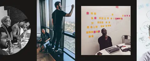
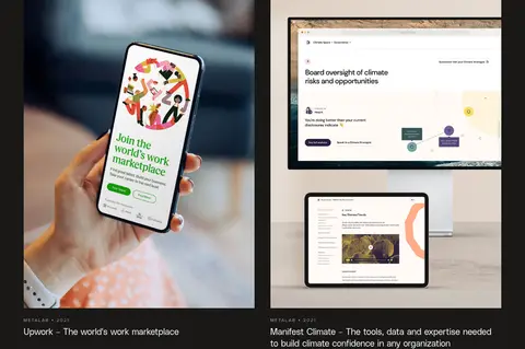
A three-column opening strip leads into wide portfolio showcases and paired project images with small uppercase metadata and captions.
Editorial statement
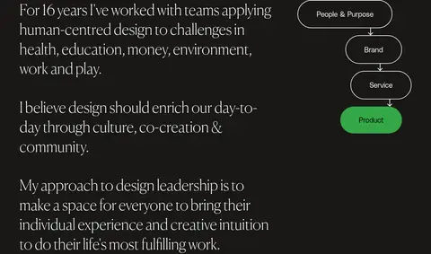
Light serif paragraphs describe the designer’s practice beside a compact vertical process diagram with outlined and green pill nodes.
Client lists
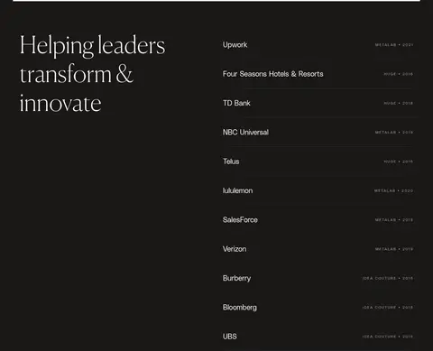
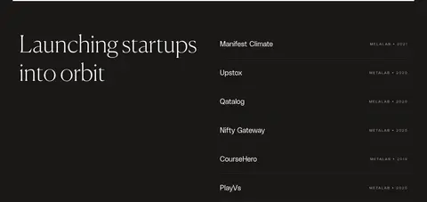
Editorial serif section titles sit beside simple client rows, divided by fine horizontal rules and accompanied by subdued metadata.
Contact actions
A large sans-serif invitation leads into a green email capsule and outlined social-link capsules.
Imagery · Use documentary and product-design photography as the main evidence of the portfolio: people at work, interface mockups, devices, and physical environments. Preserve the source image’s natural color and rectangular crop rather than applying a site-wide filter. The opening gallery is an edge-to-edge horizontal image sequence with varied framing; later projects alternate wide showcase images and balanced two-up cards, each with quiet metadata and captions.
Make display typography the primary graphic element.
Reserve #fbcbcb, #f27851, and #34a847 for selective capsule accents.
Pair PolySans utility text with Canela Web editorial copy.
Give project photography substantial space and natural color.
Use quiet rules and whitespace to organize long sections.
✕ 不该做
Do not introduce unmeasured palette colors as interface colors.
Do not add gradients, drop shadows, or glossy effects.
Do not turn every project into a heavy bordered card.
Do not use the bright accents as large continuous section backgrounds.
Do not crowd captions or client rows with decorative UI.
Do not replace the expressive hero with a generic centered banner.
给 AI 的提示词
想快速出一个同风格的新页面,把这段话连同 DESIGN.md 一起发给 AI。
Build a new portfolio page in this style using a continuous Warm Charcoal canvas (#191816), with Paper White (#ffffff) as the main text color and Soft Ash (#a9a9a9) for secondary copy. Create a spacious, typographic opening: pair oversized lowercase PolySans-like lettering with sparse rounded capsules in Blush Pink (#fbcbcb), Coral Orange (#f27851), and Signal Green (#34a847). Use a light editorial serif similar to Canela Web for reflective headings and narrative statements, and a clean sans-serif for navigation, captions, and interface text. Organize the page as a generous editorial scroll with documentary project photography, varied wide and paired image layouts, compact uppercase metadata, and subtle graphite dividers. Keep the surface flat: no shadows, gradients, or unnecessary card chrome. Make emphasis come from scale, whitespace, imagery, and a few precise color accents.