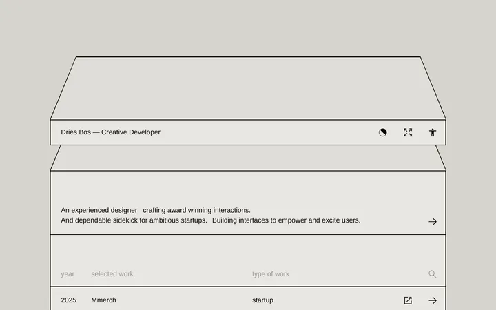
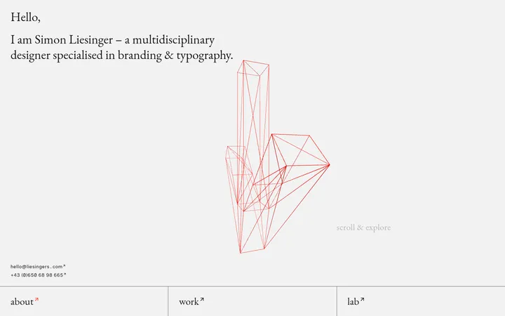
North star · Keep the portfolio shell nearly invisible so the showcased product work provides the page’s color and visual weight.
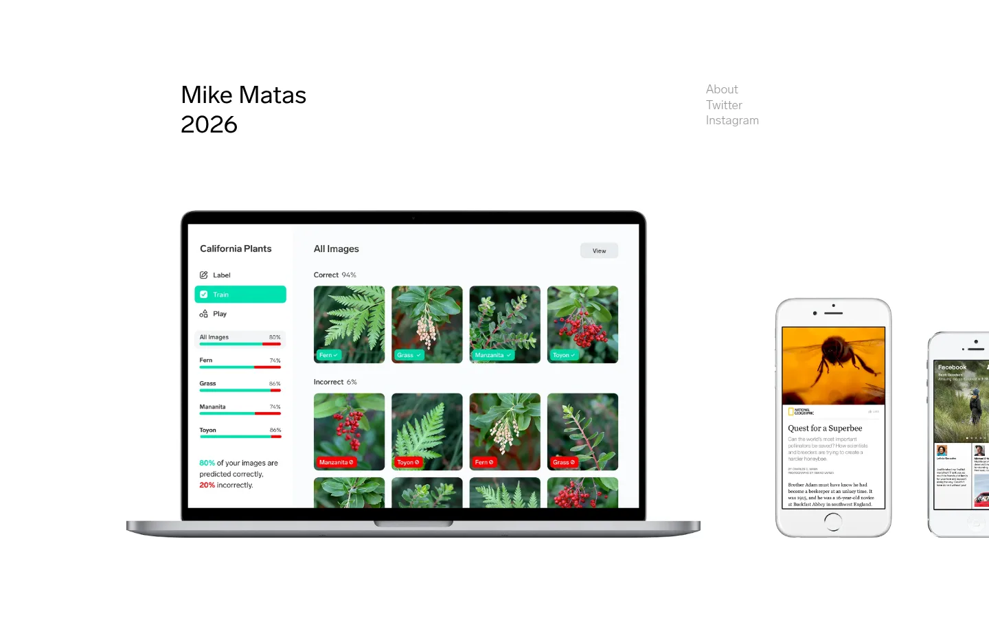
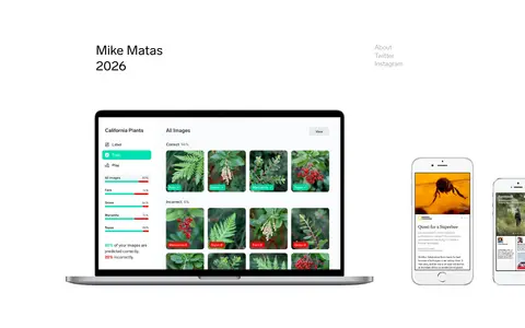
The page uses a pure white canvas as an uninterrupted backdrop, with black reserved for the portfolio title and muted gray for the small navigation links. The measured palette contains no decorative brand accent; saturated greens, reds, and warm photographic tones are confined to the product interfaces pictured within the work. Lab Grotesque carries both the large, regular-weight name and the very light body text, creating a quiet typographic hierarchy without relying on display treatments. Content sits in a centered, constrained composition with broad open margins and generous vertical separation. The first view places a small identity block and stacked links above a large laptop image, accompanied by phone mockups to its right. The imagery is shown as crisp product documentation rather than framed cards. Keep surfaces flat and edges clean; let the scale and color within each project image supply contrast.
The two-line name and year identity at the top of the page.
Mike Matas
40px
400
1.2
0
正文
Light supporting text and understated navigation labels.
The quick brown fox 敏捷的狐狸
18px
100
normal
0
间距与布局
基准单位 1px · 密度:宽松
263px版块间距
—元素间距
—卡片内边距
914px内容最大宽度
1px
2px
9px
36px
Use a centered portfolio composition with a measured maximum content width of 914px and a 12-column structural grid. Align the identity block to the left and a compact vertical link group to the right. The opening work image spans broadly below this header, with smaller device imagery alongside it. The page is intentionally sparse, with a measured section gap of 263px and a spacious overall density; preserve large areas of uninterrupted white rather than adding panels or filler.
圆角与层次
没有测到阴影:页面是扁平的,层次靠底色和描边区分。
The measured design has no shadows, gradients, or card surfaces. Keep the page visually flat, with devices appearing as image assets rather than elevated interface panels. Do not introduce borders or decorative frames around the work; the device mockups themselves provide their own outlines and depth.
组件
下面的预览按实测的按钮、输入框、徽标、卡片样式重建(字体用替代字体)。
Identity masthead
Left-aligned, two-line name and year in black Lab Grotesque; the measured h1 is 40px, regular weight, with a 1.2 line height.
Social navigation
A short vertical stack of About, Twitter, and Instagram links set in quiet gray at the upper right of the content.
Portfolio showcase
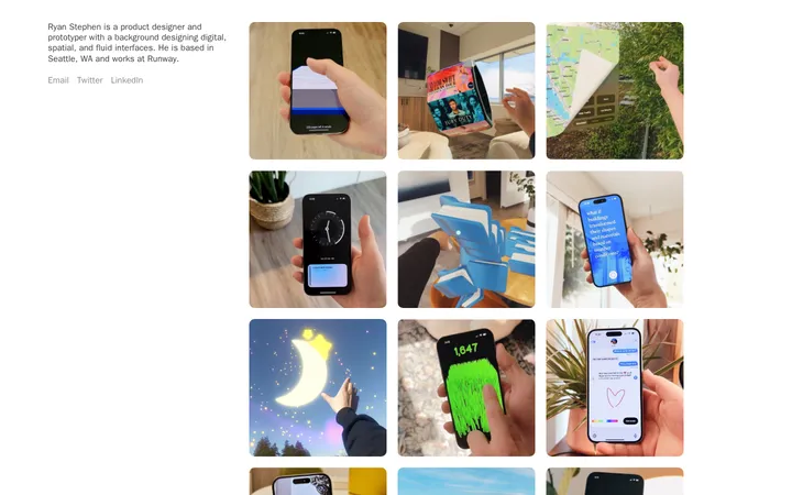
A broad, unframed work image leads with a laptop interface and companion phone mockups, arranged directly on the white canvas.
Imagery · Show product work through large, crisp device mockups: a laptop displaying a plant-classification interface, paired with phone screens. Keep the images unframed against the page’s white canvas. Green foliage, interface colors, and photographic subjects belong to the project imagery, not the site’s core brand palette.
Set identity text in black and navigation in muted gray.
Keep the header small and aligned to opposite sides.
Give project imagery generous breathing room.
Show work as direct, unframed product imagery.
Preserve a sparse, spacious page rhythm.
✕ 不该做
Do not add decorative brand colors to the site shell.
Do not place work inside cards or bordered panels.
Do not use shadows or gradients.
Do not crowd the header with extra controls.
Do not mistake colors inside project screenshots for site palette colors.
Do not use heavy display type or all-caps styling.
给 AI 的提示词
想快速出一个同风格的新页面,把这段话连同 DESIGN.md 一起发给 AI。
Build a new portfolio page using the same quiet visual language. Set the canvas to Gallery White (#ffffff), use Portfolio Ink (#000000) for the identity and primary text, and Quiet Gray (#999999) for secondary links. Use Lab Grotesque or a close free sans-serif substitute, keeping headings regular and supporting text light. Constrain the content to a centered composition with broad margins and generous vertical pauses. Place a compact identity block opposite a simple stacked navigation, then let large product imagery dominate the page without card backgrounds, borders, or shadows. Keep colors visible inside project screenshots true to those assets; do not promote them into the page’s brand palette. Favor clean alignment, natural case, and open whitespace over decorative effects.