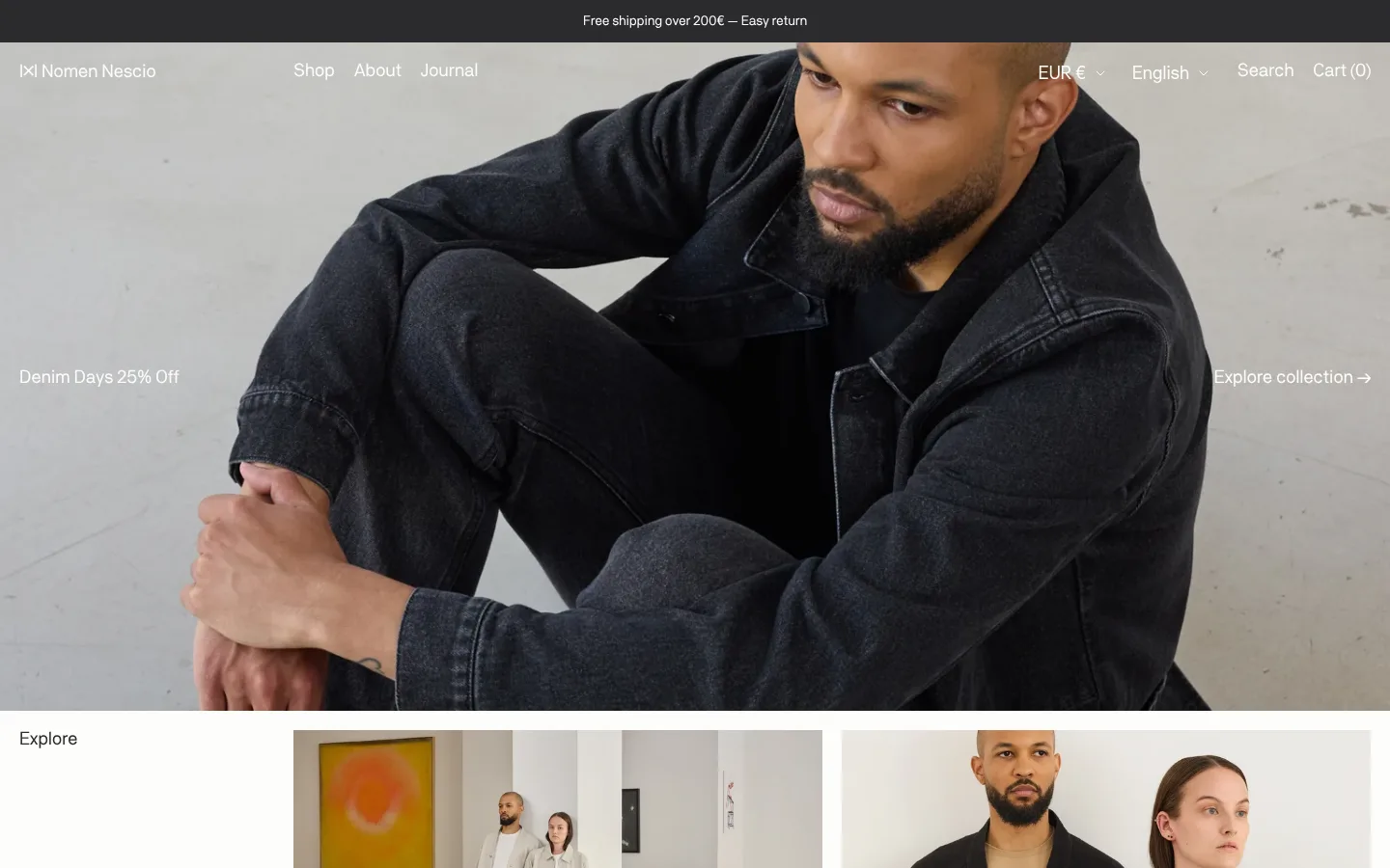
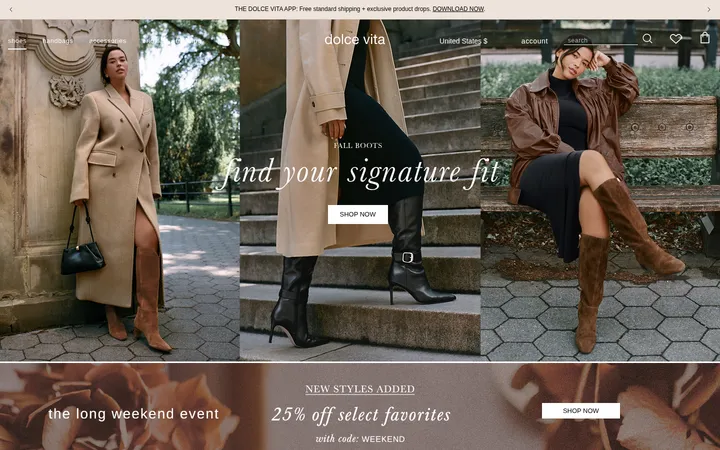
North star · Keep the interface quiet and flat so that oversized fashion photography and the garments themselves provide nearly all visual drama.
The page uses a warm, almost-white canvas (#fdfdfa) as a continuous ground from the hero through product listings, reviews, and footer. Near-black (#2b2b2e) provides the main reading contrast and the narrow dark announcement strip; imagery supplies most of the page’s other colour, rather than a designed accent palette. The custom NomenNesciopro sans-serif is used at regular weight throughout, with compact tracking and no forced uppercase. A large, quiet hero photograph fills the opening section, with small white text overlaid at its sides. Below, the layout shifts to an inset editorial category row and a four-column product grid, with concise captions and pricing. Left-aligned section labels, broad gaps between content groups, and very light dividers preserve a calm rhythm. Testimonial typography grows in scale, while the footer returns to small, organized link columns and a simple newsletter field. Keep surfaces flat and let garment photography carry texture and contrast.
Brand typeface for navigation, headings, product captions, body copy, links, and controls.
角色
示例
字号
字重
行高
字距
一级标题
Large campaign or primary page headline, used with restrained weight.
Nomen Nescio
54px
400
1.1
-0.007em
正文
General content, product details, navigation-scale copy, and review text.
The quick brown fox 敏捷的狐狸
19px
400
1
-0.02em
辅助文字
Small product labels, supporting details, and footer information.
The quick brown fox 敏捷的狐狸
15px
400
normal
-0.02em
按钮
Text for collection links and other understated actions.
The quick brown fox 敏捷的狐狸
19px
400
1
-0.02em
导航
Header navigation and locale or shopping controls.
The quick brown fox 敏捷的狐狸
19px
400
0.93
-0.02em
链接
Product names and editorial or collection navigation links.
The quick brown fox 敏捷的狐狸
19px
400
1
-0.02em
间距与布局
基准单位 4px · 密度:适中
68px版块间距
8px元素间距
—卡片内边距
1400px内容最大宽度
3px
4px
6px
8px
10px
12px
16px
20px
24px
28px
32px
36px
48px
A full-width campaign hero leads into a centered content area capped at the measured 1400px page maximum. The category section uses a left-side label beside two wide image panels; the latest-arrivals area changes to a four-column product grid. Reviews and footer content stay aligned to the same broad page structure. Sections are separated by generous vertical breathing room, while product cards remain compact and information-dense. Keep headings and labels left-aligned rather than centering every block.
圆角与层次
按钮 · 50%
inset · nav
The design is predominantly flat, with no meaningful card shadows or raised surfaces. The dark announcement band and full-bleed hero create contrast through colour and image layering rather than elevation. Use restrained hairlines for form details, and avoid framing each product as a separate boxed card.
组件
下面的预览按实测的按钮、输入框、徽标、卡片样式重建(字体用替代字体)。
Announcement and overlay navigation
Place a compact charcoal shipping message above a transparent hero header; overlay the brand, shop links, language, search, and cart in light text.
Campaign hero
Use a full-bleed fashion photograph with a short promotion at the left and an Explore collection link at the right.
Category feature panels
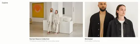
Show two large editorial category images beside a left-aligned Explore label, with concise collection names and muted supporting lines.
Product grid
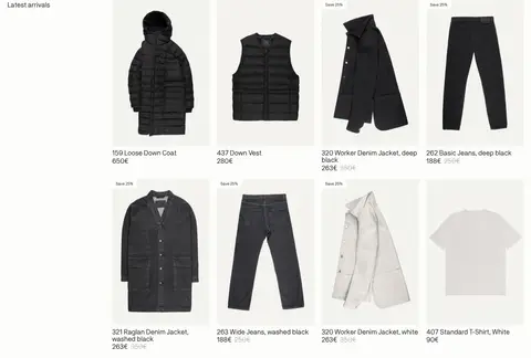
Arrange product photography in four columns with simple name and price captions; show sale prices and savings without heavy card treatment.
Testimonial
Pair a small section label with an oversized customer quote, attribution, and understated slide indicators.
Newsletter and footer
Group store, policy, and social links into columns; finish with an email field using a subtle underline and a simple arrow action.
Imagery · Fashion photography is the defining visual material: a full-bleed campaign shot opens the page, followed by lifestyle category images and isolated garment product photographs. Images are large, direct, and naturally coloured, with little visible decoration or framing. The photo’s dark clothing and pale studio surroundings create contrast against the warm ivory interface. No illustration or 3D treatment is evident.
Use Gallery Ivory (#fdfdfa) as the dominant page canvas.
Let campaign and product photography lead the visual hierarchy.
Use Soft Charcoal (#2b2b2e) for crisp text and the announcement band.
Keep typography regular-weight, compact, and sentence case.
Align section labels and product information to the left.
Use open spacing between sections and restrained hairlines in forms.
✕ 不该做
Do not add a saturated accent palette absent from the measured interface.
Do not place every product in a shadowed or boxed card.
Do not add gradients, decorative icons, or ornamental backgrounds.
Do not turn navigation or headings into heavy uppercase display text.
Do not let borders or buttons compete with the fashion imagery.
Do not use screenshot-only image colours as interface palette values.
给 AI 的提示词
想快速出一个同风格的新页面,把这段话连同 DESIGN.md 一起发给 AI。
Build a new fashion-commerce page in Nomen Nescio’s restrained editorial style. Use Gallery Ivory (#fdfdfa) for the continuous canvas and Soft Charcoal (#2b2b2e) for navigation, copy, and a compact announcement band. Reserve Muted Stone (#bebcb4) for secondary text and Quiet Divider (#dddddb) for subtle form hairlines; Pale Khaki (#d9d7c9) is measured but should remain rare. Use a regular-weight sans-serif close to NomenNesciopro, with compact tracking and natural sentence case. Establish hierarchy through large, unboxed fashion photographs: a broad campaign image first, then category imagery and a four-column product grid. Keep section labels and product captions left-aligned, with generous section breathing room and concise copy. Favor flat surfaces, restrained controls, and a small-column footer; never let interface decoration rival the photography.