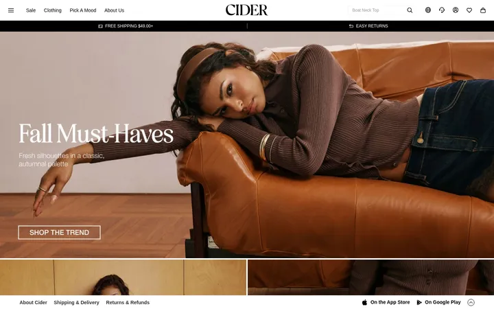
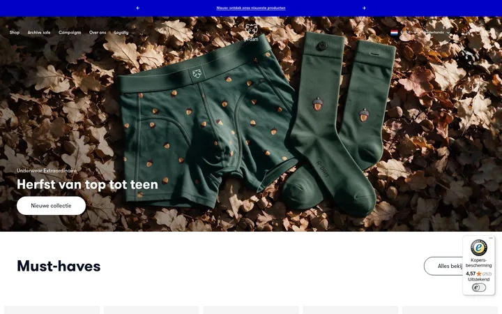
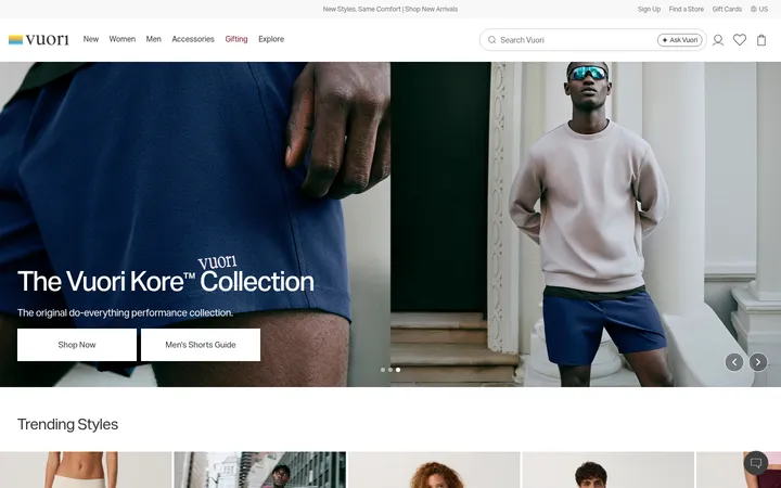
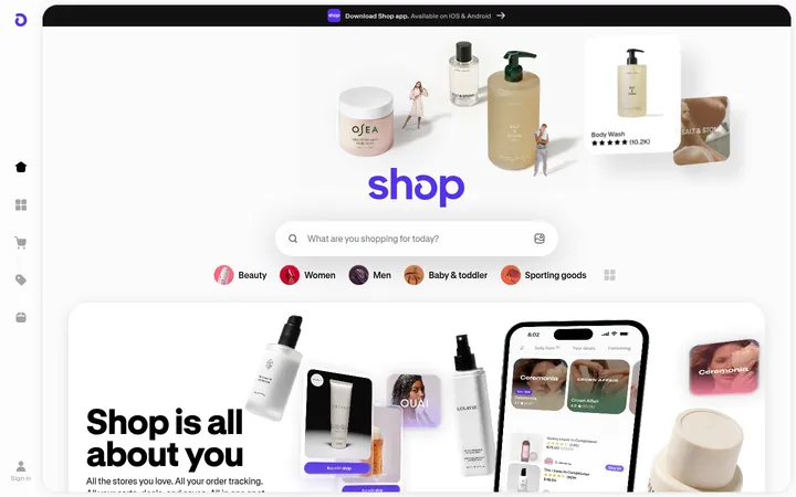
North star · Let expressive, full-bleed fashion photography lead, and keep the interface quiet with warm neutrals, black text, and editorial Baskerville accents.
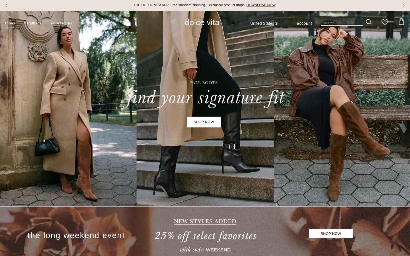
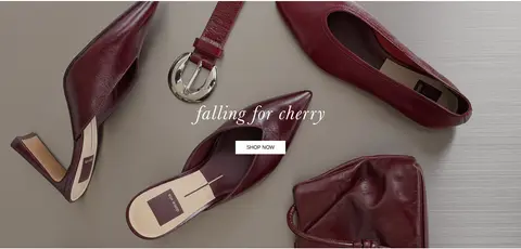
The page is built around fashion photography rather than decorative interface colour: the measured canvas is white, while warm beige bands and pale cards appear in the promotional and lower-page areas. Black anchors most text, links, and the compact subscribe button; lighter gray tones are reserved for secondary copy and fine dividers. Campaign photos supply most of the visible colour, so their browns, stone neutrals, and seasonal product tones should remain photographic rather than become interface swatches. Baskerville brings an editorial, feminine contrast to large italic campaign lines and category links, while Arimo keeps navigation, body copy, controls, and footer content crisp and practical. The layout moves from a thin announcement strip and overlaid navigation into broad, edge-to-edge image campaigns and a two-column category mosaic. Generous image areas do the visual work; simple square controls, restrained spacing, and almost no elevation keep the merchandise in focus.
Large campaign statements and editorial display text
Aa 设计
Baskerville
网络字体 · 字重 400 · 占比 5%
免费替代:Libre Baskerville
Large non-italic serif headings
Aa 设计
arimobold
网络字体 · 字重 700 · 占比 4%
免费替代:Arimo
Emphasis within sans-serif interface text
角色
示例
字号
字重
行高
字距
特大标题
Oversized italic serif campaign line over the hero photography.
Dolce Vita
69px
400
1.5
0.033em
一级标题
Primary editorial campaign headline, typically Baskerville italic.
Dolce Vita
65px
400
1.3
0.031em
二级标题
Large serif statement within a seasonal feature or campaign.
Dolce Vita
64.5px
400
1.5
0.031em
三级标题
Secondary italic serif title for product and category storytelling.
Dolce Vita
57.5px
400
1.2
0.035em
四级标题
Compact Arimo heading for utility or supporting content.
The quick brown fox 敏捷的狐狸
20px
400
1.4
0.03em
正文
Store information, descriptions, and general supporting text.
The quick brown fox 敏捷的狐狸
16px
400
1.8
0.038em
辅助文字
Small lowercase labels and short image or product annotations.
The quick brown fox 敏捷的狐狸
14px
400
1.8
0.043em
按钮
Short CTA labels such as shop now and subscribe.
The quick brown fox 敏捷的狐狸
14.5px
400
1.5
0.069em
导航
Lowercase primary store navigation and utility links.
The quick brown fox 敏捷的狐狸
13px
400
1
0.047em
链接
Category links and supporting calls to action.
The quick brown fox 敏捷的狐狸
16px
400
1.8
0.038em
间距与布局
基准单位 4px · 密度:适中
48px版块间距
8px元素间距
—卡片内边距
1100px内容最大宽度
2px
3px
4px
5px
6px
7px
8px
9px
10px
12px
14px
16px
20px
24px
30px
32px
A narrow announcement strip sits above navigation layered over the opening campaign. Below it, full-width image sections establish a long editorial scroll, followed by a two-column category mosaic and additional seasonal campaigns. The measured content area reaches a 1100px maximum width for constrained elements, while campaign media reads edge to edge. Alignment shifts with each photograph rather than relying on a rigid text grid. Comfortable spacing and large image-led sections create a relaxed rhythm, with denser four-column utility content at the bottom.
圆角与层次
没有测到阴影:页面是扁平的,层次靠底色和描边区分。
The interface is predominantly flat. No measured shadow system or rounded-corner scale is present; controls and cards remain square-edged. Use fine gray hairlines to separate content where needed, and rely on photographic layering and image contrast—not drop shadows—to establish hierarchy.
组件
下面的预览按实测的按钮、输入框、徽标、卡片样式重建(字体用替代字体)。
Announcement strip
A slim warm-neutral strip above the hero with centered shipping or app messaging and compact directional controls.
Overlay navigation
Lowercase Arimo links and utility controls sit over hero photography in white, with the Dolce Vita wordmark centered.
Campaign hero
Full-bleed seasonal photography carries a large Baskerville italic message and a simple white rectangular shop CTA.
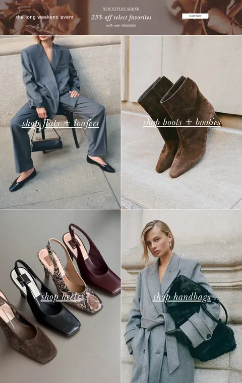
Category tiles
Paired image tiles lead to flats, boots, heels, and handbags; use understated italic serif link labels over photography.
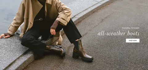
Seasonal campaign
Wide product or lifestyle image with a brief editorial headline and a small shop CTA placed within the image.
Editorial link strip
A pale warm lower-page band presents short seasonal edit links as simple white rectangular controls.
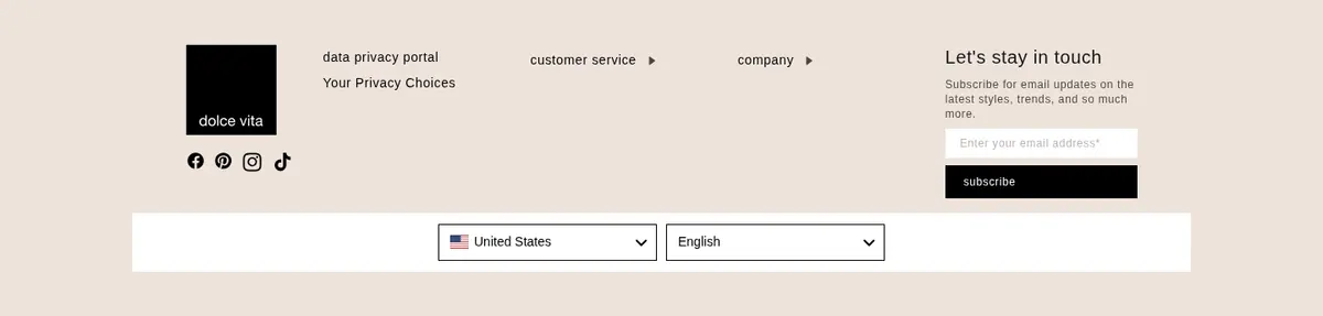
Newsletter signup
Light neutral signup area with email input and a black subscribe button using white text.
Imagery · Use polished, lifestyle-led fashion photography as the main visual material: models wearing seasonal looks, close product arrangements, and footwear or handbag details. Images are broad, edge-to-edge panels or paired category tiles, with campaign text placed directly over quieter parts of the photograph. Keep natural tones and photographic texture; avoid illustration, 3D objects, graphic overlays, or heavy colour treatments.
Use campaign photography as the dominant visual surface.
Set hero statements in Baskerville italic.
Keep navigation and utility copy in Arimo.
Use black text on white or pale neutral surfaces.
Keep CTA shapes square and visually simple.
Let image composition guide campaign text placement.
✕ 不该做
Do not add gradients or decorative shadows.
Do not turn photo colours into interface accents.
Do not use rounded cards or pill-shaped buttons.
Do not crowd the campaign imagery with controls.
Do not use heavy sans-serif headings for editorial messages.
Do not impose a dense, dashboard-like grid.
给 AI 的提示词
想快速出一个同风格的新页面,把这段话连同 DESIGN.md 一起发给 AI。
Build a new Dolce Vita-style fashion storefront page with the photography doing most of the visual work. Use Gallery White (#ffffff) as the base, Velvet Ink (#000000) for copy and primary controls, Warm Sand (#eee3db) for warm lower-page surfaces, and Linen Mist (#f5f2ee) for a pale signup card. Set campaign headlines and image links in editorial Baskerville, often italic; use Arimo for navigation, body copy, and controls. Organize the page as a slim announcement, image-led hero, category photography grid, seasonal campaign blocks, and a restrained newsletter/footer. Keep images broad and immersive, overlay only concise text and simple square CTAs, and separate areas with subtle hairlines rather than shadows. Preserve a relaxed editorial rhythm and avoid decorative UI that competes with merchandise.