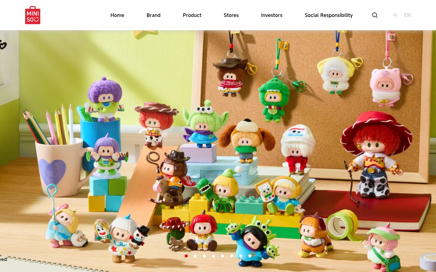
North star · Keep the interface quiet and spacious so vivid retail and collaboration imagery remains the main event.
The page uses white as its dominant canvas, with a light gray band reserved for the IP collaboration product area and footer. Black headings and dark gray supporting text keep the interface legible without competing with the imagery; MINISO red appears sparingly in the logo, small controls, and numeric highlights. Typography is clean and largely unembellished, using the measured light and medium web fonts with regular weights and no tracking or uppercase treatment. A wide desktop header gives navigation room to breathe, while centered section headings and broad content areas organize a long, one-column page flow. Product and store content becomes more modular within those sections, with image-led cards and horizontal collections. The imagery carries most of the color: bright lifestyle scenes, character collaborations, and retail locations are presented at large scale. Generous vertical gaps separate sections, keeping the overall impression airy and approachable rather than dense.
Body copy, captions, and navigation or product links.
Aa 设计
medium
网络字体 · 字重 400 · 占比 36%
免费替代:Roboto
Main headings and body text.
Aa 设计
mont
网络字体 · 字重 400 · 占比 3%
免费替代:Montserrat
A small share of heading styling, including a measured h3 role.
角色
示例
字号
字重
行高
字距
一级标题
Large hero or primary page headline.
MINISO
40px
400
1
0
二级标题
Section titles such as store or campaign headings.
MINISO
31.5px
400
1.26
0
三级标题
Secondary display headings within content sections.
MINISO
30px
400
1.17
0
四级标题
Smaller supporting headings and section labels.
MINISO
28px
400
3.24
0
正文
Main descriptive copy and prominent supporting text.
The quick brown fox 敏捷的狐狸
20px
400
1.75
0
辅助文字
Product names, image captions, and compact supporting labels.
The quick brown fox 敏捷的狐狸
13.5px
400
2.25
0
链接
Navigation, product links, and utility actions.
The quick brown fox 敏捷的狐狸
13.5px
400
5.27
0
间距与布局
基准单位 1px · 密度:宽松
100px版块间距
—元素间距
—卡片内边距
1275px内容最大宽度
10px
12px
20px
21px
25px
35px
50px
100px
A spacious, long-scroll homepage with a wide desktop canvas and a measured maximum content width of 1275px. The header distributes the logo, central navigation, and compact utility controls across a single horizontal row. Most sections read as broad, single-column bands; product and store areas shift into multi-column image collections. Headings and statistics are centered, while card labels sit close to their imagery. Section spacing is generous, with a clear change of pace at the pale gray collaboration band.
圆角与层次
按钮 · 50%
链接 · 50%
md · other
The page is mostly flat: white and pale gray bands separate content without pronounced cards or heavy shadow. Thin light borders define a few circular controls, while imagery supplies the strongest depth and layering. Keep interface elevation restrained and let photo composition provide visual dimensionality.
组件
下面的预览按实测的按钮、输入框、徽标、卡片样式重建(字体用替代字体)。
Global navigation
White horizontal header with a compact red MINISO mark, widely separated navigation links, and small search and language controls.
Hero carousel
Full-width lifestyle image with small circular pagination indicators near the lower edge; the active dot is red.
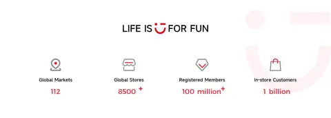
Brand statistics
Centered brand statement above four evenly distributed icon-and-metric items, with red values and labels.
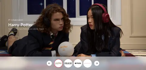
IP collaboration feature
Large campaign image and overlaid title treatment, followed by circular collection selectors.
Product showcase
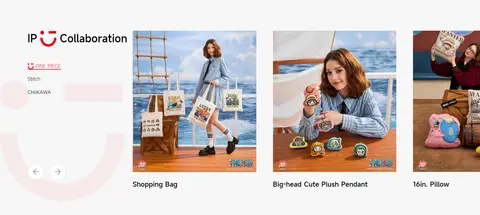
Pale gray section with collaboration navigation and a horizontal set of product images and compact labels.
Store gallery
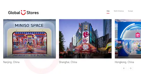
Store-location imagery arranged in a wide multi-column row with city captions and region navigation.
Footer
Light gray closing band with franchise contact details, grouped navigation links, and subdued legal text.
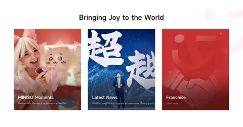
Imagery · Large lifestyle and campaign photography dominates the first screen and IP feature, followed by product, store, and news imagery in card-like collections. The visuals are bright and colorful, with character merchandise and retail environments providing most of the palette beyond the restrained interface colors. Image crops are broad and prominent; small captions remain visually secondary.
Reserve MINISO red for branding and small highlights.
Give large campaign photography room to lead.
Separate major content with generous vertical space.
Keep captions smaller and quieter than imagery.
Use pale gray as a section band, not a competing background.
✕ 不该做
Do not fill every section with colored panels.
Do not make navigation visually heavy or crowded.
Do not turn product imagery into dense text cards.
Do not use strong shadows throughout the page.
Do not apply red broadly to large backgrounds.
Do not add decorative gradients absent from the measured style.
给 AI 的提示词
想快速出一个同风格的新页面,把这段话连同 DESIGN.md 一起发给 AI。
Build a new MINISO-style retail page with a quiet, spacious interface and vivid merchandise imagery. Use Gallery White (#ffffff) for the main canvas and Soft Section Gray (#f7f7f7) for occasional content bands. Set primary headings in Core Black (#000000), supporting copy in Charcoal Text (#333333) or Muted Graphite (#666666), and reserve MINISO Red (#e60012) and Signal Red (#f12535) for small brand and metric accents. Use a clean sans-serif stack, restrained weights, and no added letter spacing. Arrange a roomy horizontal header, broad image-led hero, centered content headings, and modular product or store galleries. Keep captions compact, sections generously separated, controls simple, and borders subtle. Let photography supply the page’s color, texture, and depth; avoid heavy shadows and decorative gradients.