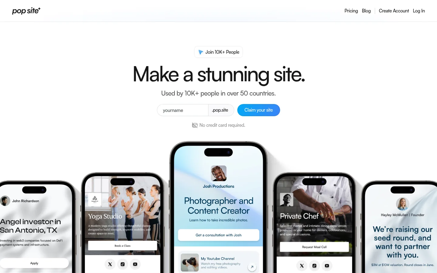
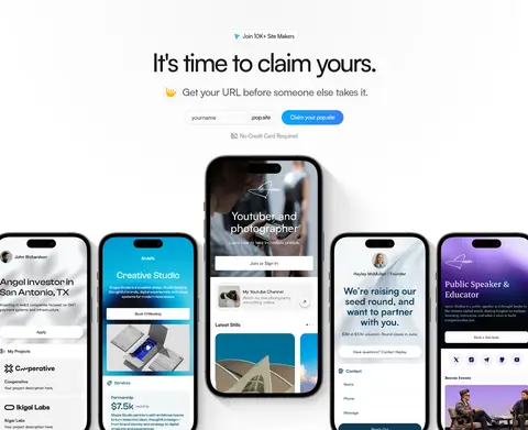
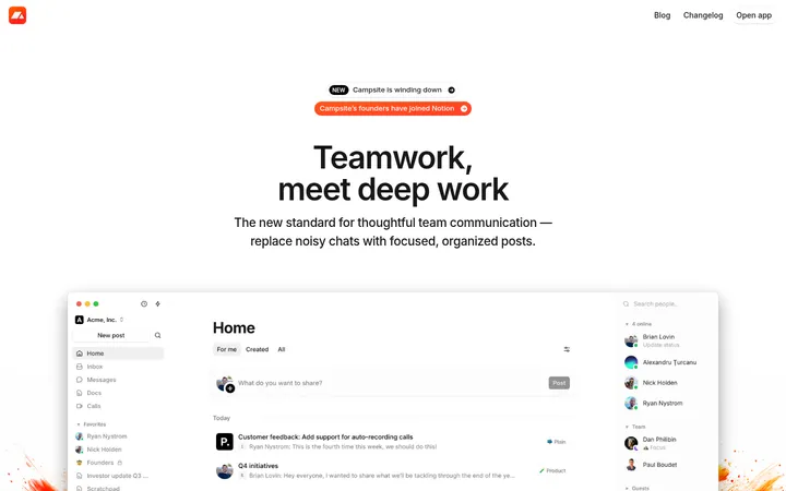
Pop Site以大面积白色留白、紧凑醒目的标题和鲜明的产品展示,呈现轻快直观的建站体验。重复出现的注册表单与设备样机串联功能介绍和转化入口。
North star · Keep the page predominantly white and spacious, using tight black typography and repeated blue signup controls to organize vivid product showcases.
The page uses white as its defining canvas, giving the long homepage a bright, uncluttered feel and letting product imagery carry much of the colour. Near-black headings establish a strong reading hierarchy; muted grays handle supporting copy, while blue marks signup actions and occasional links. Satoshi drives the display and interface typography, with large, tightly tracked headings and compact, readable supporting text. Centered hero and feature sections alternate with split layouts, multi-column feature grids, and broad showcase bands, creating variety without changing the visual language. Repeated username fields and pill-shaped CTAs make conversion familiar across the page. Product imagery focuses on phone screens and desktop dashboards, often framed as polished mockups. Subtle gradients and soft card shadows add depth selectively; most sections remain flat and open. Bright blue and purple regions appear as feature or campaign treatments, not as the page-wide background palette.
配色
点色块复制色值。用途说明来自对页面的实测位置(背景、文字、描边、按钮)与截图判读。
品牌色
强调色
表层色
中性色
页面底色 · Gallery White主文字 · Pop Ink次要文字 · Gallery White弱文字 · Soft Graphite强调 · Action Blue
Primary display and interface type for headings, body, navigation, captions, and links.
Aa 设计
Inter
网络字体 · 字重 400 / 500 · 占比 22%
免费替代:Inter
Secondary webfont used for a smaller share of page text.
角色
示例
字号
字重
行高
字距
特大标题
Oversized campaign and hero headlines.
Pop Site
69px
500
0.9
-0.057em
一级标题
Primary hero and major section headings.
Pop Site
64px
500
0.9
-0.05em
二级标题
Feature and supporting section headings.
Pop Site
28px
500
1.2
-0.03em
三级标题
Card titles and smaller feature headings.
The quick brown fox 敏捷的狐狸
21px
500
1.4
-0.03em
正文
Explanatory copy and main interface text.
The quick brown fox 敏捷的狐狸
15px
500
1.3
-0.03em
辅助文字
Small labels, disclaimers, and image captions.
The quick brown fox 敏捷的狐狸
13px
400
1.2
-0.03em
导航
Header navigation links.
The quick brown fox 敏捷的狐狸
15px
500
1.3
-0.03em
链接
Inline links and testimonial attribution URLs.
The quick brown fox 敏捷的狐狸
16px
400
1.4
-0.04em
间距与布局
基准单位 2px · 密度:适中
80px版块间距
10px元素间距
20px卡片内边距
744px内容最大宽度
4px
5px
6px
7px
8px
10px
12px
13px
16px
20px
24px
30px
40px
60px
80px
Use a centered content column with a measured page maximum width of 744px for text-led content, then let product mockups and selected colour bands extend wider. The hero and several conversion sections align content centrally; later feature areas use two-column splits, three-column grids, and a compact six-item showcase. Preserve generous measured section gaps and comfortable card padding. The overall density is low: short copy blocks, clear hierarchy, and substantial white space separate the long sequence of sections.
圆角与层次
按钮 · 50%
卡片 · 10px
图片 · 8px
md · other
md · other, card
Most page areas are flat white with little visible border treatment. Use measured soft shadows selectively on cards and floating testimonial or product elements, with restrained separation rather than heavy outlines. Rounded cards and media frames help distinguish content; the bright feature bands and showcase mockups provide the strongest depth and contrast.
组件
下面的预览按实测的按钮、输入框、徽标、卡片样式重建(字体用替代字体)。
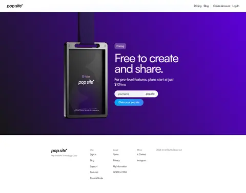
Top navigation
Slim white header with the Pop Site wordmark on the left and compact Pricing, Blog, Create Account, and Log In links on the right.
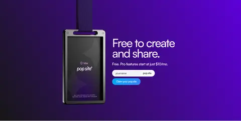
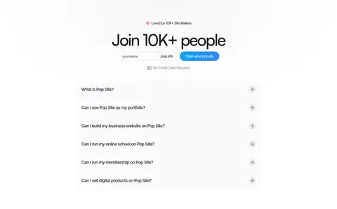
Username signup form
Repeated username field with a .pop.site suffix, adjacent pill-shaped blue Claim your site CTA, and a small no-credit-card reassurance beneath.
Hero showcase
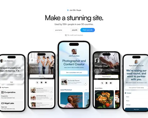
Centered headline and signup form above a wide arrangement of phone mockups demonstrating varied personal and business sites.
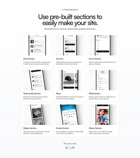
Feature cards
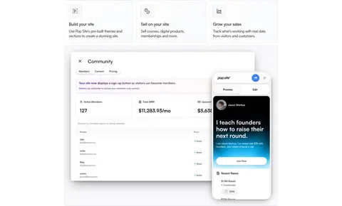
Three-column section gallery with product screenshots, concise titles, and short explanatory copy; cards use restrained spacing and subtle separation.
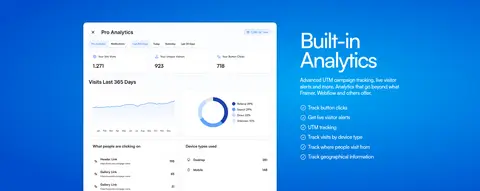
Analytics feature band
Strong blue feature treatment pairing a dashboard screenshot with a white heading, explanatory text, and a compact checklist.
Testimonial card
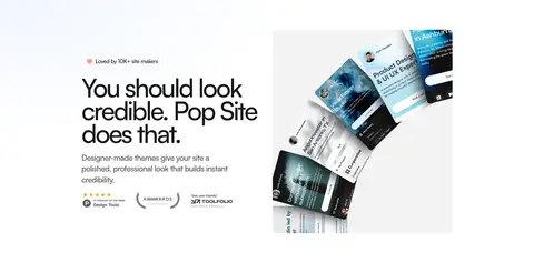
Small white card combining a portrait, quote, attribution, and social proof, lifted by a soft measured shadow.
FAQ accordion
Stacked question rows with plus controls, light neutral surfaces, and concise labels near the footer.
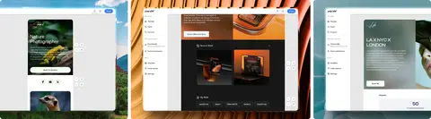
Imagery · Product imagery is the main visual proof: phone mockups show creator sites, forms, and storefronts, while desktop captures demonstrate editing and analytics. Use crisp device-framed screenshots, occasional video panels, and testimonial or portfolio examples rather than decorative illustration. Mockups can contain varied photography and saturated colours; treat those colours as product content, not the brand palette. Let showcase imagery overlap or sit beside copy while keeping surrounding space clean.
Use near-black, tightly tracked headings for hierarchy.
Repeat the username-plus-domain signup pattern at key conversion points.
Use blue selectively for primary actions and links.
Let phone and dashboard mockups demonstrate the product.
Reserve strong colour bands for specific feature or pricing moments.
✕ 不该做
Do not turn every section into a tinted panel.
Do not use heavy borders or dramatic shadows throughout.
Do not mistake colours inside mockup content for brand colours.
Do not crowd headings, copy, and controls together.
Do not replace the clean sans-serif typography with a decorative face.
Do not vary the repeated signup control styling between sections.
给 AI 的提示词
想快速出一个同风格的新页面,把这段话连同 DESIGN.md 一起发给 AI。
Build a new Pop Site page with a bright, mostly white canvas (#ffffff) and a centered, spacious content rhythm. Use Pop Ink (#171717) for compact, tightly tracked Satoshi-style headings and Soft Graphite (#545454) for supporting copy. Use Action Blue (#3b82f6) for prominent signup actions, with Sky Signal (#00a8f5) only as a restrained secondary accent. Pair short copy with clear product screenshots in phone and desktop mockups; varied colour within those images is product content, not the brand palette. Alternate centered hero sections, split feature layouts, and compact grids without losing generous whitespace. Repeat the username field, .pop.site suffix, pill CTA, and small reassurance as a consistent conversion unit. Add soft shadows sparingly and reserve vivid bands for selected feature or pricing sections.