North star · Keep the interface bright, restrained, and developer-oriented; reserve vivid color for purposeful accents and featured story artwork.
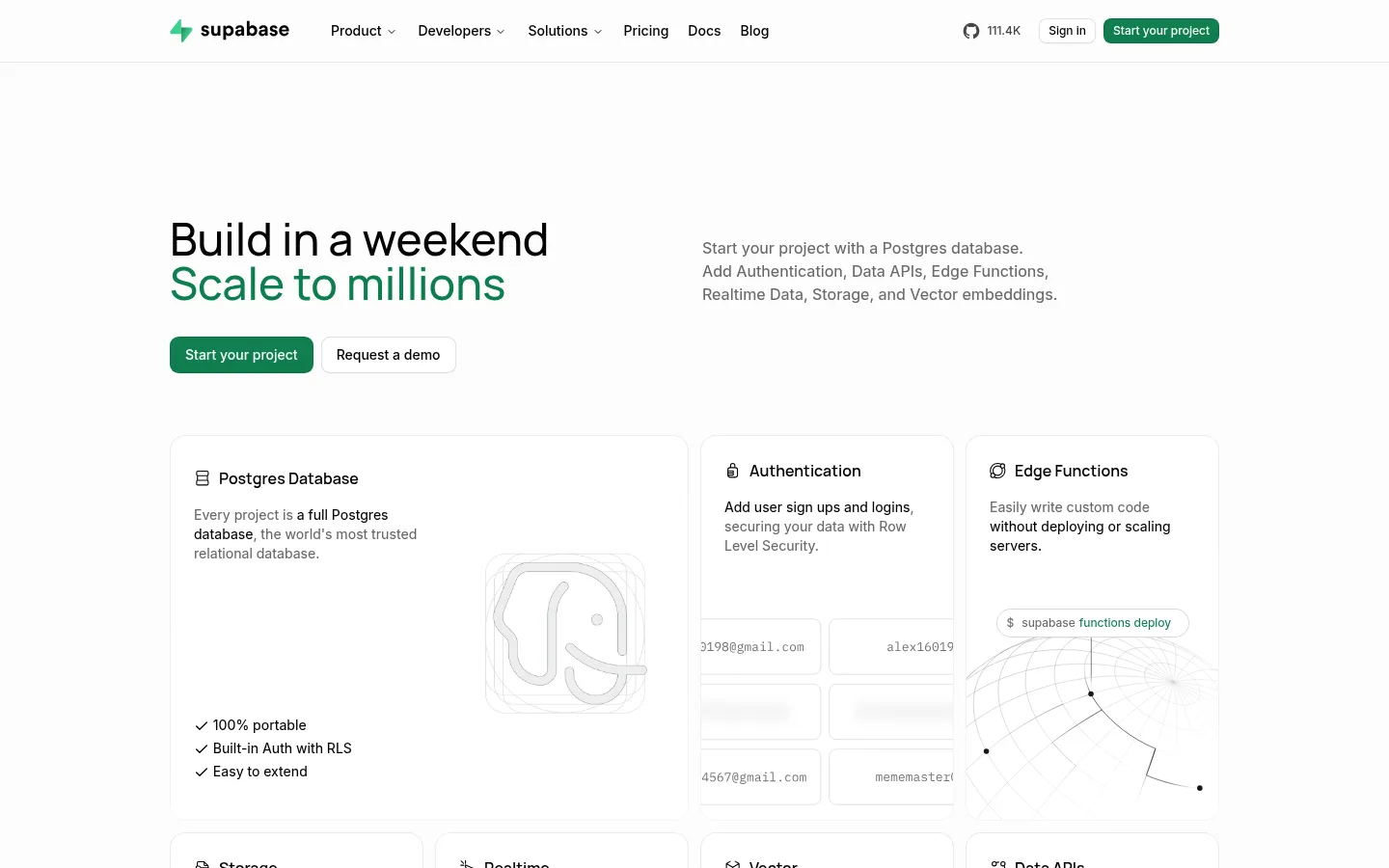
The page is built around a nearly white canvas, with black headlines, muted gray supporting copy, and thin pale-gray borders defining cards and section boundaries. Supabase green is reserved for primary actions and selected emphasis, keeping the large areas of whitespace calm; a pink-to-orange gradient appears as a distinct customer-story visual rather than a general interface color. Manrope gives headlines a softly geometric, modern character, while Inter handles navigation, body copy, and controls. Source Code Pro separates code snippets from prose. The layout uses a centered, constrained content area and shifts between multi-column feature grids and spacious single-column moments. Product interface captures, line illustrations, logos, and testimonials provide evidence of the platform without heavy photographic styling. Cards stay mostly flat, relying on hairlines and rounded corners instead of conspicuous shadows.
配色
点色块复制色值。用途说明来自对页面的实测位置(背景、文字、描边、按钮)与截图判读。
品牌色
强调色
表层色
中性色
页面底色 · Cloud Canvas主文字 · Near Black次要文字 · Slate Copy弱文字 · Cloud Canvas描边 · Fine Divider强调 · Supabase Green强调 2 · Deep Forest强调 3 · Story Pink
Navigation, body copy, captions, buttons, and links.
Aa 设计
Manrope
网络字体 · 字重 450 / 600 / 500 · 占比 18%
免费替代:Plus Jakarta Sans
Hero and section headings.
Aa 设计
Source Code Pro
网络字体 · 字重 500 · 占比 4%
免费替代:Roboto Mono
Code examples and developer snippets.
角色
示例
字号
字重
行高
字距
一级标题
Hero headline, set large with Manrope.
Supabase
46px
500
1
0
二级标题
Major section headings, including feature and community sections.
Supabase
34px
600
1.11
0
三级标题
Product-card and smaller feature headings.
The quick brown fox 敏捷的狐狸
22px
450
1.38
0
正文
Feature descriptions, explanations, and testimonial copy.
The quick brown fox 敏捷的狐狸
15px
450
1.5
0
辅助文字
Compact supporting labels and secondary card details.
The quick brown fox 敏捷的狐狸
14px
450
1.43
0
按钮
Primary and secondary action labels.
The quick brown fox 敏捷的狐狸
14px
450
1.43
0
导航
Header navigation and compact menu labels.
The quick brown fox 敏捷的狐狸
12px
500
1.33
0
链接
Small inline and footer links.
The quick brown fox 敏捷的狐狸
12px
450
1.33
0
代码
Syntax-like code examples and developer snippets.
const style = 1;
13px
500
1.7
0
间距与布局
基准单位 8px · 密度:适中
64px版块间距
8px元素间距
24px卡片内边距
1088px内容最大宽度
1px
4px
6px
8px
10px
12px
16px
20px
24px
32px
40px
96px
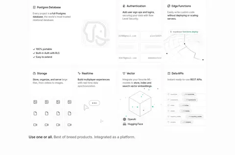
A centered content frame uses the measured 1088px maximum width, with the header and major sections aligned to its edges. The hero pairs a left-aligned headline and actions with explanatory copy, followed by a dense, asymmetric product-feature grid. Lower sections alternate between broad product showcases, multi-column template and story cards, and quieter single-column content. Section spacing is generous, while card interiors remain comfortable rather than sparse. The footer returns to a dense multi-column link layout.
圆角与层次
按钮 · 8px
输入框 · 8px
卡片 · 21px
图片 · 50%
徽标 · 9999px
导航 · 8px
链接 · 16px
inset · button
inset · button
hairline · media
hairline · button
The page is predominantly flat. Pale hairline borders define cards, controls, and section edges; rounded corners soften feature and testimonial panels. Buttons receive subtle inset treatment, but large floating shadows are not a defining motif. Maintain clear separation through whitespace and borders rather than stacked layers.
组件
下面的预览按实测的按钮、输入框、徽标、卡片样式重建(字体用替代字体)。
Primary action
Supabase-green button with light text, Inter label, and softly rounded corners; prominent at the hero and repeated in calls to action.
Secondary action
Light button with near-black label and a subtle outline or edge, paired directly with the primary action.
Product feature card
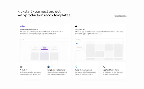
Near-white card with a pale border, rounded corners, compact heading and copy, plus a product UI capture or technical illustration where relevant.
Code sample panel
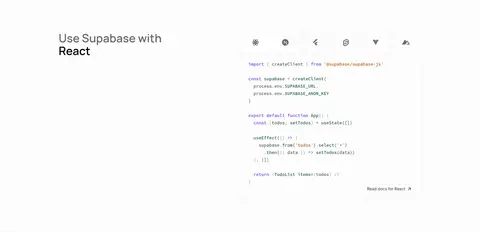
Developer example framed as a quiet interface card, using Source Code Pro to distinguish code from surrounding copy.
Customer story card
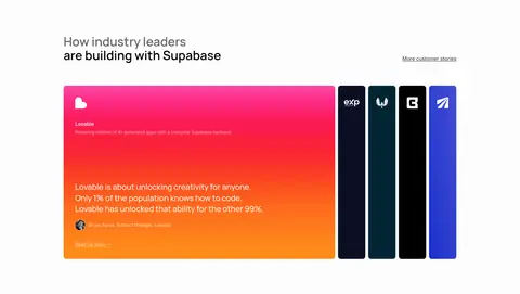
Featured case-study artwork may use the vivid measured pink-to-orange gradient; keep surrounding cards and page surfaces restrained.
Trust logo strip
Compact monochrome customer marks arranged in a horizontal multi-column band on the same light canvas.
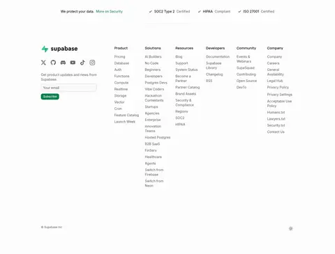
Footer link columns
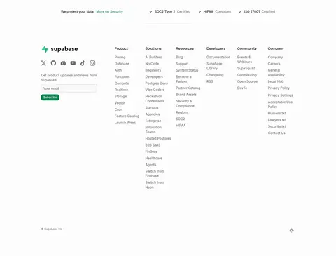
Dense multi-column navigation with muted small text, brand and social links, and a compact email subscription form.
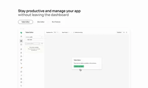
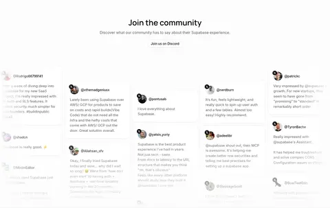
Imagery · Product imagery is mostly interface capture, dashboard previews, code panels, and fine-line technical illustrations. Small brand and customer logos support the trust section; testimonials use compact avatars and text-led cards. A customer case-study panel provides the notable saturated pink-to-orange gradient. Keep visual assets clean, lightly framed, and integrated into the grid rather than using generic lifestyle photography.
Keep the page canvas near-white and visually continuous.
Use Near Black for key headings and interface labels.
Reserve Supabase Green for primary actions and selective emphasis.
Use pale borders to define cards without making them feel heavy.
Pair Manrope headings with Inter interface and body text.
Keep code visually distinct with a monospaced face.
Confine the vivid gradient to featured story artwork.
✕ 不该做
Do not turn the whole page into a saturated gradient.
Do not introduce colored section bands absent from the reference.
Do not rely on heavy shadows to separate cards.
Do not use generic lifestyle photography in place of product visuals.
Do not make every button or link green.
Do not crowd the generous gaps between major sections.
给 AI 的提示词
想快速出一个同风格的新页面,把这段话连同 DESIGN.md 一起发给 AI。
Build a developer-platform page using a bright, near-white Cloud Canvas (#fdfdfd) and a centered content frame. Use Near Black (#030303) for headings and navigation, Slate Copy (#696969) for secondary text, and Fine Divider (#e8e8e8) for quiet card edges. Set headlines in Manrope and interface copy in Inter; use Source Code Pro for code. Make the hero spacious, then organize product capabilities into an asymmetric grid of rounded, lightly bordered cards. Alternate product UI previews, code examples, trust marks, customer stories, and testimonials with generous section breathing room. Use Supabase Green (#0e7e4e) for the main CTA, paired with a restrained light secondary action. Keep shadows subtle and reserve the pink-to-orange gradient for a featured story visual, not the general interface.