North star · Keep the page quiet and spacious: let centered, sharply typeset messaging and realistic product UI carry the story, with color reserved for small accents.
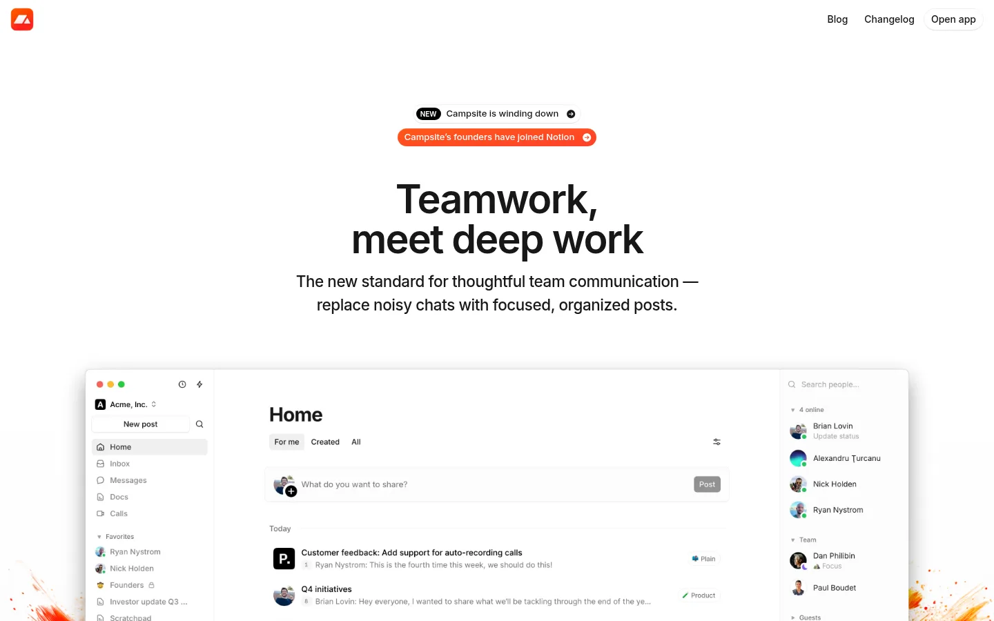
The page is built on a white canvas with a restrained neutral palette: near-black headings, muted gray navigation and captions, and delicate gray separators. A centered hero establishes the message with a large, tightly tracked Inter headline and compact supporting copy. The top navigation stays visually quiet at the edges, leaving the central content uninterrupted. Below, a large screenshot of the product interface anchors the page; later feature sections alternate concise centered headings, small UI examples, and brief explanatory text. Wide vertical gaps separate these modules and keep the long page calm rather than dense. Color is used sparingly: green appears on a small action button and product UI details, while warm orange-red announcement artwork and yellow highlighted quote fragments belong to content accents, not the core canvas. Soft shadows, rounded app cards, and thin borders make interface mockups feel layered without overpowering the editorial layout.
Primary family for hero and section headings, body copy, links, navigation, and product examples.
Aa 设计
ui-monospace
系统字体 · 字重 400 / 600 · 占比 2%
免费替代:Roboto Mono
Code-like or technical snippets where present.
角色
示例
字号
字重
行高
字距
特大标题
Large centered hero headline introducing teamwork and deep work.
Campsite
57.5px
600
1
-0.031em
一级标题
Primary page or feature heading where a compact hierarchy is needed.
Campsite
29px
600
1.2
-0.017em
二级标题
Feature-section headings and supporting headline statements.
The quick brown fox 敏捷的狐狸
22.5px
500
1.5
-0.018em
正文
Hero description, feature explanations, and longer content copy.
The quick brown fox 敏捷的狐狸
16px
400
1.8
0
辅助文字
Compact labels, quotes, and secondary interface annotations.
The quick brown fox 敏捷的狐狸
14px
400
1.43
0
链接
Navigation and secondary calls to action.
The quick brown fox 敏捷的狐狸
14px
400
1.43
0
代码
Any technical or code-like product text, used sparingly.
const style = 1;
16px
400
1.5
0
间距与布局
基准单位 4px · 密度:适中
80px版块间距
6px元素间距
—卡片内边距
1280px内容最大宽度
1px
2px
4px
6px
8px
10px
12px
16px
24px
32px
48px
A single-column editorial flow sits within a measured maximum page width of 1280px, with the hero and most feature headings centered. The top navigation is a slim horizontal row, logo left and utility links right. A broad product screenshot spans beneath the compact hero copy, followed by vertically separated feature modules with UI illustrations and short text. The page is deliberately low-density, using a measured section gap of 80px and a comfortable spacing scale; the footer resolves into three columns.
圆角与层次
按钮 · 50%
卡片 · 12px
图片 · 50%
徽标 · 9999px
链接 · 9999px
hairline · link, button
md · card, other
inset · link, button
hairline · other
The page is mostly flat, with fine gray borders defining interface cards and restrained soft shadows lifting larger product mockups from the white canvas. Use layering to make screenshots legible, not to create heavy floating panels. Rounded card corners and subtle control surfaces provide depth; avoid strong outlines or dramatic shadows.
组件
下面的预览按实测的按钮、输入框、徽标、卡片样式重建(字体用替代字体)。
Top navigation
Compact white header with the logo at left and muted Blog, Changelog, and outlined Open app control aligned at right.
Announcement pills
Small centered status and news links above the hero; a black NEW badge and warm orange-red accent treatment distinguish announcements.
Hero headline
Centered, bold, tightly tracked two-line message with a short centered supporting statement beneath.
Product showcase
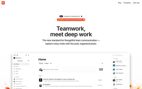
Large light application screenshot with a thin border and soft shadow; it anchors the hero and demonstrates the actual interface.
Feature story
A short centered heading paired with a compact UI example and concise supporting copy, repeated down the page.
UI cards
Rounded product panels use #f5f5f5 or white surfaces, #e5e5e5 borders, and restrained elevation.
Footer
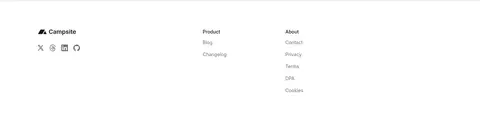
Quiet three-column closing area with brand and social marks alongside Product and About link groups.
Imagery · The dominant imagery is product UI: crisp, light application screenshots and composited interface cards, framed as large proof points rather than decorative backgrounds. Feature visuals show posts, lists, summaries, and communication flows, with occasional portraits or video-call thumbnails inside the mockups. Warm orange-red flourishes around the hero screenshot and colored app icons are illustrative content; keep them isolated from the otherwise neutral page canvas.
Use a white canvas and keep section backgrounds visually quiet.
Center the hero message and keep its supporting copy compact.
Use Inter-style sans serif typography with tight display tracking.
Give feature stories generous vertical separation.
Frame product UI with subtle borders and soft shadows.
Reserve vivid colors for small actions and illustrative interface details.
✕ 不该做
Do not fill large sections with saturated color.
Do not crowd the hero with extra navigation or copy.
Do not turn product screenshots into decorative abstractions.
Do not use heavy shadows or thick borders on every card.
Do not treat illustration-only colors as the core brand palette.
Do not compress the long page into a dense feature grid.
给 AI 的提示词
想快速出一个同风格的新页面,把这段话连同 DESIGN.md 一起发给 AI。
Build a new Campsite-style productivity page as a quiet, light editorial experience. Use Gallery White (#ffffff) for the canvas, Carbon Ink (#171717) for primary type, Slate Link (#737373) for secondary navigation, and Quiet Line (#e5e5e5) for delicate borders. Set headings in an Inter-like sans serif with semibold weight and tight tracking; keep body copy regular and readable. Place a sparse logo-and-links header above a centered announcement and hero. Follow with a large, realistic product-interface showcase, then vertically spaced feature stories pairing concise headings with UI examples. Use Soft Panel (#f5f5f5) and Cloud Control (#f0f0f0) sparingly in interface components. Keep Action Green (#22c55e) and other vivid tones restricted to small UI accents. Favor soft shadows, rounded cards, and generous whitespace.