North star · Let a warm, restrained interface frame the product clearly, and reserve the strongest colors for actions and active product states.
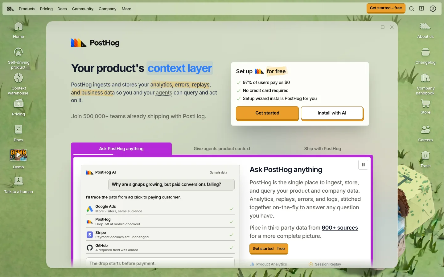
The visual strategy places a calm, light interface over a playful illustrated environment. The screenshot’s green landscape belongs to the product-world artwork; the defining interface palette is warm off-white, muted gray-green, near-black, and orange. A large rounded pale panel anchors the viewport, while small icon-and-label navigation sits around its edges. RoundHog gives headings and interface copy a friendly, sturdy voice: heavy, tightly tracked display text contrasts with readable medium-weight body copy. Orange CTAs stand out against the muted canvas, and a saturated purple outline marks the active product showcase rather than acting as a universal page color. Layout is compact but not cramped, using strong left alignment and a clear split between narrative and setup card. Fine borders, restrained shadows, and small radii keep controls tactile without making the page feel glossy.
Headings, body copy, navigation, buttons, labels, and links
Aa 设计
Source Code Pro
网络字体 · 字重 500 · 占比 2%
免费替代:Source Code Pro
Code-like or technical snippets
角色
示例
字号
字重
行高
字距
一级标题
Hero headline introducing the product context-layer proposition.
PostHog
36px
800
1.11
-0.025em
二级标题
Section and feature headings inside the product showcase.
The quick brown fox 敏捷的狐狸
24px
700
1.33
-0.025em
正文
Explanatory copy, setup details, and product descriptions.
The quick brown fox 敏捷的狐狸
18px
500
1.5
0
辅助文字
Compact badges and small supporting labels.
The quick brown fox 敏捷的狐狸
13px
600
1
0
按钮
CTA labels and action controls.
The quick brown fox 敏捷的狐狸
13px
500
1
0
导航
Top navigation and product-world side navigation labels.
The quick brown fox 敏捷的狐狸
13px
500
1.25
0
链接
Compact inline links and product navigation items.
The quick brown fox 敏捷的狐狸
12px
600
1.33
0
代码
Technical snippets or code-oriented interface details.
const style = 1;
13px
500
1.45
0
间距与布局
基准单位 4px · 密度:适中
48px版块间距
4px元素间距
—卡片内边距
1424px内容最大宽度
1px
2px
4px
5px
6px
8px
9px
10px
12px
16px
24px
The first viewport uses a two-part composition: a slim top navigation and an expansive product-world stage. A large central panel aligns its brand mark, headline, and explanatory copy on the left, with a setup card opposite; a broad product demo occupies the lower area. The measured page max width is 1424px, with a comfortable density and 48px section rhythm. Small edge navigation rails surround the central experience. Keep content left-aligned, preserve clear grouping, and avoid turning the hero into a conventional centered landing page.
圆角与层次
按钮 · 4px
卡片 · 4px
徽标 · 6px
导航 · 2px
链接 · 4px
hairline · badge
xl · card, other
md · card
sm · other
The page combines mostly flat pale surfaces with thin muted borders and restrained card shadows. A large central panel layers above the illustrated background, while the setup card and product showcase sit visibly above its surface. Keep edges defined with hairlines and modest shadows; avoid deep, glossy elevation that competes with the product UI.
组件
下面的预览按实测的按钮、输入框、徽标、卡片样式重建(字体用替代字体)。
Top navigation
A compact pale bar with the PostHog mark, short product and company links, and a gold CTA aligned at the right.
Side product navigation
Small illustrated icons with concise labels sit around the central panel, making the surrounding product ecosystem feel navigable.
Hero copy block
Left-aligned bold headline with a blue-highlighted phrase, concise explanatory copy, and a muted social-proof line.
Setup card
Bright inset card pairs a short setup promise and checklist with two adjacent action buttons.
Primary CTA
Warm gold or orange fill, dark text, brown-gold border, and compact rounded shape; use for clear next steps.
Product showcase
A large white interface panel with tabs, a vivid purple active frame, and a split between sample product data and explanatory content.
Imagery · The screenshot is dominated by a stylized green landscape surrounding the interface, with small illustrated product icons and a large embedded product-demo panel. Treat the landscape as branded scene-setting artwork, not the core color system. Keep imagery framed behind or within the interface, preserve the crisp dashboard-like content, and use the purple showcase border as a deliberate active-state accent rather than adding decorative imagery everywhere.
Use warm off-white and muted sage surfaces as the interface foundation.
Set headings in a friendly, heavy rounded sans with tight tracking.
Keep the hero copy left-aligned and pair it with a practical setup card.
Use orange-gold fills for primary actions and dark readable button text.
Reserve vivid purple for active product states or showcase framing.
Separate cards with quiet borders and restrained shadows.
✕ 不该做
Do not use the illustrated landscape palette as the entire UI color system.
Do not center every hero element into a generic SaaS layout.
Do not spread bright purple across ordinary surfaces or buttons.
Do not replace warm pale surfaces with stark, high-contrast white everywhere.
Do not use heavy shadows on every card or control.
Do not make navigation large enough to compete with the product panel.
给 AI 的提示词
想快速出一个同风格的新页面,把这段话连同 DESIGN.md 一起发给 AI。
Build a new PostHog-style SaaS page with a compact top bar and a clear product-focused hero. Use Soft Parchment (#eeefe9), Sage Canvas (#e8e9e2), and Clean White (#ffffff) for the interface surfaces, with Hog Ink (#111111) headings and Moss Text (#65675e) supporting copy. Set type in a friendly rounded sans, using bold, tightly tracked headings and medium-weight body text. Keep the main content left-aligned in a spacious central panel, with an adjacent setup or conversion card. Use Golden CTA (#cd8407) or Marigold (#eb9d2a) for key actions, and reserve Electric Orchid (#b62ad9) for a distinctive active product frame. Use fine Quiet Border (#bfc1b7) outlines and restrained shadows. If adding scenic artwork, keep it behind the interface and visually separate from the UI palette.