Toggl 首页以暖调米白为底,搭配深李子色文字、柔和洋红点缀和浅青柠色卡片。页面先用居中主张和产品界面建立印象,再通过宽松的功能区块和分人群面板展开内容。
North star · Use the warm ivory canvas and plum-led typography as the constant, then reserve lime and magenta for clearly differentiated product moments and actions.
The page is built on a warm ivory canvas (#f8f7f1), with dark plum headline treatment and bright pink-violet details setting a distinctive SaaS tone. Deep charcoal text keeps longer copy readable, while muted olive and pale lime bring a practical, work-oriented counterpoint to the purple palette. Aeoniksoft shapes the large, centered hero headlines; Aeonik carries navigation, body text, labels, and card copy. The typography feels rounded and compact rather than ornamental, with restrained tracking and strong size contrast. Layout alternates centered introductions with two-column product stories, multi-column feature groups, and spacious audience cards. Product screenshots and reporting interfaces provide evidence of the software, while soft gradients and restrained imagery add depth without taking over. Thin warm-gray rules and rounded cards structure content; emphasis comes primarily from color blocks and spacing, not heavy shadows.
配色 点色块复制色值。用途说明来自对页面的实测位置(背景、文字、描边、按钮)与截图判读。
品牌色
Olive Ink
#424a12
Muted headings and text on lime panels; also an olive brand accent.
Deep Aubergine
#37083e
Dark primary CTA and top announcement band, with pale text on buttons.
Plum Ink
#4e0e58
Prominent headline and navigation text, plus text on orchid login buttons.
强调色
Soft Orchid
#eeadfb
Login button surface and small magenta product-interface accents.
Lime Outline
#cede71
Measured card outlines and small lime details; most visible around audience content.
Moss Glow
#73820b
Olive radial-gradient highlight and occasional heading or section detail.
Violet Button
#a77cf6
Secondary legacy-product login button; a small interface accent, not a main page field.
Faded Rose
#f4d3f5
Subtle edge fade in a measured gradient, rather than a principal section fill.
Berry Violet
#8b299b
Occasional vivid text accent, including result-oriented elements; use sparingly.
表层色
Warm Ivory
#f8f7f1
Primary page canvas behind the hero and many long-form content sections.
Clean White
#ffffff
Navigation surfaces, audience cards, and contrasting section bands.
Pale Lime
#e9f4b3
Audience and feature cards that distinguish use cases from the ivory canvas.
Pale Lilac
#fae0fe
Light accent surface and pale text on the dark primary CTA.
Moss Slate
#4e5142
Dark inverse card surface, mainly supporting contrast in product or feature content.
中性色
Soft Charcoal
#363137
Default body copy, card text, and supporting interface labels.
Warm Hairline
#e7e5da
Subtle separators and media boundaries against the ivory page background.
功能色
Blush Edge
#f5e0f4
Pale border tone detected around media and cards; not a dominant page surface.
文字 背景 对比度 WCAG #363137 Soft Charcoal#f8f7f1 Warm Ivory11.85:1 AAA #363137 Soft Charcoal#ffffff Clean White12.72:1 AAA #363137 Soft Charcoal#e9f4b3 Pale Lime10.93:1 AAA #363137 Soft Charcoal#4e5142 Moss Slate1.56:1 不达标 #424a12 Olive Ink#f8f7f1 Warm Ivory8.81:1 AAA #424a12 Olive Ink#ffffff Clean White9.46:1 AAA
字体 字号阶梯:Perfect Fourth(比例约 1.332,正文 18px)。示例用免费替代字体渲染,数值为实测。
Aa 设计
Aeonik 网络字体 · 字重 400 / 500 / 600 / 700 · 占比 74%
免费替代:Inter
Navigation, body copy, captions, and interface labels
Aa 设计
Aeoniksoft 网络字体 · 字重 500 / 600 / 700 · 占比 26%
免费替代:Manrope
Display headlines and section headings
角色 示例 字号 字重 行高 字距 特大标题 Large hero or campaign headline treatment.
Toggl
75.5px 500 0.95 -0.02em 一级标题 Primary page headline and major section statements.
Toggl
61px 600 1 -0.01em 二级标题 Section headings introducing product stories or audiences.
Toggl
41.5px 500 1 0 三级标题 Feature and use-case card headings.
Toggl
30.5px 600 1 0.01em 四级标题 Smaller content headings and supporting statements.
The quick brown fox 敏捷的狐狸
25px 500 1.15 0.01em 正文 Explanatory paragraphs and longer card descriptions.
The quick brown fox 敏捷的狐狸
18px 400 1.5 0.01em 辅助文字 Compact labels, metadata, and supporting interface copy.
The quick brown fox 敏捷的狐狸
14.5px 500 1.5 0.01em 导航 Top navigation and utility links.
The quick brown fox 敏捷的狐狸
14.5px 500 1.5 0.01em
间距与布局 基准单位 1px · 密度:适中
43px 版块间距
11px 元素间距
23px 卡片内边距
1368px 内容最大宽度
4px
5px
7px
11px
13px
14px
18px
22px
25px
29px
36px
43px
58px
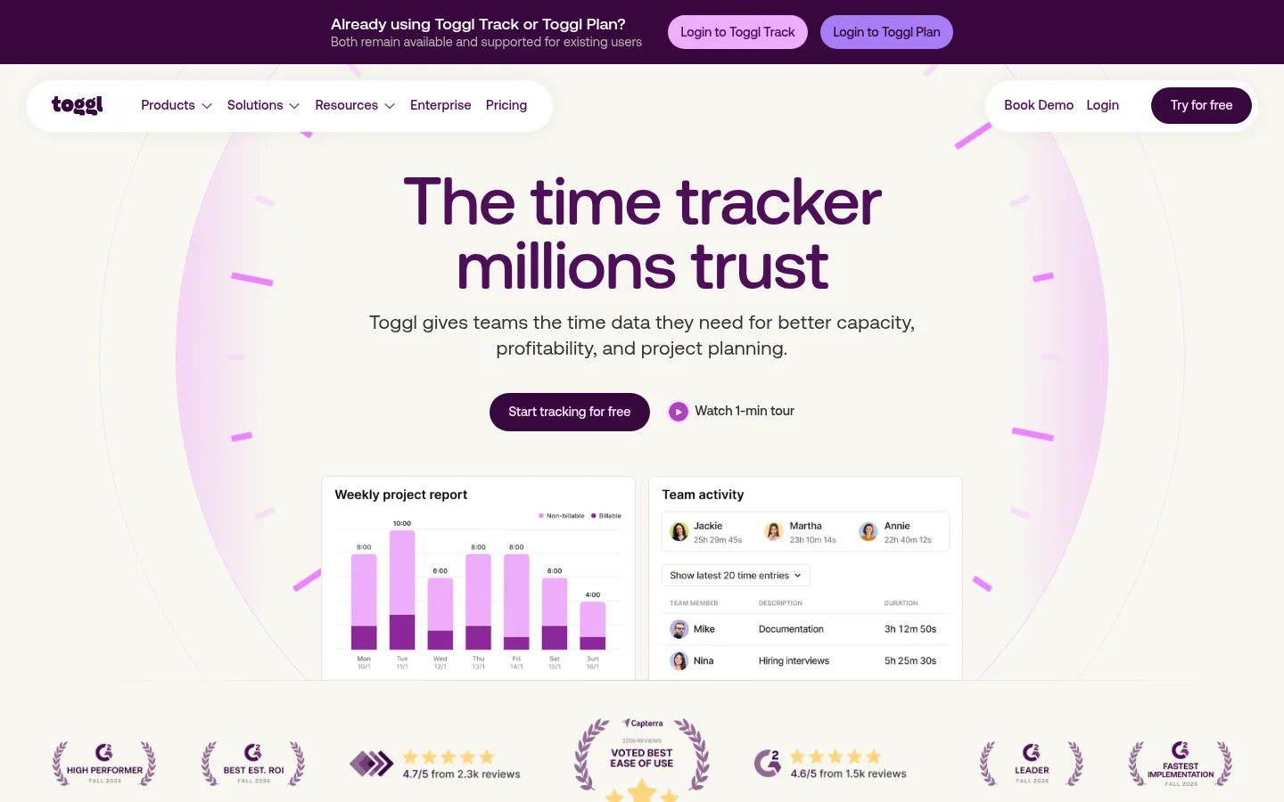
The page uses a centered content frame measured at a 1368px maximum width, with a comfortable density and generous section separation. The hero centers its headline and introduction above paired product-interface panels. Further down, layout alternates between centered section openers, two-column feature stories, four-column feature grids, and two-column audience cards. Wide media and testimonial bands interrupt the repeated card rhythm. Keep content aligned to consistent columns, letting full-bleed imagery and darker bands create occasional contrast rather than making every section edge-to-edge.
圆角与层次 md · nav
lg · card
hairline · other
hairline · other
Most sections rely on flat color fields, whitespace, and fine warm-gray rules rather than strong shadows. White navigation and product cards sit subtly above the ivory background; rounded corners make those layers legible. Reserve the measured soft nav shadow and faint pink card shadow for restrained separation, not a universal card treatment.
组件 下面的预览按实测的按钮、输入框、徽标、卡片样式重建(字体用替代字体)。
Announcement strip Deep Aubergine (#37083e) band with compact existing-user copy and pill-shaped legacy product login actions.
Floating navigation White, pill-like navigation surfaces over the warm canvas; logo and links on one side, utility actions and a dark CTA on the other.
Hero CTA pair Dark plum primary action paired with a low-emphasis tour link and small magenta play cue.
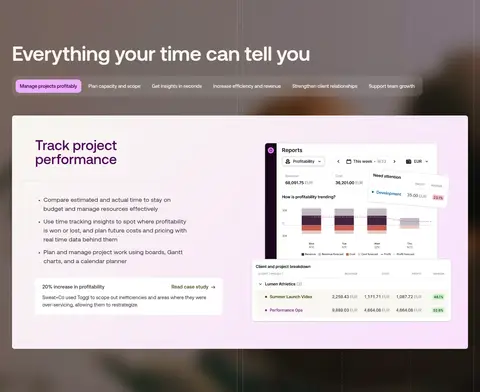
Product UI frame White interface panels present report charts, scheduling, and team activity; use clean borders and restrained card elevation.
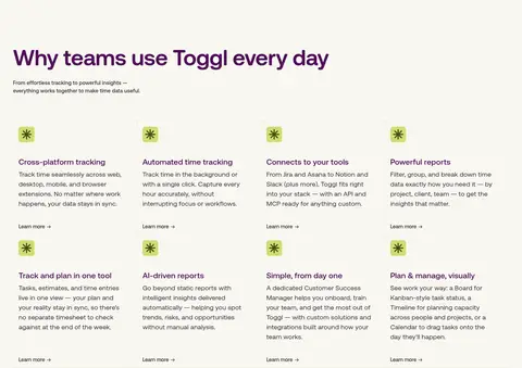
Feature grid Four-column content grid with olive-on-lime icon tiles, plum headings, compact copy, and simple text links.
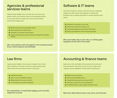
Audience cards White or pale-lime use-case panels with olive headings, fine lime outlines, inset list areas, and rounded corners.
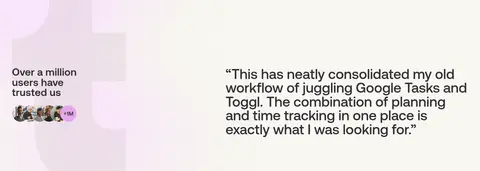
Testimonial band Wide, contrasting section that balances a customer trust statement and portrait cluster with a large quotation.
Imagery · Product UI screenshots and interface mockups are the principal visual evidence: charts, calendars, reports, and team activity panels sit inside clean white frames. Supporting visuals include customer logos, small icons, and photographic background treatments in selected full-width bands. The hero adds a soft pink-violet halo and radial clock-like marks around product imagery. Preserve legibility and avoid turning interface captures into decorative, illegible texture.
页面版块 共 11 个版块,按页面从上到下排列,每个都标了类型、布局和交互套路。
该做与不该做 ✓ 该做 Keep Warm Ivory (#f8f7f1) as the default canvas. Use Plum Ink (#4e0e58) for prominent headlines and navigation. Reserve Deep Aubergine (#37083e) for high-priority dark actions and bands. Use Pale Lime (#e9f4b3) to mark use-case or feature card groups. Show product interfaces as crisp, readable evidence. Alternate centered introductions with aligned multi-column content. ✕ 不该做 Do not replace the warm ivory canvas with stark white throughout. Do not use bright violet accents as the dominant page color. Do not make every section a rounded card. Do not add heavy drop shadows to otherwise flat content. Do not crowd the hero with competing messages or actions. Do not let product screenshots become unreadable decorative backgrounds. 给 AI 的提示词 想快速出一个同风格的新页面,把这段话连同 DESIGN.md 一起发给 AI。
复制 Build a new SaaS page in Toggl’s visual language. Use Warm Ivory (#f8f7f1) as the main canvas, Soft Charcoal (#363137) for readable body text, and Plum Ink (#4e0e58) for rounded, confident headlines. Set primary actions in Deep Aubergine (#37083e) with pale text; use Soft Orchid (#eeadfb) and Pale Lilac (#fae0fe) only for small accents, and Pale Lime (#e9f4b3) for selected feature or audience panels. Pair a spacious centered introduction with crisp product UI panels, then vary the page using two-column stories, compact feature grids, and audience cards. Use Aeonik-like sans-serif body typography and a softer rounded display face. Prefer flat surfaces, fine warm-gray rules, modest corner rounding, and restrained shadows. Keep screenshots legible and preserve generous section breathing room.
DESIGN.md Tailwind v4 CSS 变量 Design Tokens
---
title: "Toggl design system"
variant: extended
source: https://toggl.com/
captured_at: 2026-10-12
theme: light
industry: saas
generator: Design DNA (https://four.wiralomi.com/style/toggl-com)
ai_generated: true
ai_label: "本文件由 AI 辅助生成:数值取自公开网页的实测样式,命名、用途说明与建议为模型解读。商标归原所有者。 / AI-assisted content"
---
# Toggl · Design System
> Warm neutrals, vivid product clarity
**Theme:** light · **Industry:** saas · **Source:** https://toggl.com/ · **Captured:** 2026-10-12 (1440×900 desktop)
_AI-assisted content: values are measured from the public page at capture time; names, roles and guidance are model-written interpretations. Trademarks belong to their owners._
Toggl’s homepage pairs a warm off-white canvas with deep plum typography, soft magenta accents, and pale lime cards. Centered messaging and product-interface imagery give way to spacious feature sections and audience-specific panels.
## North star
Use the warm ivory canvas and plum-led typography as the constant, then reserve lime and magenta for clearly differentiated product moments and actions.
## Overview
The page is built on a warm ivory canvas (## Colors
| Name | Hex | Token | Group | Role |
|---|---|---|---|---|
| Warm Ivory | ` | `--color-warm-ivory` | surface | Primary page canvas behind the hero and many long-form content sections. |
| Soft Charcoal | ` | `--color-soft-charcoal` | neutral | Default body copy, card text, and supporting interface labels. |
| Clean White | ` | `--color-clean-white` | surface | Navigation surfaces, audience cards, and contrasting section bands. |
| Olive Ink | ` | `--color-olive-ink` | brand | Muted headings and text on lime panels; also an olive brand accent. |
| Pale Lime | ` | `--color-pale-lime` | surface | Audience and feature cards that distinguish use cases from the ivory canvas. |
| Deep Aubergine | ` | `--color-deep-aubergine` | brand | Dark primary CTA and top announcement band, with pale text on buttons. |
| Soft Orchid | ` | `--color-soft-orchid` | accent | Login button surface and small magenta product-interface accents. |
| Lime Outline | ` | `--color-lime-outline` | accent | Measured card outlines and small lime details; most visible around audience content. |
| Moss Glow | ` | `--color-moss-glow` | accent | Olive radial-gradient highlight and occasional heading or section detail. |
| Warm Hairline | ` | `--color-warm-hairline` | neutral | Subtle separators and media boundaries against the ivory page background. |
| Pale Lilac | ` | `--color-pale-lilac` | surface | Light accent surface and pale text on the dark primary CTA. |
| Violet Button | ` | `--color-violet-button` | accent | Secondary legacy-product login button; a small interface accent, not a main page field. |
| Plum Ink | ` | `--color-plum-ink` | brand | Prominent headline and navigation text, plus text on orchid login buttons. |
| Blush Edge | ` | `--color-blush-edge` | semantic | Pale border tone detected around media and cards; not a dominant page surface. |
| Faded Rose | ` | `--color-faded-rose` | accent | Subtle edge fade in a measured gradient, rather than a principal section fill. |
| Berry Violet | ` | `--color-berry-violet` | accent | Occasional vivid text accent, including result-oriented elements; use sparingly. |
| Moss Slate | ` | `--color-moss-slate` | surface | Dark inverse card surface, mainly supporting contrast in product or feature content. |
### Semantic aliases
`--color-canvas` → ` (Warm Ivory) · `--color-surface` → ` (Clean White) · `--color-surface-2` → ` (Pale Lime) · `--color-surface-3` → ` (Moss Slate) · `--color-surface-4` → ` (Pale Lilac) · `--color-text` → ` (Soft Charcoal) · `--color-text-muted` → ` (Olive Ink) · `--color-border` → ` (Warm Hairline) · `--color-accent` → ` (Olive Ink) · `--color-accent-2` → ` (Soft Orchid) · `--color-accent-3` → ` (Moss Glow) · `--color-on-accent` → ` (Plum Ink)
### Contrast (WCAG 2.x)
| Text | Background | Ratio | Level |
|---|---|---|---|
| ` | ` | 11.85:1 | AAA |
| ` | ` | 12.72:1 | AAA |
| ` | ` | 10.93:1 | AAA |
| ` | ` | 1.56:1 | fail |
| ` | ` | 8.81:1 | AAA |
| ` | ` | 9.46:1 | AAA |
| ` | ` | 8.13:1 | AAA |
| ` | ` | 1.16:1 | fail |
| ` | ` | 8.81:1 | AAA |
| ` | ` | 9.46:1 | AAA |
### Gradients
- `radial-gradient(circle closest-side, rgb(115, 130, 11), rgba(255, 255, 255, 0))`
- `linear-gradient(135deg, rgb(248, 247, 241), rgb(250, 224, 254))`
- `linear-gradient(90deg, rgb(244, 211, 245), rgba(0, 0, 0, 0) 10%, rgba(0, 0, 0, 0) 90%, rgb(244, 211, 245))`
## Typography
| Family | Token | Source | Weights | Role | Free substitute |
|---|---|---|---|---|---|
| Aeonik | `--font-body` | webfont | 400, 500, 600, 700 | Navigation, body copy, captions, and interface labels | Inter |
| Aeoniksoft | `--font-display` | webfont | 500, 600, 700 | Display headlines and section headings | Manrope |
- **Aeonik:** Use clean sans-serif forms with measured, lightly tracked body and nav styles; keep copy in sentence case.
- **Aeoniksoft:** Rounded, confident headline shapes; medium to semibold weights, tight leading, and modest negative tracking at display scale.
### Type scale — Perfect Fourth (ratio ≈ 1.332, base 18px)
| Role | Size | Weight | Line height | Letter spacing | Case | Family | Used for |
|---|---|---|---|---|---|---|---|
| display | 75.5px | 500 | 0.95 | -0.02em | — | Aeoniksoft | Large hero or campaign headline treatment. |
| h1 | 61px | 600 | 1 | -0.01em | — | Aeoniksoft | Primary page headline and major section statements. |
| h2 | 41.5px | 500 | 1 | 0 | — | Aeoniksoft | Section headings introducing product stories or audiences. |
| h3 | 30.5px | 600 | 1 | 0.01em | — | Aeoniksoft | Feature and use-case card headings. |
| h4 | 25px | 500 | 1.15 | 0.01em | — | Aeoniksoft | Smaller content headings and supporting statements. |
| body | 18px | 400 | 1.5 | 0.01em | — | Aeonik | Explanatory paragraphs and longer card descriptions. |
| caption | 14.5px | 500 | 1.5 | 0.01em | — | Aeonik | Compact labels, metadata, and supporting interface copy. |
| nav | 14.5px | 500 | 1.5 | 0.01em | — | Aeonik | Top navigation and utility links. |
## Spacing & layout
- Base unit **1px**, density **comfortable**.
- Scale (most used values): 4, 5, 7, 11, 13, 14, 18, 22, 25, 29, 36, 43, 58 px.
- Section rhythm 43px · element gap 11px · card padding 23px · max content width 1368px.
The page uses a centered content frame measured at a 1368px maximum width, with a comfortable density and generous section separation. The hero centers its headline and introduction above paired product-interface panels. Further down, layout alternates between centered section openers, two-column feature stories, four-column feature grids, and two-column audience cards. Wide media and testimonial bands interrupt the repeated card rhythm. Keep content aligned to consistent columns, letting full-bleed imagery and darker bands create occasional contrast rather than making every section edge-to-edge.
## Shape & elevation
- Radius: button `11px` · card `11px` · media `50%` · nav `9999px` · link `7px` · xs `7px` · sm `11px` · md `14px` · pill `9999px`
- Shadow `md` (nav): `rgba(0, 0, 0, 0.06) 0px 0px 24px 0px`
- Shadow `lg` (card): `rgba(236, 132, 255, 0.08) 0px 1.8px 28.8px 0px`
- Shadow `hairline` (other): `rgb(250, 224, 254) 0px 0px 0px 4px`
- Shadow `hairline-2` (other): `rgb(250, 224, 254) 0px 0px 0px 2.7px`
- Motion: standard transition `0.333s cubic-bezier(0.48, 1, 0.52, 1)` on interactive elements.
Most sections rely on flat color fields, whitespace, and fine warm-gray rules rather than strong shadows. White navigation and product cards sit subtly above the ivory background; rounded corners make those layers legible. Reserve the measured soft nav shadow and faint pink card shadow for restrained separation, not a universal card treatment.
## Imagery
Product UI screenshots and interface mockups are the principal visual evidence: charts, calendars, reports, and team activity panels sit inside clean white frames. Supporting visuals include customer logos, small icons, and photographic background treatments in selected full-width bands. The hero adds a soft pink-violet halo and radial clock-like marks around product imagery. Preserve legibility and avoid turning interface captures into decorative, illegible texture.
## Components
### Announcement strip
Deep Aubergine (### Floating navigation
White, pill-like navigation surfaces over the warm canvas; logo and links on one side, utility actions and a dark CTA on the other.
### Hero CTA pair
Dark plum primary action paired with a low-emphasis tour link and small magenta play cue.
### Product UI frame
White interface panels present report charts, scheduling, and team activity; use clean borders and restrained card elevation.
### Feature grid
Four-column content grid with olive-on-lime icon tiles, plum headings, compact copy, and simple text links.
### Audience cards
White or pale-lime use-case panels with olive headings, fine lime outlines, inset list areas, and rounded corners.
### Testimonial band
Wide, contrasting section that balances a customer trust statement and portrait cluster with a large quotation.
### Measured component styles
- **Primary button** (“Login to Toggl Track”): background ## Do
- Keep Warm Ivory (## Don't
- Do not replace the warm ivory canvas with stark white throughout.
- Do not use bright violet accents as the dominant page color.
- Do not make every section a rounded card.
- Do not add heavy drop shadows to otherwise flat content.
- Do not crowd the hero with competing messages or actions.
- Do not let product screenshots become unreadable decorative backgrounds.
## Agent prompt
Build a new SaaS page in Toggl’s visual language. Use Warm Ivory (## Page sections (top to bottom)
| # | Type | Layout | UX patterns | UI patterns |
|---|---|---|---|---|
| 1 | hero | Centered hero, product mockups below copy, with trust marks along the lower edge. | Free trial CTA, One-minute product tour | Plum headline, Soft radial glow, Paired UI panels, Logo strip |
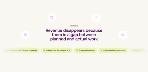
| 2 | other | Centered problem statement with small floating icons and a horizontal row of pain-point labels. | Problem framing, Scannable pain points | Ivory canvas, Plum heading, Pale lime labels |
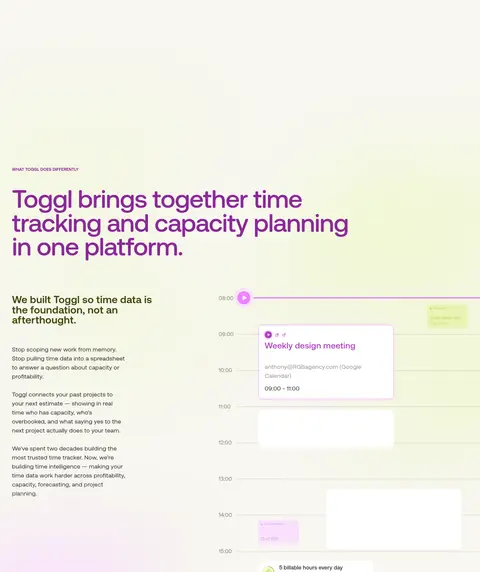
| 3 | feature-split | Large headline and explanatory text beside a broad scheduling interface illustration. | Product explanation, Feature proof | Two-column split, Gradient wash, Calendar UI |
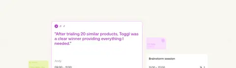
| 4 | testimonials | Full-width two-column band with trust statement and a prominent customer quote. | Social proof, Customer quote | Wide media band, Portrait cluster, Large quotation |
| 5 | product-showcase | Dark full-width showcase with tab-like labels above a large product report panel. | Tabbed capabilities, Feature browsing | Dark photographic backdrop, White UI card, Pink gradient wash |
| 6 | feature-grid | Four-column feature grid with multiple rows of compact icon-led entries. | Feature scanning, Learn-more links | Small lime icon tiles, Plum headings, Thin dividers |
| 7 | other | Short white transition band separating feature content from audience cards. | Section transition | White surface, Minimal content |
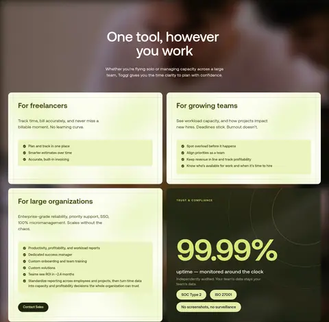
| 8 | feature-grid | Centered audience heading followed by a two-column grid of large use-case cards. | Audience selection, Use-case comparison | Pale lime cards, Fine lime outlines, Inset bullet panels |
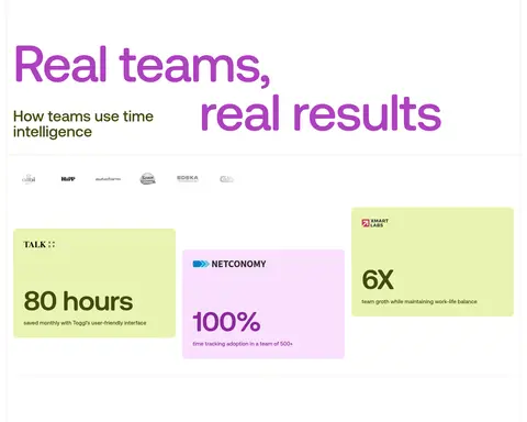
| 9 | stats | Broad white results area with statement, customer marks, and three staggered metric cards. | Outcome proof, Customer recognition | Oversized type, Lime and lilac cards, Metric-led layout |
| 10 | feature-grid | Centered heading above two-column audience cards over a dark photographic background. | Audience pathways, Contact action | Dark image backdrop, Pale cards, Olive feature lists |
| 11 | other | Ivory continuation with cropped interface cards arranged as a visual product montage. | Product browsing, Interface proof | Floating UI cards, Pale background, Soft shadow |
## Source CSS custom properties (selected)
```css
--_colorsystem---surface: